Pivot tables are one of Excel’s most outstanding features. They allow fast dynamic and interactive analysis of data from the workbook or from any number of external sources. Pivot charts go hand in hand with pivot tables in showing the data visually. I am not a staunch fan of pivot charts: they allow only a limited selection of chart types, and their formatting possibilities are not as extensive as those of regular charts. however, for a quick look into a new data set, they are hard to beat. Later when I know what I want to show, I make custom regular charts, with data often derived from pivot tables.
In Visualization Challenge – How to show market share changes? our colleague Chandoo presented the following data and challenged his readers to display it meaningfully. The data shows market share for two brands and five competing retailers, at two times. The challenge was to show the trends over time. I took on this challenge in Challenge – Show Market Share Changes. While working on this challenge, I realized that the data made for a good example of the power of pivot tables for fast and detailed analysis.
Pivot Table Data
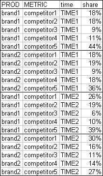
I’ve rearranged Chandoo’s sample data into the form required for an effective pivot table. There are no blank rows or columns, the first row has headers (field names), and there is one row (record) per observation.
Pivot Tables and Charts
To create a pivot table, select all of the data or a single cell within the data (Excel will try to use the contiguous range surrounding the selected cell), and from the Data menu or the Insert tab in 2007, choose Pivot Table. To include a pivot chart, you can choose the appropriate option in the dialogs, or you can select the pivot table and insert a chart, or (and this can be dangerous) you can select an existing chart, edit the source data, click in the Data Range entry box, and click in the pivot table. This last operation is dangerous, because it converts the chart into a pivot chart, and pivot charts cannot be reverted to regular charts. Of course, it is possible to create Regular Charts from Pivot Tables.
The pivot chart is joined to the pivot table at the hip. Any changes to the pivot table are reflected in the pivot chart, and vice versa. For clarity, I have hidden the pivot buttons from these pivot charts. They are redundant since the pivot table and chart are so close together, and they consume valuable chart real estate.
This first arrangement shows each competitor as a different color series. This is fine, but there is too much spacial separation between the two times to allow a good assessment of the trends.
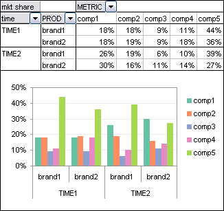
This is easy to fix with a pivot table. You can click and drag the gray field buttons around to change the arrangement instantly. So I dragged the time field inside the product field. The times are closer, but the trends are still not so easy to discern.
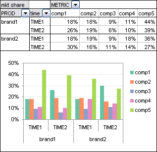
Okay, maybe the competitors shouldn’t rank their own series. I dragged the competitor field down to the rows area and the product field up to the columns area. Hmm, the times are again too far apart.
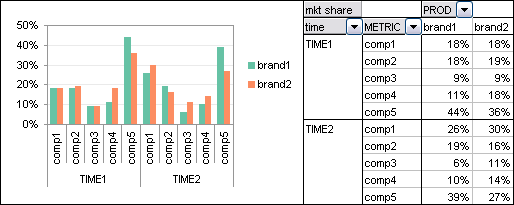
Click, drag. Okay, the times are pretty close now, but the comparison between brands is given more emphasis.
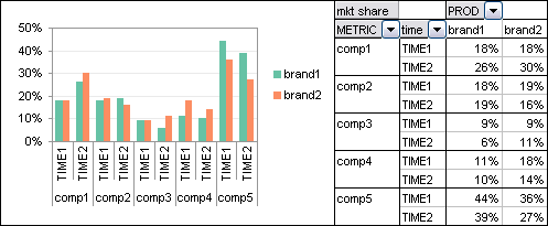
So if we swap the time and product fields, we put the data for the two corresponding time periods next to each other. This view compares the competitors for each brand…
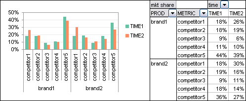
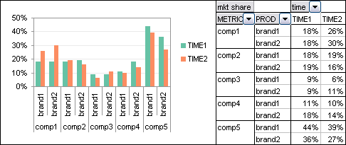
… while this view compares the two brands for each competitor.
The Ultimate Chart
This analysis gave me just enough insight to know how I should build the chart I answered Chandoo’s challenge with. It was not a pivot chart, nor was it based directly on a pivot table, but it utilized the insights from the analysis above. I created a panel chart with each competitor in its own vertical panel, and with lines connecting the data.

I’ll show the particular data arrangement and protocol I used to create this chart in an upcoming post. Stay tuned.
More About Pivot Tables
For more about pivot tables, check out these web pages, mostly from my site:
- Pivot Tables and Pivot Charts
– Contributed by fellow Excel MVP Debra Dalgleish. Check out Debra’s Excel Tips page
– Introduction to Pivot Tables in Excel
– Working with Pivot Charts in Excel
– Pivot Table Programming
– Pivot Table and Pivot Chart Links - Pivot Table Articles on the Peltier Tech Blog
– Explore Your Data With Pivot Tables
– Preliminary Data Exploration with Excel Pivot Tables
– Making Regular Charts from Pivot Tables
– Update Regular Chart when Pivot Table Updates
– Using Pivot Table Data for a Chart with a Dual Category Axis
– Grouping by Date in a Pivot Table
– Referencing Pivot Table Ranges in VBA
– Copy a Pivot Table and Pivot Chart and Link to New Data
– Pivot Table Conditional Formatting with VBA
– Dynamic Chart using Pivot Table and Range Names
– Dynamic Chart using Pivot Table and VBA - Books on Excel Pivot Tables
– Excel Pivot Tables Recipe Book: A Problem-Solution Approach by Debra Dalgleish
– Beginning PivotTables in Excel 2007: From Novice to Professional by Debra Dalgleish
– Pivot Table Data Crunching by Bill Jelen and Michael Alexander
– Pivot Table Data Crunching for Microsoft Office Excel 2007 by Bill Jelen and Michael Alexander


dermotb says
I agree the last chart is the best
Robert says
Maybe I’m missing something. Is the example suppose to show what the market looks like excluding Brand 1 and Brand 2? If I’m the client here, I would need to know what are Brand 1 and Brand 2 shares of their respective markets. Otherwise, the exercise doesn’t make a lot of sense.