Excel Stock Charts
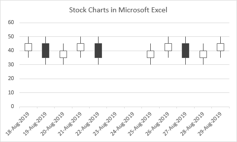
Microsoft Excel offers a variety of charts you can use to plot stock prices over time. If all you have is a single value per time period, such as closing price, you can just use a simple line chart. But if you have additional values, such as high and low price, opening price, and volume, there are specialized stock charts for that.
Built-In Stock Charts
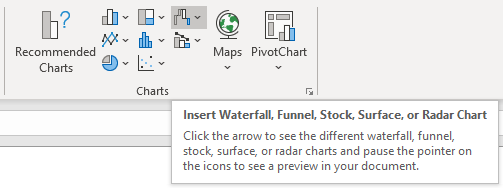
The Insert tab of Excel’s ribbon has a group called Charts. Mouse over the Waterfall icon, and the tooltip will tell you that stock charts are found here.
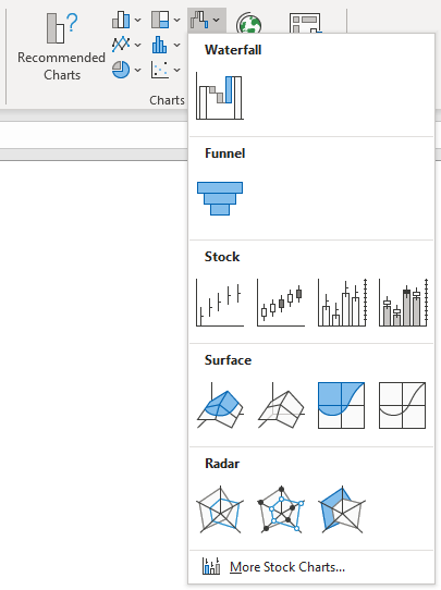
Click on the icon, and a gallery of chart types will appear.
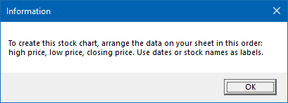
Select your data, then click one of the stock chart icons to create a stock chart. If you have not selected data that is appropriate for the icon you’ve clicked, you’ll get an alert which will help you get it right.
The four built-in types of Excel stock chart are shown below, with a sample of the data layout required for each.
High-Low-Close
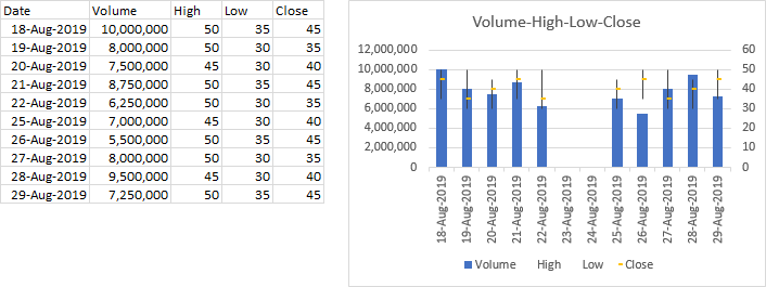
The High-Low-Close (HLC) stock chart uses four columns of data. The first column is a category, usually a date but stock names can also be used. The next three columns in order are for high, low, and closing prices. The range of price for each category is indicated by a vertical line from low to high, and closing price is shown using a tickmark extending to the right of this line.
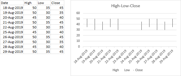
I haven’t made this stock chart variant in quite a long time, and when I did, I was surprised how much I had to squint to see the tickmarks for closing price. Back in Classic Excel (2003 and earlier), these ticks were easy to see because they were black, but in the chart above they are gray. They also seem smaller at 3 points, but in Excel 2003 they were also 3 points; I think in more recent versions of Excel, the vertical line partially obscures the tick marks.
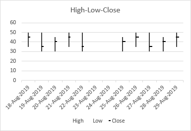
I’ve made visibility improvements in the chart below. I’ve made the vertical line 2 pixels (1.5 points) thick, and I’ve made the tickmarks black; the first set of tickmarks are increased to 5 points, and the second set to 8 points. Anything to help my aging eyes.
Open-High-Low-Close
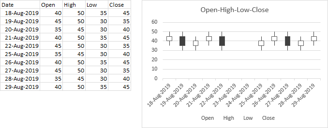
The Open-High-Low-Close (OHLC) chart uses five columns of data, in order: category, open, high, low, and close. The range of prices in each category is again indicated by a vertical line, while the range between open and close is given by a wider floating bar; if the price increases in the category (close is higher than open), the bar is filled with one color, while if the price decreases, the bar is filled with another. This type of chart is often called a candlestick chart.
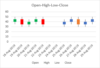
Often people will use colors rather than black and white to indicate increasing and decreasing prices. In the first set of candlesticks below, green shows increasing nad red decreasing prices. This color scheme isn’t ideal: about 8% of men and 0.5% of women (of European descent) suffer from the most common color vision deficiency, an inability to distinguish red and green. Using the first two colors of the modern Excel palette, blue and orange, are often used instead, as in the second block below.
Volume-HLC and Volume-OHLC
The other two stock charts include a column for volume immediately after the first (category) column, and the charts include a column chart on the primary axis showing this volume, while the prices are moved to the secondary axis.
Here is the Volume-High-Low-Close (VHLC) stock chart:
Finally, the Volume-Open-High-Low-Close (VOHLC) chart:
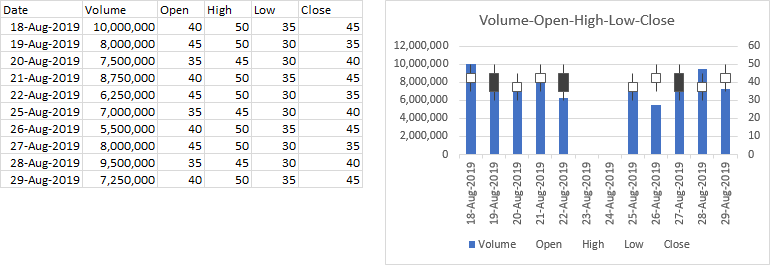
I don’t particularly care for the stock chart variations that include volume: they look cluttered and are difficult to read. If you make them as large as a full sheet of paper, and adjust the scales so the volume bars fill the bottom of the chart and the price data the top, I suppose they’re okay. But I won’t talk about them further.
Home-Made OHLC Candlestick Chart
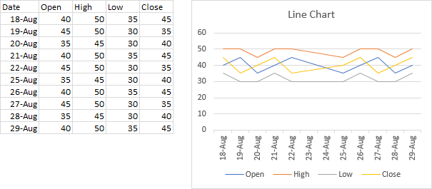
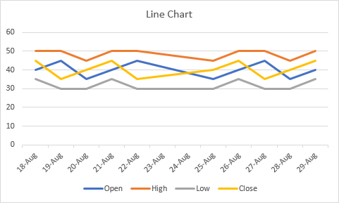
You can hack together a candlestick chart using features of Excel’s line charts. Below is a line chart made with our simple data set. Note the order of the data columns. After the category (date), open is first and close is last, while high and low are between open and close.
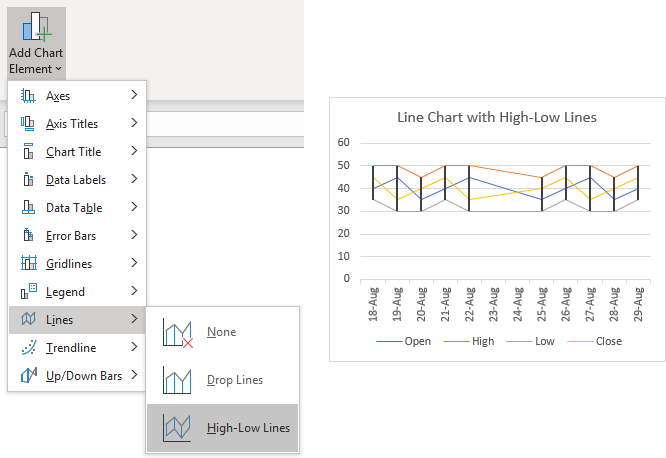
It’s easy to add high-low lines to a line chart. Select the chart, or select a line chart series if the chart is mixed, and on the Chart Design tab of the ribbon, click the Add Chart Element dropdown and select Lines, then High-Low Lines. A line will connect the lowest value at each category to the highest.
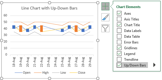
It’s even easier to add up-down bars to a line chart, because you don’t need to go traipsing up to the ribbon. Click the plus icon that floats next to the chart, and check the Up-Down Bars box. The bars in the chart below have already been formatted with the color-vision-friendly blue and orange colors.
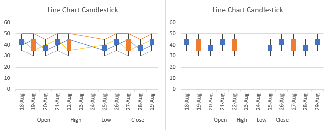
It’s an easy matter to add both high-low lines and up-down bars to a chart (below left), then hide the line chart lines (don’t delete them, just format them with no lines) to roll your own candlestick chart (below right).
In classic Excel, at this point, Excel would know that the chart was a stock chart. If you then made sufficient changes (like adding or removing series), Excel would know that it was no longer a stock chart. In modern Excel, stock charts are treated as something inviolable, so it’s not an easy job to combine one with another chart type. So if you need to combine your stock chart with a series of another chart type (say, an XY scatter series to show some kind of index), it’s good to know how to build a more flexible candlestick chart from a line chart.
OHLC Chart with Open/Close Tickmarks
Excel’s High-Low-Close chart uses a tickmark to indicate the closing price. There is a variation of the Open-High-Low-Close chart, which uses tickmarks rather than up-down bars for both open and close prices. While it’s not native to Excel, it’s not too difficult to build.
We’ll use line chart series for High and Low to exploit a line chart’s high-low lines. We’ll use horizontal error bars for the Open and Close tick marks; since line charts only accommodate vertical error bars, we’ll change the chart type of these series to XY scatter.
Start by inserting a line chart using your stock data.
Right click on a series in the chart and choose Change Series Chart Type to get the following dialog:
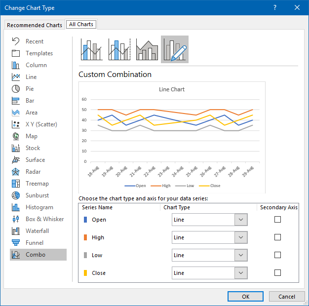
Change Open and Close from Line to Scatter. Excel wants to check Secondary Axis for both, which would probably be fine, but it will be simpler if you uncheck the box.
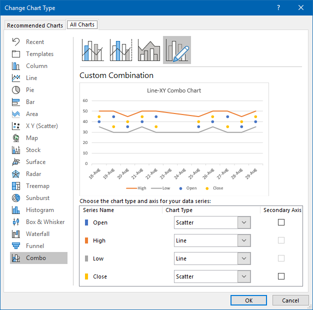
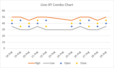
Here is the resulting mixed-series chart.
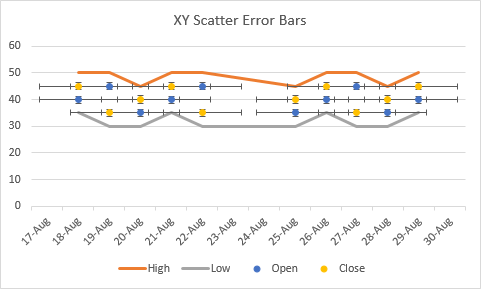
Add error bars to each of the XY series: select the series, click the plus icon beside the chart, and check the Error Bars box.
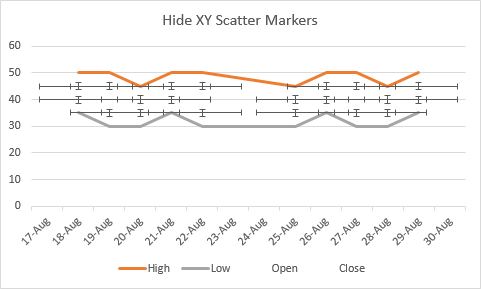
Hide the scatter chart markers so they don’t obscure the error bars.
Delete both sets of vertical error bars: select and delete. They might be hard to select with the mouse, so select the Y error bars from the chart element dropdown that appears when you right click on the chart.
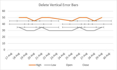
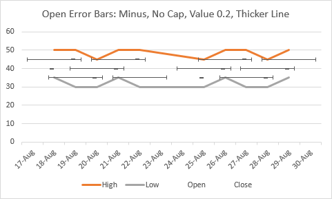
Format the Open X error bars: Minus direction (so they point to the left), no cap, fixed value of 0.2 (adjust to suit), and a line thickness of 1.5 pt (2 pixels).
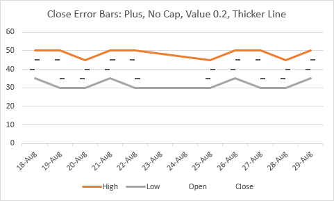
Format the Close X error bars: Plus direction (so they point to the right), no cap, fixed value of 0.2 (adjust to suit), and a line thickness of 1.5 pt (2 pixels).
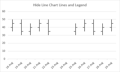
Select one of the line series, go to Add Chart Element in the Chart Design tab of the ribbon, and choose Lines > High-Low Lines. Make the line thickness 1.5 pt (2 px).
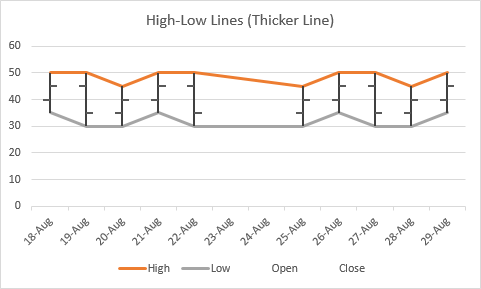
Hidh the line chart lines (don’t delete them, just format to have no line) and ditch the legend, and you’ve got it.
Stock Chart with No Gaps for Weekends
A common question about stock charts is, “How can I remove the gap that appears on weekends, when there is no trading and therefore no price data. The dates don’t even appear in the table, why does Excel include them on the axis?”
Personally. I like the gap for weekend dates. It helps me to see the data more clearly, broken up by weeks instead of mashed all together. But my preference for nicely spaced data won’t prevent me from showing you how to mash them all together.
The reason the data-less dates appear is that Excel treats the date axis as a number line. Even though there is no data for some days, each day has a slot along the axis.
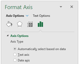
In a line chart (or column or area chart), the category axis can be either a text type or a date type. Normally Excel automatically guesses the type based on the data.
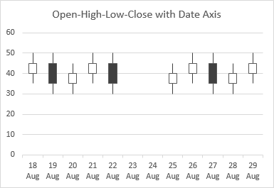
OHLC Candlestick
Here is Excel’s candlestick chart with an automatic axis type, and dates in the category column. Note the gap on Saturday and Sunday, August 23 and 24, 2019.

Let’s format the axis and select Date Axis. No change, still a gap over the weekend, so obviously Excel correctly selected this type based on the dates it detected in the first column of data.
Now let’s select Text Axis. Now the weekend dates do not appear on the axis and there is no gap.
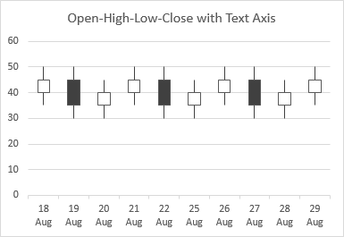
So there’s your answer, and it’s actually pretty easy: to remove the weekend gaps in the chart, change the axis type to Text Axis.
OHLC with Tickmarks
Since the OHLC chart with tickmarks is a combination of line chart and XY scatter chart, we need to work a little harder to eliminate weekend gaps. But it still can be done.
Here is our custom OHLC chart with Open and Close tickmarks as it appears with either automatic axis or date axis. The axis is defined by the line chart series, and since the XY data uses the same dates, these series are plotted along the same axis, with no issue.
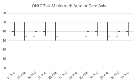
Let’s see what happens when we change the axis type to Text Axis.
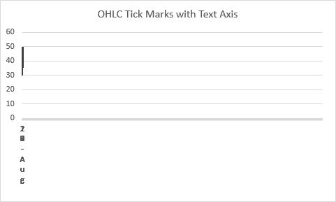
Oh, that’s pretty ugly. All the data is pushed off to the left, the axis labels are all scrunched up. But there’s no need to panic. Let’s add markers to the Open and Close series to see if we can figure it out.
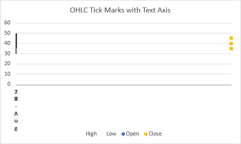
While the high-low lines of the line chart are squished against the left edge of the chart, the XY markers are pushed all the way to the right. Why is that? Well, in a line chart’s text axis, the categories are treated as if they are numbered 1, 2, 3, etc. So our line chart data covers categories 1 through 12. Our XY data is still using 18-August-2019 through 29-August-2019, which according to Excel’s date system are the numbers 43,695 through 43,706. So there are really almost 44,000 axis slots between the line chart data and the XY data.
So how do we fix this? We could plot the lines on the primary axis and the XY data on the secondary axis, then take heroic measures to keep them aligned whenever the data is extended.
But there’s an easier way. We’re going to remove the dates, in fact, we’re going to remove the X values altogether, from the XY series. You can edit the series formula, or use the Select Data dialog.
The series formula for the Open series looks something like this, where the arguments in parentheses are for the series name, X values, Y values, and series plot order:
=SERIES(OHLC!$B$1,OHLC!$A$2:$A$11,OHLC!$B$2:$B$11,1)Select the series, and edit the formula in the Formula Bar just like any other formula, to remove the X value reference:
=SERIES(OHLC!$B$1,,OHLC!$B$2:$B$11,1)Do this for both Open and Close series.
Or if you find it easier (especially since it’s hard to select series which are not easy to click on), you can right click on the chart and choose Select Data.
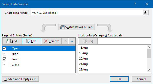
Select a series in the list and click Edit. In the small Edit Series dialog that pops up (below left), delete the contents of the X Values box (below right)

Do this for both Open and Close series. Now the XY points line back up with the line chart.
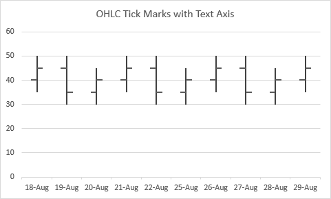
So why did this work? When there are no X values specified for an XY scatter series, it defaults to using the counting numbers 1, 2, 3, etc., as its X values. Since the line chart treats the categories along a text axis as the numbers 1, 2, 3, etc., both sets of series are again plotted on the same basis, and they align nicely.
Include an Index in a Stock Chart
While the volume columns can really clutter up a stock chart, sometimes one or more line series can actually enhance your stock chart, depicting an index or some kind of analytical construction, like Bollinger bands.
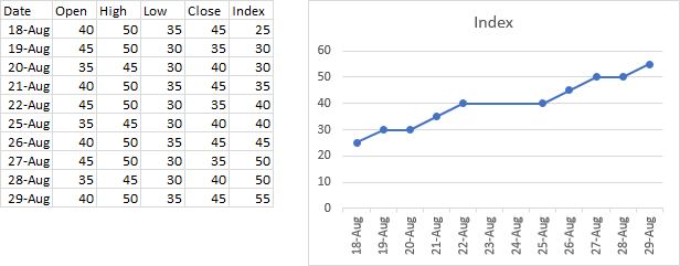
Here is a dummy index to go with our stock data.
OHLC Candlestick
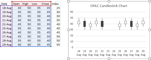
If you had the forethought to put all the data together nicely, the easiest way to add the data is to select the chart, then resize the highlighted data range to include it. If your data isn’t so nicely arranged, you can copy it and use Paste or Paste Special to add it to the chart.
Stock chart before including Index data:
Stock chart after including Index data:
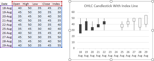
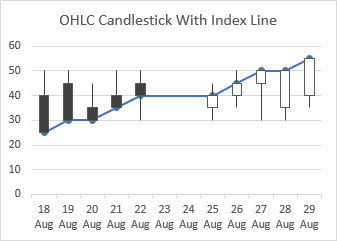
But that has messed up the chart, because Index is now the last line chart series, not Close. The up-down bars now span the difference between Open and Index.
When we add line and markers to the added series, we can see this more clearly.
The easiest fix is simply to format the series and assign it to the secondary axis (below left). Then you can delete the secondary vertical axis (below right).
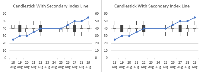
This approach, a line chart series on the secondary axis, turns out to be the best way to add an index to a native Excel candlestick OHLC chart.
Initially, I’d thought it would be easy to change the series to XY, and I could keep it on the primary axis with the OHLC data, but when I right-clicked on the Index series and selected Change Series Chart Type, I go this nasty message:

This happens to be one of the restrictions that Modern Excel places on stock charts. If I had instead built my own candlestick chart from a line chart, using up-down bars and high-low lines as I described earlier, I could have done this very easily.
It turns out that VBA doesn’t have all of these same restrictions, so I gave that a try, typing this into the Immediate Window:
ActiveChart.SeriesCollection(5).ChartType = xlXYScatterLinesAnd I got an XY series plotted on the secondary axis.
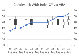
I couldn’t change the axis in the Excel interface (which actually showed it was on the primary axis, despite the presence of the secondary axis in the chart), so I tried VBA again:
ActiveChart.SeriesCollection(5).AxisGroup = xlPrimaryBut I got a run-time error, and the chart didn’t change.
OHLC with Tickmarks
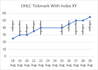
Let’s add the Index series to the OHLC Tickmark chart. Before (below left) and after (below right) the series is added. It’s probably more likely that the series will be added as an XY series. There is no change, since an XY series does not interact with up-down bars or high-low lines.
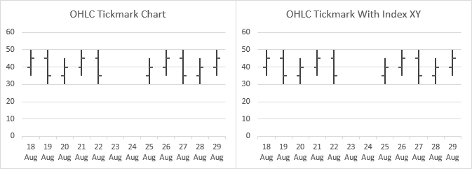
All we need to do is format the lines and markers of this series, and we’re done.
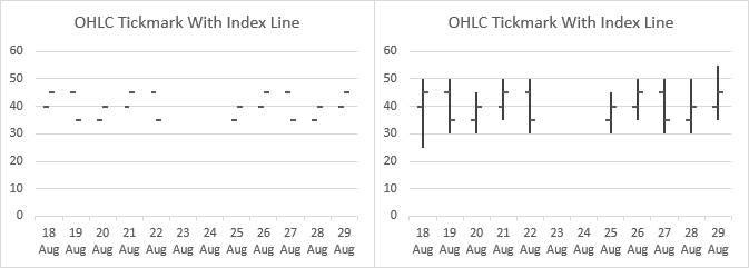
Sometimes, Excel might trip you up and add the Index series as a line series. When this happened to me, the high-low lines went away (below left). When I restored them (below right), it was obvious that they were affected by the Index line series.
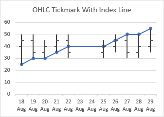
Applying line and markers to the Index series made this clear.
The best approach would be to change the Index from a line to an XY scatter. But I wanted to make sure.
I reassigned the Index series to the secondary axis (below left), then deleted the horizontal and vertical axes that appeared (below right).
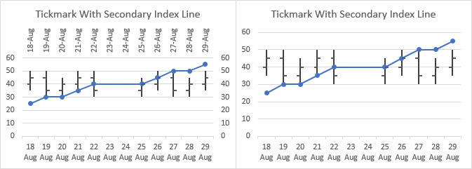
This line on the secondary axis is more complicated than the XY series on the primary axis that I showed first.


Guilherme says
Can we apply named ranges to this kind of chart? I am having some trouble managing to do that on Excel for Mac, any Tip Will be welcome.
Calin says
How the price range can be manipulated / adjusted Y axis ( I want to see only the price range stock is trading in chart ). In all charts Y axis is form 0 to N and I like change that range let say lowest $ 40.0 and Highest $ 60.0 . Can be done ????
Jon Peltier says
Calin –
Double click on the axis. The Format Axis task pane should appear along the right edge of the Excel window. Under Axis Options, enter your desired minimum and maximum scale values.
erick says
Why is it that it’s so hard to find vba code to automatically adjust the y axis on a candlestick chart?
I have one chart on one sheet of my workbook, and I found some vba online to adjust y axis automatically. Although it works, I need to click every time. Also something must not be correct since excel stops working a few times a day (where it didn’t before I added the macro).
Granted I’m a noob. I am great at using excel, just never picked up on vba. But I must say, you’d think it would be simple finding this online. I never get answers on forums, can’t find it, so maybe there are limitations?
Anyway, just frustrated after spending hours the past few weeks trying to find something. I try again every time excel freezes simply out of frustration.
Jon Peltier says
Erick –
Let me point you to a couple of articles that cover VBA automatic axis scaling:
Link Excel Chart Axis Scale to Values in Cells – This is the conventional approach, which can be driven by Worksheet_Change (manually changing cell values) or Worksheet_Calculate (recalculating cell values).
Chart UDF to Control Axis Scale – This is an undocumented and “unsupported” approach that reapplies axis scales whenever the worksheet is recalculated.
I might use either of these in conjunction with Calculate Nice Axis Scales in Excel VBA, Calculate Nice Axis Scales in Your Excel Worksheet, or even Calculate Nice Axis Scales with LET and LAMBDA. I would even use the first (calculate nice scales in VBA) with a routine that finds the actual largest and smallest values in the chart, to ensure that the scales reflect the actual plotted data. In fact, that might make a good tutorial.
Shawn Bertrand says
I’m graphing values with their ranges (not stock price data) and some of the values are outside the range. Excel overrides the high/low range to include the value and I don’t want Excel to do that. I’m wanting the range to be graphed as-is and the value to appear where it should be – regardless of whether or not it is in the range. Can Excel do that? I don’t see any options to make it so.
Jon Peltier says
Shawn –
If you set your own axis scales, Excel will not try to plot every point. Double click the axis, and in the Format Axis task pane, enter values for minimum and maximum.
Blake says
Jon, Thanks for your amazing resources. Tremendous help.
Would you concur that this chart is a OHLC candlestick VBA or do you see something else? I am trying to recreate it: https://ultimatereloader.com/wp-content/uploads/2018/02/Chart-50-Shot-load-development-crop-600×409.jpg
Jon Peltier says
Hi Blake –
Actually, I would say that it is not a candlestick chart. I talk about making a similar chart with floating bars and overlaid data points in Salary Chart: Plot Markers on Floating Bars and also in Categorical XY Chart with Highlighted Categorical Ranges.
David L says
Many, many thanks for posting this — it was very helpful.
Please take care and stay safe.