Here’s a problem that I’ve heard people ask (and complain) about. They’ll have data in their workbook, neatly sorted from top to bottom. When they make a bar chart, the sorting is reversed, with the Bottom data appearing at the top of the chart. Not only that, but the series are in backwards order too. If they sort the data in reverse order, the chart’s categories look right, but now the worksheet is upside-down, and the series are still in the wrong order.
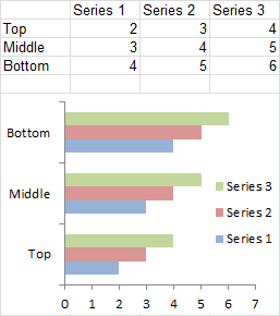
The reason for this arrangement is logical, once you figure it out. To illustrate, let’s start with this data. Yes, the data in column A is mixed up. Instead of 1-2-3-4, it goes 1-3-2-4, to help illustrate differences between XY and Line charts at the same time.

Here is an XY chart made from this data. Looking at Series 1, we see it starts at X=1, proceeds to X=3, then X=2, and finally X=4. No surprise, since it’s following the data, which as I pointed out above, is in mixed up order.
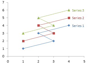
Big deal, no surprises. But let’s look at the chart axes for a moment, and review 4th grade math.
By default, the two axes will be located along the bottom and left edges of the chart. Where the axes intersect is called the origin, and it is where both axes have their minimum values (we’re dealing with non-negative data). Lower values are plotted closer to the origin, and higher values further away.
Let’s make a Line chart with the same data. It looks different from the XY chart. No, the series are formatted the same, with markers and lines. But check out the horizontal axis. The numbers are not sorted numerically, they are listed in the order they appear in the worksheet, as if they have no numerical value. In fact, in line, column, area, and bar charts, Excel treats X values as non-numeric labels. (Unless the X values are dates, and I’ll cover that another time.)

Note that the axes still cross at the origin in the lower left of the chart. Lower Y values are closer to the origin, and X values encountered earlier in the worksheet are closer to the origin.
Okay, easy enough. In a line chart, Excel lists the X axis labels in the same order as in the worksheet, and the origin is at the bottom left of the chart.
Same with a column chart. Note in the column chart that the order that series are clustered is also the same order as in the worksheet.
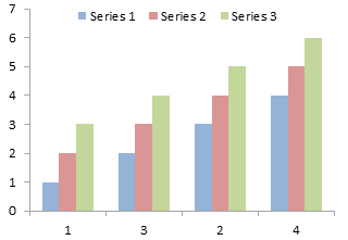
Now let’s make a problematic bar chart. 1 is in the top of the worksheet range, but at the bottom of the axis. But remember, the origin is at the bottom left, and the lowest values and first labels are located closest to the origin. So the “1” label on the vertical axis is closest to the origin, that is, lowest in the chart, even though it was highest in the worksheet. The series are also in the order they are because series 1 is closest to the origin.
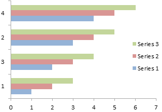
If you really need the chart to be arranged the other way, it’s a simple two-step fix. First, format the vertical axis, and check the box for “Categories in reverse order”.
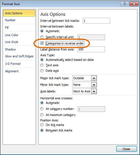
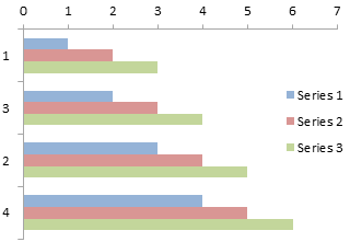
See, now the top label in the worksheet is also the top label in the chart. Reversing the categories has moved the origin to the top left of the chart, so the bottom axis is now at the top of the chart. Note also that the series are now listed in the expected order.
If you want the horizontal axis back at its customary bottom position, format the vertical axis again. (You can do this step at the same time as the earlier Format Axis step.) Select the option button for “Horizontal axis crosses: At maximum position.”
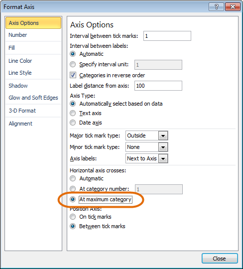
Since the vertical axis maximum is now at the bottom, that’s where the horizontal axis appears.
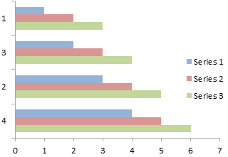
Now we know enough to go back and fix the original chart. Format the vertical axis, reverse the category order and make the horizontal axis cross at the maximum.
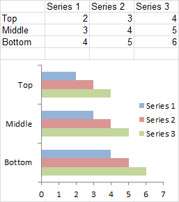
Top is Top, Bottom is Bottom, series are plotted in 1-2-3 order, and we can finally rest easy.


Calvin Graham says
Or for Excel 2003 users, right click that up/down/vertical axis >> Format Axis >> Select the second Tab >> The two boxes to tick are at the bottom
Once again this blog has successfully managed to show me something I somehow missed in the last 10 years…
mattmaison says
Great tip! Thanks! I always just re-sorted manually.
Meic Goodyear says
Excel 2003 users can get even more control by right-clicking on a series, >> Selected Object >> Series order, then Move Up / Move Down as desired.
Red says
Thanks this was helpful!
Tom Ryan says
Thank you very much! I have been looking for this for my work.
M. George Puziak says
MS 2013: portrait prints one 3-hole paper where I want it, on the seft side.
In landscape, the same file prints with the holes on the bottom, not the top where I want them.
How can I fix this without actually running over to the printer to reverse the paper feed.
Jon Peltier says
George –
Your only hope is if your printer driver allows you to change the print orientation on the paper.
Debbi Barnes-Josiah says
Jon – any way to do that Categories in Reverse Order on a pie chart? (Other than re-ordering all the data which I don’t want to do since there are 9 graphs worth…)
Jon Peltier says
Pie charts don’t have a category axis, so you can’t reverse the order of items on the axis.
Pie charts should always have their data sorted. It should be easy enough to apply a sort to the data.
Debbi Barnes-Josiah says
Not really, because the data are coming from complicated tables. But I just tried selecting the points individually, and in reverse order, rather than highlighting them in a group all at once, and that worked! Thanks Jon.
Rodrigo says
Pretty useful! thanks sir
Gurk says
Thanks, it is really helpfull