Column Chart with Primary and Secondary Axes:
Use a Panel Chart Instead
It’s hard to make column charts with primary and secondary axes; special steps must be taken to prevent secondary columns from obscuring primary columns. Such charts are even harder to read than most two-axis charts, probably because the primary and secondary columns are interspersed. You can avoid these problems if you use a panel chart instead.
What People (Think They) Want:
Column Chart with Two Axes
Let’s use some simple data to illustrate the situation. Here the Secondary data is more than an order of magnitude greater than the Primary data.

When plotted together on a single axis, we can’t tell much about the Primary data, because it is overshadowed by the Secondary data.

Aha! We’ll just plot the Secondary data on the Secondary axis, despite Jon’s earlier warnings about Secondary Axes in Charts.

Now the Secondary data really obscures the Primary data. This is where people usually get stuck with their chart.
Of course, it’s possible to add dummy series to the chart to provide adequate spacing.
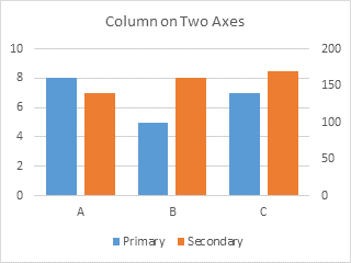
I’ve found that plotting data on two different axes makes it hard for the reader to determine and recall which axis goes with which data. It’s even more confusing with bars that alternate between axes. No matter how you try to clarify the chart, using axis labels that coordinate with the data (shown below), using arrows (not shown), people still mix them up.
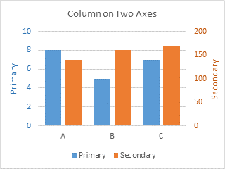
This is added to the usual confusion with two axes. I’ve had people (smart people, mind you) look at the chart, and their takeaway was that Secondary started lower then Primary, but finished higher.
Ah, the perils of a chart with primary and secondary axes.
What People Really Should Use:
Panel Chart
It’s okay to use primary and secondary axes in the same chart, but to avoid confusion, it’s best to separate them into separate panels of the chart. This is the protocol for creating such a panel chart.
We’ll use the same data.

Start by making a plain old column chart.
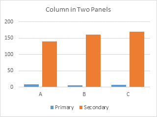
Format the Secondary series so it is plotted on the Secondary Axis.
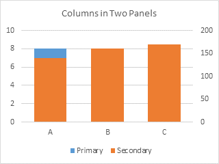
The Primary axis is scaled from 0 to 10, and the Secondary axis from 0 to 200. We need to adjust these scales so the Primary panel is in the bottom half of the chart, and the secondary panel in the top half. If the primary panel has to be 0 to 10 in the bottom half of the chart, we need another 10 units on top, so the total primary scale should be 0 to 20. If the secondary panel has to be 0 to 200 in the top half of the chart, we need another 200 units below this, so the secondary scale should be -200 to 200.
Format the primary and secondary vertical axes according to these computations. If you use a major unit of 2 for the primary axis and of 40 for the secondary axis, both sets of labels line up with the primary horizontal gridlines.
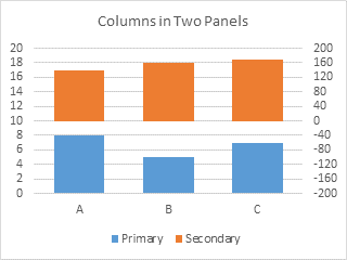
We don’t want to display primary axis labels in the secondary panel or secondary labels in the primary panel. We can use custom number formats to display only the desired axis labels.
In general, number formats have four elements, separated by semicolons. The first element shows the format to be used for a particular numerical situation, the second for another particular numerical situation, the third for all other numerical values, and the fourth for alphanumeric labels:
[first condition]format;[second condition]format;format;alphanumericIf conditions are not specified, the first condition is positive numbers and the second is negative number, leaving the third for zero values.
This makes the custom number format for the secondary axis very easy:
0;;0;@Positive numbers (first element) and zero values (third element) will be displayed as numbers with no decimal digits (i.e., “0”), negative numbers (missing second element) will not be displayed, and alphanumerics (fourth element) will be displayed as themselves (“@”). You could leave off the “@”, and alphanumeric values will also not be displayed.
The custom number format for the primary axis is not much more difficult, now that you know the system:
[<=10]0;;;@Values less than or equal to 10 (first element) will be displayed as numbers with no decimal digits (i.e., “0”), any other values (missing second and third elements) will not be displayed, and alphanumerics (fourth element) will be displayed as themselves (“@”), or omitted if desired (omit the “@”).
Format the primary and secondary axes in turn, and assign the applicable custom number format to each.

We’ll want to visually separate the two panels. Excel only gave us the secondary vertical axis, but we’ll add the secondary horizontal axis, and position that between the panels (at Y=0 on the secondary vertical axis).
First, format the gridlines to use a lighter shade of gray, and the primary horizontal axis to use a darker shade of gray (but not too dark, no need to use harsh black lines).

Using the plus icon (Excel 2013) or the Chart Tools > Layout tab > Axes control (Excel 2007/2010), add the secondary horizontal axis. Excel puts it at the top of the chart by default.

Format the secondary horizontal axis so it uses the same gray line color as the primary horizontal axis. Also format it so it has no labels and no tickmarks.
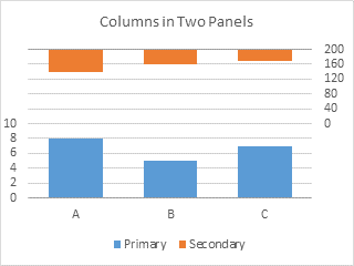
Format the secondary vertical axis (right side of chart) so the horizontal axis crosses at the automatic position (zero).
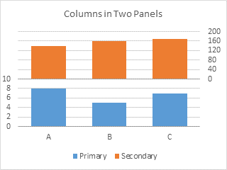
Nobody says you need to keep the original aspect ratio of your chart. You can make it narrower (more so for fewer bars) and taller. You can also adjust the size of the plot area to minimize the white margins around the plotted data.
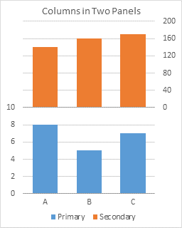
You probably want to label your vertical axes. Using the plus icon (Excel 2013) or the Chart Tools > Layout tab > Axis Titles control (Excel 2007/2010), add axis titles to the two vertical axes.
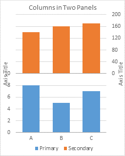
Excel centers these axis titles along the sides of the chart. You can drag them so they are centered on their respective panels. You’ll probably also have to readjust the plot area.

Adding Data
Making the panel chart seemed like a lot of steps, but it’s really not more steps than making any chart with primary and secondary axes, and it’s fewer steps than the gymnastics needed to put columns on two axes with appropriate spacing.
Adding data is also easier for the panel chart. If I add a series to the column chart with two axes, it throws off the spacing provided by the dummy series, and I’ll need to adjust the number and arrangement of blank series in the chart.
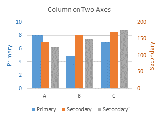
But I’m not going to bother. Instead I’ll add the data to my panel chart.
So copy the new data, select the chart, click on the Paste button of the Home tab (the Copy button in 2007!), and add the data as a new series.
The data is added to the secondary axis.

If the data belongs on the primary axis, simply format the new series and assign it to the primary axis.
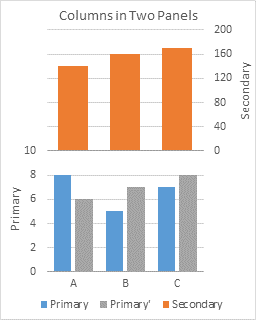
If the new series belongs on the secondary axis, you’re already done.
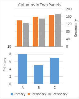
If you add multiple series, and they belong on both axes, well, just move the appropriate ones to the primary axis.
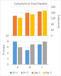
If you need primary and secondary axes, it’s easy to use panel charts to produce charts that avoid the confusion that overlapping axis scales can cause.


Kiev says
I really like this cool stuff, hope it can be used someday to impress may big boss. ha…
Tom says
Thanks for the cool guide. Love the little hacks.
Although I can’t really think of a use-case right now where I’d use this over just creating 2 different charts.
Jon Peltier says
Tom –
Much of the time, two separate charts is just as good. Especially if it’s just you examining the data.
For presentations, having all the data in one chart links it together, and the data shares a common category axis, so you don’t need to continually tweak alignment of two charts.
Justin V says
I just used this to doctor a daily report and it looks MUCH better. I have four values to display that should logically be separated into two pairs, yet the pairs are related to one another and are better shown on one chart. The value of one is also much higher than the other three. Just excellent, thank you.
Kalle says
Hi Jon,
Thanks for this great post.
I am still not able to figure out how to make the second chart:
https://dl.dropboxusercontent.com/u/15685326/Total%20sales%20vs%20operating%20margin.png
Is it possible or do I need to use the linechart on the first axis?
Thanks
Jon Peltier says
Kalle –
The two series must go on different axes, since they display much different data ranges.
When I get a lull, I will post another half dozen or more tutorials, including your example.
Prashant says
Thanks for sharing panel chart technique
Number formatting axes is new learning for me
Only thing I can’t get gridlines accurately as you in secondary chart.
Jon Peltier says
Prashant –
If I understand your problem, you need to adjust the major tick spacing and the min and max of the two axes, so that there are the same number of gridlines in each half of the chart.
Eric says
Hi Jon,
I’m having trouble creating a custom number format for my primary axis that runs 0 to 30,000 in increments of 5,000. I tried using [<=10]0;;;@ and modifying it to [<=30,000]0;;;@ but when I try that the axis disappears leaving only a zero at the bottom. Do you know what I'm doing wrong? I would greatly appreciate your help with this.
Thanks for this great post,
Eric S
Jon Peltier says
Eric –
The number format looks okay. What are the axis scale parameters?
Clarice says
Hi Jon –
I am looking to create a clustered and floating stacked-bar chart with a primary and secondary axis as well. Do you have any guidance on that?
Thank you.
Jon Peltier says
Clarice –
A floating bar chart is a stacked bar chart with a transparent bar in the lowest position, on which the other bars “float”.
A clustered-stacked bar chart has a particular arrangement of bars across the different categories.
To get a floating clustered-stacked chart, you just need to insert a transparent series that the clustered-stacked bars will float on.
Vince Luu says
Just the solution I needed! Thanks for the guide. I’m currently preparing a report for forest fire survey with lots of data, and these tips have helped greatly.
Brad says
Everytime your site comes up in a google search on how to fix something in Excel, your advice always seems to be to make a panel chart. I think I’ll stick with a dummy column for this problem.
Kevin says
Hi John, great post as always. how do you take a 2 series vertical column chart and make it horizontal and use a secondary axis. But not have the series overlapped. thanks
Silvia says
I have created a panel chart using your wonderful tips. My graph has month as the x- axis for both the primary and secondary axis, number of open risks as the primary y axis, mitigation $ on the secondary y axis but then for each of the y axis items are further broken down into risk rating. The graphs looks great but then when I refresh the data, all the secondary axes default to primary and the axis ranges change and default to automatic which totally messes up the graph. Is there any way I can stop this?
Thank you
Jon Peltier says
Hi Silvia –
What version of Excel is this?
Is it a pivot chart? Pivot charts are notorious for losing custom formatting.
Thomas says
Jon,
do you know of a method for creating a chart showing columns over time on a numeric scale and then multiple series of percentages within each Column that are based upon the numeric value of that particular column being 100%. the percentage series are not additive. I want to show how the percentage of custom calculated parameters have individually improved over time along with the growth of the total volume.
Thanks
Jon Peltier says
Thomas –
I think it might be better to plot the individual items using line chart series.
pratap says
i want two primary axis column graph and two secondary axis column graph in one chart seprately…..ex first two should be primary axis and then secondary axis…..can u plz help me on that….
Jon Peltier says
Pratap –
Follow this protocol.
Plot data in clustered column chart (Chart 1).
Assign Sec 1 & Sec 2 to secondary axis (Chart 2).
Set primary Y axis scale to 0 min and 6 max, set secondary Y axis scale to -30 min and +30 max (Chart 3).
Use custom number format
[<=3]0;;;for primary axis tick labels, use custom number format0;;0;for secondary axis tick labels (Chart 4).Debbi Barnes-Josiah says
Hi Jon,
I thought that you used to have the actual explanation, which I can’t find anymore, of how to actually make column charts with primary and secondary axes, given that Excel wants to hide one of the series. I accept your reasoning above that it’s a bad idea, but sometimes I do it to produce a particular effect. Is the explanation still on this site somewhere?
As always, thanks for all this great info.
Jon Peltier says
Debbi –
I removed that old tutorial a long time ago, because people get confused by the resulting charts. But against my better judgment, I’ll describe the approach.
Start by counting the series you want to show. You need this many series on both the primary and secondary axis. For plotting on the primary axis, you use the primary axis data and blanks instead of the secondary data; for plotting on the secondary axis, you use the secondary axis data and blanks instead of the primary axis data.
In my example, I plot one series on the primary axis and one on the secondary series. For the dual axis chart I need the primary series data and blank data for the primary axis, and I need blank data and the secondary series data for the secondary axis.
The table below shows the four series I need to make two series appear on the chart. The first chart shows the plotted data for the X axis (column B) and data for the the two primary series (well, primary and blank, in columns C & D). The second chart shows the plotted data for the X axis (column B) and data for the the two secondary series (blank and secondary, in columns E & F). I’ve added data labels above the bars with the series names, so you can see where the zero-height Blank bars are.
The blanks in the first chart align with the bars in the second, and vice versa.
This is how you make the chart.
Select the whole data range and insert a column chart (all series or on the primary axis).
Select the Blank2 series, and assign it to the secondary axis. Repeat for the Secondary series. Note that each slot on the axis now has two sets of labels: one for the primary or secondary axis series, and another for the corresponding blank series on the other axis.
Finally hide the stuff you don’t want to show. Delete the labels on the Blank series, and remove their legend entries (click once to select the legend, then click again to select the legend entry, then press Delete).
Michael says
Hi, quick question about number formatting for the axes. My data range includes both positive and negative numbers. When I format my secondary axis, I am trying to get the lowest negative numbers to disappear. The range of the secondary axis is -3500 to 2000, and I want -500 to 2000 to be visible. I formatted the numbers as 0;[>=-500]0;;@ which works on making the digits disappear for -3500 to -500, however it retains the negative signs. Do you know if there is a way to fix that?
Jon Peltier says
Michael –
I would have tried
[>=-500]0;;;Hassan says
I’ve never seen any site separate two bar charts the way you did. Really great!!
Boone says
Jon,
How do I add number formatting like a $ or Euro sign using the custom number formats [<=3000000]0; ; ;@
Also having difficulty in excel 2016 getting the secondary grid line 0 value to be darker than the rest.
Thanks!
Jon Peltier says
Boone –
To get a dollar sign in a number format, you just type it into the format, e.g.,
$#,##0.00So to embellish the format in this example, insert the dollar sign where it belongs:
[<=3000000]0;;;@The darker horizontal line for the secondary data is the secondary horizontal axis. Format the secondary vertical axis to make it cross at zero, then format it a little darker, like the other horizontal axis.
Jon Peltier says
Boone –
To get a dollar sign in a number format, you just type it into the format, e.g.,
$#,##0.00So to embellish the format in this example, insert the dollar sign where it belongs:
[<=3000000]$0;;;@The darker horizontal line for the secondary data is the secondary horizontal axis. Format the secondary vertical axis to make it cross at zero, then format it a little darker, like the other horizontal axis.