A colleague was planning a training session, and asked if I had a few points I always try to make about effective charting in Excel. I put together this list, then decided turn it into a blog post.
Data
Spend five minutes with the data before making the chart, or five hours later trying to make the chart conform.
Optimum Layout
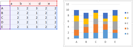
Data should be arranged in columns, X values in the first column, Headers in the first row except above X, and very important, a blank cell in first row of X (real blank, no formula). This helps Excel parse the data. No blank rows or columns, but blank cells (real blanks) are okay if Y data for that X is missing. Below left is a good data range, per these guidelines. Below right this range is shown again, with X values (purple), Y values (blue), and series names (red) highlighted.

Of course, in the real world, you can’t always be so particular. Excel is flexible enough to accept most data, but it may take more effort to make it work.
Blank and Empty Cells
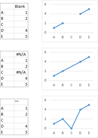
Excel omits the connecting line in a line or XY chart, only if the cell is a true blank. Excel will not plot a point if the Y value is NA() or #NA, but it will draw a line across the gap. Anything in a cell besides nothing (a blank), #N/A, or a number will be treated like any text and assigned a numerical value of zero. This includes any text you insert to try to make a cell look blank.
Highlighting a Chart’s Data
When you select the chart, its data is highlighted in the worksheet (if the data range is “uncomplicated”). In Excel 2013, X values are highlighted in purple, Y values in blue, and series names in red.
When you select a series, its data is also highlighted in the worksheet, using the same highlight formats as above.
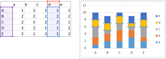
You can drag and resize these highlighting rectangles to adjust the data.
Formatting
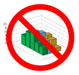
When it comes to formatting charts, less really is more. No 3D charts. I showed several ways to improve this 3D bar chart in my tutorial, Alternatives to a 3D Bar Chart.
Quick Access to Format Dialog or Task Pane
To quickly open the Format Dialog or Format Task Pane for a particular chart element, select that element, and press Ctrl+1 (numeral one). You can also double click on that element in Excel 2010 and 2013 (not in 2007), but Ctrl+1 prevents accidentally moving an element or selecting a different element.
If it’s hard to select a particular chart element, you can select it from the Current Selection dropdown on some of the Chart Tools tabs or the dropdown on the right-click menu in Excel 2010 and 2013. You can also select one chart element, then press the up and down arrow keys to cycle through all the chart elements. If a series or set of data labels is selected, the right arrow key will select the first point or label, and the left and right arrow keys will move among all of the points or labels.
Using Colors
Use white (or very light) backgrounds. Use gray axis lines and light gray gridlines, and don’t use lines if they are not necessary. Borders on the chart area and plot area are generally unnecessary. I often use a light chart area border in this blog to set the figures apart from the text. Use lighter fill colors and no borders for areas and bars. Use bolder colors for lines and markers. Use darker colors for data labels but medium grays for axis labels and titles. Use colors that go together and that do not assault your viewers’ eyes. Avoid the colors developed for 16-bit Windows. Some of these guidelines can be seen in this comparison of default charts in Excel 2003 and 2013.

Use colors sparingly, for emphasis. While it is possible to assign different colors to each bar in a chart, these different colors are not needed. When you do use a different color, it calls attention to the one point that looks different.

No gradients, shadows, glows, false 3D effects (bevels on bars etc.). Any effects that did not exist in Excel 2003 should be avoided.
Secondary Axes
Secondary axes confuse more than they enlighten. No matter how hard you try to make them clear, people will confuse the axes and the plotted data. They will also try to assign meaning to the meaningless points where lines on different axes cross. This chart shows two series of vastly different numbers.

Here one series has been moved to the secondary axes. You could play games with formatting, try to make the axis labels match the corresponding series; you can use very descriptive labels, even put arrows on the data.
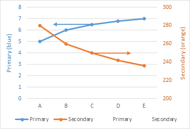
Changing the axis limits by small amounts can drastically change the viewers’ impressions. Do the lines cross between A and B, or between C and D? Neither: if they cross at all, it’s way out beyond Z.
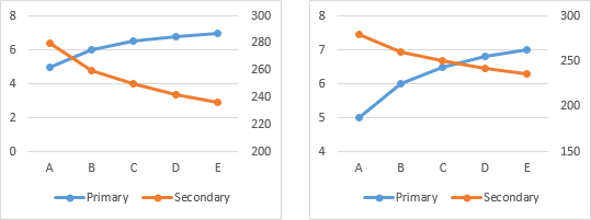
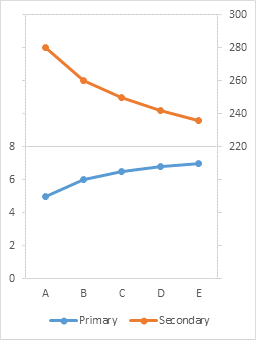
To reduce confusion, it’s usually not too big a deal to make the chart into a panel chart with separate value axes.
Smoothed Lines
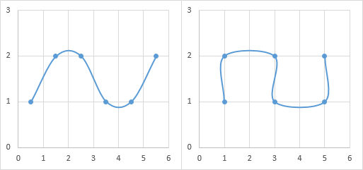
There is an option in Excel Line and XY Charts to smooth the lines that connect adjacent points. In general this is not a great idea. A reader may think that there may be data at extremes in the curve, where no data exists. I’ll resort to reductio ad absurdum to illustrate the problem.
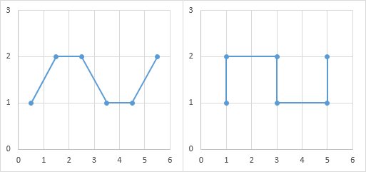
Here is the same data connected with smoothed lines. Looks prettier, doesn’t it? It also implies that the data extends beyond the plotted points, reaching above Y=2 at X=2 and below Y=1 at X=4. In the second chart it also implies some reversal of direction, with X starting at 1, going down to about 0.9, then going above 3, then below 3, up to about 5.1, before ending at 5. But the plotted data shows no signs of any such behavior.
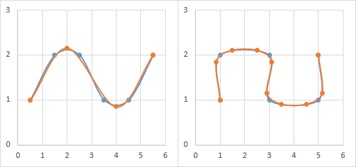
The same curve can be made from our original blue points, or by an alternative set of orange points.
Don’t make your reader guess where the data is. Use only straight lines, to show the markers go together, and not smooth lines that imply the data goes where we don’t have evidence for it.
Chart Types
3D Charts
Did I mention “No 3D charts”? Especially no 3D Exploding Pie Charts. 
Line Charts and Bar Charts
To show discrete values, use columns/bars. The chart below left emphasizes individual month sales, e.g., about 120 in January, 130 in February, etc. To show trends or data over time, use lines or XY. Use markers to show where data is and to clarify that lines connect the points without indicating more values between actual data. The chart below right emphasizes the trend of steadily increasing sales from January to June.

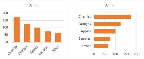
If the X values are unsortable categories, use columns/bars. (If you are really clear about it, you could use line charts, especially if the bar/column chart has lots of series. Some purists don’t like a line chart for categorical X values, but others call this a parallel coordinates plot.) The column chart below says that Cherries had the most sales with about 175, followed by Oranges, Apples, etc. The line chart below implies that sales steadily declined from Cherries through Bananas. Wut?

Value axes on bar, column, area charts must include zero, because the value is encoded by the length of the bars or height of the filled region. Line charts are not limited in this way, because their values are encoded by the position along the vertical axis scale.

Vertical or Horizontal Bars
When axis labels become too long to fit nicely along a vertical column chart’s axis, use a horizontal bar chart to ensure easily readable labels. If the chart is wider than it is tall, you also gain resolution in the value axis. But don’t use the vertical axis for times or dates.
Line or XY (Scatter) Charts
There is a great deal of confusion about whether to use Line or XY (Scatter) charts. Part of the problem is that the default icon for creating a line chart shows lines connecting points while the default icon for creating a scatter chart shows only markers. In fact, the plotted series can be formatted the same in either chart type: with or without markers, with or without connecting lines.
The difference between Excel Line Charts and Excel XY (Scatter) Charts is in the way each type treats category (X) axis data. When choosing between Line Charts and Scatter Charts in Excel, it is important to understand the way these charts treat numerical, categorical, and date values in the X data range. Excel Area, Column, and Bar Charts use the same category axis treatment as Line Charts.
When presented with categorical (non-numeric) X axis data, a line chart treats each value as a separate category label, evenly spaced along the axis. An XY chart assigns counting numbers (1, 2, 3, etc.) to these categories, and uses these numbers to plot the data.

When presented with numeric X axis data, a line chart treats each value as a separate category label, evenly spaced along the axis, despite its actual numerical value. An XY chart uses these numeric values to plot the data.

If you have dates as the X values, both line charts and scatter charts plot the dates proportionally according to the date. The difference here is in the way the axis is formatted.
For example, if you set the line chart to use days as the base unit and set the major scale to 1 month, you get an axis label at each month. Note how the spacing for February is narrower than for January or March in the line chart below.
The scatter chart forces you to use a constant major scale value, in days. Since months have different numbers of days, it is not possible to get a nice axis scale with ticks on the first of each month. Instead, there is an accumulating deviation from the desired labeling, shown in the scatter chart below.

An interesting feature of the line chart’s handling of dates is how it treats unsorted dates.
A line chart plots the data according to date, and connects the points according to date value, not according to order in the source data range. A scatter chart plots the data according to date, and connects the points according to order in the source data.

A line chart isn’t so neat when the X values are date-time values. The line chart uses the dates only, stripping off the times, and plots all values for a given date in the same horizontal position along a vertical line. An XY chart knows all about fractions, converts the times to fractions of a day, and plots according to the date+time.

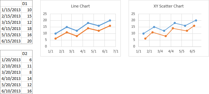
All series in a line chart are forced to use the same X values. In the pairs of charts below, each chart has plotted two sets of data.
The charts below have two sets of data with categorical X values. When the second series of the line chart is selected, although the second X data range was used to add the series, the original X data range is highlighted.

When the second series of the scatter chart is selected, the new X data range is highlighted. Since both set of labels are plotted using counting numbers, the chart uses the same counting numbers to plot both sets of data.

The charts below have two sets of data with numeric X values. The line chart uses the first set of X values to label the X axis, and plots both sets of data against these same labels. The scatter chart plots each set of data independently, using its own distinct X values.

The charts below have two sets of data with dates for X values. The line chart uses the first set of dates to label the X axis, and plots both sets of data against these same dates. The scatter chart plots each set of data independently, using its own distinct dates.
Combination Charts
A combination that uses a column chart (with gap width of zero) or area chart for Budget and a line chart for Actual works well.

Pie Charts
Try to use bar charts instead of pies. Don’t make people try to compare multiple pie charts.
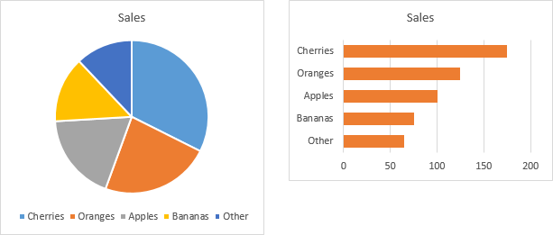
The bar has several benefits. First, the relative sizes of the bars are easier to judge than the relative sizes of the pie wedges. Second, the bar chart takes up less area without giving up detail.
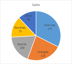
If you have to use a pie chart (and you probably don’t have to), use data labels with category name (and values if desired) in place of the legend, and try to fit the labels within the wedges. If there are too many labels and they don’t all fit well, then there are too many wedges, and you should switch to a bar chart. Always sort pie wedges in decreasing order of size.
Don’t Use Radar Charts
Radar charts look like a great idea, but cognitively they don’t work as well as expected. Even if your data is cyclic, a radar chart isn’t a very good way to display it. Use a line chart.
People like to use radar charts to compare data, for example, customer ratings of different features in a product. Below are a radar plot and a line chart showing fictitious customer approval ratings of features A through F in a product. The thought is that readers can judge the ratings based on distance from the center of the chart. In practice this is not effective because the scales reach out in different directions, so the reader must resort to counting gridlines, which adds a significant cognitive load to reading the chart. A reader can easily compare the vertical positions of points in a line chart to compare values, without any excessive brain strain.
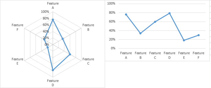
Another problem with radar charts is its resolution. The line chart above is substantially smaller than the radar chart, yet its vertical resolution is greater, because the line chart only needs to use the height of the axis once, while the radar chart must use it twice, once reaching up and once reaching down.
The “horizontal” (circumferential) resolution in the center of a radar chart is worse than at its edges, because the circumference of a given gridline decreases. Points are plotted more closely, and it’s harder to resolve them. This is particularly true when the radar chart displays several series. It is very difficult to see what’s going onwith the data below 20% in the radar chart, but the data below 20% in the line chart is easy to resolve.
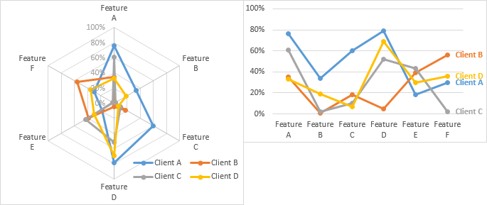
In addition, it’s easier to label the series in the line chart, while the radar chart needs to use a separate legend to identify the different series.
Some purists would not approve of using a line chart to plot categorical data, because readers may improperly interpolate between categories and extract meaningless data. If done with care, however, this is not wrong, and in fact, forms the basis of Parallel Coordinate Charts (see Sample Parallel Coordinate Chart, Interactive Parallel Coordinates Chart, and Composite Baseball Player Evaluation for examples of these).


Lee says
A great piece I’ll be sharing with many of my co-workers as it backs up a lot of what I’ve been telling them all for years.
One thing I’d value your opinion on is the use of line charts when the data being plotted is not along a time line. In your last example, it feels to me that unless Feature A somehow “leads to” Feature B, it ought to be a column/bar chart… What’s the significance of the drop between A and B, for example? If there is no significance because the features are entirely separate, doesn’t the line connecting the points suggest that there is one..? There’d be a drop in column chart too of course, but to my mind it’d be clearer that the two items are separate, unconnected categories so it wouldn’t be an issue. As always – perfectly willing to have my mind changed on this!
Lee says
Oh bloody hell. Scratch all that. Totally missed your last paragraph before jumping in. :)
GMF says
Thank you for taking the time to post some important core concepts for charting. I often take advantage of your more sophisticated chart recommendations, but there are always one or two “basic” concepts that I should know but don’t (or forgot ages ago). For example, I work a good deal with dates/timelines and would love to combine the accurate depiction of months in a line chart with the flexibility of a scatter chart, but you probably saved me a couple of hours of effort trying (and failing) to shoehorn different timeline dates into a line chart. (Why won’t Feb 15 show a different X value than Feb 1st???) Please keep up the mix – both your simple and sophisticated recommendations have saved me a lot of time and frustration. (Now, can you get INDIRECT to work with dynamic ranges so I can easily switch my chart series?)
Jeffrey Shaffer says
Nice post Jon.
Bryan says
I’m new to the “good data visualization revolution”, and this post perfectly sums up the hundreds of posts I’ve been reading over the last few months. It’s going in my bookmarks so I can refer back to it every time I make a new chart :) I even learned a few new things! I always use XY plots to cover date data, since I was worried that a line plot would ignore the dates and plot everything on an equal-width scale. Little did I know all that time I have been spending finding the exact right major scale value could have been spent doing more productive things like sitting back and watching TV!
salsa31 says
well ive search allot of forums but didnt find what i was looking form
i have a mschart that display each month the total profit
the problem is it dosnt show the amount
is there a way or somebody knows how can i display the total on top of the mschart bar using a label or whatever?
this is the code i am using now:
Private Sub Form_Activate()
CmbChType.text = CmbChType.List(0)
CmbChStyle.text = CmbChStyle.List(0)
Dim r As New ADODB.Recordset
r.Open “SELECT Format(CashDate, “”mmmmyyyy””) As CashMonth, SUM(CashProfit)FROM CashBox Group By Format(CashDate, “”mmmmyyyy””)”, CN, adOpenKeyset
If r.EOF Then Exit Sub
ReDim arrmn(1 To r.RecordCount, 1 To 2)
For i = 1 To r.RecordCount
arrmn(i, 1) = r.Fields(0)
arrmn(i, 2) = r.Fields(1)
r.MoveNext
Next
MSChart.ChartData = arrmn
MSChart.Column = 1
MSChart.ColumnLabel = “monthly sales”
End Sub
salsa31 says
i am using visual basic 6
Jon Peltier says
Salsa –
I can’t follow your code. I don’t know that the variables mean or even how they’re declared, and I don’t recognize half the syntax.
Look for syntax like Series.HasDataLabels or Series.AddDatLabels.
Kiev says
A great post, and i just realized that I only applied half of them after finish reading it. so thank you for your nice post & i will visit here very often..
John G says
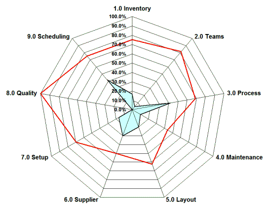
Great summary of do and don’t. The radar plot section reminded me of a recent “Laugh out loud” moment I experienced. I work in power generation, and we have Human-Machine Interface (HMI) display screens that are used by the operators to control the plant. I was reading a book on the so-called “High Performance HMI” in which the author actually reccomends presenting multiple data points to the operator in the form of a radar plot. His justification was that because people are good at pattern recognition, the operators would become accustomed to seeing specific shape(s) in the radar plot, and an abnormal shape would alert them to a problem. Seems to me the only way that could work in practice would be if you arranged the scales in such a way that the “normal” condition formed a perfect circle. Which only works if you have exactly one “normal” condition.
I will NOT be implementing that suggestion.
John G says
Here’s a web article refering to the book, and helpfully includes an example radar plot.
http://www.automationworld.com/hmis-inflection-point?goback=%2Egde_137598_member_5798877367380226050#%21
John Mansfield says
Great article!
I use Excel for line charts mainly and have a question which is very basic yet i cannot find an answer. The company i work for upgraded from Office 2003 to Office 2010 and the way in which you select a single data point on a scatter or line chart has changed. You used to have two small black squares which tracked through the data following each other when you used the cursor keys. This was great as when you have thousands of data points it made it very easy to identify a peak value. This has now been replaced by one larger square which when you hover over it with the mouse displays various values and is of far less use to me. I wish there were some way of switching back to the older two small black squares method of data point selection. I am sure this change must have happened for a reason but i find no benefit in it.
Any advice greatly appreciated, Thanks John.
Tom Stickland says
There is only one thing that I disagree with and that’ s using light grey for axes. I like axes to be black so I can easily see them since they are normally the zero point for measurements.
Jon Peltier says
Tom –
If the axis lines are too dark, they overshadow the data. I agree that they shouldn’t be so light as to be hard to find.