Excel 2010 Chart Type Dialog
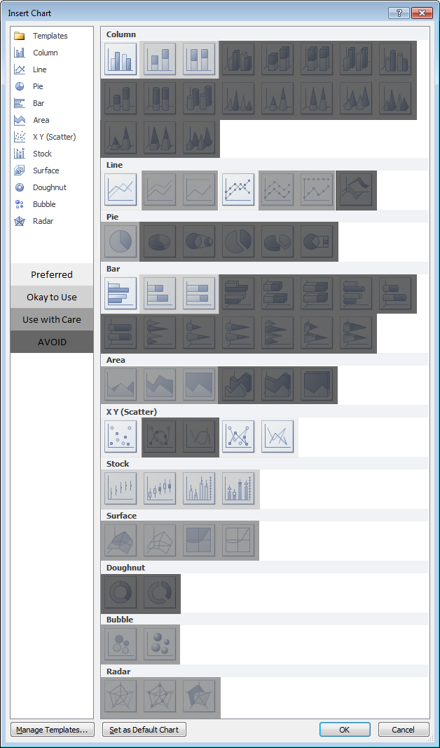
Excel offers a wide range of standard chart types. Below is the Chart Type dialog from Excel 2010, but all of these standard chart types have been available since Excel 97, and most of them since before that.
What makes my dialog different is that it has been annotated to show which chart types you may use freely, which types you may use with caution, and which types you should avoid. If you’ve been reading this blog for a while, and paying attention, you will probably not be surprised by most of the ratings.

Explanations for the ratings
Preferred
This group comprises the commonest and most easily understood charts you can make. Line charts and XY (Scatter Charts), with and without markers and lines. Simple clustered bar and column charts.
Acceptable
These charts are also readily understood, but might not be the first choice for most data sets. They should be used with “a little” caution.
Stacked charts are tougher to decode. Because the bars do not share a common baseline, their lengths are harder to compare.
Stock charts are tough for non-finance people to get, because they convey a lot of information in a specialized way. However, for people familiar with them, stock charts are very useful.
Use With Caution
This set of charts can be useful, if you understand their limitations and drawbacks, and if the audience is skilled in their interpretation.
Stacked line charts can be confusing if the audience does not understand that each line represents a cumulative total of that line’s data plus all previous lines’ data.
Ordinary 2D pie charts can be useful if the number of data points is small and you only use one at a time. Bar charts generally do a better job.
Area charts are problematic for several reasons. Unstacked charts risk areas in back being obscured by those in front, while stacked ones may have an issue if the audience doesn’t realize they represent cumulative data. Line charts are often a better option.
Bubble charts cause problems with interpretation of bubble sizes. Is the area or the diameter proportional to the data being represented? Also, the resolution isn’t too good. It’s often best to use bubble size to indicate discrete factors.
Radar or spider charts seem like they’d be good at displaying cyclic data, but the spoke length is often confounded by the areas within the lines, and it’s impossible to compare values which are not on the same spoke. Line charts are usually a better choice.
Surface and contour charts are the only 3D charts not rated “AVOID”. They can be useful for showing some data. The X and Y values are not treated as numeric variables, but as categories (though you can still use them for numerical values if the points are equally spaced along the axes). Some orientations may lead to features in front obscuring features in back. The wireframe versions have too many line segments, the filled ones may rely too much on color, and starting in 2007, the filled ones have a weird shading applied which often makes the chart less clear. However, when used with care, these can be useful tools.
AVOID
These charts should be avoided because they are difficult to interpret, and some of them have features which may actually distort data.
Most 3D charts are particularly troublesome. The audience has trouble lining up the data elements with offset axes, some elements hide other elements, and the perspective may stretch some elements and shrink others. In many cases the third dimension is a false dimension, created not with data but with lots of extra non-data ink.
All but the simplest 2D pie charts are problematic: donut charts, pie-of-pie and bar-of-pie charts, exploded pie charts. These all have features that make them even less comprehensible than regular 2D pie charts.
New Dialog
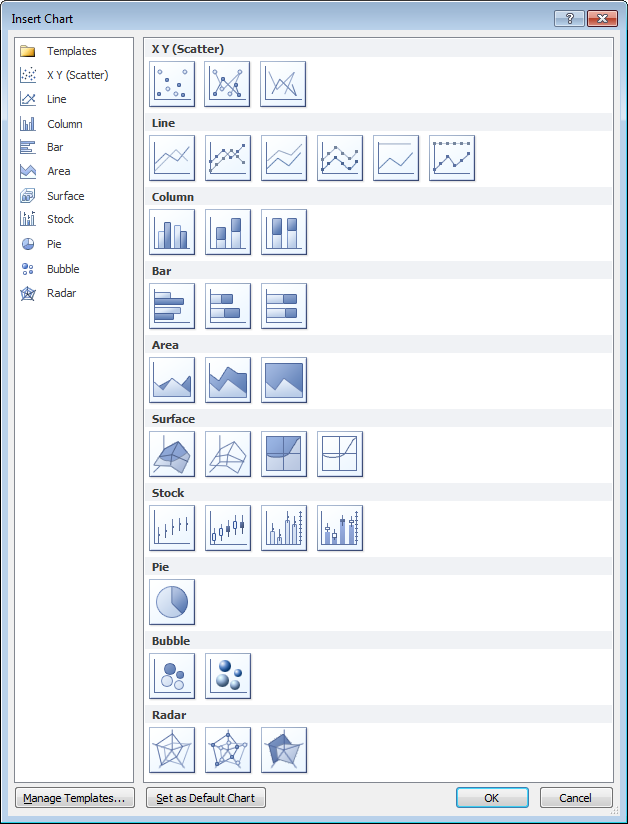
What if we just remove the charts rated “AVOID” from the dialog and do a little rearranging? This isn’t bad:

“Missing” Chart Types
There are various other chart types that aren’t in the Excel dialog, but which you can still make in Excel. You need the savvy to figure out how to arrange the data and how to mix various chart types, and you need the patience to repeat these tasks as necessary. There’s no decent Histogram (despite what the Analysis Toolpak claims), though you can make a column chart and fix it up. Similarly you can make your own Pareto Chart by adding a line series to a column chart. You can make Tornado Charts or simple Gantt Charts by pimping a bar chart. I’ve written some tutorials that show how to make tricky chart types and utilities that will do the work at the click of a button: Waterfall Charts (Bridge Charts), Box and Whisker Charts, Clustered and Stacked Column and Bar Charts, Marimekko Charts, Dot Plots, and Panel Charts.


Calvin Graham says
Slightly disagree with “don’t use donuts.” I like to use them combined with a pie chart to show a break out of the first main slice around the edge. Like if you had a pie showing Windows:Mac:Linux you could add some detail around the outside of the first slice, breaking it into XP:W7:Vista – imagine that the diameter of the first pie slice is a bit larger but beyond the circumference that one slice is split into its 3 components
Pyramid bars are still there though? Seriously? What I’m looking forward to with cloud software is that we may one day extract a statistic of what % of charts made by users are Sideways 3D conicals. Actually, a chart of the useages of everything across the userbase would be awesome.
Jon Peltier says
Calvin –
I’ve seen this type of chart before, and while it’s intriguing, I think a Marimekko Chart is a better way to subdivide this data. The orthogonal arrangements in the Mekko make comparisons easier than the circumferential layout of the Sunburst chart, as this is called. I discussed this chart type in a comment to Leave the Donuts for the Cops, and Stick with the Bars.
Naomi B. Robbins says
This may well be the most useful blog post I’ve ever read. I wish Microsoft used this dialog in Excel. It would dramatically improve the graphs we see.
Alex Kerin says
Jon, I would like you to write an add-in that will hide all of the AVOID chart types from the options.
This add-in must be able to spread like a virus so that it is quietly installed on everyone’s laptops, preferably via a picture of a cat that people are bound to click on.
Tom Quist says
Good graphic and explanations, Jon. I would consider adding one more category for “are you kidding me?” This category would definitely include the 3D Cone Chart.
Robert Kosara says
Good idea, terrible choice of colors! I’d suggest overlaying the options you want to steer people away from with gray to make them look inactive, rather than pulling people’s attention to them with a highly saturated purple. As it is, the most obvious feature of the dialog is all the reddish purple, while the options you want people to use are lost in the noise.
I’m also unsure about the use of shapes. You end up not covering the entire icon, which adds more noise and makes it harder to see the shape. I would reduce the number of categories to three (combine “acceptable” and “use with caution”), and use more subtle cues, in particular grey and simply leaving the ones you recommend the way they are. In fact, it would be even better to just completely remove charts like the cone and pyramid nonsense.
Jon Peltier says
Robert –
You’re right. And I played with the scheme for annotating the dialog, and fiddled with colors because I thought if I was pontificating about good charting practices I should use colors that are friendly to our colleagues with color vision deficiencies. And it got ugly.
I’ve changed to my backup diagram, which used progressively darker shades of gray to blot out the bad chart types. What do you think?
Jon Peltier says
Andy, a class mate of mine from ages ago, commented on my Facebook posting of this article, that the distribution of chart options across my suitability rating scale was “Not the distribution I would suggest for a good analytical tool.” Here is how it looks:
Alex Kerin says
Out of 18 standard chart types in the Tableau “Show-me” dialog, according to your criteria none are avoid (no 3D, no ability to smooth lines), none are use with care without modifying the default (e.g. adding a measure to the size of a scatter chart), and the same acceptable (stacked bars).
Just as with Excel, we can create new charts (Joe’s Marimekko Charts in Tableau), but have Gantt and Histogram as standard.
I don’t know if I had a point…
Alex Kerin says
I did prefer the original version – I found it hard to identify between acceptable and use with care.
Robert Kosara says
Yes, much better! Though I’d use white instead of black/gray in your overlays, that would remove the dark areas and have the effect of just reducing contrast against the white background. But this is clearly much easier on the eyes than the earlier one.
Oli says
Hi Jon, I would generally agree with all you have to say, except in this post I wonder if there is a use for the smoothed line XY scatter; plotting math functions like the butterfly curve etc. I know this is not an every day occurance but it would you agree it is valid? Oli
Jon Peltier says
Oli –
Smoothed lines are abused. If you are plotting measured data, the only valid connecting curve between points is a straight line (or a line which is fitted to a function that comes from a physical model of the data). A smoothed curve implies that the data goes places where it has not been measured. Smoothed lines without points are even worse, because the person trying to interpret the chart doesn’t even know what points on the smoothed curve belong there.
Same with plotting a continuous function. If you need more resolution of the function, you should calculate and plots points with greater frequency. The smoothing algorithm does not know where the function actually goes, so using it may produce a misleading curve.
m-b says
Excellent post. Shouldn’t the 3D line chart be left out in the new dialog though?
Jon Peltier says
M-B –
Good catch. I don’t know how I forgot to delete that one, but I’ve updated my custom dialog, and now nobody will understand your question.
suong soseabp says
Thank for your show me to make chart in type perato diagrame.
Cnybkrdr says
Is it possible to use 2 different chart types in the same chart, such as column and stacked column?
Jon Peltier says
In general you can combine chart types in the same chart. However, you cant combine stacked and clustered versions of column or bar charts.
I’ve written a tutorial that shows how to create Clustered and Stacked Column and Bar Charts. The results are good, but it’s rather a long protocol.
To speed things up, I’ve written a program in Excel VBA that builds this kind of chart at the click of a button. This program is part of the Peltier Tech Chart Utility.