How many points can I plot in each series of my chart? How large of a VBA array can I plot in my chart? Two good questions, which I’ll investigate here.
A colleague emailed me asking about the VBA array size limit for plotting in a chart. He said he thought the limit was 32,000 points, but couldn’t find any official documentation of this, and his trials only worked for half that many points. I couldn’t find any documentation of any limit on how large a VBA array can be used to populate a chart.
tl;dr
The number of points in a chart series populated by worksheet ranges is limited by available memory, as the spec states. This limit can be greater, perhaps much greater, than the number of cells in a worksheet column.
The number of points in a chart series populated by a VBA array is 32,000 if the array is a 2-dimensional vertical array. The limit drops to 16,384 if the array is a 1-dimensional horizontal array.
VBA Arrays as Chart Series Data
I’ll start with the VBA question.
If you generate data in VBA using arrays, you can plot this data in two ways:
- Put the arrays into a worksheet, and plot the ranges that contain the data;
- Put the arrays directly into the chart.
Below is a simple VBA procedure that generates small arrays for the X and Y data, creates a scatter chart with one series, and puts the arrays into the .Values and .XValues properties of the series.
Sub ChartWithVBAArrays()
  ' declare arrays
  Dim X(1 To 10) As Variant
  Dim Y(1 To 10) As Variant

  ' populate arrays
  Dim i As Long
  For i = 1 To 10
    X(i) = i
    Y(i) = i
  Next

  ' create the chart
  Dim cht As Chart
  Set cht = ActiveSheet.Shapes.AddChart2(240, xlXYScatter).Chart

  ' populate the chart
  With cht.SeriesCollection.NewSeries
    .Name = "VBA Arrays"
    .Values = Y
    .XValues = X
  End With
End Sub
The resulting chart (Scatter with Markers and No Lines) looks like this.

Here is what the SERIES formula looks like:
=SERIES("VBA Arrays",{1,2,3,4,5,6,7,8,9,10},{1,2,3,4,5,6,7,8,9,10},1)The arrays are simply shown as comma-separated lists of values, enclosed in curly braces.
Easy enough. Now let’s see how much data we can put into those arrays.
VBA to Explore Series Length
I made two procedures: PlotManyPoints which had two arguments, the number of points to (try to) plot, and the chart to plot those points in; and TEST_PlotManyPoints, which pops up an InputBox asking me how many points I wanted to plot.
Sub TEST_PlotManyPoints()
  Dim cht As Chart
  ' in case I forget to select the chart
  If Not ActiveChart Is Nothing Then
    Set cht = ActiveChart
  Else
    Set cht = ActiveSheet.ChartObjects(1).Chart
  End If
  ' ask how many points
  Dim n As Long
  n = Application.InputBox("How many points?", , , , , , , 1)
  ' run the procedure below
  PlotManyPoints n, cht
End Sub

Sub PlotManyPoints(n As Long, cht As Chart)
  Dim x As Variant, y As Variant
  ReDim x(1 To n), y(1 To n)
  ' build arrays
  Dim i As Long
  For i = 1 To n
    x(i) = i
    y(i) = i
  Next
  ' apply arrays to chart
  With cht.SeriesCollection(1)
    .Values = y
    .XValues = x
    Dim Points As Long
    Points = .Points.Count
  End With
  ' report results
  ActiveSheet.Range("B3:B4").Value2 = WorksheetFunction.Transpose(Array(n, Points))
End Sub
The chart was already present, so the program simply replaced the chart’s existing data with the new data, and it recorded in the worksheet how many points were in the arrays and how many points were plotted in the chart.
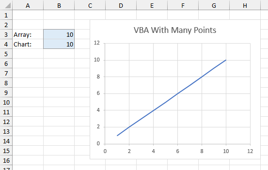
I started small, with 10 points. Here is the output worksheet with an XY Scatter Chart with Lines and No Markers.
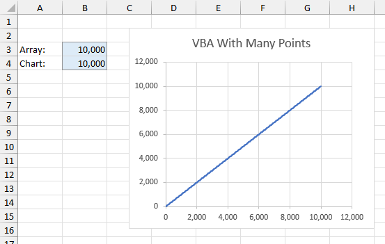
Then I tried 100 points, 1000 points, 10,000 points…
A brief aside while I obsess about the SERIES formula…
I’ve written extensively about Excel’s chart SERIES formula:
- The Excel Chart SERIES Formula
- Change Series Formula – Improved Routines
- How to Edit Series Formulas
- Edit Series Formulas
- Delink Excel Chart Data
The chart SERIES formula keeps showing all of the X and Y values in their arrays for longer than I expected. Here is the SERIES formula for 10 points:
=SERIES(,{1,2,3,4,5,6,7,8,9,10},{1,2,3,4,5,6,7,8,9,10},1)Here it is for 100 points:
=SERIES(,{1,2,3,4,5,6,7,8,9,10,11,12,13,14,15,16,17,18,19,20,21,22,23,24,25,26,27,28,29,30,31,32,33,34,35,36,37,38,39,40,41,42,43,44,45,46,47,48,49,50,51,52,53,54,55,56,57,58,59,60,61,62,63,64,65,66,67,68,69,70,71,72,73,74,75,76,77,78,79,80,81,82,83,84,85,86,87,88,89,90,91,92,93,94,95,96,97,98,99,100},{1,2,3,4,5,6,7,8,9,10,11,12,13,14,15,16,17,18,19,20,21,22,23,24,25,26,27,28,29,30,31,32,33,34,35,36,37,38,39,40,41,42,43,44,45,46,47,48,49,50,51,52,53,54,55,56,57,58,59,60,61,62,63,64,65,66,67,68,69,70,71,72,73,74,75,76,77,78,79,80,81,82,83,84,85,86,87,88,89,90,91,92,93,94,95,96,97,98,99,100},1)Here it is for, well, I won’t show you 1000 points, but the series formula showed all 1000 X and Y values. In fact, the series formula was complete all the way up to 1042 points. The formula was 8221 characters long, slightly more than the stated limit of 8192 in Microsoft’s documentation. If I try to edit the formula and hit Enter, Excel warns me:

When I plot 1039 points, the SERIES formula has 8191 characters. I can edit this formula without changing its length, and Excel will accept the change.
Beyond 1042 points, Excel starts leaving off characters in the array of Y values, then of the X values, to keep to the almost-limit of 8221. At 2000 points, the end of the 8221-character formula looks “broken”:
,1852,1853,1854,1855,1856,1857,1858,1859,1},{1,2,3,4,5,6,7,8,9,}The X values are truncated in the middle of point 1860, the Y values after point 9, and we’ve lost the final plot order argument and closing parenthesis. Despite the lack of fidelity of the series formula display, however, Excel plods, I mean, plots along.
After reopening a workbook that has such “broken” formulas, the formulas can no longer be read. If you select the series, Excel leaves the formula bar blank, and shows this message.

You can still format the series and the rest of the chart. And you can still access all 32,000 data points in VBA using the .XValues and .Values properties of the series object.
In the old days (Excel 2003), the limit on the SERIES formula was 1024 characters, each of the four arguments was limited to one-fourth of this, and if the SERIES formula was “broken” by having too many characters, Excel would refuse to plot anything. The limit using this methodology was 81 points.

If your data had more than one or two digits, the limit quickly became smaller. Try more than the limit and Excel gave you a nasty error.
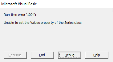
Can you believe I opened up Excel 2003 to try this? I keep a virtual machine around with Excel 2003 just to try stuff like this, because I sure can’t rely on my memory. And by the way, get offa my lawn!
Back to the main topic
When I tried 100,000 points, I hit another limit: the arrays contained 100,000 points, but the chart only accepted 16,384 of them.

So my result validates what my colleague told me: a VBA array can populate much less than the 32,000 points that we unofficially think is the limit.
But that number 16,384 is not a nice round number like 32,000. In fact, it looks like a power of 2. It happens to be 2^14, which is also the number of columns in an Excel worksheet.
A one-dimensional array such as I used in this code is a horizontal array. Perhaps the chart can only accept a horizontal array with as many values as there are columns.
Smarter VBA to Explore Series Length
We can make a two-dimensional array in VBA readily enough. I’ve modified my earlier routine PlotManyPoints to do just that. My arrays x and y are dimensioned with 1 to n rows and 1 to 1 columns.
Sub PlotManyPoints(n As Long, cht As Chart)
  Dim x As Variant, y As Variant
  ' 2-dimensional vertical arrays
  ReDim x(1 To n, 1 To 1), y(1 To n, 1 To 1)
  ' build arrays
  Dim i As Long
  For i = 1 To n
    x(i, 1) = i
    y(i, 1) = i
  Next
  ' apply arrays to chart
  With cht.SeriesCollection(1)
    .Values = y
    .XValues = x
    Dim Points As Long
    Points = .Points.Count
  End With
  ' report results
  ActiveSheet.Range("B3:B4").Value2 = WorksheetFunction.Transpose(Array(n, Points))
End Sub
I ran this for 10, 100, 1000, 10,000, and finally 100,000 points, and I hit the limit of 32,000 points when I tried to add 100,000.
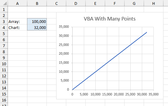
So 32,000 points is the limit for VBA arrays as chart series source data. If you need more, you could do one of two things:
- Put the longer arrays into a worksheet, and plot the ranges that contain this data;
- Break the arrays into smaller 32,000-element arrays, and use these smaller arrays to populate separate series in the chart. Even with the limit of 255 series per chart (which has not changed), you’re allowed 8,160,000 points.
Where Does 32,000 Come From?
So where does this VBA array limit of 32,000 come from? Microsoft’s own Excel specifications and limits informs us that Excel 2007 had a limit of 32,000 points per chart series, but the limit for Excel 2010 and later is “Limited by available memory”. I can’t find anything other than hearsay and speculation about the limit on VBA arrays.
I suspect that somewhere in Excel’s source code, there is still a hard-coded 32,000 chart series limit that nobody can find. This limit is ignored for worksheet data but is still enforced intentionally or otherwise for VBA data.
File Sizes for 32,000 Points
One reason people cite for using VBA arrays instead of worksheet ranges is that the arrays result in smaller workbooks. I made four workbooks to investigate this. One workbook contained data for 32,000 points, but no chart. One workbook contained the data and a chart that plotted the data. One workbook contained no data but had a chart that was copied from one of the first two workbooks, so it was still linked to the workbook with the data. The last workbook had no data, and a chart populated with 32,000 row VBA arrays. The results are summarized in the table below.

The workbook containing only the data needs 413 kb of storage. Add a chart, and the workbook increases to 721 kb. Interestingly enough, if the chart is alone in the workbook and links to a different workbook, the file size is about the same as if its parent workbook contained the data, 724 kb. Most interesting, the workbook with only the VBA-populated chart, with its “broken” and hidden SERIES formula, was smallest of all, at 316 kb.
So the conventional wisdom is correct, and a VBA-populated chart requires a smaller workbook than a chart that links to worksheet data. In any case, these are not enormous files, and I feel safer with the data accessible in the worksheet rather than hidden by VBA.
Worksheet Ranges as Chart Series Data
What does “Limited by available memory” mean?
To finish my analysis, I thought it would be informative to see how many regular worksheet data points I could squeeze into a chart series.
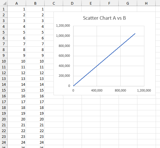
I set up data in columns A and B of a worksheet that start with 1 in row 1 and continue down to 1,048,576 in row 1,048,576 (the last row in the worksheet). I plotted this in an XY chart (line and no markers) and got all of the points into the chart.
Note that hard-coded values work much nicer than formulas in these million-plus-row ranges. It takes a long time to calculate such a lot of cells.
So the limit appears to be 1,048,576 points.
Multiple-Area Worksheet Ranges as Chart Series Data
Then I thought it might be possible to extend this. Let’s examine the following ranges and charts, and apply some SERIES formula magic.
I can plot A1:B4, shown in the first chart below.
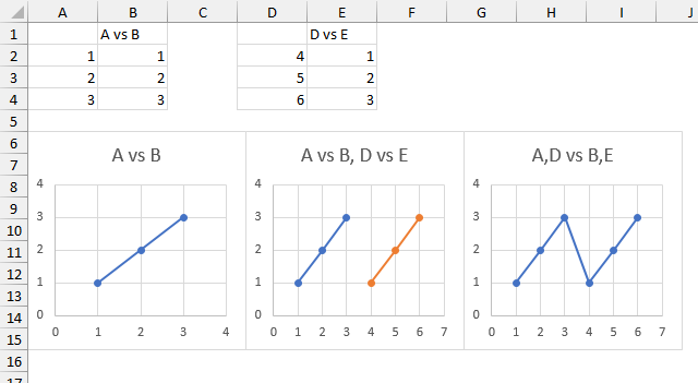
The SERIES formula looks like this:
=SERIES(Sheet1!$B$1,Sheet1!$A2:$A4,Sheet1!$B2:$B4,1)I can add the data in D1:E4 as a second series (orange) in the middle chart, with the following formula:
=SERIES(Sheet1!$E$1,Sheet1!$D2:$D4,Sheet1!$E2:$E4,2)But I can also combine the X and Y values to create a single series using both sets of data, as shown in this series formula and the third chart below:
=SERIES("A,D vs B,E",(Sheet1!$A$2:$A$4,Sheet1!$D$2:$D$4),(Sheet1!$B$2:$B$4,Sheet1!$E$2:$E4$),1)The X values are Sheet1!$A$2:$A$4 and Sheet1!$D$2:$D$4, comma-separated and enclosed in parentheses. Likewise, the Y values are Sheet1!$B$2:$B$4 and Sheet1!$E$2:$E$4, also comma-separated and enclosed in parentheses.
Let’s add more full columns of X and Y data.

I’ve already plotted the first series above with this formula:
=SERIES("A vs B",Sheet1!$A:$A,Sheet1!$B:$B,1)
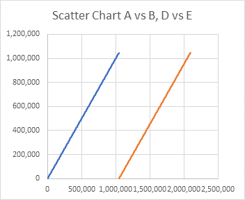
I can add another series with the data in columns D and E with this formula:
=SERIES("D vs E",Sheet1!$D:$D,Sheet1!$E:$E,2)Which produces this chart:
But as I’ve shown above, I can combine the two sets of X and Y data into one series’ worth of X and Y data, using this formula:
=SERIES("A,D vs B,E",(Sheet1!$A:$A,Sheet1!$D:$D),(Sheet1!$B:$B,Sheet1!$E:$E),1)
When I first entered this SERIES formula, I got an error, and I thought that I’d found a hard limit. But I went back and fixed a typo, and it all worked. I ended up with this chart:

So I don’t know what the limit is, except that it is in fact “Limited by available memory,” and this limit is more than the number of rows in a worksheet column. I leave it as an exercise for the reader to determine how many full columns they can squeeze into the SERIES formula.
When the data is comprised of static values in cells, it isn’t too slow to build and display these charts. If you have formulas that calculate the X and Y values, though, this calculation takes a minute or more each time, and it becomes very tedious while you wait for Excel to start responding again.
File Sizes for Whole Columns of Points
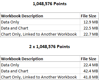
I tabulated file sizes for 32,000 points above to show that populating charts with VBA arrays can reduce file sizes. For completeness here are file sizes needed for charting full columns of data. These are large files. I’ll let you draw any further conclusions.
Follow-Up 2.5 Years Later
Just for fun, I extended my chart up to 4 full columns of X and Y values, a total of 4,194,304 points. The file size was 80.7 MB and the SERIES formula was:
=SERIES(,(Sheet1!$A:$A,Sheet1!$D:$D,Sheet1!$G:$G,Sheet1!$J:$J),(Sheet1!$B:$B,Sheet1!$E:$E,Sheet1!$H:$H,Sheet1!$K:$K),1)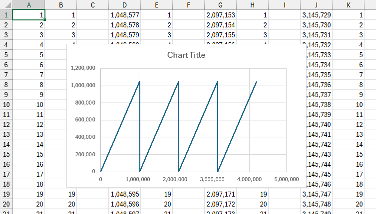
As you might expect, Windows was a little bit slow, and Excel was slipping in and out of Not Responding Mode.


Peter Bartholomew says
Hi Jon
I may have missed the answer but a further thought is what limits apply to series generated entirely within memory using named formulas such as x=SEQUENCE(n)? Or is it just a case of ‘taking forever to render an image with detail that cannot be seen is not the best use of resources’?
Jon Peltier says
Peter –
Oh yeah, define a formula and name it BigArray. But a little testing shows me that =SEQUENCE(n) only works up to n = 1,048,576.
Your second point is something I’ve often pointed out to people (slow to render gazillions of points and unable to see any particular one). But if you’re looking for an outlier, something that doesn’t fit, then it’s useful.
Bob says
Love the Gazillions :)
Moumen Mohammed says
This solution is amazing! thank you!