In Line Charts vs. XY Charts I described the difference between these two Excel chart types. There is no difference in the ways you can format the series, so perhaps the names of the chart types are confusing. The differences are in the ways their respective X axes treat the X data. I discussed the differences in that post, and in Line-XY Combination Charts I showed how to make a combination Line-XY chart that combines the nice date formatting of a Line chart’s date scale axis with the more flexible plotting that an XY chart allows along the X axis.
In this post I will illustrate the behavior of the different category types in more detail.
Categorical Data
The following data has a column of category labels for X and a column of numerical values for Y.
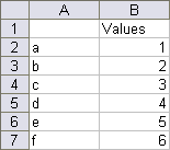
The default Line and Column charts are shown below. The categories are completely visible in the chart, because the value (Y) axis is set to cross the category (X) axis between categories, the default setting for line and column charts.
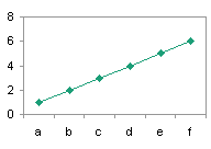

Below, the value (Y) axis is set not to cross the category (X) axis between categories, so the first and last categories are only halfway visible.


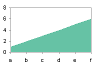
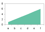
The default Area chart is shown below left. Unlike the Line and Column charts, its default is for the value (Y) axis not to cross the category (X) axis between categories. When the value (Y) axis is set to cross the category (X) axis between categories, there is a gap between the edges of the filled area and the edges of the chart (below right).
A default bar chart has its category (X) axis along the vertical axis, and the bars extend horizontally parallel to the value (Y) axis. Note that the vertical axis is the X axis and the horizontal axis is the Y axis, unlike the convention in most charts. This is a common confusion for newcomers to Excel’s charts.
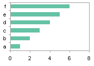
Here is an XY chart made using text labels for its X values. An XY chart has a value-based X axis, like its Y axis. Excel cannot plot nonnumerical data in a chart, so instead of the text labels, Excel inserts counting numbers, 1 for the first label, 2 for the second, etc. Nonnumerical values used for Y values in any chart are treated as zeros.
Numerical Data
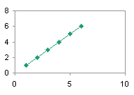
The following data has a column of numerical values for X and a column of numerical values for Y.

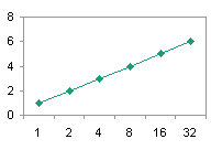
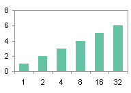
Here are default Line and Column charts made using numerical values for their X values. The category (X) axis treats the X values as labels, despite their numerical character, so along the X axis points are spaced equally, not spaced according to the numerical values.
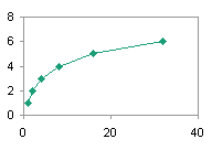
Here is an XY chart made using numbers for its X values. Of course, this is what XY charts were designed for, so both the X and Y numbers are plotted along the X and Y axes according to their numerical values.
Dates
The following data has a column of date for X and a column of numerical values for Y.

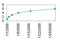
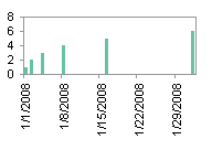
The default Line and Column charts using this data are shown below. Unlike the treatment of text or numbers as nonnumeric category labels, the dates are treated as numerical dates, with the spacing between points proportional to the number of days between points. By default, the X axis stretches from the first date to the last, and Excel has chosen a “nice” X axis spacing of 7 days (one week).
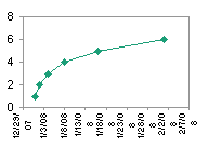
Here is an XY chart made using dates for its X values. Like the Line and Column charts shown above, the spacing of points along the X axis is proportional to the date value of the X data. The axis scale parameters are chosen as for any other value axis. The minimum, 12/29/2007, is day number 39445 in Excel’s date-time system*, the maximum, 2/7/2008, is day number 39485, and the spacing is 5 days. The formatting of the Line chart’s date-scale axis is much nicer.
* Excel stores dates and times as a mixed number: the whole number part is the number of days since January 1, 1900, and the fractional part is the fraction of the day elapsed since midnight (e.g., noon = 0.5, 6 pm = 0.75).
Weekly Dates
The superiority of Excel’s date-scale axis for a chart’s X axis is better illustrated with a broader range of dates. This table shows Friday dates for the first three months of 2008.
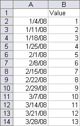
The default Line and Column charts using this data are shown below. The X axis stretches from the first date to the last, and Excel has chosen a “nice” calendar-related X axis spacing of 14 days (two weeks). The column chart illustrates a “problem” people have with using column charts with date-scale axes. The columns are very thin, and there is no way to make them much wider. Even changing the gap width to zero, which makes adjacent columns touch each other, leaves a large gap. This gap is created by the date-scale axis itself, which provides a slot for each day along the axis. Weekly data then consists of one data point followed by six blank slots before the next data point. Since line charts are generally a better tool to illustrate time series data, this is just one more reason not to use a column chart in this context.


The corresponding XY chart is shown below. Its X axis scale is not calendar based, starting on Monday, 12/24/2007 (day 39440), and ending on Wednesday, 4/2/2008 (day 39540), with a tick spacing of 10 days.

We can clean up the Line chart’s X axis by removing the year and rotating the resulting labels (below left) and fix up the XY chart’s X axis in the same way, and also by incorporating week-based scale parameters (below right). The charts are essentially identical.

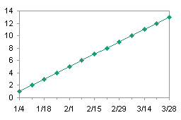
If we format the date-scale axis to show months, the Line chart does so nicely, with a tick mark at the beginning of each month, regardless of the number of days in the preceding month. The XY chart comes up short, because we have to use a “best-fit” major unit, in this case, 30-1/3 days. January is represented in two tick mark labels and February not at all along the XY chart’s X axis.

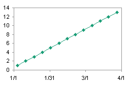
Taken over a whole year, with a “best-fit” major unit of 30-1/2 days per month (366 days/12 months), the XY chart (shown under the Line chart, below) is even less appealing. January is shown in two tick mark labels, February not at all, and three months (March, May, and July) on the second of the month, not the first.


It is for this reason that I will often use a Line-XY combination chart: I get the benefit of the Line chart’s nice date-scale axis without the Line chart’s requirement that all series use the same X values.
Axis Types (Chart Options)
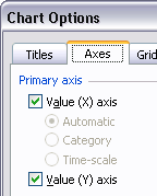
The axis types shown above for the Line, Column, and Area charts were assigned automatically by Excel, based on the X values data. You can actually tell Excel which type to use. For example, in your chart of stock prices, Excel plots every value by date, and leaves gaps in the chart for Saturdays and Sundays. You can omit the gaps by forcing Excel to use a Category type axis instead of a Date-Scale axis. In Excel 2003 and earlier, you can select Chart Options from the Chart menu, and the Axes tab of the resulting dialog lets you select which axes to use in the chart (in Excel 2007 these options are available on the Format Axis dialog). In the Line chart’s dialog (below left), the three options Automatic, Category, and Time-Scale (correctly renamed “Date-Scale” in Excel 2007) are available for selection. In the XY chart’s dialog (below right) these options are visible but disabled.
 —-
—- 
In the following pairs of charts, the left hand one uses the Automatic (Category) axis, while the right hand one uses the Date-Scale type. The left hand charts, repeated from above, treat numerical X data as nonnumerical categories. In the right hand charts, the numbers in the X data are forced to be interpreted numerically, and plotted proportionally, not uniformly. The right hand charts are horizontally compressed because Excel leaves room for the longer axis tick labels which may extend beyond the plot area. The dates begin with day 1 (January 1, 1900).


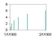
The Line chart (above right) can almost be converted into an XY chart, by changing the X axis number format from a date format to a numerical format (such as “General”), setting the value axis not to cross between categories, and choosing appropriate scale parameters. Of course, it’s not perfect; since the first day in Excel’s date-time system is 1/1/1900, the smallest value that can be used as the X axis minimum is 1, not 0.
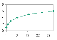
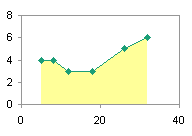
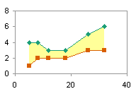
This technique comes in handy when combining an XY chart with an area chart, to fill the area under or between XY chart series.
In the following pairs of charts, the left hand one uses the Automatic (Date-Scale) axis, while the right hand one uses the Category type. The left hand charts, repeated from above, plot the dates in their X values proportionally. In the right hand charts, the dates are plotted uniformly, not proportionally.


This technique is useful to plot stock data while omitting gaps for weekends. Frankly I prefer the time scale axis; the gaps where the weekends occur give me a better sense for the date values.




LEM says
Hello Jon,
I have been searching for a while for this, and am hoping you can help! I am using Excel 2003 – I have a bubble chart where I am trying to set it where both the x axis and the y axis are referencing individual cells (with a median number for x and y from the data set). Previously I have been able to do this for one axis on a scatterplot:
ActiveChart.Axes(xlValue).Select
Selection.CrossesAt = ActiveSheet.Range(“$G$37”).Value
But have no idea how to do this for the other axis as well.
Would appreciate your help!
LEM says
** Sorry – Trying to link to the median cell for the Cross Property of each access (so the Cross Property feature acts in a dynamic way)
Wendell Hovey says
I want to make an xy plot of blood sugar levels. Data consists of date and time versus blood sugar level. Before I start to enter from written sheets to a spread sheet is there a best way to enter date and time data Put it in two adjacent cells or in a single cell?
Jon Peltier says
Wendell –
Excel stores days as whole numbers (number of days since 1/1/1900) and times as fractions (the fraction of the day elapsed since midnight). For best results, enter your date and time together as date and time in the same cell, and apply a suitable number format.
Lakshman V says
Hello John,
I am trying to display a stock chart where I am stacking the volume and price information using the methods you have described elsewhere. I followed your methodology to display the stock prices as OHLC stock ticks. Open & close are XY scatter plots & high & low are line plots. The volume plot is a column plot. I have adjusted the data such that volume occupies 30% the plot at the bottom & the price takes the remaining 70%.
All good until I try to adjust the X axis to category type. I am using 2007. Hence I select the text option, instead of the automatic & date option. I am doing this to eliminate gaps due to the weekday plot as you have suggested here. However, as soon as I do this the whole chart shrinks along the horizontal axis with the plot displayed in 5% of the space from the left. The remaining 95% is empty. Is there a way I can eliminate gaps and still have a nice stock chart plot with volume at the bottom.
Thanks for your help in advance.
Anonymous says
I’m trying to do this for a scatter graph and it’s not working
Jon Peltier says
XY (Scatter) charts do not offer different types of category axes, because both X and Y axes of this chart type are value axes.