Arrow charts are a great way to visualize comparisons and changes, such as actual vs budget, year-over-year, or before-and-after data.
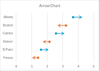
This version of the arrow chart uses stacked bars (which are hidden) to position the arrows, and custom-formatted error bars for the arrows themselves.
Arrow Chart Alternatives
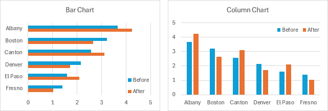
The same data can be shown in many other ways. Bar or Column charts, for example. But these charts compare the data without really directing you to the change in the data. Besides, the saturated colors make the charts a bit hard to digest.
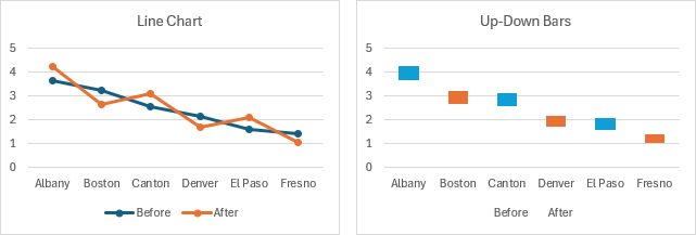
Line charts, with or without up-down bars, can also compare this data. These are visually less dense than bar or column charts, but they don’t show the direction of changes. At best, up-down bars color code the directions.
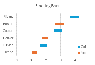
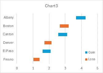
You could build a floating bar chart, the horizontal equivalent of the line chart’s up-down bars. The direction of change is color-coded but not shown the way an arrow can.
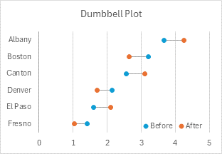
You could also use a dumbbell plot, which I described in Target vs Actual Dumbbell Plot. This makes comparisons easy, and the colored markers hint at the direction of change, but not as smartly as an arrow chart.
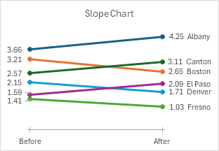
Slope charts can also be used, but they emphasize the endpoint values more than the changes in value.
How to Make an Arrow Chart
Arrow Chart Data
Our simple data set is shown below. We have a list of six US cities in column B, with Before and After data in columns C and D.
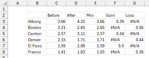
The chart will require the minimum of Before and After in column E, the amount of Gain in column F, and the amount of Loss in column G. These values are calculated using these formulas, which are copied down to row 8.
Cell E3:  =MIN(C3:D3)
Cell F3:  =IF(D3>C3,D3-C3,NA())
Cell G3:  =IF(C3>D3,C3-D3,NA())
Build the Chart
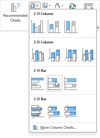
Select B2:B8 in the data range above, then hold Ctrl while selecting E2:G8, so that both areas are highlighted. Go to Insert > Charts > Stacked Bar Chart.
The result is this stacked bar chart. I have changed the colors so that the Min bars are gray, Gain is blue, and Loss is orange.
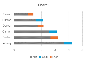
Excel likes to build bar charts upside-down (see Excel Plotted My Bar Chart Upside-Down and Why Are My Excel Bar Chart Categories Backwards?), so let’s first fix that. Select the vertical axis and press Ctrl+1 to format it. Under Axis Options, select Categories in Reverse Order and Horizontal Axis Crosses at Maximum Category. Now it’s sorted properly.
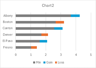
Format the Min series as no fill, so it is hidden, and remove the Min entry from the legend (click once to select the legend, then click on the unwanted legend entry, then click Delete). This is the floating bar chart we saw among the arrow chart alternatives at the beginning of this article.
Create the Arrows
Eventually, we will apply no fill to the floating bars, but I don’t want to hide them yet, just make them lighter so they don’t obscure the details of the next few steps. I kept the same fill colors but applied a 50% transparency to do this. Then I selected the Gain series, clicked on the plus icon next to the chart, and selected Error Bars. I repeated this for the Loss series. The error bars use a default value and extend in both plus and minus directions.
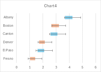
To apply the appropriate length for the error bars, select a set of error bars, and click Ctrl+1 (if the Format task pane isn’t already showing). For direction select Minus, and for error amount, select Percentage and enter 100 in the text box. Apply the same settings to both sets of error bars.
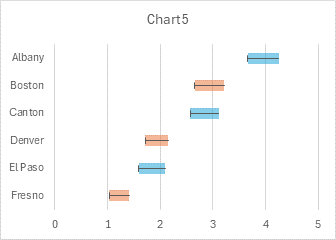
For both sets of error bars, format the end style to No Cap. Choose line colors of blue for the Gain error bars and orange for the Loss error bars. Change the line width from 0.75 points (1 pixel) to 1.5 points (2 pixels). For the blue error bars, select an arrowhead for the begin arrow type and the dot for the end arrow type. For the orange error bars, select the dot for the begin arrow type and an arrowhead for the end arrow type.
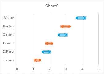
One more step and the arrow chart is finished. Set the fill color of both Gain and Loss floating bars to no fill.

This version of an arrow chart is nice because the arrows are color-coded: blue means increase while orange means decrease. But even if not color-coded, the dots and arrowheads on either end of the error bars clearly show the direction of movement of the data.
You can make arrow charts with vertical arrows by applying the stacked bar approach to stacked column charts, or with a little tweaking, to line charts.


Leave a Reply