Excel offers a great many different chart types. Many of these are 3D types, which should be left off the palette of any serious data technician.
Here is a simple cross-tab table of data, showing how the strength of an experimental alloy varies as a function of alloy chemical composition and test temperature. In a former life I was a metallurgist, and this data was going to change the world.

2D Charts
These 2D line charts are the clearest plots you’ll see of this data. Instead of confusing the viewer by trying to render a third dimension on 2D paper or monitor, the data is plotted as 2D data, with the third dimension represented by multiple series (one series for each factor level along the third dimension). Instead of trying to get everything into a single chart, the data is presented as two charts, one plotting the data by rows, the other by columns.
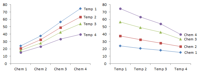
The experts insist that line charts should only be used along axes that plot numerical variables, and not for categorical factors. That’s a little strict, and in this case, the Chem and Temp variables do change monotonically from low to high at nearly regular intervals.
3D Line (“Ribbon”) Charts
The much-maligned UI Ribbon introduced in Excel 2007 isn’t the worst ribbon in Excel. Among the most pointless 3D charts Excel offers is the 3D line chart, or “ribbon” chart, shown below in a handful of arrangements.
The data regions of the charts are shrunk because of the need to put all the third dimension infrastructure in the chart. This loss of resolution is rendered moot by the distortion caused by the perspective view.
It’s impossible to see where the “ribbons” lie with relation to the axes, or how they are positioned with respect to each other. And if the ribbons are aligned edge on to the viewer (see below right), they become nearly invisible.
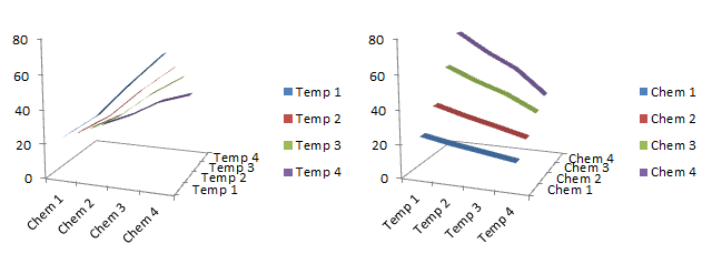
The data labels on the lines in the 2D charts above make identification of the series very easy. It’s much harder to get labels positioned nicely in these 3D charts (I know, I tried and gave up). We have to use a legend, and the chart above right shows one problem with legends: the series are arranged purple to blue from top to bottom, while the legend entries are arranged blue to purple from top to bottom. Our eyes forced to move side to side to relate data to label, and our brains are forced to think about this backwards correlation, leaving less cognitive power to actually analyze the data.
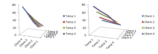
Differences in plotting order can make the charts even worse. Left: strength for all temperatures is the same for chemistry factor 4; right: strength for all chemistries approaches the same value at the highest temperature. These conclusions are not borne out by the boring but accurate line charts above, nor by the tabulated data.
3D Area Charts
In the first 3D area chart below, the Temp 1 data obscures all the rest. In the second, the data in back is exaggerated because the unseen but progressively higher baselines of each plank are hidden by the areas in front. Blocking of rear data by front data occurs in 2D area charts as well, the the perspective and varying baseline is the third dimension’s contribution to this obstruction.

2D Column Charts
This 2D column chart isn’t a terrible way to show the data, though the taller bars make following the shorter series more difficult. This wasn’t a problem with the line charts.

3D Column Charts
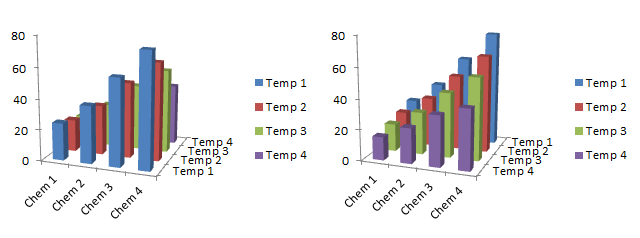
There are two ways to make a 3D column chart. Left: keep all of the 3D bars in a 1D arrangement, so it’s just a 2D chart with thickness, and the resulting distortion. Right: arrange the vertical bars in a 2D horizontal grid, so the perspective distortion is made worse by bars in front hiding bars in back.
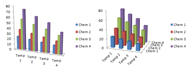
In the charts above the bars in front were only obscuring the baselines of the bars in back; in the charts below, which result from factors being shown in the opposite order, entire bars disappear in the matrix.
Wait, It Gets Worse
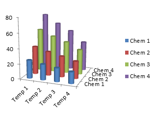
Who needs rectangular columns when you can use cylindrical columns? Very pretty.
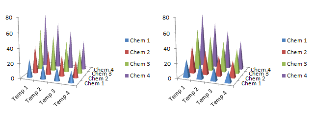
You can further distort the data by using bottom-heavy cones and pyramids.
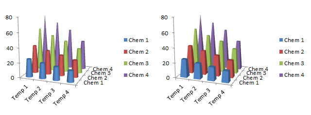
You can also make truncated cone and pyramid charts, formed by starting with shapes of the same height, and cutting them off at the height representing their values. The heights are no easier to read than in the pointy charts above, but perhaps you can estimate the areas of the cross-sections to help judge the values. Hmm, except areas increase as values decreases, and values changes in proportion to the square root of the area (that is, proportional to the width of the area).
If 2D Is Good, 3D Must Be Better, Right?
Mmmm, no.
All of the 3D charts shown above suffer from distortion. In the chart below, I’ve hidden the data, and made the borders of the walls visible, and added gridlines. No two lines anywhere in the chart are parallel. It’s very artistic, with lines extending to the vanishing point and all, but that only makes the data more difficult to judge. If you look at it long enough, the back corner suddenly changes, so it’s sticking out of the page. A chart showing your hard-earned data is no place for optical illusions.

The way these charts have achieved their third dimension is not through addition of a useful dimension to the data. This third dimension is achieved by adding chart junk, coloring loads of non-data pixels, and greatly decreasing the data-to-ink ratio.
So many of Excel charts can get very fancy, even without using gratuitous visual effects, such as shadows, gradients, glows, and transparencies. The 3D charts shown here are certainly fancier than the plain old 2D line charts at the top of the article, but not a single 3D chart shown here depicts the data as clearly as the line charts.


Doug says
When I plot data like this, I use colors for one dimension, and symbols for the other. For example, all points for temp1 would be blue as in your first plot, but all chem1 would be squares. This definition would hold for both plots.
bill says
i am very pleased to see this rutless no holds barred exposure of the Excel 3-D graphing limitations (they are unable to communicate information clearly and simply). i am pretty sure that countless managers across the world who have had to decipher these brainless 3-D graphs in reports and reviews are thanking you for this article. so thank you.
Bob says
I agree with Bill.
In fact, I think you showed great restraint.
My questions, how do you politely tell somebody that their chart is not worth the paper it is printed on?
Cheers,
B
Carl Witthoft says
Excel’s got 3D line charts , pie charts (3D or 2D), stacked charts, 3D bar charts, … it is just amazing how many styles they have that never should be allowed to exist. Then again, most people I know can’t comprehend the difference between a “true” x-y plot (aka Scatterplot) and a category plot. Category plots done with lines are just plain wrong.
Mathias says
When I see an idea that makes no sense to me, I often try to imagine a world or a perspective in which it could make sense. It’s a good exercise that can help dismissing good ideas too fast.
However, no matter how much efforts I put into it, I can’t imagine a scenario where the right chart would be 3D-cones, -pyramids or -cylinders.
Out of curiosity Jon, can you think of a situation where this chart would be a good idea? I assume this is just driven by “in 3D it looks cooler”, but maybe in a parallel universe there is a case for these?
Mathias
Jon Peltier says
Mathias –
In most cases, I think the designer’s thought that “3D is a whole D better than 2D”. Even though with this kind of D, less is more.
Jon Peltier says
Bob –
How about, “Excuse me, but your chart is not worth the paper it is printed on”?
Jon Peltier says
Carl –
“Category plots done with lines are just plain wrong.”
In general this is true, but I’ll add, “it depends.” If the categories are in some kind of logical order, then a line chart is not necessarily bad. And the Parallel Coordinates chart is a categorical chart with many line series, and it performs well in its role.
AdamV says
Jon
I agree that the mantra of always avoiding lines for categorical axes can sometimes be overruled, but only if someone properly understands why it matters.
In your example, if the difference between chem 1-4 was the addition of a small amount of four different elements to the alloy, then the order is somewhat arbitrary. Even ranking them does not (in my view) justify joining them with lines.
If however the difference was a changing proportion of the same element, then there is a natural order and joining them with lines implies the continuum that might be expected for mixtures at intermediate points. Of course, in this case it is arguably better to actually use a quantitative value such as the proportion of the changed element and XY plot it with a quantitative axis rather than purely categorical.
On the subject of 3D charts, I do lots of work with Dynamics CRM, and the charts and dashboards in 2011 are a great addition, although somewhat limited in their “out of the box” delivery (but usually in good ways).
I am hugely saddened to see the number of people blogging about how to use the chart xml language to customise these charts to “look better” – you guessed it, by adding 3D, gradient fills, rounded edges, and in the worst case I have seen holding up a 3D, lighting-modelled pie chart as being a great example of stunning data visualisation.
I also need to try and convince people why a funnel metaphor for a sales forecast is only useful as a metaphor – the huge visual distortion provided by drawing a large triangular area either side of a simple stacked column is ridiculous.
Jon Peltier says
Adam –
Thanks for your thoughtful comments.
The alloys I discussed are a bit complicated. Based on aluminum, they contain varying but not exactly proportional amounts of three transition metals that result in nearly proportional amounts of a second phase precipitate, which provides strengthening in these alloys. I don’t remember exactly, but the alloys had something like 8, 16, 25, and 33 percent by volume of this strengthening phase. We generally left out the microstructural details when presenting this data.
The temperatures are nearly proportional as well. In our literature, we used actual temperatures rather than the dummy labels used here.
The problem with the use of lines is when nonproportional measures are represented by equal distances along the independent axis. The aluminum alloys had a nearly proportional variation in a parameter. Lines make the data easier to interpret than bars:
I think we’re fighting an uphill battle against people who think the only justification needed to add an effect is our ability to do so (and especially our ability to hack our way to it).
Speaking of funnels, the funnel analogy describes the shape of the plot. But in my kitchen, everything that goes into the top of a funnel comes out the bottom. In a funnel chart, the smaller dimension indicates things that go in but do not come out (prospects lost, sales not consummated, etc.). I dislike this metaphor, especially when people think they have to center the bars, instead of aligning them along one edge.
AdamV says
You are definitely correct to say the lines are easier to interpret than columns here, and certainly easier to interpret correctly. My eye is tempted to draw imaginary lines through the tops of the columns, and because of the spread of columns I see a greater or lesser difference between the series depending on which way round they are ranked.
The funnels I am referring to in CRM are an out of the box, centered style chart such as the one in this MSDN blog post, where they also pimp it up to a 3D purple monstrosity:
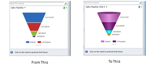
http://blogs.msdn.com/b/crm/archive/2010/11/12/simple-chart-modification-in-microsoft-dynamics-crm-2011.aspx
If you cover the two side areas, the stacked bar left in the middle is correctly proportioned, in other words it is only the heights (=length) of the bands that matter, so the 2D distortion is bad enough, and 3D is just horrible.
As for the analogy, I think the bit usually missed out from the metaphor is that this is not supposed to be a filter used to narrow a flow (to refill a small bottle from a large container, say), but should be thought of as a laboratory *filter* funnel – the filter paper means that only “the good stuff” gets through, and rubbish is kept back.
I always get rid of these as soon as I can and go for more useful visualisations like single hue column charts, usually using time categories on the horizontal axis to represent the age of the opportunities, and shading according to expected probability of success or phase of the sales process (so “>90%” are at the bottom of a stack for a given month, in the darkest shade, “<10%" are at the top in the lightest)
Jon Peltier says
The captions on those snapshots should be “From Bad … To Worse”. Got an idea for a blog post…
Steve A says
I have a situation where I think the 3-D graph will be useful and I have a question. In a field experiment the design has 4 Replications where each rep is composed of 10 Blocks and each Block consists of 10 plant varieties. Each Rep is also arranged in 5 strips with 2 Blocks end-to-end. I want to visualize (visualate!) the yield values as a means to see field trends not identified by stats analysis. My question is how can I enter the blocks as different series and have them end-end in the chart, rather than side by side? I want the chart to minimic the same arrangement. One 3-D advantage is the ability to view in two dimensions and the rotation allows viewing very low values. Thanks
The field layout of Rep 1 would “look” like this, and Rep 2, 3 & 4 would be similar.
R1B1========== R1B2==========
R1B3========== R1B4==========
R1B5========== R1B6==========
R1B7========== R1B78==========
R1B9========== R1B10==========
Jon Peltier says
Steve –
Everyone thinks their situation is special, and allows them to do what is generally not recommended.
Given that your data has an actual planar arrangement for the location of the data, you may almost have a point, not necessarily for a 3D chart, but perhaps for a different kind of chart that allows for plotting a value variable against two positional variables.
What is the value you want to plot?
Steve A says
Thank you for responding. We’re plotting crop yield as lbs/Ac. The ANOVA can effectively remove variation due to Reps (& Blocks in this design) and the layout reflects the structure needed to do this. However, in this experiment, severe weather may have affected localized areas disproportionately. This sort of variation will not be revealed in the ANOVA. My thought was to create the 3-D layout in Excel in such a way that visually it will help identify small affected areas. (The weather and flooding could not likely affect just a single plot, 1100 sqft.).
Steve A says
The yield values typically fall in the range from 1000 to 5000 pounds per acre with some more extreme values.
Jon Peltier says
Steve –
I think a heat map might be a useful way to illustrate your results. I’ve described how to make a heat map using some dummy data based loosely on your description, in Create a Heat Map Using Excel’s Conditional Formatting.
Steve A says
Jon, Thanks for that; it’s a really good idea. I’ve used them before in “mapping” weather data (temps) to performance but didn’t consider them in this situation for some reason. I’ll work on it. btw: I reallly appreciate your site and the comments you’ve made..-Steve
SamT says
IMO, The Naysayers are missing the point of Charts.
Charts, other than navigation, are not intended to communicate Data. That’s what Tables are for. Charts are meant to inform of the relations between data in a meaningful way.
No Graph can communicate data to any greater precision than about +-3 in the third significant digit under the best of conditions. OTOH, looking at all the Charts above, some of the 3D Bar Charts inform me at a glance which things did what in relation to the others, under differing conditions. Then, I looked at the legends to see what was what, what was better or worse, and, what Conditions? Oh, I never did look at the numbers, they are irrelevant to understanding the relationships.
Jon is complaining about some factors being in the wrong place in different Bar Charts. Merely reverse the order of data in one or two columns to change the appearance of the chart. Reversing the order of Data is only a seven line Function in VBA.