I’ve written many blog posts and web pages on Dynamic Charts. See Dynamic Chart Review for a summary and Archive of ‘Dynamic Charts’ for an archive of the Dynamic Charts category on this blog. What they have in common is that they rely on you to define dynamic ranges in the worksheet, and then assign these dynamic ranges to the chart source data. Not too bad if you’re doing one or two series or a couple of charts, but after a while the tedium can turn your brain into mush.
What do 99%* of the dynamic charts ever created have in common? They are used for sets of data that stretch with time as more rows are added. In the examples cited above, there are other categories of dynamic charts, but those are much less common.
* Don’t tell anyone, but this is one of the 96% of statistics that are made up on the spot.
In the classes I teach I always start with an easier way to make dynamic charts for expanding or shrinking data sets. To answer a question the other day, I looked up the link to my blog post on this topic, and I couldn’t find it. So I had to write something, and here it is.
If you are using Excel 2003 or later, it is remarkably easy to create a chart that depends on a data set with a varying number of rows. The technique makes use of a feature introduced in Excel 2003 called the List, which was enhanced and embellished in Excel 2007, and renamed the Table. When Excel 2003 came out, the new List was the awesome killer feature that made me immediately upgrade to 2003. Unfortunately, neither Excel 2007 nor 2010 has such a feature, for me anyway.
A List or Table is a designated range that has a row of column headers and rows of data beneath this. The List or Table has the functionality of an Autofilter built in, without the Autofilter’s limitation of allowing only one per worksheet. As data is typed in the row below or in the column beside the List or Table, the List or Table expands to include this newly added data. As rows or columns are inserted or deleted, the List or Table accommodates the changes.
The most important feature of a List or Table is that any formula that references a full column of data in the List or Table updates its cell addresses when the List or Table changes its number of rows. In addition, a pivot table that uses all rows of a List or Table updates its source data range to the resized List or Table.
The chart SERIES formula updates as the List/Table changes size, making Lists/Tables ideal for many dynamic charting purposes, and here I’ll show you how that works.
The Data
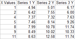
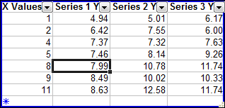
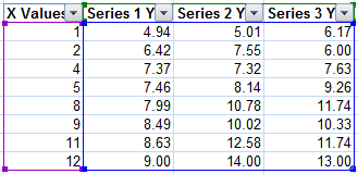
Let’s start out with this typical made-up data set. It has columns of data, X and Y values in this case, and a row of headers.
Creating a List or Table
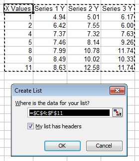
To create a list in Excel 2003, press Ctrl+L (L for List). Excel guesses what range you want to use and whether that range includes headers. The guess is almost always what you expect.
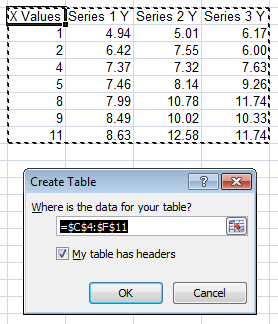
To create a Table in Excel 2007, press Ctrl+T. You can also use Ctrl+L: they didn’t mess up any Excel 2003 users by changing the shortcut.) The dialog is the same, except it now calls the List a Table.
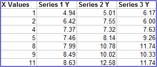
Here’s what the newly created List looks like in Excel 2003. When the active cell is not within the List, there is a thin blue border highlighting the List.
If your range did not include headers, Excel inserts a row and uses dummy headers as shown below. If one of your columns did not have a header, Excel inserts a dummy header. If you want a header to appear blank, you need to type a space character in the cell.

When the active cell is within the List, the thin blue border becomes a thick blue border, Autofilter dropdown arrows appear in the header row, and the list expands by one row, giving you a data entry row denoted with a blue star in the leftmost cell. Any formatting and formulas are filled down as you enter data into this row. When you enter data in this row, the next row becomes the new record row. As you add rows to the List, any data below the List that would be overwritten is itself shifted down by one row.
The bottom right corner of the List has a small gray backwards “L” shape, which you can drag the change the dimensions of the List. You can click and drag on the thick border to move the List around the worksheet.
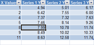
Here is the same data, converted into a new Table in Excel 2007. There is no border highlighting the Table, but the Table takes on the default Table formatting. A bit much, but that’s what Excel 2007 is all about. The bottom right corner of the Table is indicated with a small blue backwards “L” shape, which you can drag to change the dimensions of the Table. You can click and drag on the (unseen) border of the Table to move it around the worksheet.

When the active cell is within the Table, it does not change its appearance. The Autofilter dropdown arrows are always visible. Also, the empty row below the Table does not explicitly become a data entry row, as indicated by the unformatted row below the Table shown here. If you type data in the unformatted row below the Table, Excel assumes you want it added to the Table, and the Table and all of its formatting is filled down to include the new data.
Charting a List or Table
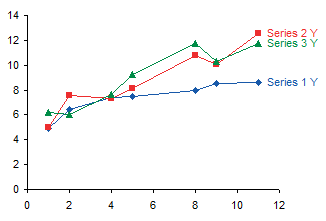
Here is an Excel 2003 XY chart that uses the data in our Excel 2003 List. It is created like any Excel 2003 chart: select the data and run the Chart Wizard.
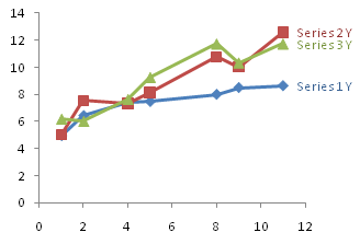
Here is an Excel 2007 XY chart that uses data from our Excel 2007 Table. It is created by selecting the data and choosing the chart type from the Insert tab.
When the Excel 2003 chart is selected, you can see the chart source data highlighted in the List. Green (top row) denotes series names, purple (left column) X values, and blue (the bulk of the List) Y values.

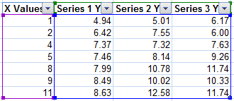
When the Excel 2007 chart is selected, the Table is highlighted the same way, but the highlighting is a bit difficult to make out with all that shading in the default Table style.
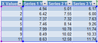
No problem, I created my own lightly formatted Table style, and applied it to my Table. Now the highlighting shows up clearly.
The Magical Dynamic Formulas
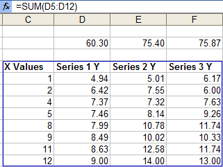
To illustrate this wonderful behavior of Lists and Tables, I placed formulas in a row above the Excel 2003 List that calculate the sum each column of Y values in the List. This works identically in Excel 2007. The formula includes all data rows in the List, from 5 to 11.

I expanded the list by entering a new row of data. Without any further effort on my part, the formula updates to extend to row 12, the new bottom of the list.
The Magical Dynamic Charts
Here is my Excel 2003 chart from above, after the List was expanded. Each series extends one point further, plotting the data in the new row.
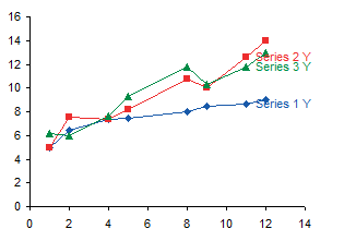
Here is the corresponding Excel 2007 chart, which now includes data from the new row in the Table.
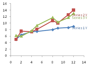
The data labels in these charts are attached the the previous last point in the series, so the new point and line segment partially obscure the labels. No problem, simply rerun my Label Last Point routine to move the labels. Here’s the fixed up Excel 2003 chart.

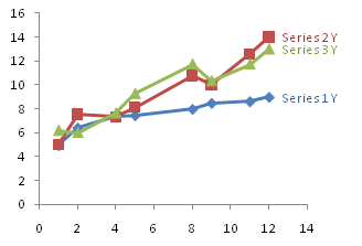
And here’s the fixed up Excel 2007 chart.
We also note that the highlighted chart source data expands to include the entire List in 2003…

… and the entire Table in 2007.
Here is the Excel 2003 chart of the original List, with Series 1 Y selected to show the chat SERIES formula. Note the X and Y values include rows 5 through 11.

Here’s the same chart and the same chart SERIES formula after the List is expanded. The X and Y values now include rows 5 through 12. The Excel 2007 behavior is identical.

No discussion of dynamic charts in Excel is complete without a description of charts that use Lists or Tables as their source data. It is so much easier to use Lists or Tables than dynamic names to make charts respond dynamically to the number of rows in your data.
First Post of 2011
I certainly claimed that I would post more, but there have been some circumstances beyond my control. I had to struggle to get even this one post completed this month.
Here is a plot of January’s actual high and low temperatures (dark gray bars) compared to their typical values. To all you Celsius people, water freezes at the top of the light gray bars.

Guess which morning we awoke to a malfunctioning furnace. I’ll give you a hint: see that blue diamond on January 24th, at -9°F? It got down to 47°F in the kitchen before the faulty intake compressor was replaced. Fortunately the upstairs furnace was fine.
Here’s a plot of January’s snowfall, daily totals as blue bars, and cumulative total as a dark blue line. I didn’t provide a plot of wind, but we get a lot, which means 6 inches on this chart represents 6 inches that fell on the driveway plus 6 inches that blew onto the driveway from the lawn. Each bar represents one to three hours of shoveling and snowblowing, hours I could have been blogging. The exception to shoveling hours is the total of 21.1 inches on January 12th, which was four hours plus spent clearing the driveway by my wife and two daughters. The night before and the day of this storm I drove the 12 hour round trip to Rochester to deliver my other daughter back to school, because her flight the day before had been canceled. That’s two days I couldn’t spend blogging.

Note: these charts were generated using the above technique, from an Excel 2003 List of data scraped from the accuweather.com web site.


John says
I’ve been waiting for a post like this for a long time. Thank you so much!
Matt Healy says
Thanks for the clear explanation of how to use the List/Table feature of Excel. I had been aware of its existence for some time, but never used it because previous book chapters and articles about this feature had not made it clear to me how useful it could be. Now that I know, from your clear explanation, I will probably start using them.
As for snow, we’ve had truly impressive amounts of that here in Connecticut this winter. I have not seen such huge piles of snow since my Wisconsin childhood. We have had at least one significant snowfall every single week since late December, including three storms of over a foot (the biggest one was over two feet). Many school districts have had to announce there will be no Spring Break (due to the number of snow days and a State law requiring they have 180 days of classes by the end of June). What we have not had here, and I hope we do not get, is one of those weeks when it never got about zero F (-18C) that I also remember from my Wisconsin childhood.
Key Lawson says
Hello Jon,
I tried your example of arranging seven similar charts to be neat and uniform.
(This is in Office 2003 Pro Excel.) My .ChartType = xlLineMarkers. The charts
would overlap vertically, so I position them in two columns that zigzag down
the worksheet.
My Sub has two sections. One like yours, sizes and positions the charts in a
“With chartObj … End With” block. Following that I set up the .DisplayUnit and
.Font[s] in a “With chart … End With” block. Everything works great except for
the .Font[s] in the last chart processed. If I put in a breakpoint and step
through the last iteration, the last chart comes out fine too.
Some of the time, the seventh chart in its original default size will still be visible
until I scroll up and down to have Excel repaint that portion of the worksheet.
When I scroll down however, I always find the seventh chart in its correct
smaller size and location.
Might you have a guess as to where I’m going wrong, I hope?
Thanks much,
Key
Peter D Klugherz says
I enjoyed reading about the use of lists/tables to create dynamic charts. I wish I had known about this feature in the years before I retired. I was updating charts with new data on almost a daily basis, and my crude solution was to edit the series formula to extend the range way beyond the range of the current data.
I applied this technique to some financial data I track. I was disappointed to find that if I edit the series formula for the chart to eliminate the first couple of rows (because of missing data), the chart no longer updates when I add new rows to the list.
Jon Peltier says
Peter –
That’s right, your formula has to reference the entire row of the list. You could references the whole list in the formula, then adjust the date axis so it starts a few days later. Or even plot the missing days, leaving a short gap at the beginning. Or plot the entire formula, and hide the rows with missing data.
Jim LaBarr says
Thanks for the excellent information.
Please add Magical Dynamic Pivot Tables to the list.
When the Pivot Table is based on a Table, the Data Source for the Pivot Table automatically expands to include the new Columns to the right and the new Rows at the bottom.
In the past I had always included blank rows at the bottom, but that yielded an unwanted Row Field of Blank.
Jon Peltier says
Jim –
Thanks for pointing this out. I’ve included a mention of using Tables as the source data of a Pivot Table.