In Interactive Multiple Line Chart I showed how to make an interactive chart that allows the user to select from among a number of series using a listbox, and the selected series is displayed in a chart.

A similar technique is described in Interactive Parallel Coordinates Chart on my web site, and I used this technique in a workbook that supports my blog post Re: Abortion Ratios 1980-2003.
My colleague Dermot Balson read the post and wondered why I was doing it the hard way. Well, he’s right. I built a set of dynamic names that change based on the listbox selection, which is certainly a valid approach. However, for something as “simple” as plotting a column or row of data, it’s overkill. In this post I will describe an easier approach.
Data by Columns
The worksheet has data for multiple companies in columns, with each row representing the respective values on a given date. I made up some sine functions for the company data; a portion of the data is shown below.

For many situations a popular visualization approach is to plot one series in a contrasting color, and the rest of the data set is plotted in the background. I plotted this data on a single chart, and formatted all series to use a light gray line. This chart comprises the background.

We need to define a couple names to make this work. First, the column headers, the range of cells containing the Company names, is named “Companies”.
The listbox we will add requires a columnar (vertical) list, and the company names are in a horizontal list. I selected a range one column wide and 12 rows high (there are 12 companies in the table), typed this formula
=TRANSPOSE(Companies)
and held down CTRL+SHIFT while pressing ENTER to make it an array formula. When an array formula is correctly entered, Excel wraps it in curly braces:
{=TRANSPOSE(Companies)}
I named this range “CompanyList”, then selected another nearby cell (cell O2 in the shot below) and named it “SelectedItem”.

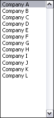
I added a listbox from the forms menu to the worksheet, and formatted it to use CompanyList as the input range and SelectedItem as the cell link. This means the list in CompanyList is displayed in the listbox, and the index of the selected item is displayed in Selecteditem.

The listbox looks like this:
A column adjacent to the data range is used to hold the data for the selected company. Here is a pilot’s eye view of the worksheet (for a better view, download the workbook from the link at the bottom of the page).
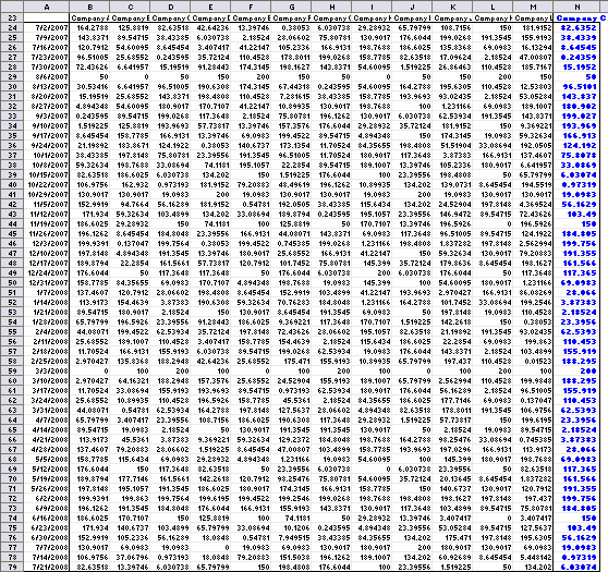
The original data is in A23:M79, and the added data, highlighted in blue, is in N23:N79. Cell N23 has this formula:
=OFFSET(A23,0,SelectedItem)
and the formula is filled down to N7.
Now the selected series can be added to the chart. Copy the blue range, select the chart, and use Edit menu > Paste Special to add the data to the chart as a new series. Format to suit.
To create a chart without the background series (like the one shown at the top of this post), simply make the chart using column N for the Y values and column A for the X values.
Here is the chart, showing all series in the background gray and the selected Company A highlighted in blue.

Clicking another item in the list changes the highlighted series, to Company L below.

By Row
For this example I made up data for multiple companies in rows, with each column representing the respective values on a given date; a portion of the data is shown below.
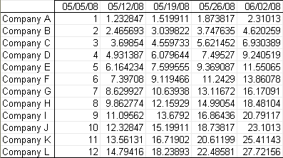
I plotted this data on a single chart, and formatted all series to use a light gray line. This chart comprises the background.
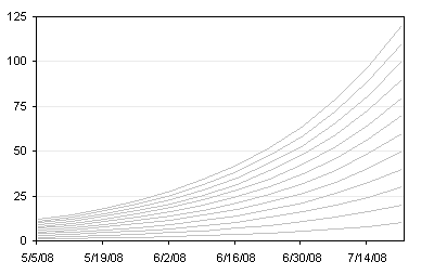
We need to define a couple names to make this work. First, the row headers, the range of cells containing the Company names, is named “TheCompanies”. I selected another nearby cell and named it “TheSelection”. (The names are different than in the first example, because both examples are in the same workbook, and I wanted to avoid naming conflicts.)
I added a listbox from the forms menu to the worksheet, and formatted it to use TheCompanies as the input range and TheSelection as the cell link. This means the list in TheCompanies is displayed in the listbox, and the index of the selected item is displayed in TheSelection.
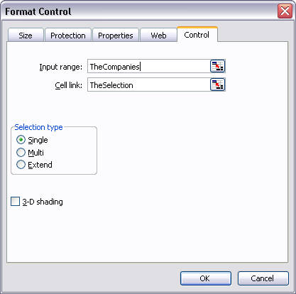
The listbox looks like this:

A row adjacent to the data range is used to hold the data for the selected company. Here is a pilot’s eye view of the worksheet (for a better view, download the workbook from the link at the bottom of the page).

The original data is in A23:M35, and the added data, highlighted in orange, is in A36:M36. Cell A36 has this formula:
=OFFSET(A23,TheSelection,0)
and the formula is filled right to M36.
Now the selected series can be added to the chart. Copy the orange range, select the chart, and use Edit menu > Paste Special to add the data to the chart as a new series. Format to suit.
To create a chart without the background series (like the one shown at the top of this post), simply make the chart using row 36 for the Y values and row 23 for the X values.
Here is the chart, showing all series in the background gray and the selected Company A highlighted in orange.
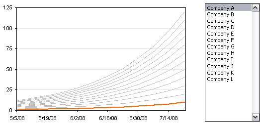
Clicking another item in the list changes the highlighted series, to Company L below.

Sample Workbook
Download a workbook that contains these two examples: EasierInteractiveLines.zip


Alvaro Ledesma says
Jon, in the “by row” example, the listbox format window shows as cell link “TheSelection” and the offset formula to capture the selected row data uses “TheSelected”.
Regards
Alvaro
Alvaro Ledesma says
Jon, I am a bit curious: I am learnig about “keep it at the minimum” reading you, the guys at microchart and others in the field. With that in mind I really like tha idea of keeping, let’s say, 5 or 6 series in gray and the one being analized in color… it gives you a quick overview and provides background, reference and very brief “ranking” idea to begin with.
However, in your example, the gray lines are too many, so the only purpose I can see is a “background” based on data, with no analytical value (or very little value at most). Am I missing something?
Regards
Alvaro
Jon Peltier says
Alvaro –
Oops! Thanks for pointing out my mistake. Both should be “TheSelection”. I’ve made the correction.
Jon Peltier says
Alvaro – “Do as I say, don’t do as I do.”
In hindsight, I should have taken more time to find or create a better sample data set. Or I could have made this example with only three or four series instead of a dozen. Perhaps when I get a chance I should rewrite these examples with better illustrative data.
Colin Banfield says
Alvaro’s got a point – I was thinking the same thing when I read your original post. Incidentally, the Few article you mentioned shows an equally indecipherable background – a real distraction when you consider the efforts one take to tone down or eliminate gridlines. Now, there’s actually one useful application for such a jumble, and that is to filter out all but a few selected series for comparison!
Alex Kerin says
Very nice – love the simplicity of this method. Thanks for your continued efforts.
Tom says
I’m trying what looks similar to your dynamic charts examples, except that I want to vary the x ( Num Sys ) and the y ( Num int ) of a stacked line chart. A sample of my data is:
System Int 1 Int 2 Int 3 Int 4 Int 5 Int 6 Int 7 Int 8 Int 9 Int 10
1 3.940 5.902 4.910 5.060 4.385 4.409 5.333 5.862 4.164 4.016
2 4.075 5.713 4.257 4.151 4.388 4.080 4.164 5.781 5.248 4.206
3 4.567 4.427 5.457 4.244 4.339 5.866 5.032 6.163 5.926 5.810
4 5.869 4.190 5.067 4.549 4.232 6.147 5.738 4.118 5.031 5.022
5 4.306 5.670 19.453 20.558 5.793 3.833 5.636 5.025 4.329 5.584
6 5.828 5.909 6.186 5.247 5.832 4.481 5.794 5.939 5.889 4.296
7 4.822 4.397 4.706 4.872 4.350 19.570 4.923 5.751 5.101 4.682
8 5.120 4.990 19.418 5.703 19.564 5.040 4.609 4.202 4.535 20.207
9 4.351 4.285 19.413 3.869 18.909 4.261 5.910 5.888 5.965 4.628
10 5.984 4.376 20.948 5.635 5.038 5.033 4.914 5.416 5.134 5.513
Num Sys 3.000
Num Int 5.000
Jon Peltier says
Tom –
A stacked line chart?
What are you trying to show? Num Sys and Num Int implies you want to highlight a single point.
Trung says
How do you copy/move the Interactive Chart out of Excel to, says, PowerPoint or Words?
Jon Peltier says
Trung –
You can copy it like any other chart. Depending on how you paste it, it may remain interactive, though the interaction is driven only from within Excel.
If you paste-link, it will update when the original chart updates. If you paste as a picture, the link is broken.
Jason says
Thanks for sharing, this is a very useful way to highlight data. If you’re interested in a blog project maybe you can answer this question: how would you show year over year with the previous year as the background and the current year’s choice as well as last year’s choice highlighted?
Jon Peltier says
Jason –
I would use either a 7-day moving average or a weekly total for year on year, and I would plot simply by day number or week number. My chart would have either two lines (this year and last) or a line for this year and a lightly shaded area for last year.
Anonymous says
hii….thank you for sharing ..i was looking for this for some time now.thank You.
Regards
Phil_S says
Been looking to do this for a while. Very neat. I wouldn’t have thought of this solution in a 100 years. I have a table of gas (the home heating stuff) consumed per month for a number of years, so months as a header in one row, years in columns below. Now I click on the forms button, e.g. January, and get a single line on the chart for all the January values from 2001 to 2014. Took a while to get set up, mainly trying to find the right “Forms” after looking in the ribbon version then finding the right one in the developer tab. Couldn’t see the”selection type” shown in your format control screenshot above, only the 3D bit. Thanks