Peltier Tech Functions
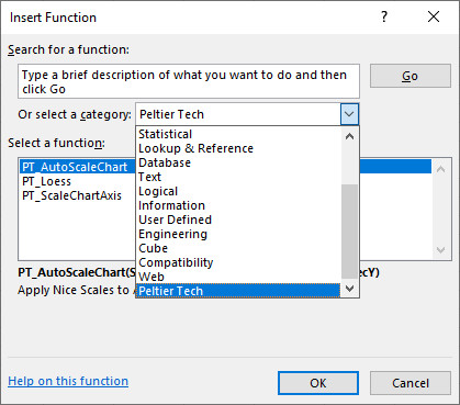
Peltier Tech Charts for Excel includes several custom worksheet functions. They are found in the Insert Function dialog (the Formula Wizard) which pops up when you click the fx button next to the formula bar.
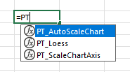
Start typing =PT in a cell, and IntelliSense will give you a list of these functions.
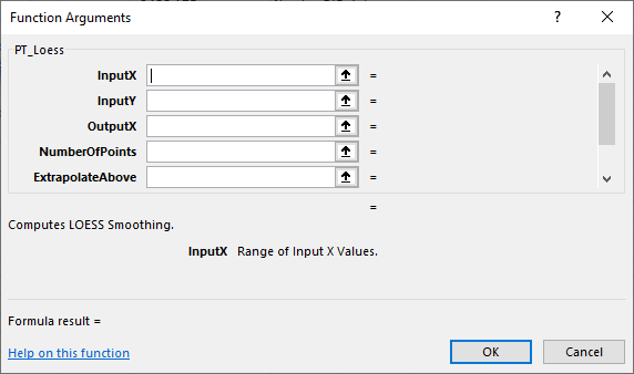
And the Function Wizard provides documentation for each function.
LOESS
The PT_Loess function allows you to calculate LOESS smooth curves in the worksheet, rather than the dialog-driven LOESS feature that calculates the LOESS data and places it in the worksheet as static values.
Syntax and Arguments
=PT_Loess(InputX,InputY,OutputX,NumberOfPoints,[ExtrapolateAbove],[ExtrapolateBelow],[QuadraticRegression])InputX– Range containing all X valuesInputY– Range containing all Y valuesOutputX– X value for calculation of a Y valueNumberOfPoints– Number of points in the moving weighted regressionExtrapolateAbove– True to extrapolate above largest X valueExtrapolateBelow– True to extrapolate below smallest X valueQuadraticRegression– True to use a second order moving regression
The last three arguments are optional and default to False. Note that extrapolation beyond the data range may lead to strange results and should not be used for predictions. A moving quadratic regression may improve smoothing and avoid straight-line fits near the edges of the chart, but may also increase calculation times.
Sample Usage
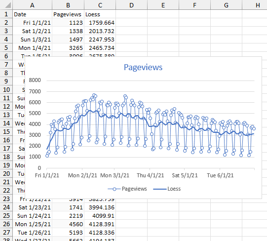
PT_Loess is used here to smooth out the daily fluctuations in web traffic. In the example below, A2:A182 contains dates, B2:B182 contains daily pageviews. We want to calculate a smoothed value for each date in the data, though it’s possible to use a different range of dates. Cell C2 contains this formula and it is filled down to C182:
=PT_Loess($A$2:$A$182,$B$2:$B$182,A2,15,FALSE,FALSE,FALSE)If you are using a recent Dynamic Arrays aware version of Excel, you can simply enter this formula into C2 and the calculations will spill into C2:C182:
=PT_Loess(A2:A182,B2:B182,A2:A182,15,FALSE,FALSE,FALSE)The smoothed data is shown in the chart with the actual daily measurements. It is probably best to store the number of points (15) in a separate cell, so you could adjust the amount of smoothing. Increase the number of points to get a smoother curve.
AutoScale Chart
Excel does a pretty good job of calculating axis scales automatically. But the margins around the data are often just a little bit wider than necessary.
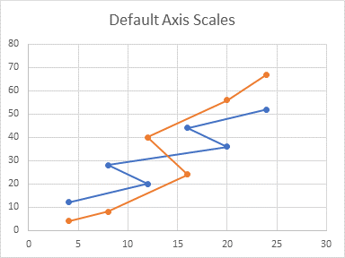
You could manually adjust the scales, and then readjust as necessary. But this becomes tedious and you may forget to readjust all axes of all charts.
The PT_AutoScaleChart function allows you to calculate and apply nice axis scales to your chart automatically.
Syntax and Arguments
=PT_AutoScaleChart(SheetName,ChartName,PriX,PriY,SecX,SecY)SheetName– Name of the sheet containing the chartChartName– Name of the chartPriX– Scale the Primary X axisPriY– Scale the Primary Y axisSecX– Scale the Secondary X axisSecY– Scale the Secondary Y axis
Valid entries (case insensitive) for the last four arguments are:
- Apply nice scale to axis: 1, “auto”, “autoscale”, true
- Make no changes to axis: 0, “ignore”, “skip”, false
- Reapply Excel’s default scale: -1, “default”, “reset”
Sample Usage
Enter the PT_AutoScaleChart in any convenient cell. The chart below is named ‘Chart 2’ and it is located in a worksheet names ‘AutoScale Chart’. The formula for this chart is:
=PT_AutoScaleChart("AutoScale Chart","Chart 2",TRUE,TRUE)The function returns the following to its cell, indicating what it has done to the chart:
Sheet 'AutoScale Chart' Chart 'Chart 2': Primary X {0, 26, 2, 0.5}; Primary Y {0, 70, 10, 2}; No Secondary X Axis; No Secondary Y AxisThe maximum values of both axes have been reduced, as shown below:
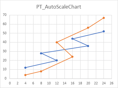
To handle several charts, you could set up a region of a worksheet, and list the arguments for the function, as shown below. The formula in cell F3 is
=PT_AutoScaleChart(B3,C3,D3,E3)
and this is filled down to F6. Cells F3:F6 show the actions taken by the function for each chart in the grid.

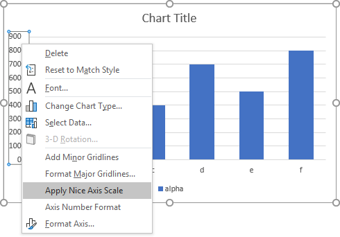
The PT_AutoScaleChart uses the same algorithm as the Apply Nice Axis Scale command that appears when you right-click on an axis. For more about “nice” axis scales, see Calculate Nice Axis Scales in Your Excel Worksheet, Calculate Nice Axis Scales in Excel VBA, and Calculate Nice Axis Scales with LET and LAMBDA.
Scale Chart Axis
PT_ScaleChartAxis is used to apply custom values to the scale parameters of an axis. The formula must be used once for each axis to be rescaled.
Syntax and Arguments
=PT_ScaleChartAxis(SheetName,ChartName,X_or_Y,Primary_or_Secondary,Minimum,Maximum,MajorUnit,MinorUnit)
SheetName– Name of the sheet containing the chartChartName– Name of the chartX_or_Y– Enter X or 1 for X-axis, Y or 2 for Y-axisPrimary_or_Secondary– Enter Primary, Pri, or 1 for primary axis, Secondary, Sec, or 2 for secondary axisMinimum– Format axis minimum valueMaximum– Format axis maximum valueMajorUnit– Format axis major tick spacingMinorUnit– Format axis minor tick spacing
Valid entries (case insensitive) for the last four arguments are:
- Apply specific value: numeric value
- Make no changes to parameter: “null”, “skip”, “ignore”, “blank”
- Reapply Excel’s default to parameter: “autoscale”, “auto”, “default”
Sample Usage
PT_ScaleChartAxis must be used for each axis that must be rescaled, which usually means multiple times per chart. For this reason It is most efficient to set up a grid in the worksheet with the parameters of the function, as shown below. In this case, Chart 1 will show Excel’s default axis scales, while Chart 2 will show the custom scale parameters from the worksheet. The formula in cell J3 is
=PT_ScaleChartAxis(B3,C3,D3,E3,F3,G3,H3,I3)
and this is filled down to J6. Cells J3:J6 show the actions taken by the function for each axis specified.

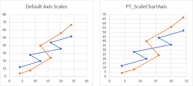
We can see the default axis scales (left) and the custom scales (right). You could write your own formulas in F3:I6 to adjust the custom axis scales.
The VBA code and mechanisms behind this function are described in Chart UDF to Control Axis Scale.


