In Blue Ribbon Interface I summarized and provided links to a number of recent articles which were critical of Excel 2007’s new Ribbon interface. In his thoughtful comment, my colleague Dennis bemoaned the emotional content of the cited articles, saying one cannot love or hate tools, only individuals. My argument is that I become emotionally involved with any tool I spend a majority of my working hours working with, and the nature of this emotional involvement ranges from positive for tools which are pleasant to use, to negative for tools which frustrate and confuse. This post is an attempt to discuss shortcomings in Excel 2007’s redesigned dialogs objectively, with examples showing good and bad designs, and with a minimum of whining.
Microsoft has violated its own published user interface guidelines that it offers to designers. Ironically I cannot find the same version of these guidelines that I remember: they came out during the Vista beta program, and have since been edited and re-edited, and moved from place to place on the Microsoft web site. However, these guidelines were well stated and even seem to be based on our knowledge of human cognition.
The largest single region of the human brain is the cerebral cortex, which is tasked with parallel processing of large quantities of visual input. In contrast, our short-term memory is capable of holding only about seven pieces of information, and transfer of information into and out of this short-term memory is not always efficient.
Display All Options
The first interface design guideline I will discuss is that whenever possible the interface should show all options which are available to the user. For example, the Excel 2003 Format Axis > Patterns tab shows all axis tick options, allowing us to use our vast image processing capability, rather than load the options into short term memory:

In contrast, the Excel 2007 Format Axis > Axis Options dialog shows only the currently selected axis tick options. Sure, I “know” the other choices, because I have formatted hundreds of thousands of chart axes in my Excel experience. But I still have to stop to think what these options are, or click on each dropdown in turn to remind myself.

The dialog in 2007 is smaller than that in 2003, but it is not as self-explanatory, and isn’t the 2007 dialog larger anyway? (See below for an analysis of dialog sizes.)
Show Closely Related Subtasks Together
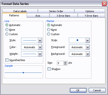
The second interface design guideline states that controls for tasks or subtasks that are done together should be placed in proximity to one another. My “good” example here is the Excel 2003 Format Series > Patterns dialog, which contains the options for Area (Fill) and Border for area, bar, and column charts, and the options for Marker and Line for line and XY charts. For an XY chart, for example, the controls for selecting markers, line styles, and colors appear on a single screen:

Excel 2007 provides a “bad” example for this guideline. The same options as above require the Excel 2007 user to jump between SIX different views: Marker Options, Marker Fill, Line Color, Line Style, Marker Line Color, and Marker Line Style. There is a lot of empty space on these six panes. When various preliminary options are made, this space fills with the various formatting options (gradients, fills, etc.) which were added to Excel 2007. These options would be more effectively added as child dialogs, as they are not used as much as “plain” formatting; in fact, many would say that their use runs contrary to good charting practice. Relegating fancy formatting to child dialogs would enable the separate items to be once again combined onto a single dialog view, and suppress the urge to add chart-junk formatting to charts.

Dialog Size
It is worth a brief digression to examine the old and new dialogs. The Excel 2007 chart formatting dialogs appear a lot larger then their 2003 predecessors, but the practical increase in size is mush smaller.
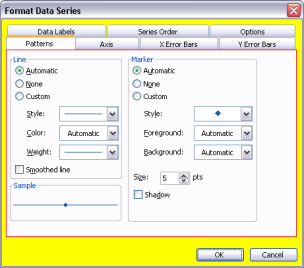
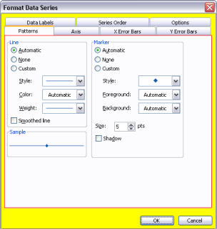
I’ve reduced the images of the dialogs to 66% of their original size, outlined the working region in red, and highlighted the dialog client area in yellow.
 – – –
– – – 
The Excel 2007 dialog is 20% larger than the 2003 dialog, and the client area (yellow) is 22% larger. However, the working area (red outline) is only 6% larger. Most of the increase in area is consumed by the “tabs”, which are compactly arranged in 2003 and displayed in a list in 2007 which fills at most half of the space given to the list. (So there is plenty of room in the list to restore missing tabs, such as Error Bars and Data Labels.)
If the area of the 2003 dialog were made as large as that of the 2007 dialog by increasing its height, it would have 22% more space to accommodate enhanced formatting, not 6% for formatting and 16% for empty space.
 – – –
– – – 
Maximize Interactivity
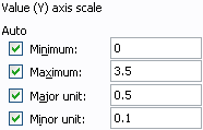
The Excel 2003 Format Axis > Scale dialog is an elegant example of interactivity that makes a user’s job easy. Clicking the checkbox or its label changes the value of the cheeckbox. Clicking also changes focus to the box with the value and highlights the entire value, saving the user a click and drag. For example, I can change the minimum from 0 to 1 with two minor actions: click on the Minimum checkbox, then type 1. Also, the value entry boxes are always enabled, so I can click on one anytime. If I change one of the values and the checkbox is checked, it automatically unchecks itself.

One change in the 2007 version of the Axis Scale dialog may even be an improvement. Often inexperienced users would enter a desired axis scale value i the box above and then click Auto, which then told Excel to use its own value and ignore what the user entered. Giving the user a choice between Auto and Fixed may clarify the definition of “Auto” in this context.
The improvements end here, and the functionality is decreased. First, notice that the entry boxes are disabled if the Auto options are selected. This means the user cannot just highlight a value and overtype a new value to change to a fixed value. The user mush select Fixed first. Selecting Fixed, unlike in the 2003 version, does not give focus to the value entry box, nor select the current value. This forces more mouse actions on the user.

This lack of interactivitiy compared to the earlier version of the dialog indicates a few things to me. First, there was a lack of familiarity with the dialog among the design team. Second, there was a lack of resources to implement the dialog completely (which was evident during the technical preview phase). Another sign of a hastily implemented 2007 dialog is that the Fixed option buttons are all one pixel higher than the corresponding Auto option buttons.
Summary
My colleague Dennis has pointed out in a comment to Blue Ribbon Interface, my recent post summarizing user complaints about the Excel 2007 Ribbon interface, that this interface is version 1.0, and that we should expect improvements in version 2.0. I agree completely that the 2007 interface is not mature, though I consider it more of a 0.9 version.
I expect changes in the Ribbon, but I fear that other aspects of the interface design, such as dialogs which reduce productivity as much as or more than the Ribbon, will remain in version 0.9 in the next release of Office. The Ribbon is a new innovation, receives a great deal of attention, and will likely see a great deal of development. On the other hand, dialogs are an old technology, not considered worth deploying scarce resources to improve.


Dennis Wallentin says
Jon,
Thanks for this post which loooks interesting. I will print out and get back within some days with my 2c opinion.
Kind regards,
Dennis
jeff weir says
“I agree completely that the 2007 interface is not mature, though I consider it more of a 0.9 version.”
Jon – That is a great line indeed (although I fear you are being far too generous).
However; the line “On the other hand, dialogs are an old technology, not considered worth deploying scarce resources to improve.” just scares the shit out of me.
I used to dread anytime I need to change a data series in a chart. When you right click on a chart and start up the Select Data Source dialogue box, then select the Edit Series option, the the puny dialogue box that comes up only shows the first thirty odd charaters of the range address, and this box can’t be resized. That is just crap. Sure, now I know how to change the series in the chart series formula bar, but how many people know which bit of the series formula does what?
And the charting dialogues are of course just the tip of a growing iceberg. To recycle a rant I had in the Bacon Bits comments, why the hell is so much stuff basic stuff in Excel 2007 still suffering from the crappy usability flaws of Excel ’97? I wish Microsoft would put new ‘bling’ functionality on hold they you do simple no-brainers…like resizing dialog boxes now that we all have screens bigger than the ones we had 10 years ago. It would have been incredibly easy to identify and then change these simple but major annoyances, and these things would be worth the programming overhead.
Jon Peltier says
Jeff –
That Select Data dialog is among the worst I’ve ever had the pleasure to use, for a number of reasons. By itself it’s a good topic for a blog post. In this post I started with a couple “easy” ones, and stopped when I reached a good length.
JP says
So you had the same idea I had LOL.
I plan to go through Excel 2007 and run it head to head with some subjective tests to see how long various simple tasks take, how difficult it is to find menu items, and if speed increases with use over time.
I sent an email to the Excel team through their blog to see if there is an email address or website to make feature requests/suggestions. There has to be a way to communicate with them re: Edit Series dialog box size, Named range dialog box size, etc.
Dennis Wallentin says
Re: Display All Options
It can be argued that once the user make a choice the other options become irrelevant. Therefore a drop-down combo box can be used.
Re: Show Closely Related Subtasks Together
The same argument (as above) can be applied here as well where the right column in the dialog support the user in his/her navigation within the specific task/area.
Re: Dialog Size
I strongly believe that the guy who made the final sizing at MSFT worked with a 40″ screen with a resolution of 6000 x 6000. Late in the night (and after some beers) he thought that the dialogs looked too small so he decided to upsize them…
Kind regards,
Dennis
Jon Peltier says
Dennis –
Re: Display All Options
If a user is trying to decide what to do, having to go back and forth among hidden options is a terrible punishment. Four options do not take up much space.
I know in this particular case, that I spend much longer formatting my axes just because I can’t see the options all at once.
Re: Show Related Tasks Together
You can get all the options for a series in one pane; they did it in Excel 2003. Then if the user wants a fancy gradient, place a button there to open an “advanced formatting” dialog. Like we have Fill Effects in 2003. Why make a user go to a view that has fill effects just to select a color, and make the color hard to match because it was on a tab which was navigated away from?
Re: Dialog Size
The beers help explain the misalignment of the Auto and Fixed option buttons.
jeff weir says
Speaking of punishment, here’s a new 2007 feature that REALLY REALLY punishes.
I like the new pivot table functionality, but I REALLY REALLY HATE the ‘dance’ you have to do when dragging a field from the fields list into a specific place in the Row Labels pane.
The window is so small, that Excel ‘helpfully’ scrolls the existing fields up or down if you hover near the top or the bottom of the list. I say ‘helpfully’ because it scrolls so fast that most of the time you miss the place where you want to drop the field in. Really pisses me off.
Only a problem when there’s heaps of fields in the Row Labels pane, but for me that’s 90% of the time.
DIfferent subject now: Jon, your blog and site are outstanding, as are your pointers to other books and blogs of interest. I can’t believe the time you put into this stuff…and probably your wife cant believe it either ;-)
When do you ever get any paid work done?
My learning is skyrocketing from reading your stuff. And I’ve only read a small portion. Thanks.
Jon Peltier says
Jeff –
I switched the the 2003 pivot table interface, just so I can drag fields around on screen. That was so handy, and the pivot table pane seems so unweildy, just like so much of the new interface. I don’t know what features I might be missing because of this setting, and I’m not sure they’d be worth suffering with the new interface..
AdamV says
Jon, I agree with most of your comments here and in your previous discussions of the worst of the interface changes (from a pro-user perspective, in particular).
As far as I can see, the dialog box being larger is partly in an effort to make the multi-language capabilities easier to write, with languages reading in different directions, or with substantially longer words able to fit in the standard size dialogues.
I used to provide Excel support for a client with some German users so I know how lengthy some of those labels can get (and how hard it is to train your muscle-memory to use ; as an argument separator in place of , which is used as a decimal separator in much of Europe).
As for a list down the side rather than tabs at the top, the usability argument I have seen for this is that some users get confused by multiple tab rows, as the row order changes when you click on a tab to bring that row to the front. An alternative fix for that issue would of course be to simply leave the tab labels exactly where they are, don’t swap the rows about and simply highlight the current tabe more clearly. That said, I don’t mind the left navigation method, but they do seem to have split them up too much as you say, so you don’t get many options side by side.
I also wonder if the change of navigation layout for dialogs is a move towards something which is easier to deliver in a browser interface, versus a classic multi-row tabbed box? Just a thought…
The way that dialogs such as the formatting ones update properties one at a time rather than as one update after clicking OK is really frustrating as you say, if one wants to re-use the same changes using CTRL-Y. Possibly an option within the dialog to turn off this behaviour would be useful – similar to the “defer layout update” checkbox for Pivot Tables. This might also require the reinstatement of a “sample” pane since this has been dropped in favour of “live” changes which let you preview (well, you’re already committed, but that’s what 100 undos are for, right?)
Speaking of Pivot tables – @Jeff, did you know you can move the split between the upper “Choose fields” box and the lower areas boxes? This can give you almost twice as much space in the bottom half. Equally, you could simply drag the fields into the right areas in any order, then turn off the upper pane by choosing the task pane view for “Areas section only (2 by 2)” which gives you oodles of space to drag and drop into the right order
Jon Peltier says
Adam –
I wasn’t arguing against the larger dialogs, I was merely commenting about how ineffectively the larger area has been utilized. I can think of many reasons to expand the size of a dialog, and localization of labels is a good one.
I had not thought about the vertical alignment of dialog tabs being a precursor to web forms, good point. It doesn’t change the poor use of space. Maybe if the dialogs were wider and not as tall (how many tabs are really necessary?) they would be more effective.
Simon says
The whole effluent UI is for the web isn’t it?
I thought that was the whole reason for the XML and the clumsy controls, and why the COM based stuff had to die.
They couldn’t get the native level of power into the browser version so they dumbed down the full client version so the web ones wouldn’t look like the poor cousins they are.
Maybe they will fix it back up if Silverlight ever gets decent take up?