Last week in Series Lines: Useful or Chart Junk?, I wrote about Excel’s “Series Lines” feature, and how it seems like a good way to clarify the data in a stacked column chart, until you implement it and realize it just adds chart junk to your chart.
I proposed a panel chart to show the stacked chart data more clearly. Joe Mako commented that the line chart I showed prior to building a panel chart could be cleaned up by taking the rolling percentages of the cumulative total of the original data. I agreed that it makes the chart look cleaner, but I think it forces us to sacrifice too much detail in the data.
I’ll illustrate my reasoning in this post.
Individual Values
These are the original values I used in my previous post.
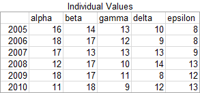
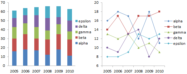
Here are the stacked column chart and line chart of this data. They are rather cluttered, and not easy to interpret.
Here is the panel chart. Splitting the data into separate panels according to category makes it much easier to see trends within an individual category and to compare values across categories.

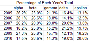
Percentages of Annual Total
This table shows the data as a percentage of the annual total. For example, the “alpha” value for 2005 is the alpha value divided by all values, or 16/(16+14+13+10+8), or 26.2%.
The stacked chart is now flat across the top, because the total in each year is 100%. The details within the stacked column chart and the line chart are no easier to see than the charts showing the individual values. In fact, it’s hard to see the differences between these and the earlier charts.
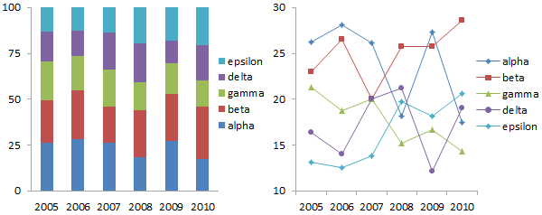
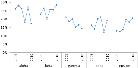
The panel chart of the percentage data isn’t much different than that for the individual values, and it is much easier to read than the stacked and line charts.
Rolling Percentages of Cumulative Total
Here are the calculations proposed by Joe Mako. The values for the first year are the same. The values for the each subsequent year are the values for a given category for all years so far divided by the values for all categories for all years so far. So alpha for 2006 would be (16+18)/((16+14+13+10+8)+(18+17+12+9+8)), or 27.2%.
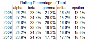
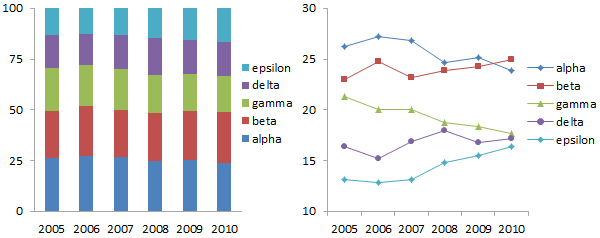
Essentially each year’s rolling value is a weighted average of the current value with the previous years’ values, which results in a smoothing of the data. The data is smoothed so much that it’s not easy to see much difference at all within any particular category in the stacked chart below. In the line chart, we can make out trends, but they are not nearly as pronounced as in the original data or in the annual percentages.
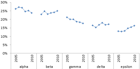
The panel chart also shows this smoothed data.
What’s the Big Deal?
So why don’t I like this smoothing of the data? Smoothing can be helpful when you’re trying to find patterns in noisy data. In fact, I’ve written about LOESS smoothing in Excel, and I’ve released a utility to perform LOESS smoothing on worksheet data.
But smoothing can also obliterate details in data, and it can give the wrong impression of trends in the data.
In the latest stacked column chart above, the variation in the data from year to year has been almost smoothed out of existence. The latest line chart contains more white space, because points have been moved away to provide this space.
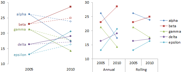
The line charts below compare how the unsmoothed data compares to the rolling average data. In the chart on the left, the first and last years in the analysis are connected, without showing the intervening years. The solid symbols and lines show the annual percentages, while the open symbols and dashed lines show the rolling averages. The lines start at the same points in 2005, and both sets of data move in the same direction. But for all categories, the rolling averages change much less than the annual averages. The rolling averages make it seem that alpha and beta have become close in value, while the annual averages show that they have diverged to a great degree. The rolling averages show that gamma, delta, and epsilon have moved very close to each other, while the annual averages have changes so much that the categories have crossed each other and reversed their order. The line chart on the right is another view of the two sets of data.
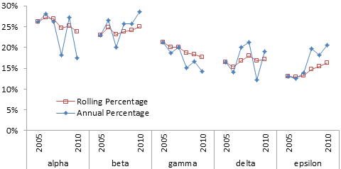
As is often the case, the panel chart shows the data most clearly. The blue solid diamond markers show the annual percentages, with their considerable variability, while the red open squares show very gradual changes. The smoothed data in this case tends toward the overall time average of the data.
Data Smoothing
Data soothing can be a useful tool for teasing patterns out of noisy data. It’s important that the consumer of the data understands the unsmoothed and smoothed data, and how the smoothed data may have been distorted by the smoothing technique used.


Charles Crous says
Fantastic post, Jon!
And quite poignant in my case. I’ve been using a 12 month moving average method that’s essentially similar to the above mentioned Percentage of Annual Total, and I’ve been experimenting with more pronounced smoothing in order to counter the impact of outliers.
I must say that I found your words and charts sobering, and I appreciated you use of panel charts.
Thank you again for this insightful post.