Heat maps are a popular way to display varying values in a two-dimensional display. The heat map may be an actual geographic map with regions colored differently according to some variable, for example, population density or electoral results. I showed such maps, also called cartograms or choropleths, in Redrawn Electoral Maps and An Undistorted Election Results Map.
Heat maps are not just used for alternate representations of geographical maps. They can be used to map out sectors of a hard drive, or performance of various companies or industries in the stock market. In this post I’ll show a simple heat map showing relative values within a 2D worksheet grid, a crosstab of days of the week and times of day.
In Columbus Web Analytics Wednesday — Feedback Analysis, Tim Wilson of the Gilligan on Data blog surveyed attendees at a Web Analytics meeting to find out what times are good for holding future meetings. It was a simple enough survey, and there were 21 respondents. Tim broke out the results in a bubble-style chart, which I reproduce below. Obviously the respondents were not limited to one choice.
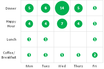
From Tim’s chart, it is evident that Happy Hour and Dinner time slots work best, and Wednesday is the best night of the week, with Monday, Tuesday, and Thursday all at nearly the same distant second place.
A well known problem with bubble charts is that we don’t perceive areas proportionally to the values they encode. Tim even said:
Compare the size of a “1″ to the size of the “14″ — does it look to you like the larger circle is fourteen times as big as the smaller one? It doesn’t to me.
It doesn’t to me, either. We seem to underestimate the differences when areas are used to encode values. It’s the opposite when diameters are used. I think we overestimate the differences to an even greater degree.

I didn’t even label the smallest data points, because the labels would have obliterated the circles.
The purpose of this chart is to get a quick idea of the survey responses, so the bubble approach isn’t really inappropriate (even the bubble chart based on diameter). Its point is readily understood, and since there is a clear winner, that winner stands out. But there are alternatives, and I decided to see how a heat map would work.
Heat Maps
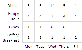
Heat maps are pretty easy to generate in Excel 2007 using a worksheet range and conditional formatting. Start with a simple worksheet range.
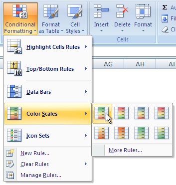
The Conditional Formatting command is accessed from the Home tab on the Excel 2007 ribbon. Hovering the cursor over the button shows the fancy Super Tooltip below the ribbon.

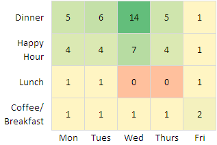
Clicking on the Conditional Formatting button shows a series of built-in formatting styles plus some style management commands at the bottom. Color Scales has the built-in color gradients. For this data, I selected the first one, which goes from red at the low end, through yellow in the midrange, to green at the high end.
The result is much as expected, but I thought the red and yellow were both a bit overstated. In fact, it would seem better to use a single color that ranges from a low saturation at the low value to a high saturation at the high value. A one-color display is simpler to understand, and does not discriminate against those with color-deficient vision.
I went to Manage Rules on the Conditional Formatting dropdown, which opened the Rules manager.

I selected the Graded Color Scale rule, which I just applied, and clicked Edit Rule.
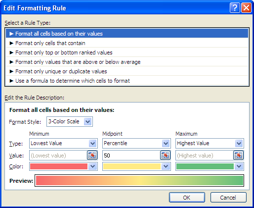
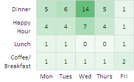
I switched to a two-color scale, kept the green shade at the high end, but selected a very lightly saturated shade of the same hue for the minimum. (I could have chosen white, but the faintest shade of green makes it obvious that the rule is being applied to the entire range.

The result isn’t too bad. Like the bubble chart, it’s reasonably self-explanatory. With little conscious thought, it is apparent light for low values and darker for higher values. The winning value stands out clearly. Another nice feature of this graphic is that is is very compact.


Naomi B. Robbins says
I prefer the heat map to the bubble chart. Instructions for creating the heat map are valuable. However, let’s realize that in both cases we are communicating values through the labels and not the figures although both figures help to make the larger values stand out. I agree that it is difficult to tell that the circle representing 14 is 14 times larger than the circle representing one, but it is even more difficult to tell that the darker shade of green represents 14 times that of the lighter shade.
Jon Peltier says
Naomi –
For semi-qualitative information display, in which the precise values are not as important as the patterns, the heat map is nicer than the bubble chart.
Good reminder that the graphics are merely helping highlight the numeric labels. I didn’t mean to imply that the colors are easier to read than the bubble sizes. Maybe I can edit my article to clean it up.
Stefan says
Hi Jon,
I played with the topic and got a simple solution with vba (i used a former solution to simulate shapsize in cells…).
best regards,
stefan
maybe i should send it?
Jon Peltier says
Stefan –
VBA’s a big topic, what kind of solution did you come up with? (Sure, send me the file: jonpeltier at gmail dot com.)
Stefan says
i sent you my working example to meet some parts of heatmap requirements, instead of the case selects for the background,
best regards from vienna, stefan
Fabrice says
Stefan,
I bet this is based on the add-in “Sparklines for Excel” … right ?
With SfE you can use a combination of size (circle or square) + color as shown here : http://sparklines-excel.blogspot.com/2008/09/in-pipe.html
Cheers
Stefan says
Hi Fabrice,
I really like Your work, but the origin of my solution is a little bit older, as I sent to Jon. Nowadays i use Your Sparklines, but for the example i wanted to try some of my older work… ;-)
best regards
Jeff says
Both are important ways to display patterns. I would point out that the difference between 2 and 4 are better represented in Bubble than Gradient/Heat.
Subtle differences are more easily picked-up on Bubble – however Heat Maps are also well suited when the plots are non-overlapping. (I realize that is not the case here, but on a map for instance, gradients relating to points make little sense and when overlapping provide a false condition.)
If the intent is to normalize the data so that there are only 4-5 different gradient levels, then it may be easier to discriminate between each gradient level, otherwise the differences are imperceptible.
Lastly, if the intent is to convey as much detail as possible while still providing a general pattern, I would opt for the area in the very first example. ;-)
Tim Wilson says
Jon,
Thanks for taking this one up! I’m slipping on my RSS feeds in that I missed the post. For my purposes, the heatmap is a definite winner. Thanks!
AnnMaria says
I think you must get this question a lot, so I expect you have a variety of methods – how do you handle concerns about color-blindness? I usually do maps, graphs, etc. for presentation or publication in shades of gray or some other single color, and occasionally patterns. Any more creative solutions would be most welcome.
Jon Peltier says
Hi AnnMaria –
Thanks for your comments.
The first way to accommodate colorblindness is to stick to bar charts and to clearly labeled line charts. The same features that make a chart friendly for those with color vision deficiencies (limited rainbow effects, minimal clutter, not too many series, clear labeling, etc.) make the chart friendly for all viewers.
If you need to use a heat map, then a range of gradients of a single hue (e.g., white through gray to black) is colorblind-friendly, as well as photocopier- and fax-friendly. The use of patterns is problematic for human viewing and for mechanical reproduction.
The ColorBrewer palette generating utility, which I described in Excel Chart Color Update, has a colorblind-safe setting. there are numerous sites (e.g., VisCheck and Colorblind Web Page Filter) that will modify an uploaded image or entire web page to show how colors which are distinct to a person with normal color vision become indistinct to a person with color vision deficiency.
Tim Wilson wrote a detailed article about colorblind-friendly data visualization in Data Visualization that Is Colorblind-Friendly — Excel 2007?
Stephen Few touches on accommodating color vision in Dashboard Design for Real-Time Situation Awareness (pdf) and in Practical Rules for Using Color in Charts (pdf).
bruce mcpherson says
John this is a great article. I use your site as the fount of all knowledge on charting matters. Thank you.
Here’s an automated VBA version that doesn’t use conditional formatting for those on earlier versions of Excel.
Bruce
Jon Peltier says
Bruce –
Thanks for the link. I’ll repeat the warning about color-vision-deficient viewers. This is why I like to stick to a monochromatic color scale (white to fully saturated color) or a simple two-color scale using blue and orange as endpoints. Green and red in the same scale will cause problems.
Bruce says
Hi John
Following on from your comments, I put together a ramp library, where you can specify any number of milestone colours and it will figure out the bridging colours.
That way you can create or avoid any combination
http://ramblings.mcpher.com/Home/excelquirks/snippets/heatmap/rampcharts
Bruce
Abigail Daken says
Is there a way to do somethng similar, but instead of formatting the cells in a range, the color scale is applied to the markers of an x-y chart?