Conditional Formatting of Excel Line and XY Chart Lines
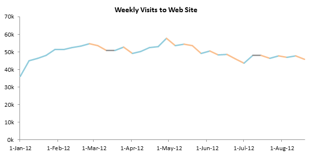
I’ve written a lot about conditional formatting of charts. One topic I have not covered is formatting of lines in line charts and XY charts, because this isn’t as easy to do.
Formula-Based Conditional Formatting
In Conditional Formatting of Excel Charts and Conditional XY Charts Without VBA, I showed examples of a formula-based technique to apply conditional formatting in Excel Charts. Essentially there are as many series in the chart as there are distinct formats you want to show. There is one point (i.e., one bar or marker) displayed where a point should be displayed, and the formulas control which series displays each point, with which format. Using formulas is more reliable than using VBA, because updating is dynamic without needing to run code whenever the data changes, and it’s easier to maintain. This approach can be applied to bar or column charts…
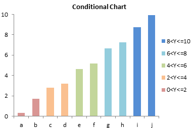
… to markers in line charts…
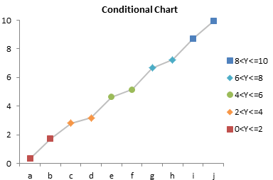
… and to markers in XY charts…
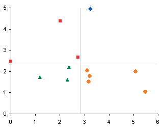
This conditional formatting is applied to each individual point, but unfortunately it cannot be applied in this way to the individual line segments connecting markers in a line chart.
VBA-Controlled Conditional Formatting
Sometimes you don’t have the luxury of using formulas for your conditional formatting. Here are a few articles showing VBA techniques for applying conditional formats to a chart:
- VBA Conditional Formatting of Charts by Series Name
- VBA Conditional Formatting of Charts by Value
- VBA Conditional Formatting of Charts by Category Label
- Pivot Table Conditional Formatting with VBA
- VBA Conditional Formatting of Charts by Value and Label
VBA-Controlled Conditional Formatting of Line Chart Lines
You might want to format lines differently if they represent rising or falling values. Green line segments for increasing trends or red for decreasing. Actually, a more color-vision-friendly combination is blue for increasing and orange for decreasing. The chart at the top of this article is a good example.
Unfortunately, line segments in a line or XY chart cannot be turned on or off using formulas, the way markers or columns and bars can be. So we’ll have to use VBA to format them.
For this tutorial. let’s dig out some web site statistics. This chart of weekly visits show some week-to-week fluctuations, with occasional flat segments which we will not want to color.

I decided to record a macro so I can figure out the syntax. The help files are pretty sketchy about this.
I started with a boring dummy chart with three series.
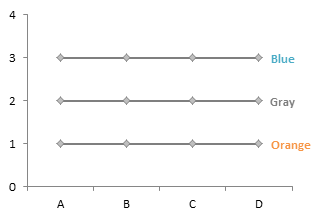
I turned on the macro recorder while I applied the following formatting to the dummy chart. I changed line colors, and I didn’t change the marker color but shrunk the marker size

Here’s the recorded macro. It’s no uglier than any other recorded macro.
Sub RecordedMacro1()
'
' RecordedMacro1 Macro
'

'
    ActiveChart.SeriesCollection(1).Select
    With Selection.Format.Line
      .Visible = msoTrue
      .ForeColor.ObjectThemeColor = msoThemeColorAccent5
      .ForeColor.TintAndShade = 0
      .ForeColor.Brightness = 0.400000006
      .Transparency = 0
    End With
    With Selection.Format.Line
      .Visible = msoTrue
      .Weight = 2.25
    End With
    Selection.MarkerSize = 4
    ActiveChart.SeriesCollection(2).Select
    With Selection.Format.Line
      .Visible = msoTrue
      .ForeColor.ObjectThemeColor = msoThemeColorAccent6
      .ForeColor.TintAndShade = 0
      .ForeColor.Brightness = 0.400000006
      .Transparency = 0
    End With
    With Selection.Format.Line
      .Visible = msoTrue
      .Weight = 2.25
    End With
    Selection.MarkerSize = 4
    ActiveChart.SeriesCollection(3).Select
    With Selection.Format.Line
      .Visible = msoTrue
      .ForeColor.ObjectThemeColor = msoThemeColorBackground1
      .ForeColor.TintAndShade = 0
      .ForeColor.Brightness = -0.349999994
      .Transparency = 0
    End With
    With Selection.Format.Line
      .Visible = msoTrue
      .Weight = 2.25
    End With
    Selection.MarkerSize = 4
End Sub
Well, yeah, it is kind of ugly. It selects everything, then works on the selection object, and includes all that default stuff I never touched.
Long story short (long code short), I used constants for the formatting settings, streamlined the code. I also did some magic to compare whether adjacent points showed increasing or decreasing values to decide what colors to use.
Sub ColorLinesBasedOnSlope_ThemeColor()
  Dim srs As Series
  Dim iPoint As Long
  Dim vValues As Variant

  Const thmclrBlue As Long = msoThemeColorAccent5
  Const briteBlue As Double = 0.4
  Const thmclrOrange As Long = msoThemeColorAccent6
  Const briteOrange As Double = 0.4
  Const thmclrGray As Long = msoThemeColorBackground1
  Const briteGray As Double = -0.4
  Const dWeight As Double = 2.25
  Const lMarkerSize As Long = 4

  Set srs = ActiveChart.SeriesCollection(1)
  vValues = srs.Values
  For iPoint = 2 To UBound(vValues)
    With srs.Points(iPoint).Format.Line.ForeColor
      Select Case vValues(iPoint) - vValues(iPoint - 1)
        Case Is > 0
          .ObjectThemeColor = thmclrBlue
          .Brightness = briteBlue
        Case Is < 0
          .ObjectThemeColor = thmclrOrange
          .Brightness = briteOrange
        Case Else
          .ObjectThemeColor = thmclrGray
          .Brightness = briteGray
      End Select
    End With
    srs.Points(iPoint).Format.Line.Weight = dWeight
    srs.Points(iPoint).MarkerSize = lMarkerSize
  Next
End Sub
I selected my chart (actually, I was smart and selected a duplicate chart) and ran this code. Here’s what happened:

Oof! Not only did the code format the line segments, it also formatted the marker lines. I never did that while recording the macro.
Turns out, the object model for Excel 2007/2010 charts does not distinguish between the connecting lines and the lines that draw the markers. Well, that’s no good.
Fortunately I still can use the old tired and true Excel 2003 VBA syntax. Instead of .Format.Line.Whatever, I reverted to .Border.Whatever, and I took out that weird ThemeColor drivel, and replaced it with the familiar RGB color definitions. I present the updated code.
Sub ColorLinesBasedOnSlope_RGBColor()
  Dim srs As Series
  Dim iPoint As Long
  Dim vValues As Variant

  Const rgbMyBlue As Long = 14536083
  Const rgbMyOrange As Long = 9486586
  Const rgbMyGray As Long = 10921638
  Const lWeight As Long = xlThick
  Const lMarkerSize As Long = 4

  Set srs = ActiveChart.SeriesCollection(1)
  vValues = srs.Values
  For iPoint = 2 To UBound(vValues)
    With srs.Points(iPoint).Border
      Select Case vValues(iPoint) - vValues(iPoint - 1)
        Case Is > 0
          .Color = rgbMyBlue
        Case Is < 0
          .Color = rgbMyOrange
        Case Else
          .Color = rgbMyGray
      End Select
      .Weight = lWeight
    End With
    srs.Points(iPoint).MarkerSize = lMarkerSize
  Next
End Sub
I selected another copy of the chart, and ran this new procedure.

Nice. It colored the lines orange and blue, except for a couple horizontal segments that were colored gray. It also kept the markers gray, but shrunk them so they don’t overwhelm the lines.
The markers aren’t really necessary. I like them, so I know for sure where there is actual data, but you can judge where the lines change their angle or color to know this. I made yet another copy of my original chart, removed the markers, and ran the formatting procedures.

Which procedure did I use? Doesn’t matter. Both produced the same result, since there were no markers for the newfangled code to mess up.


pato says
Hi Jon. I’ve been working today on formatting lines on charts in excel using VBA.
Encountered the same issue you described here … “Oof! Not only did the code format the line segments, it also formatted the marker lines. I never did that while recording the macro”
I thought I was going crazy here. Because I need the marker lines to keep 1pt thick.
I’ve got one question: It seems that the Border.Width procedure does not let you select a width value with double precision as the Format.Line.Weight procedure does.
How can I have double precsion line widths (e.g 1, 1.2, 1.5 and 2.25 pts) set with the Border.Width procedure? Or am I stuck with xlThick or nothing?
Thanks!
Pato
Jon Peltier says
Border.Width use named constants xlHairline, xlThin, xlMedium, and xlThick. I don’t know the integer values of these constants, but it doesn’t matter. xlThin is 0.75 points, xlMedium is 1.5, and xlThick is 2.25 points. That’s all the precision the old syntax needed.
Pato says
THank you for the info!
Igor says
And If I need to conditionally format the line on the graph in red – what would be the value in this expression:
rgbMyRed as Long = ???
(rgbMyOrange As Long = 9486586)
Jon Peltier says
Igor –
To determine the Long value if you know the RGB values, use RGB(red, green, blue), where red, green, and blue each range from 0 to 255. Of course, you can’t declare a constant using a formula for its value, but you can easily get the value you need:
In the Immediate Window, enter this expression and press Enter:
?RGB(255,0,0)
The answer is 255. So
Const rgbMyRed As Long = 255
Of course, if it’s definitely always going to be red and you won’t need to change it in the declarations, you can use the built-in constant vbRed, which is 255, right in your code. In fact, this also works:
Const rgbMyRed As Long = vbRed
Callan says
I have this situation.
A line chart plotting 4 sets of data – past year, forecast, latest forecast and budget. These are all populated from an array that points to a datasheet. While I am happy ho have a past year line, budget line and forecast line, I want the actual line to merge with the latest forecast so that the incomplete months show as a dotted rather than solid line value. Each time the month passes I change the cell from forecast to actual so that this should then change the line segment from dotted to solid. Can this be done using a variation of the above without VBA Coding?
Jon Peltier says
Callan –
For the actual-budget dual line, check out the non-VBA approach in Category Axis Tricks for Line and Area Charts.
Johan Duyck says
Hi Jon,
I have a question in addition to what you developped here. I made a custom ribbon in Excel 2007 that formats graphs exactly the way I want them to. When change a normal sized graph to a small graph I want the linesize of the series to go from 2 to 1.5 and the marker linesize from 1 to 0.5.
I face two problems doeing this. I have difficulties in sizing the lines to decimals (1.5 becomes 1) and the second problem concerns my wish to have different linesizes for the marker and the line itself.
This is the function I call, to execute what I just explained:
Sub Resize_Main(TypeResize As String)
‘ Procedure to size and align Selected charts of a worksheet
‘ New Sheet is added where the resized graphs are stored
‘ User specifies: Number of charts across (1 to max )
‘ Procedure automatically freezes text size to avoid distorting text as charts resized
Dim Chrt_width As Single
Dim Chrt_height As Single
Dim Font_size As Integer
Dim Chrts_across As Long
Dim ChrtO As ChartObject
Dim i As Integer
Dim MarkerResize1 As Double
Dim MarkerResize2 As Double
Dim MarkerLineSize As Double
Dim LineSize As Double
Dim sSub As String
Dim TypeSel As String
Dim ChartName As String
Dim MarkerborderSize As Integer
Dim mySeries As Series
Dim seriesCol As SeriesCollection
Dim J As Integer
TypeSel = TypeName(Selection)
sSub = “Resize_Main”
On Error GoTo errorhandling
‘ Define
If TypeResize = “Small” Then
‘Chrt_width = 222.8031
Chrt_width = 205
Chrt_height = 160
Font_size = 6
MarkerResize1 = 4
MarkerResize2 = 5
MarkerLineSize = 0.5
LineSize = 1.5
ElseIf TypeResize = “Big” Then
Chrt_width = 426.792
Chrt_height = 227.6224
Font_size = 8
MarkerResize1 = 5
MarkerResize2 = 6
MarkerLineSize = 1
LineSize = 2
ElseIf TypeResize = “PPT2” Then
Chrt_width = 290
Chrt_height = 182.0979
Font_size = 7
MarkerResize1 = 3
MarkerResize2 = 4
MarkerLineSize = 1
LineSize = 2
Else
Chrt_width = 585
Chrt_height = 318.67136
Font_size = 10
MarkerResize1 = 5
MarkerResize2 = 6
MarkerLineSize = 1
LineSize = 2
End If
Call Freeze_text ‘ Procedure to freeze text for all charts on active sheet
‘ Loop through all selected charts on active sheet
If (TypeSel “ChartArea” And TypeName(Selection) “DrawingObjects”) Then
MsgBox (“0 charts selected.”)
Exit Sub
ElseIf (TypeSel = “ChartArea”) Then
If ActiveChart.ChartType = 4 Or ActiveChart.ChartType = 65 Then
‘SeriesResize = ResizeSeries(ActiveChart, LineResize)
MarkerResize = ResizeMarker(ActiveChart, MarkerResize1, MarkerResize2, MarkerLineSize, LineSize)
End If
Selection.Width = Chrt_width
Selection.Height = Chrt_height
ActiveChart.ChartArea.Font.Size = Font_size
ElseIf (TypeSel = “DrawingObjects”) Then
For Each ChrtO In Selection
If ChrtO.Chart.ChartType = 4 Or ChrtO.Chart.ChartType = 65 Then
‘SeriesResize = ResizeSeries(ChrtO.Chart, LineResize)
MarkerResize = ResizeMarker(ChrtO.Chart, MarkerResize1, MarkerResize2, MarkerLineSize, LineSize)
End If
ChrtO.Width = Chrt_width
ChrtO.Height = Chrt_height
ChartName = ChrtO.Chart.Name
ChrtO.Chart.ChartArea.Font.Size = Font_size
Next ChrtO
End If
Exit Sub
errorhandling:
MsgBox “Please contact the CIC-team. An error has occured in the ” & sSub & ” sub”
End Sub
Jon Peltier says
Unfortunately the Excel 2007-2013 object model does not appropriately distinguish between the marker outline size and the connecting line size. Using the new syntax, they have to be the same.
You can use the old syntax, which allows for a marker outline of 0.75 points (1 pixel). The line can be xlhairline, xlthin, xlmedium, and xlthick. In classic Excel, these correspond to 0.25, 0.75, 1.5, and 2.25 points, but in 2007+ they come across as 0.25 (I think), 1, 2, and 3 points.
CamdenL says
Mr. Peltier
This is a great example, thanks very much. My question is how would I edit the macro to run on multiple lines in the same chart?
Thanks,
Camden
CamdenL says
I actually figured out how to run on multiple lines using another for loop. Is there a way to change the case to highlight the line segments which are above a certain value?
Jon Peltier says
Camden –
Modify the code as follows, to evaluate
vValues(iPoint), notvValues(iPoint) - vValues(iPoint - 1). Adjust the values in theCase Islines, and use more of these and more colors if you want.Jon Peltier says
For a non-VBA way to achieve this conditional formatting, see Different color for up and down line segments in an Excel chart