I’m not sure what to call this chart, other than it’s a combination chart (stacked column and XY scatter) and it requires some additional data manipulation. The chart shows test results from a test program that includes different factor levels: Groups (Alpha, Beta, Gamma), Classes (High and Low), and Treatments (A, B, C), with four replications per set of factors. The intent is to show each replication, while also showing how the groups, classes, and treatments compare against each other.

About the Test Program
A few years ago I wrote Make Technical Dot Plots in Excel, which showed each test result from a relatively simple test program. A typical one of these charts is shown here, where all results from each of the three test conditions are shown.

The above chart shows three treatments, but what if we have other factors in the test program. We have two classes and three groups, which might refer to any other way to categorize testing conditions. Age groups of test subjects, species of an infectious agent being targeted, season of the year, etc.
A comment to the article cited above posted a data set, part of which I’ve shown below (after anonymizing it). You can download a CSV file with the data set here: test_results.csv. For each combination of Group, Class, and Treatment, there are Four replications. We want to plot each of these replications in the final chart.
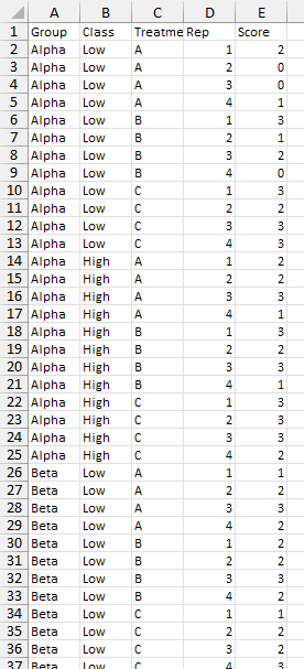
Here is how the first several rows of data look when opened in Excel and converted into a Table.
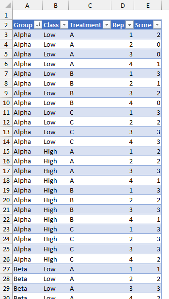
Exploring the Data
Simple Charts
When I first get my hands on a new data set, I like to make a chart or three to see if there are any obvious insights. My first chart was a simple line chart of the data column. The X-axis is simply the point number, from 1 to 72 (the number of results in the program).
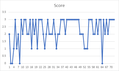
Nothing is immediately obvious, other than the scores being skewed toward the upper end of the range (more 2s and 3s on a scale of 0 to 3).
I change this chart to use the Treatment column for category labels. No insights come to light.
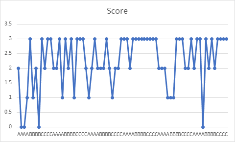
I further adjusted the chart to include the Class column to the category labels. Nothing but clutter along the axis.
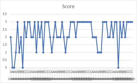
When I included the Group column to the category axis labels, the clutter increased.
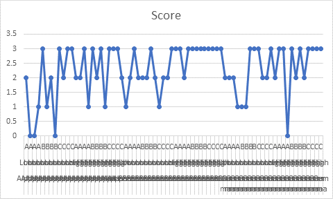
With the appropriate data layout, multiple columns of category labels can bring order to the chart. This is obviously not the appropriate data layout, but we’ll get to it shortly.
Pivot Table and Charts
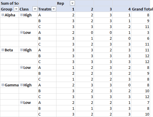
Sometimes a Pivot Table helps with displaying data. The Picot Table below has Group, Class, and Treatment in the Rows area, Rep in the Columns area, and the Scores in the Values area. Each test result appears in the cross-tabbed Pivot Table, with one set of conditions per row and the four associated test results in that row. Easier to see all at once, but not (yet) easier to find any meaning.
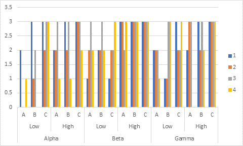
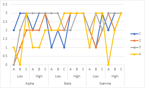
Here is a pivot chart, type clustered column. It shows all results, but the bars are so pinched together it’s hard to make sense of it. That horizontal axis looks better, though, since it is laid out in a much nicer way than the cluttered one above.
A line chart of the same pivot data looks a bit less cluttered, but it’s hard to see how many points might be occupying the same space. It would be better if we could move some left or right by a small amount (the way the columns are spread out in the previous chart), but line charts do not allow that.
How do we get that nice layout? I’ve described it in Chart with a Dual Category Axis and numerous other articles, but I’ll describe it again. Below is the Pivot Table, where I’ve highlighted the chart source data. The blue highlights indicate the Y Values (the test results in the Pivot Table’s Values area), the red highlights indicate the Series Names (in the Columns area), and the purple highlights indicate the X Values or Category Labels (in the Rows area).
There are three columns of category labels, just like in the original Table of data. What makes the axis work nicely in the Pivot Chart is that repeated labels are replaced by blanks. These blanks tell Excel how to construct the labels: place A-B-C along the axis, center Low and High under successive blocks of A-B-C, and center Alpha, Beta, and gamma under blocks of Low and High.
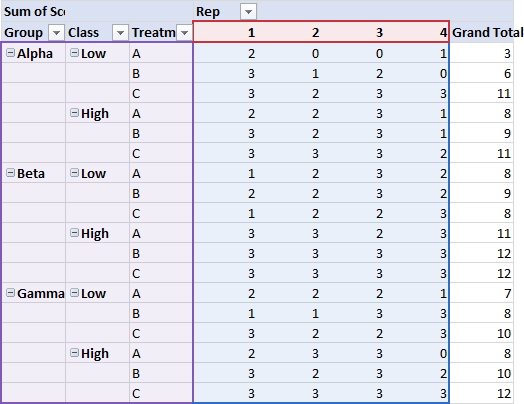
What we can do is use these three columns of the Pivot Table for our chart’s category axis, and then combine this with XY Scatter series where we calculate X values that include the lateral offset to reduce overlapping of the markers. (We could also construct a range like this by hand, but the Pivot Table is here, so let’s use it.)
Calculating X Values
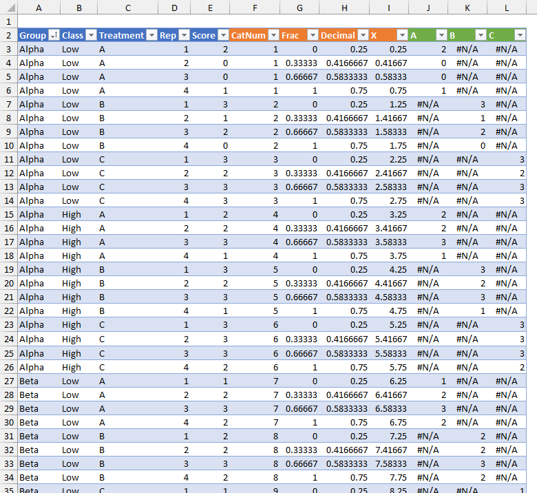
My previous article, Clustered Column and Line Combination Chart, shows how to calculate X values to position XY Scatter markers precisely over columns in a chart. We’ll use a similar approach here. I’ve columns to the Table to accommodate these calculations.
Each combination of factors in the Table results in one category in the Pivot Chart and in our ultimate chart. So we need to calculate Category Number (“CatNum” in the Table). The formula in cell F3 (which Excel fills into the whole column of the Table) is
=INT((ROW()-ROW($F$2)+3)/MAX([Rep]))
Each replicated test takes up a fraction of the width of each category (“Frac” in the table), with the first replication at zero and the last replication at 1. The formula in G3 is
=([@Rep]-1)/(MAX([Rep])-1)
I want to leave space around the reps within a category, leaving a space between categories. This is like the gap width in a column chart. I’ve placed a gap width of 0.5 in cell $N$3, and this formula in cell H3 (under Decimal)
=($N$3/2+[@Frac]*(1-$N$3)
Finally, I add this Decimal amount to CatNum minus one in I2 (under X) using the formula
=[@CatNum]-1+[@Decimal]
I certainly could have combined all of these calculations into a single “X” column, but for ease of explanation, I used several columns for intermediate calculations. Many Excel users love their big ugly formulas that take up fewer columns, but our column limit now stretches beyond 256 columns, while our cognitive limit seems to have shrunk. Helper columns are your friends.

Let’s just see how it looks. First I’ll plot the Score column in an XY Scatter chart, using lines and markers. Without specifying X values, Excel will just use the counting numbers 1, 2, 3, up to the number of points.
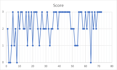
Similar to our first line chart at the beginning of this article. Those connecting lines need to go, and let’s format the markers to have no fill, which lets us see more easily when points overlap.

Now let’s use the calculated X values for the data. There are 18 categories, so let’s set the axis maximum to 18. The data is also grouped into threes, that is, A, B, and C, so let’s set the axis major unit to 3 and minor unit to 1. We have four replications within each vertical slice of the chart.

We can make one further improvement. The tests within each category would stand out from other categories more visibly if we plot each category in a different color. To do this, I’ve added three more columns to the Table, labeled A, B, and C for the three treatments. The formula in J2, filled into the three added columns, is
=IF($C3=J$2,$E3,NA())
Here I’ve plotted the three different treatment columns in place of the one Score column, and colored each series distinctly.

Building the Chart
We’re going to make a combination chart. We’ll start with a column chart using the Rows area of the Pivot Table as category labels and averages for each category of tests as the column Y values. To this, we’ll add XY Scatter series using our calculations in the data Table for X values and the test results as Y values.
We can’t use a Pivot Chart, since a Pivot Chart is constrained to plot all data in the Pivot Table and no data from outside the Pivot Table. But that’s no impediment, as I described in Making Regular Charts from Pivot Tables.
I’ve added three columns, A, B, and C. to the right of the Pivot Table for the average test result values (much as I did for the test results in the Table). These will serve as a background to the individual test results. The formula in X4 (filled into the range X4:Z21) is:
=IF($R4=X$3,AVERAGE($S4:$V4),0)
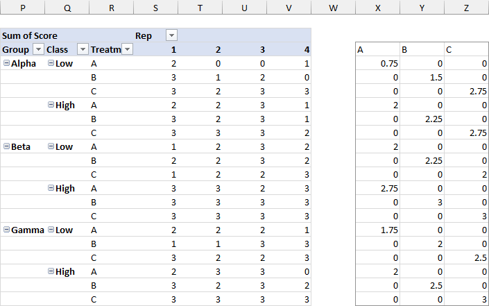
One thing to be careful of is the sorting in the original data and in the Pivot Table. The original data lists Class in the order Low-High. Default sorting in the Pivot Table lists Class in the opposite order, High-Low. You can change the order by clicking on a pivot item label and dragging it to where you want it.
Create the Chart
Select the columns of average data; include the header row and Excel will use these cells as series names. Then insert a column chart. I’ve made a stacked column chart, so the overlap is 100% and all columns are centered within their categories. The chart’s source data is highlighted in the worksheet.
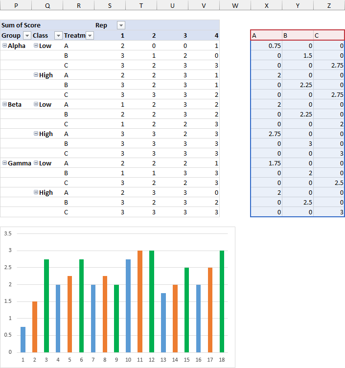
Now add the category labels from the Pivot Chart. I’ll add them bit by bit so you can see how Excel builds up the multiple tiers of labels.
You could use the Select Data dialog to add the labels, but I find that tedious. It’s much easier to edit the SERIES formula. Select the blue columns and this will appear in the Formula Bar (the precise address will depend on the location of the Pivot Table in the sheet):
=SERIES(Sheet1!$X$3,,Sheet1!$X$4:$X$21,1)
The syntax of the SERIES function is
=SERIES([series name],[X values],[Y values],[series number])
Since there are no X values specified, Excel just uses 1, 2, 3, etc. in the chart. Do assign X values, put your cursor between the two commas where the X values should go, select the range in the sheet, then press Enter. The formula should now look like this:
=SERIES(Sheet1!$X$3,Sheet1!$R$4:$R$21,Sheet1!$X$4:$X$21,1)
You only need to add this to one series, since all series (except for XY Scatter series) share X values/category labels.
The worksheet now shows these highlights, and the column of Treatments is used as category labels in the chart.
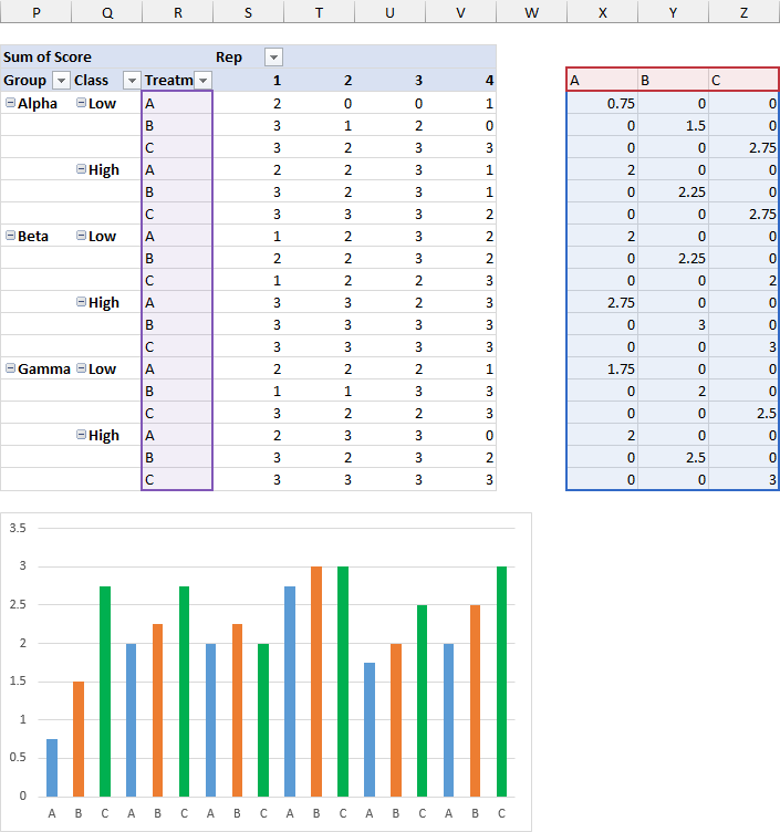
Let’s include the column of Class labels in column Q. Simply edit the series formula to include the two-column range:
=SERIES(Sheet1!$X$3,Sheet1!$Q$4:$R$21,Sheet1!$X$4:$X$21,1)
The highlighted regions and the chart show the adjustment.
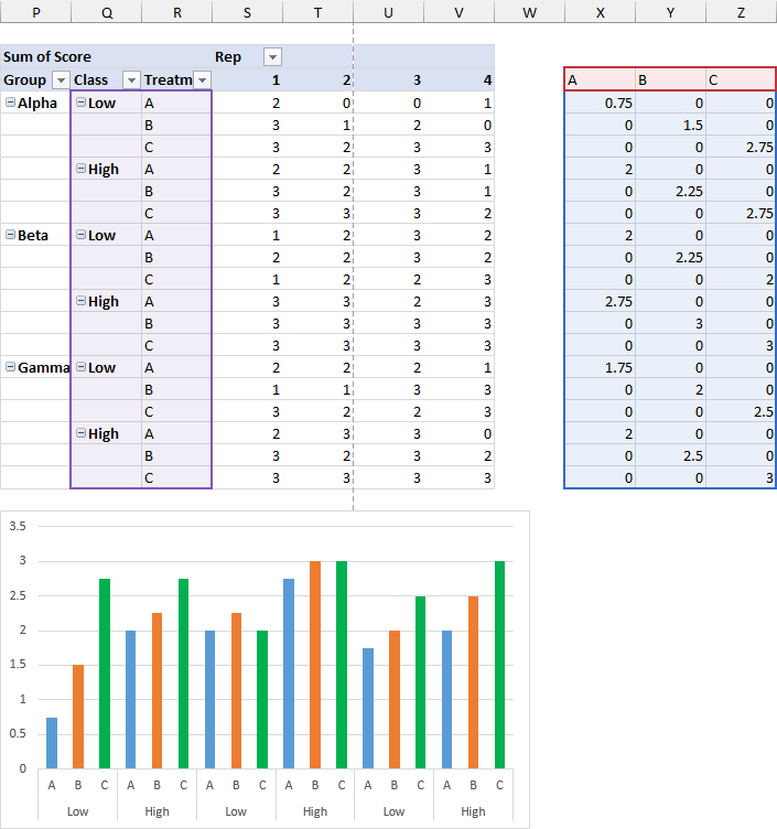
One more time: edit the SERIES formula to include Group in column P, so the formula looks like this. Of course, I could have just selected all three columns of the Rows area two steps ago, but I wanted to show how the category label structure develops.
=SERIES(Sheet1!$X$3,Sheet1!$P$4:$R$21,Sheet1!$X$4:$X$21,1)
The worksheet highlights and chart axis show the change.
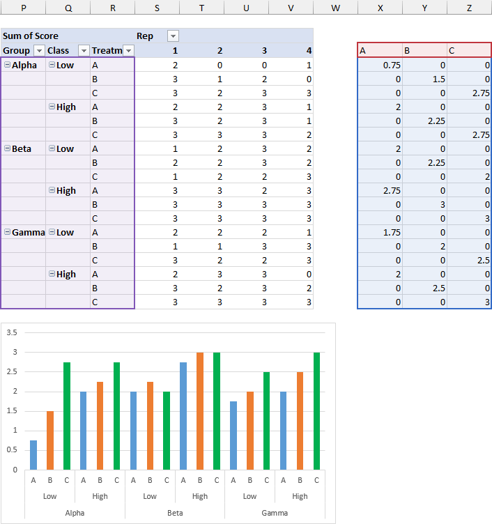
We have the nice category axis we wanted, now let’s do a little cleanup. Set the scale of the Y-axis to minimum=0, maximum=3, major unit=1. Select one of the column series and set gap width to zero so the columns fill the width of each category. Lighten up the colors: I set the transparency to 75% or so, which makes the colors light and lets the gridlines show through.
Add the Test Results
Now it’s time to add the actual test results. Select and copy the last four columns of the Table (X, A, B, and C) including the column headers. Select the chart, click Paste Special from the Paste dropdown on the Home tab of the ribbon, and make the appropriate selections in the dialog: Add as New Series, Values in Columns, Series Names in First Row, Categories in First Column.

You can also Paste Special with Alt+E+S, which is a legacy of the old menu structure of Excel 97-2003, and which is permanently ingrained in my muscle memory. Another more recent shortcut that I can never remember is Ctrl+Alt+V.
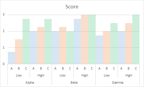
Excel adds the new series as more sets of stacked columns.
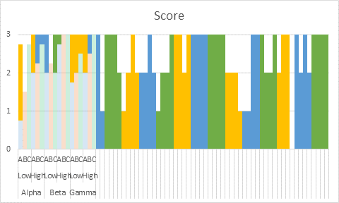
That’s easy to fix. Right-click on any series in the chart, and choose Change Series Chart Type. This rich dialog pops up with a preview of the chart and a list of all series in the chart. Note that all series are Stacked Column.
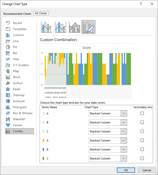
Change each of the newly added series to Scatter using the Chart Type dropdowns. Excel will check the Secondary Axis box for each, which in this case is what we want.
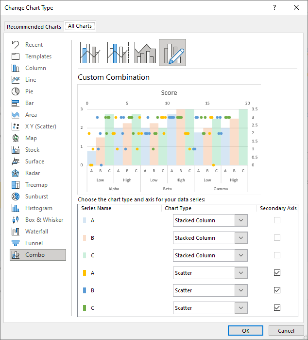
The resulting chart is starting to look good.

Format the scale on the secondary (upper) horizontal axis: minimum=0, maximum=18, major unit=3, minor unit=1.

Add major and minor secondary vertical gridlines.
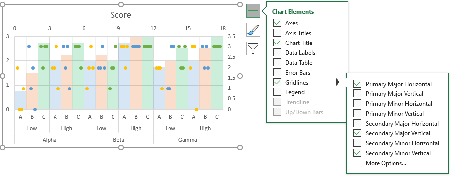
Format the secondary (upper) horizontal axis to show no labels. Delete the secondary (right-hand-side) vertical axis.

Finally, format the XY Scatter series so the markers have no fill. This makes overlapping points easier to see.


Leave a Reply