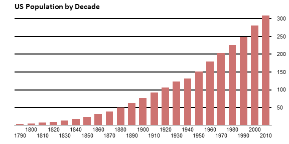
An astute reader asked how to achieve the gridline effect in the following chart. The gridlines are not gray lines running across the whole chart, behind the bars. Instead, the bars themselves appear to be cut into sections where the gridlines would have gone. There are in fact gridlines in the chart, with a line color to match the background, in front of the bars.

Gridlines
The thing is, gridlines are always in back of the bars, as shown in this chart. I’ve lightened the bars, and darkened and widened the gridlines, to show their normal relative positions. Don’t let me EVER catch you making gridlines like this.
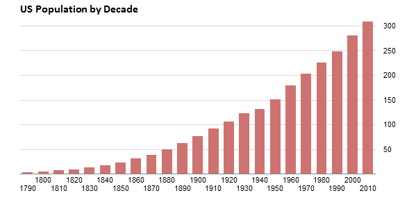
If gridlines are used at all, they should be thin light gray lines, as unobtrusive as possible.
But I digress.
The Data and Chart
Here is the population data for this exercise. Column B has numerical years. Column A has formulas as follows. The even decades (1800, 1820, etc.) simply link to the year; A3 has the formula =B3. The odd decades (1790, 1810, etc.) insert a line feed before the year; A2 has the formula =CHAR(10)&B2. The reason for this will become apparent when we get to it.

Here is the default chart created from the data in columns B and C.
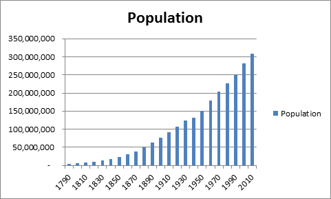
Let’s apply some formatting. That default title is way too large, perhaps the only concession to my over-50 eyes in all of the Office suite. The gap width is set to 50% so the bars are more prominent. And I’ve changed the source data for the chart to column A. The line feed in alternating cells staggers the X axis labels so the years are easier to read. The vertical axis is removed, because we’ll add our own later.

Adding Custom Gridlines
And now to add the gridlines. And how do we get gridlines in front of the data? Well, there are several ways to make horizontal lines in Excel charts. The crudest is simply to draw lines from the Shapes command on the Insert tab, but they’re hard to line up, and they don’t stay where you put them. What’s the trick?
Error bars. Error bars are positioned in front of bars in a chart. We’ll apply error bars, and color them white, so they appear to cut through the bars.
We’ll add a series of points along the right vertical edge of the chart, draw error bars to the left of these points, and add data labels to the right. Here is the data.

To get the millions to show without all of those extra zeros, apply a number format of “0,,” (without the quotes, duh). The zero by itself means use the number format with no decimal digits, and each comma after the zero means slice off one group of three zeros, one for thousands, another for millions.
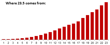
But that 23.5? People always ask me where that came from. The answer is easy once you know it. Let’s look at the chart without the year labels, and just count the bars. They are numbered 1 to 23 from left to right. The tickmarks on the axis between the bars are at the halves: the chart starts at 0.5, the next tickmark is at 1.5, all the way up to the tick at 23.5 at the right edge of the chart. We’ll add an XY series with the points directly above this tickmark, at X=23.5.
Copy the gridline data (two columns and all rows including the “million” label). Select the chart and use Paste Special to add the data to the chart. Make sure the Paste Special dialog has these options selected: New Series, Values in Columns, Series Names in First Row, Categories (X Labels) in First Column, and DON’T Replace Existing Categories.

And here is the chart with the added data. It’s in column chart form, but we’ll fix that.
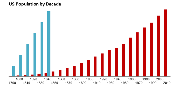
Right click on the added bars, choose Change Series Chart Type from the pop-up menu, and choose the XY Scatter type with markers only.

Excel moved the series to the Secondary axis, and dumped an extra set of axes into the chart. No problem, Format the XY series, and on the first tab of the Format Series dialog, choose Primary Axis.
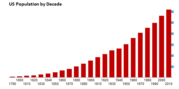
Now it’s time to add the error bars. Select the XY Series, and on the Chart Tools > Layout tab, click on Error Bars, More Error Bar Options.
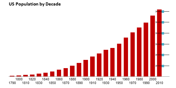
The horizontal error bars are easily visible: note how they lie in front of the bars. You can’t see the vertical error bars, because they are only one unit (one person) tall, but they are selected when you add the error bars. Close the Format Error Bars dialog and press delete to remove the vertical error bars.

Format the horizontal error bars. Choose the Minus direction, No Cap as the End Style, and a Fixed Value of 23 (see the explanatory chart above: the error bars reach from X=23.5 to X=0.5, so they are 23 long). Here’s how the Format Error Bars dialog should look:

And here’s the chart with the appropriately sized error bars.
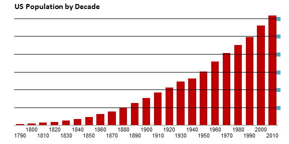
Select the XY series, and on the Chart Tools > Layout tab, choose Data Labels > Right. This adds the default data labels, which show the value. The data labels have the same number format as the cells containing the values. You’ll probably have to select the plot area and drag the right edge inward to make room for the labels.

Format the XY series, and choose None for the Marker Option.
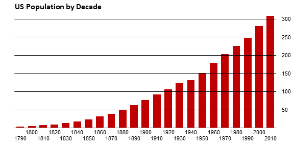
Finally, format the error bars, so the line color matches the chart background, in this case, white.

Lessons Learned
In this tutorial I’ve shown how to use gridlines that seem to cut the bars in a bar or column chart. Among the tricks I’ve used are:
- Line feeds in the category axis labels to stagger labels and prevent overlap,
- Using error bars to draw horizontal lines in a chart (error bars are great for vertical lines, too),
- Using data labels for custom axis labels.
You can accomplish many things with these tricks in your charting arsenal.
For an Excel workbook that contains this step-by-step tutorial, click on this link: Gridlines_Splitting_Bar_Chart.xlsx


rkw says
Working with error bars is extremely helpful, but can be a cumbersome to update for charts that are frequently reused and have data that change often.
For anything I expect to need to update later, I would typically accomplish the same task by adding “dummy” columns to the data and plotting them as white line graphs. Next to the data column for “Population,” add columns, so the data table is more like this:
“Year” “Population” 50,000,000 100,000,000 150,000,000 200,000,000 250,000,000 300,000,000
1790 3,929,214 50,000,000 100,000,000 150,000,000 200,000,000 250,000,000 300,000,000
1800 5,308,483 50,000,000 100,000,000 150,000,000 200,000,000 250,000,000 300,000,000
1810 7,239,881 50,000,000 100,000,000 150,000,000 200,000,000 250,000,000 300,000,000
…
Then set each of the bars for the dummy columns to “Chart Type” –> “Line,” format as appropriate.
The only problem is getting the white reference lines to extend all the way to the edges of the chart to include the last bar rather than just half of it. I just added an additional row to the data set with the first two columns blank to solve this:
“Year” “Population” 50,000,000 100,000,000 150,000,000 200,000,000 250,000,000 300,000,000
…
2000 281,421,906 50,000,000 100,000,000 150,000,000 200,000,000 250,000,000 300,000,000
2010 308,745,538 50,000,000 100,000,000 150,000,000 200,000,000 250,000,000 300,000,000
50,000,000 100,000,000 150,000,000 200,000,000 250,000,000 300,000,000
Derek says
I’m glad they had those staggered year labels, because otherwise I would have been really confused about what year the bar between 1910 and 1930 was supposed to be…
Naomi B.Robbins says
Do you really need two lines of labels? Why not label every other bar?
Jon Peltier says
RKW –
You can use the line chart approach for the lines, but it causes wider than necessary margins on the left and right edges of the chart.
You could also use XY series, with X=0 and 1 and the secondary X axis scaled from 0 to 1 (and delete the secondary Y axis, so the XY series are plotted with the bars).
Lots of ways to skin this cat.
Jon Peltier says
Derek, Naomi –
I was reacting to not wanting every other label to be the odd years (1790, 1810, etc.). Of course, the easy way to handle this is, instead of using the linefeed formula, just leaving the alternating cells blank.
I thought of this after publishing the article, and decided I could let it slide. No such luck.
tamoghna says
Sigh of relief,
‘Peltier tech blog’ is back in action !!
Glynn says
Hi Jon,
Many thanks for the great website. I have used quite a few of your techniques in graphs I have created for management reports and so on.
I have a graph that tracks exchange rates and I add a line of data to it every day. How can I get the graph to automatically add the extra row per day without having to manually amend the data ranges. I went on an Excel course a few years ago that entered a formula into the graph’s data range that always selected all of the data. Unfortuately I have moved jobs a few times since then and the notes have been “tidied up”.
Thank you and regards,
Glynn
Janet says
I was also wondering if you could achieve the same effect using the “picture or texture fill” with the stack feature. Of course, you’d have to have a picture of a square or rectangle in the color you wanted… Just a thought. Love your site.
Jon Peltier says
Janet –
You could use that kind of technique, but I find it’s messier.
Dave Statezni says
This is great, but I would like to be able to do the same kind of thing with a stacked area chart. I can’t see any of the gridlines except those above the max points. Can you give me any help, or point me to an article on this?
Jon Peltier says
Dave –
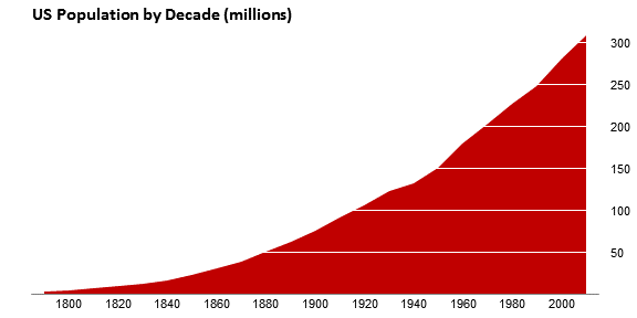
You can do the same thing with area charts:
Josh says
Hi Jon
Is there any way to achieve this effect with a bar chart?
Josh
Jon Peltier says
Josh –
Sure. Make the bar chart. Add the XY series so points go along the top or bottom edge of the chart, and use vertical error bars on the XY series.
Josh says
Jon
Placing the XY series is the bit I’m not sure about.
I’ve got the lines on my chart but they don’t align with axis labels.
Josh
Jon Peltier says
Add the XY data to the bar chart. Select the added series, and change it to an XY type. Excel 2007 and later versions assigns it to the secondary axis, and draws a secondary vertical axis but not a secondary horizontal axis. This makes the XY points use the primary horizontal axis for horizontal placement, and no further adjustment is needed. If somehow you’ve got a secondary horizontal axis, it might not be lined up with the primary horizontal axis.
Excel 2003 and earlier also assigns the XY series to the secondary axis, and draws both secondary horizontal and vertical axes. You cannot delete the secondary horizontal axis and use the primary horizontal axis to position the XY points. You have to manually adjust the scales of the two horizontal axes so the XY points go where you want them.
Josh says
Got it. For some reason I had the chart type as line series rather than XY series. Thanks for your help.
Your blog is great by the way!
Josh says
Jon
A follow up question:
Is there any way to get this to work so that I can still have a primary vertical axis showing?
Right now if I put a axis in it has stripes from the white error bars.
Josh
Jon Peltier says
Josh –
You could position the XY points so they lie not on the axis, but slightly inside it (23.45 in my original column chart, not 23.5), then make the error bars just long enough to cover the bars, but not extend all the way to the opposite edge of the chart (22.9, not 23).
Josh says
Jon
That worked perfectly! Thanks very much I really appreciate your help.
Josh
Para says
Is there a way to do this with a stacked bar chart?
Jon Peltier says
Para –
Sure. The dummy points will be along the bottom axis, with X values corresponding to the gridline locations, and Y values of zero. The error bars will be positive vertical error bars with the value you need to cross the chart bottom to top.