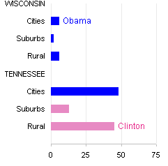
I’ve decided to follow up to my recent Close Races post. My last chart in that post was a dot plot, and the lines were dark enough to detract from the plotted points (below left). I’ve lightened the lines (below right) to reduce this effect, while keeping the lines to help viewers trace the series. The lighter lines seem to help a bit. I’ve also replaced the teal/cyan (hard to view”) with a plum shade for Clinton.


In my recent post I had showed a two-sided bar chart comparing the two candidates’ vote totals, based on a chart in Kaiser’s Close Races post on the Junk Charts blog:

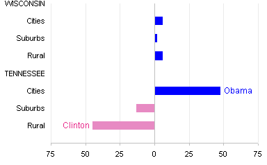
This is an effective display of the election results, though it is difficult to compare vote totals in close races. Some readers (for example, Andreas) of my earlier post in this blog and of Kaiser’s original Close Races post would have preferred to see not the totals for both candidates, but instead a simple summary plot showing the margin of victory by the winner.

I’m not sure, but I think I prefer the version with both candidates’ vote totals. The difference-only chart has the advantage that it need not be as large as the two-sided chart. I’ve flipped the Clinton votes so both candidates’ winning margins are plotted to the right, in different colors, and I’ve shrunk the plot area in half:


Rod McInnis says
I have a few favorite tricks to making line charts more readable. I set the marker Foreground color to white while using a matching marker background and line color. This brings more attention to the data point. (Sometimes I’ll use a lighter color for the line.) I also tend to use the diamond shaped marker because the corners of the diamonds correspond the the exact point being plotted.
Jon Peltier says
Actually, I often use diamond markers instead of squares. In an XY chart, where there may be regions where points are overlapping, I use a foreground (marker border) color but no background (marker fill) color. This helps judge density of points, or multiple points in close proximity.
I’ve used the white foreground (marker border) color only rarely, but I’d expect it to make the markers stand out with respect to the lines.
Andreas Lipphardt says
Hi Jon,
I have the feeling that you could improve the Bar colors slightly. The Obama
blue is too vivid compared to the Clinton red and clearly stands out.
Maybe
– a less saturated Obama blue R:112/ G:154/ B:209
– a more saturated, darker Clinton Red R:205/ G:97 / B:97
Andreas
Jon Peltier says
Andreas – Excellent point, especially since one of my early posts was about using colors in Excel charts. I went to the custom palette I designed using the Color Brewer utility, and picked out a green/teal for Obama (the custom blue was too purple, gotta fix that).
If I were doing this chart for real, I’d do something a bit more elegant with the state name labels, but I thought this was better than the way a vertical dual category axis would have looked.