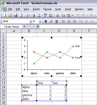
There is a handy feature of Excel that makes it easier to manipulate the source data of a chart. When the chart is embedded in the same sheet that contains its data, and the data range is “well-formed” (I’ll define this later), the data range is highlighted with up to three rectangular outlines.
This highlighting is displayed when the chart area of the chart is selected…
… and when the plot area of the chart is selected.
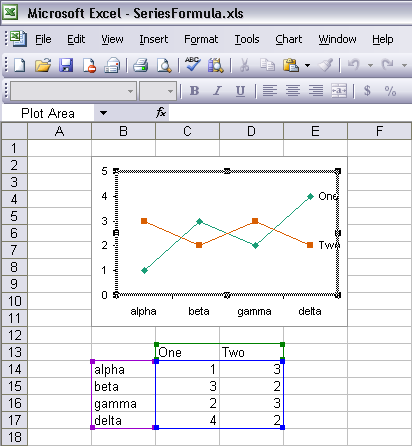
The X values are highlighted with a purple border, the series names with a green border, and the Y values with a blue border. If the series names or the X values have not been defined, the corresponding colored borders are not displayed.
Examining the Chart Source Data Range
The original source data range which is illustrated in this screen shot
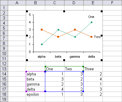
is referenced in the Data Range input box in the Classic Excel (up to 2003) Source Data dialog
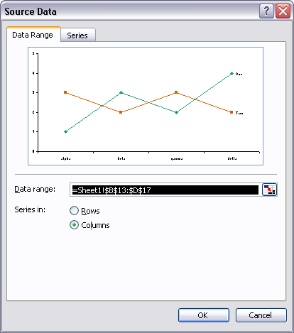
and in the Chart Data Range input box in the Excel 2007 Select Data Source dialog.
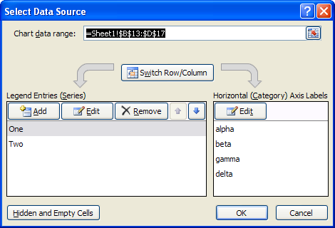
When focus is on these input boxes, the source data range is outlined with the “marching ants” border.
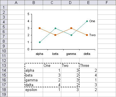
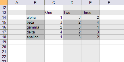
The source data range is “well formed” because it is defined by the intersection (below, dark gray) of entire rows and entire columns (light gray). The series names and the X values are aligned with the Y values.

Not only do these highlights show the location of the chart data, they can be manually adjusted without opening a dialog or editing the series formulas.
Adjusting the Chart Source Data Range
When the mouse passes over the cornerof a highlighted region, the border becomes thicker, and the cursor is replaced by the northwest-southeast arrow icon, indicating to an alert user that the range can be resized. In this view, the range has been stretched by one row and one column.

The Y values range can be resized in both directions, but it cannot be shrunk to zero rows or columns, and it cannot be stretched backward to overlap the X values or series names. The series names range can be stretched only in the direction to add or remove series names, horizontally in the view above. The X values range can be stretched only in the direction to add or remove points, horizontally in this view. When one of these ranges is resized, the other ranges resize accordingly.
When the mouse passes over the edge of a highlighted region, the border becomes thicker, and the cursor is replaced by the four-arrow icon, indicating that the range can be moved.

The screen shot below shows the Y values range dragged one row down and one column right.

The Y values range can be moved in both directions, but it cannot be moved backward to overlap the X values or series names. The series names range can be moved only in the direction to change series names, horizontally in the view above. The X values range can be movedonly in the direction to change which points are plotted, vertically in this view. When one of these ranges is moved, the other ranges move accordingly.
The Excel 2003 Data Range input box shows the address of this multiple area range

as does the Excel 2007 Chart Data Range input box.

This areas of this multiple-area range are surrounded by the marching ants.

We can show that although the range consists of multiple areas, it is still well-formed. The areas of the range can be defined by the intersection of entire rows and entire columns.
A Poorly Formed Chart Source Data Range
What happens when the range is not well-formed? In the following, the Y values range for series Two in the range above chart has been offset one row upward (pink).

This offset has disturbed the neat arrangement of the chart’s source data, and Excel cannot readily display such a range. Instead, Excel 2003 explains that the data range is too complex to be displayed, and warns you that if you select another range, it will wipe out all of the series you’ve painstakingly added to your chart.
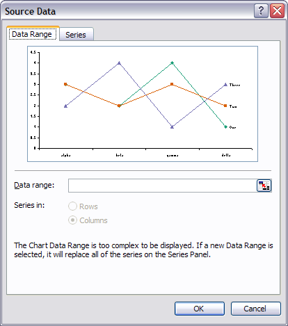
Excel 2007 displays the same explanation and warning.

I hope this feature will make your charting gymnastics easier. In a future post I’ll show how you can use related highlighting that shows the name, X values, and Y values of a single series when it is selected.
This article provides a cleaner explanation of this topic, which was previously covered in Highlighted Chart Source Data.


Syed Altaf says
Hi, Thanks for the wonderful explanation. :-)
I have a problem . . .I want to change the Color of the name reflecting E.g. Alpha Beta Gama delta I want one of these to be Highlited in different color. . .
Please guide me . .Thankyou!!
Jon Peltier says
Syed –
The highlighting described in this article uses the stated colors, without any way to change them. They are a convenience to the person manipulating the chart data range, and not intended as an aid to data visualization.
If you want to change the color of one label on the category axis, check out the techniques in Individually Formatted Category Axis Labels.