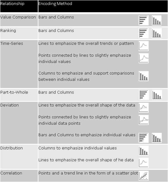
In Chart Rules, As Simple as Possible, But Not Any Simpler!, More Information per Pixel! (the blog of XLCubed, the BonaVista Systems – MicroCharts parent company) has posted some comprehensive chart type selection guidelines, to follow up the recent brouhaha over pie and bar charts. It’s not inappropriate to repurpose a quotation from Einstein, because it reminds us that a data presentation should be simplified to the extent possible, without oversimplifying all meaning out of it.
I am recreating a portion of the XLCubed guidelines here, which shows for a given class of relationship between variables, which chart type you should use.
If you want to follow up on the recent posts, here is a roughly chronological list of posts that I’ve followed:
- The three laws of great graphs, by Seth Grodin
- Seth’s Three Laws of Great Graphs, this blog
- Bar graphs vs. Pie charts, follow-up by Seth Grodin
- Bar graphs vs. Pie charts, follow-up on this blog
- Peltier Loves Pie, on Daily Dose of Excel
- Seth Godin on Great Graphs: A Very Light Purple Cow by Jorge Camoes of Charts
- Seth Godin on charts by Kaiser Fung of Junk Charts
- On Seth Godin on Charts, this blog
- Peltier Loves Pie, this blog
- Chart Rules, As Simple as Possible, But Not Any Simpler!, in More Information per Pixel!
- Peltier Goes Bar Hopping, this blog
- Godin Dumps on Bar Charts; Data Visualization Record Falls to 1 and 1, by Zach Gemignani, Juice Analytics


Colin Banfield says
Jon, excellent guide…and probably represents less than 10% of all charts available in Excel. So many junk charts to filter out…
Jon Peltier says
It gives me an idea for a charting add-in….