I heard a rumor that Excle 2010 had expanded limits to how many points you could plot in a chart. From Excel 97 through 2007, you were limited to 32,000 points per chart series, and 256,000 points per chart. As far as I was ever concerned, this was more than enough points to make a chart unreadable. Most charts have a plot area less than 250,000 pixels. The plot area in the following chart, which I’ve shaded yellow, is rather large, 605 x 423 pixels, or 255,915 total pixels. If every point is one pixel in size, and no points overlap, you couldn’t fit them all into this chart.
Never mind now long it takes to redraw.
![]()
Number of Points in a Series
Despite the limited utility of cramming data points on top of each other, I thought I’d investigate the rumored new limits. Here’s an Excel 2010 chart with 100 points; I’ve used the row number for X and 1/(row number) for Y.

Let’s skip 1000 points, here’s a chart with 10,000 points

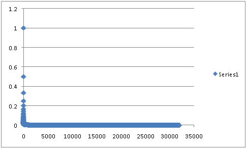
Keep piling on. Here’s a chart with 32,000 points, the maximum allowed in a series in earlier Excel versions.

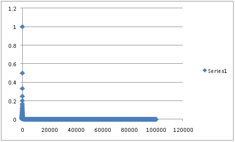
100,000 points, anyone?

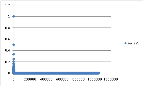
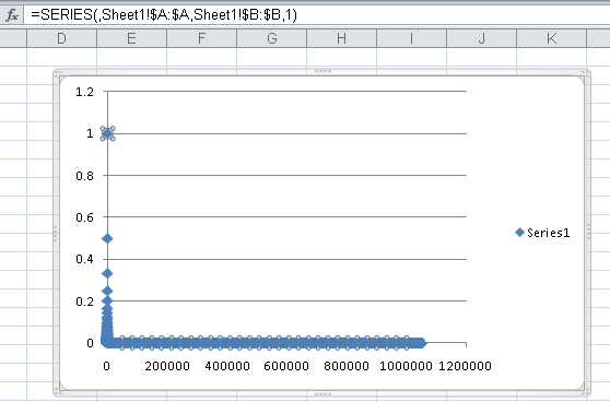
Okay, I’ll bite. Here’s a chart with all of column A as X values and all of column B as Y values. 1,048,576 points. And it didn’t choke. It took a while to redraw, of course.

Check out this unique chart series formula. It uses the entire columns in the definitions of X and Y.

Number of Series in a Chart
I tried the same thing with the number of chart series. This is what 100 series look like in a chart. The X values are 1 through 25. Series 1 uses Y values 2 to 26, Series 2 uses 3 to 27, and so forth.

Here’s the same chart with 255 series, the maximum number of series in a chart in prior versions of Excel.

I tried adding more, and learned I’d exceeded the limit.

Summary
The number of series allowed in a chart in Excel 2010 has remained the same as in earlier versions, 255 series, but the number of points in a series has increased dramatically, from 32,000 to 1,048,576, so that entire columns in the larger grid of Excel 2007 & 2010 can be used as the source data of a chart series.
The total number of points allowed in a chart has obviously increased, since the old limit of 256,000 points is smaller than the new limit on points per series. Since drawing one series with a million points took over a minute, I did not have time to explore this limit. (Hmm, I also didn’t check whether the help files have yet been updated with the new limits.)


AdamV says
No, the online and offline help for Excel 2010 both have the old limits at the moment. But then the offline help is also labelled as being for 2007, so this looks like they simply have not replaced those files yet.
You are absolutely right – this does seem to be raising or removing a limit for some pretty arbitrary reasoning, beyond the usual level of resolution available, particularly for on-screen use. I guess you could have much larger charts which you would have to show full screen or possibly scroll around to see anything worthwhile – or use some kind of “deep zoom” facility to move in and see more detail.
derek says
I have a little private challenge to myself called the Million Point Challenge, inspired by your remarks on large data sets being hard to graph usefully. The idea is to create a small multiple of at least four scatter graphs, having a total of a million data points, printed on a page no larger than A3, without the picture being a mess.
(it has to be at least four, because Excel before 2007 allows at most a quarter million points)
I’ve made good progress with the techniques necessary, but I’m now stalled by a different problem: just how often do any of us ever see a genuinely interesting data set that has a million points? So now I’m looking out for data I can use to demo the techniques. It should ideally have at least two two quantitative dimensions and at least one category dimension (or a quantitative dimension that can be binned into categories) and have interesting structure.
Bob says
In my old job in a laboratory, I was able to produce very high resolution charts with excel of gamma ray spectra of Uranium powders.
Getting the data into excel was tedious, but the quality of the chart was great. I used the thinnest line possible. This was back in the days of 20 Mhz 386 machines being “state of the art”.
Spectral analysis may be a venue for these huge data sets.
Peder Schmedling says
Interesting post. According to the below blog-entry on the Microsoft Excel Team blog, the number of points per data series is limited by the available memory on the machine..
https://blogs.office.com/2009/08/25/more-charting-enhancements-in-excel-2010/
What setup did you test this on?
(OS, 32/64bit, RAM installed?)
A 64bit setup should be able to address an enormous amount of memory, but I don’t know what the memory manager in post-2003 versions of Excel can cope with..
Jon Peltier says
I have used 32 bit versions of 2010 TP and 2003 SP3 on a laptop with around 1.5MB of RAM running 32 bit Windows XP SP3.
Jim says
Where does one obtain Excel 2010? Please email me if you know. [email protected].
THANKS !!
Jon Peltier says
Excel 2010 is only available now to beta testers and reviewers.
DaleW says
Jon,
Given that Excel 2003 can only utilize 1 GB of memory, and Excel 2007 can only utilize 2 GB of memory, but Excel 2010 can utilize (in theory) 8000 GB of memory in its 64-bit version . . . is it almost time for power users (or their employers) to invest in a new computer with a 64-bit OS and 6 GB or more of RAM for our bigger spreadsheets?
Dale
Eike Kaiser says
Re: your notes on chart point limits in Excel 2010
There is a very restrictive limit in X-Y scatter plots. I’ve found that when the two series charted exceed 2899 data points, the chart turns into a time series plot of just the second (Y) data set. My data ranges from 0-10 in the X series, and 0-16 in the Y.
Obviously in such a chart there are many overlying data points, a situation not addressed in your comments. The chart remains usefull though, in highlighting relationships amongst extreme values in each series. Further, by modifying the point shape, colour, and border style (in my case, changing one feature each month in the daily data), much of the time series value of the chart is retained. This makes it almost a 3-D chart, very valuable analytically.
Excel 2003 (from which I just switched to Excel 2010) did not have this restriction.
Any insights or work-arounds would be appreciated.
Jon Peltier says
Eike –
The only way I could duplicate your result was if the 2900th X value was text, not a number. This causes the chart to treat all X values as non-numeric labels, giving the chart the appearance of a time series.
Like the proverbial bad apple, it only takes one non-numeric X value to screw up the whole set of X values.
The non-numeric X value might be a number formatted as text. Remove horizontal alignment from the data, and look for a number that is left-aligned, unlike all the well-behaved, right-aligned numbers.
Daniel Smith says
It is not true that plotting a much larger number of points than you can possibly discern on the screen is useless. Imagine that you have 1 million extremely noisy x/y values and you don’t know if there is any pattern in them, for instance is there some line along which a lot of the values lie? or are they in two clusters? or in some other pattern.
A quick way to find that out is to plot them all on an x/y chart.
One way to cope with this with a smaller series limit would be to randomist the order of the values and then take 1 in 1000 and plot them, hoping that the pattern was strong enough to still show, or to build a 2-d histogram. however plotting them all on a chart is definitely a quick and useful technique.
Jon Peltier says
Daniel –
Point taken. It may sometimes be useful to show gazillions of points on a chart, depending on the nature of the distribution of these points, and on the familiarity with the data of those using the chart. You need techniques that help to show the density of points, such as semitransparent markers, so darker regions mean more points are obscuring the white background. Other alternatives are to set up bins along one axis, and then showing distribution within the bins, visualizing with box plots, for instance, or with stacked bars that show each decile of the distribution for the bins. Or you could use a smoothing technique like Loess to deconvolute the data. Or you could decimate the data, as you suggested, hoping to tease out order without destroying patterns.
In my experience, the reason people show every last data point to the detriment of clarity and rendering speed is loss aversion. All of this data is cluttering up their worksheet, so they need to show it.
Brent says
I upgraded to Excel 2010 with the hope that the number of series would be greater than 255. I just purchased Excel 2013 which may provide greater latitude.
I have been creating scatter charts to identify when a large real estae office has taken listing over a three year period broken down by month and dollar amount (in $1,000 increments) which generaly represents hundres of listings. I don’t know how to set up a defaut setting to format all “points” so they are the same color, shape, size, etc. Excel wants to differeniate each point and the only way I know how to make each point the same is to “fomate each individualy” which becomes a Herculean task. Any help would be appreciated.
Jon Peltier says
Brent –
Why do you need over 255 series? Are you assigning series names to each point, and using these as data labels?
You can (tediously) apply labels to individual points in a uniformly formatted XY series, or use Rob Bovey’s Chart Labeler (http://appspro.com). And I haven’t tried it yet, but Excel 2013 finally has this feature, the ability to add labels from a range of cells to a chart series, baked in.
shawn says
It is a very helpful investigation, thank you very much
Richard says
A common application where one needs more than 32k points is a data collection experiment from a sensor of some kind; one data point a second for 24 hours is 86,400 points, already exceeding the old limit on data points per series.
For example, if the question is whether the sensor output went above baseline at any time during the duration of the test – the easiest way is to plot the data a graph and see if and where the data is above baseline. One can then expand that section if needed, or correlate to the conditions at that time etc. etc.
Jon Peltier says
Richard –
In the old days we would have to set up the data in groups of 32,000 points, and then format the series to look the same. In this way I could plot your 86,400 points using three series. Excel 2010 and later make it easier.
Randy says
Clearly I’m not the expert that several posters on this site seem to be, but am nonetheless taking a crack at using a bar graph to build a Gantt chart. Am having reasonable success, but as I go to expand it, I seem to be hitting a wall at what Excel will do, or what my PC will do.
Charting an array of data that’s 80 rows by 10 columns works okay (though Grouping and hiding some rows of data creates havoc on the color scheme of the cart).
Pushing the array to 40 columns, however, causes the charting to fail. All the images on the chart seem to disappear. They’re not visible, and they’re not really there but set to No Fill and No Line, only appearing to be gone. Rather, they seem to be really gone. Waiting a while for it to finish processing doesn’t help.
So, the question is, what has reached it’s limit, Excel or my PC? If Excel, any idea what the max number of column is that I ought to be able to successfully plot?
Thx!
Jon Peltier says
Randy –
There should be no limit that would prevent plotting an 80×40 grid in an Excel stacked bar chart, plotting series by columns or by rows. I’ve just done it as a test, and the data plots on the chart, though that much data is really not legible.
You may need to repair Office, especially if there is other stuff going on.
You may be interested in a recent tutorial, Gantt Charts in Microsoft Excel.
Randy says
Hey Jon,
Thanks for getting back to me. Found the problem… I wasn’t actually going through the steps to “add” the data sets. Rookie mistake. Caught it and all points started plotting.
I did find out, however, that the 3D style formatting that I was applying was prohibitive, though. About 20-30% the way through plotting all points it would just “give up” and only plot the shadow effect, leaving the actual fill missing. Result was a “fuzzy” Gantt chart. Perhaps a consequence of running 32 bit. Switched to a simple solid fill and all runs okay.
Thanks again!
Jon Peltier says
Randy –
You’re better off without those 3D effects. The 2D chart is cleaner and doesn’t have excess formatting that risks obscuring features of your data.
Bob Melville says
Plotting of gps data points recorded every second over 24 hours or longer creates 86400 points / day.
This is a common occurrence in my bike riding analysis, especially where power is included.
The xy plot uses all the points which plot with no problems in Excel 10.
Also plot the variables on xy charts with time (seconds) or distance on the x axis.
Can zoom or reset the axes as required.