I’ve been corresponding frequently with Paresh Shah (Visual Quest blog). Unlike me, Paresh is rather a fan of circular charts, as we learned from his comments under the recent ChartBusters post, Reworking a New York Times Box of Donuts. Paresh did point out to me, and has since blogged about, a circular chart he doesn’t like. This graphic from the Economic Times of India uses two pie charts to show changes in how people spend their free time, from 2005 to 2010.
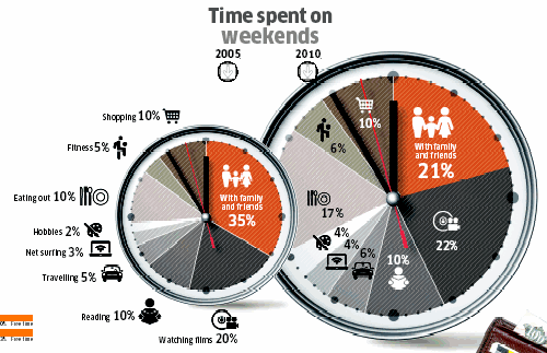
What’s wrong with this chart? Well, it’s two pies used to try to show different values over time. Why is this bad? Despite their proximity, each pie is a separate entity, and we have to look at one of them, load that into short term memory, then look at the other, then look back. In order to make the comparisons, we need to look back and forth many times, as if watching a table tennis tournament. It’s hard to make a lot of comparisons, because within a given pie, and from pie to pie, the different slices are misoriented. We could count minutes around the circumference, but this confuses the false measurement of minutes with the angular measurement that represents percentages.
This graphic is also very cluttered. One pie has icons and labels, while the other only has icons, so we must use the first pie as a legend. Since the topic is time, the pies are decorated like clockfaces, complete with tick marks for hours and minutes to confuse us, and hour, minute, and second hands to disrupt out view of each chart. In addition, the two pies are shown in different sizes, so we wonder whether the overall pie diameters are significant. And one pie overlaps the other, but the damage was already done.
“Improving” the Pie Charts
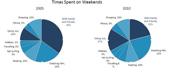
Paresh reworked the chart and came up with the following pair of pies. He criticized the original pies for having no baselines, but then neither have his. He removed the hour and minute tickmarks, but added his own markers at 45° intervals. At least there’s no clutter on the face of each pie, so you can see that the dark blue wedge decreased a lot in size, and the, uh, other dark blue wedge increased by almost as much. The rest of the wedges look about the same. I discovered later that there were three fill colors used, for large, small, and no changes.
I put on my Chart Busters cap, and made my own pies, partly to correct the ills of the two previous sets (I removed the markers around the circumference, and sorted the wedges), and partly to demonstrate once again that pies aren’t so effective at showing changes. Sure, we can see the large changes I mentioned before, and the two smallest slices seem to have grown. But all the other slices have changed positions around the pies, so as stated, there’s no baseline.
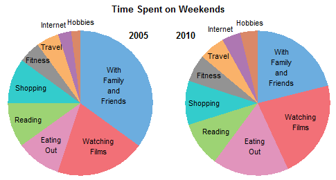
Hint: “Watching Films” (red) increased its value by 10%, but you wouldn’t know it from this graphic.
I don’t know about anyone else, but when I see two pie charts, I want to draw on a nose and mouth.
Unsuccessful Line Charts
The general consensus about plotting trends over time tells us to use line charts. I put this data into a line chart, and got a result which was not very good. There are obviously some points that are hidden behind the ones we can see, and it’s hard to identify the series.
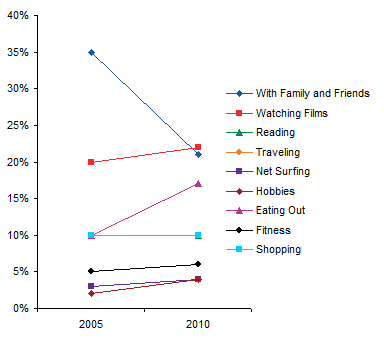
To identify chart series more clearly, I like to remove the legend, and place data labels by each series in the chart. That didn’t help in this case. Out of nine labels, three pairs are completely overlapped, and another pair is touching. Conventional wisdom has not helped much, though at least we can see that most series saw changes from start to finish.

Semi-Satisfactory Bar Charts
Okay, we know bar charts can be effective when comparing values. In this bar chart, clustered by year, it is easy to compare percentages within each year, but not between years.
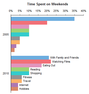
Transpose the data and group by category, and it’s easy to compare by year, and we haven’t lost much within each year. Time on the vertical axis is a bit irregular, though, and rotating the chart will result in hard to read category labels.

Stacked Bar and Area Charts
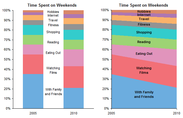
My comment to Pradesh was that his use of markers around the circumference of a pie chart was like adding a numerical scale. Might as well straighten out the scale and make stacked bar or stacked area charts. These aren’t too bad, but it’s hard to tell whether “Watching Films”, “Reading”, “Shopping”, and a few others changed during the five years.
Panel Chart – Hey, This Works!
The line chart is still best at showing the trends, but what if we didn’t have to overlap all the series? Let’s put each one into its own panel of a panel chart.

This graph clearly shows even the smallest change, and preserves the percentages as well. Apparently everyone has become bored with their friends and family, and is spending more time on other activities.


Tony says
Jon, you had me at the side by side bar chart and was pleasantly surprised to see the panel version. So, less family time and more time eating out. Are they eating out by themselves???
SteveT says
Jon,
Yes this is a horible pie chart! Also, any remake into a pie is equally bad.
I do like your panel chart. Kinda like the grammy bump.
To save I strain and short term memory, I would recommend removing the Verticle gridlines and putting the labels on the line or a data point.
Also, still don’t believe that an Area chart would be good for the NYtimes donuts, but perhaps the panel chart would be a better compromise than a donut.
Joe Mako says
Here is another view that makes it clear that time that was previously reserved for Family/Friend time is being distributed among other activities:
http://public.tableausoftware.com/views/DifferenceinPercent/Dashboard
[here’s a static version of Joe’s chart]

Chad says
Jon,
Good post, though I would like to call your attention to one small fact:
Everything you have pointed out about lack of baseline, etc, etc, etc, makes complete logical sense, and in any kind of “serious” business environment, the panel chart should be used to provide the audience with the most objective, valuable basis for comparison.
HOWEVER, when selling newspapers, magazines, etc, the flashier, colourful, loud versions invariably win out in editorial rooms. What I’m getting at, is it really depends on your audience, particularly when it comes to making money.
This also explains why excessive /superfluous / bright / loud packaging continues to persist even though we all know there is nothing utilitarian about it.
Just my 2 cents.
Chad
Jon Peltier says
Steve –
I debated what to do with the labels. And I wanted to keep at least faint vertical lines, to preserve the association with the labels across the top. How’s this:
Joe –
Thanks for your chart. I hadn’t even considered a dot plot with that orientation, but it looks good.
Chad –
Very true, glitter is what sells. But, the infographic in question was in the middle of an economic magazine, albeit one apparently aimed at the general public, like Time magazine in the US.
Anonymous says
Hi Jon,
I like the final panel chart. Nice touch with the labels on the points. Does away with the need for the legend, and it is readily obvious.
Always something to learn here.
Cheers
Bob
ikkeman says
What is missing from your remakes are the actual numbers. Your remakes do show the trends much better, but What if the numbers are the point.
I couldn’t get a line or scatter combined with an Area chart – so I faked it using multiple stacked bar charts.
Matt says
I like the panel chart – nice and easy to read and gives a good at a glance view of the changes, rather than the pie which takes much too long to read/interpret/decode.
Joe’s chart is also good and makes for some interesting comparisons.
I’m not sure about ikkeman’s rendition of the data though – too many colours and jagged lines for me. Also seems to take up too much vertical space for the information it gives.
Matt
Jon Peltier says
Matt –
I think Ikkeman’s point was that value labels are more important than the value scale. I’ve added these labels to my chart:
Tim Wilson says
You had me at the side-by-side horizontal bar chart. But…maybe that’s because it seems like a very common convention used by some of the marketing analyst groups that I see content from. The panel chart, I think, probably is *better*…but it has to grapple with being somewhat “foreign” to the first-time viewer. I love watching the progression of options you try out on these things. More ChartBusters posts!
Muntz says
I have one suggestion regarding the labeling of data points in tune with providing the most information “bang for the buck” on the panel chart. Perhaps one might add a label to the 2010 data point which represents a percentage change from 2005. I would place the label above or below the data point, matching respective increases or decreases.
Personally, I’d simply subtract the 2005 amount from the 2010 amount (ie Family Friends: 21%-35% = -14%), but others might feel more comfortable displaying a relative change (ie [21%-35%]/35%= -40%). I think this choice depends subject matter and audience.
Muntz says
Oh, and one more point regarding jazzing up the chart for Chad ;)
Assuming the icons on the original chart are not copyrighted or trademarked, we might borrow those images (or creates similar ones) and incorporate them cleanly and creatively into the chart. They might be placed directly above or below the text labels (which by the way aren’t currently all on the same horizontal axis…making me cringe ever so slightly).
paresh says
The panel chart is definitely the best option [ excluding my pie chart version].
The major changes in the numbers are the time spent with friends and time eating out. The dark blue colours draws your attention to those segments and one can clearly see the change there in. The other segments and the changes therein are not that meaningful – one reason why the label are comparatively de-emphasised [ you can see that in the chart on my blog] – The objective of my pie chart was not to show the relative proportions of ALL the components [ as one normally does in a pie chart and obviously has been read as such by the viewers] but to draw attention to the two main components.
One issue with the panel chart – the reader may guess or have to compute whether all components are shown – do they add up to 100% – a problem which we do not have with the pie chart.
Different strokes !!
@Joe : I have a similar chart in my post.
Chad says
@ Muntz,
Thanks. I’m a strong believer in a little eye candy, so long as it doesn’t take away from the message. E.g. should be used sparingly. I’ve been doing this very successfully at the office with small, high resolution icons.
I also agree that the area chart doesn’t work on many levels. For instance, even once the data labels are added, some activities that have increased are still “going down” due to the downward visual slant. The last two categories illustrate this point perfectly. One has gone up only slightly (watching films) while the other has gone down dramatically (family time), though both appear to be “going down” at the same rate lol.
I quite like Joe’s approach, but it gets more points for creativity than readability. It would highly depend on the audience, but I’d say it may get “over analyzed”.
Lastly, there was a comment about showing relative changes (e.g. from 4% to 8% is a 100% change). VERY DANGEROUS and probably mathematically incorrect. One point that has not been said yet is WHAT ARE THE TOTAL HOURS being spent, and has that changed from 2005 to 2010 (e.g. are people sleeping more or less? haha)
Chad
Joe says
Hi Jon,
Really nice progression of charts. I just wanted to comment on the odd nature of the data. It is very easy to shade opinion polls by the form of the questions. Aside from “reading” virtually everything else on the chart (yes, even some hobbies) is something you will do with someone. I do not believe that a large percentage of the people in the survey were friendless orphans. Strangely all of the percentages add up to 100%. I think a look at the questions and how they were explained as well as any differences between the two polls would be of interest.
I strongly suspect that the time spent with family and friends was taken to mean aside from the other activities named. Even listing it last would have this effect.
Regards,
Joe
paresh says
“Strangely all the percentages add up to 100 % ………” the issue with the panel chart. Not really strange they do add up to 100% – the panel chart just confuses you.
Muntz says
@Chad
I think the assertion that the relative changes I mentioned are “VERY DANGEROUS and probably mathematically incorrect” may be an overstatement or incorrect itself. Run the numbers. Four percent of 24 hours is 0.96 hours. Eight percent is 1.92 hours. Relatively speaking, the time difference is a doubling (or as mentioned, an increase of 100%).
Granted, this is not the way percentage change information is generally presented. Right or wrong, usually the simple difference is given, not a relative difference. The simple differences will sum to zero, but the relative differences won’t generally. I guess it really all depends on what you’re trying to communicate and who you’re communicating to.
Since a percentage of a percentage (aka relative difference) may be confusing to some, I think you’re definitely on the right track in asking what the underlying number of total hours spent on each activity is. Besides, people don’t go around thinking about their days in terms of percentages…”I’ll call you in about 8% of a day”!
paresh says
A wonderful debate here as always – Jon provides a great forum.
The innovative aspect of the pie chart was the use of markers [ at 3hrs /6/9/12 and then at 50% intervals in between] and the use of colors to emphasise critical segments rather that all segments.
The relevant questions therefore are;
– Do the markers help us in assessing the segment percentages?
– What were the margin of errors [ your guess using the markers and the actual percentage]?
– Does the coloring help in identify the critical segment [ the segments with the maximum changes]?.
– If the markers become the norm for future pie charts would any “axis labels” be required.?
– In respect of the panel chart, was it clear that all the segments were covered? If the chart was seen without the preceeding discussion, would you assume that the segments add up to 100%.
Jon Peltier says
Paresh –
1. As I’ve stated, I don’t think your little markers improve readability of the data. They look like decorations, much like the clock-like decorations in the original version we all “like” so much. The kind of tickmark people might recognize would be radially oriented line segments. but to make these meaningful you’d have to also apply labels. An additional set of labels would simply add clutter to the chart.
The percentage labels added the points shows the exact values better than your circumferential markers and better than the wedges themselves. But then, you may as well use a table.
2. I see no reason to try to make a circumferential scale the norm for pie charts. If you need a scale, use a chart type with a scale that people already are used to using. Line charts, Bar charts, something familiar like that.
3. Showing multiple points with the same color caused me to look at how they might be grouped. There was no legend, so I had to guess. Okay, “Eating out” with “Friends and Family” could go together. But “Watching films”, “Net surfing”, and “Fitness”? I didn’t get the connection. It never dawned on me that color represented percentage change, and you buried that information elsewhere in the text.
4. There should be a notation on the panel chart that data for each year adds to 100%.
5. Unrelated to your comment, but we don’t even know that 100% of 2005 equals 100% of 2010. Did each year have the same total number of hours of free time? Doubtful. Maybe the number of hours spent with friends and family is really the same, but we have more time for these other activities.
paresh says
Jon,
I had hoped that others would respond to the questions.
We do need to try new things or we would still be stuck in the “good old days” –
Possibly I should have used one colour for all the other segments.
The original chart in the Economic Times provides information on the amount of free time – that is the reason for the two pies with different size. Did not want to divert attention to other aspects.
Jon Peltier says
The different sized pies indicated different totals? According to the bar chart elsewhere in the graphic, free time went from 50% to 63% of the (I guess) waking weekend hours. This is an increase of 25%. The pies in the graphic showed an increase in diameter of 61%, and an increase in area of 158%. This is another abuse of pie charts.
Without a legend, your use of colors adds nothing. But in any case, enhancements to pie charts will only keep us mired in the “good old days”.
Anders says
I believe that pie charts do not show change very well, and that the panel chart and the bar chart are the best ones shown in this thread.
The three most important points in this discussion:
– The “slices” with the biggest absolute change may not be the most important ones. If you ran a gym, the 20% increase in time spent on fitness may be more important than the fact that people spent less time with family and friends. The trend is easy to spot in the panel or bar chart, but impossible in the pie (unless you read the numbers). So coloring the slices with biggest absolute change do not help, it may even hide the important/interesting data.
– As mentioned, hours or minutes is a better unit then percentages here. People are used to measure the day in hours and minutes, and it will also show a change in the total hours spent on these activities (rather than a meaningless increase in total pie area). And since 5% in 2005 does not translate into the same amount of time as 5% in 2010, the increase and decrease in a slice may be misguiding or plain wrong when you’re looking at trends.
– It’s actually meaningless that the categories add up to 100%. Doesn’t anybody sleep or work during the weekend? And the categories aren’t mutually exclusive, e.g. I often enjoy a meal out (or at home) or watch a movie with friends and family.
Jon Peltier says
I converted the percentages to hours, assuming the weekend has 48 hours, but people sleep 8 hours per day, leaving 32 hours of waking time. 50% or 16 hours were spent on leisure in 2005, 63% or 20.2 hours were spent on leisure in 2010. Here’s the updated panel chart, which tells a new story.
paresh says
If you were a marketing executive which panel chart/pie chart would you want to analyse. What is the objective of the analytical exercise – where would I spend the marketing Yuans [alias dollars] ? Whether the leisure time is increasing or remaining the same, I would be looking at segments which are significant and increasing at a fast clip.
Jon Peltier says
Paresh –
“I would be looking at segments which are significant and increasing at a fast clip.”
Then I think you’d better dispense with the pie charts and check out something better. For example, the latest panel chart I posted shows significant growth in almost all activities. The pies at best show growth in only one.
paresh says
In accounting there is a concept of “Materiality” a concept which is relevant to us in our graphical endeavours too. Giving equal emphasis to all the segments is, to my mind, not the way to go.
Anyway I am now moving on to other areas – you will like my current post on “Simple Explanations : Heads I win, Tails you lose” – not directly related to data visualization though.
Jon Peltier says
There is a difference between giving equal emphasis to all segments (which I have not done) and clearly showing data so one can make a more informed decision. Otherwise, you may as well just say “the segment with largest growth expanded by X%”.
ikkeman says
Paresh,
I think there are exactly two reasons for using a pie chart –
1) comparing two sets composed of several sub-sets. The pie chart is very helpful in determining which halve is bigger than another. Make the one category different shades of red and the other different shades of blue (or whatever color you like) – Thus it is restricted to duopolies. Intel vs AMD (subset per processor type), Airbus vs Boeing (subset per aircraft type), Free time vs Work time (subset per activity).
2) Marketing and hiding data. The Pie chart has the almost unique property of being pretty and unreadable at the same time. Adding hour and minute hands and pretty icons just hides more data.
Don’t get me wrong, this is a strength – sometimes it is better to not include useless detail and only use a gross overview to get a notion across – but it’s not something that is acceptable in many areas of heavy excel use.
@Jon,
How did you get the value labels added to the area chart in that manner.
The area chart with value labels still gets my vote for displaying this data. If you allow the left hand and right hand value axis to be of different size (more than 100% on one size) you can also capture the change in absolute hours. and it’s easily expandable to multiple years.
Anders says
Excellent rework of the panel chart with hours. As you said, this tells a different story the %-chart, a difference that’s not possible to show with a pie, but yet might be of big importance. A fine example of the limited use for pie charts.
As far as coloring the critical segments in the pie: I don’t believe the slight difference in shading is enough to make it stand out. As Jon said, I thought it was confusing and by preselecting those slices with biggest absolute change, you actually hide some of the (more?) interesting points. And the panel chart has a “built in” emphasis on the categories with large absolute change. Look at “With Family and Friends” and “Eating Out” in the panel chart; the eye are drawn to it due to the large angle of the slope and the long line between 2005 and 2010. Much better then the confusing difference in shading on the pies.
jonmcrawford says
I’m not sure I like your panel chart the best, although I’m still mulling it over, since it definitely shows the change better than the 100% stacked option, and regular line charts with two data points are annoying. However, wondering why you didn’t use a horizontal 100% stacked bar chart as one of your examples? I’ve found those useful before, as people seem to (anecdotal based on my experience) find it easier to compare than the vertical stack.
Also, the arbitrary colors are distracting, (i.e. red means nothing, green means nothing, unless you’re trying to bias the reader toward/away from Reading/Watching Films, etc) you could get away with a simple black to white (or gray to light gray, probably) gradient as you move from category to category and convey just as much information.
Have a quick mockup in Excel, if you wished, can’t get to the image-sharing sites from here and don’t have a blog, email me if you care.
Down with pie charts! (but Up With Pie)
Jon Peltier says
Ikkeman –
I used XY series, with Y values midway between the edges of each area, and with X values of 1 (left side of the chart) or 2 (right side), then added custom data labels with the percentages. I used Rob Bovey’s Chart Labeler (from http://appspro.com ).
Prakash Singh Gusain says
I loved the Panel Chart… a changed way to plot the data graphically….
SteveT says
Another Donut emerges. Not sure how this would be better displayed.
Fowmy says
I was wondering how I could make such a beautiful Panel Chart like the Jon made, then I came up with my own imagination and tried something similar.
http://cid-18c2ae6c7e70126a.office.live.com/self.aspx/.Documents/Time%20Spent%20Chart.xlsx
Regards
Fowmy
Kelly says
To see the equation that describes a trendline, select the line, and then select Show Equation. You can drag this equation to wherever you want it to appear on the slide.
Jon Peltier says
Kelly –
The point wasn’t how to show a trendline on a chart (though, of course, you can’t put a trendline onto a pie chart no matter what you try). The point is that you can’t clearly see trends from one pie chart to the next.