This is a guest post written by my colleague Jon Acampora.
The Problem
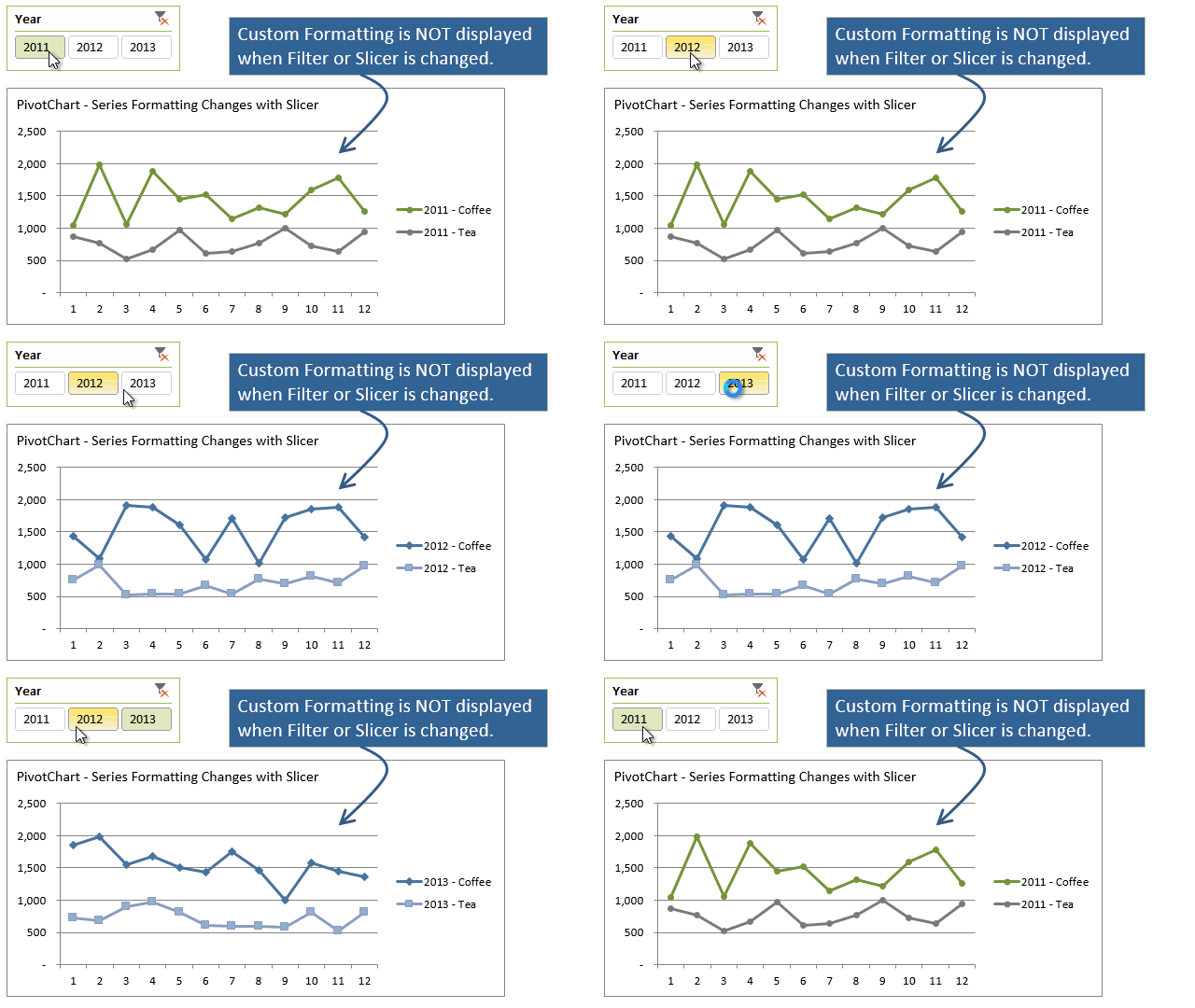
When you apply a filter or slicer to a PivotChart the custom formatting can change with each change in the filter. This can be very frustrating and require you to apply the custom formatting to each possible view or slice of the data.
The screencast below shows this problem. I customized the colors of the lines to green and grey for the Year 2011, but the line colors change back to the default colors when I filter the data for 2012. This happens when the data is filtered by a slicer or manually filtered it in the PivotTable.
This post will explain why this happens and present an alternative solution that will save you time when creating PivotCharts with customized formatting. VBA or macros will NOT be needed for this to work, so it should be easy for anyone to implement.
Why Does This Happen?
It’s all about the cache…
Any changes to the formatting of a data series in a PivotChart are stored in a cache inside the Excel file. In the example below I made a few changes to the formatting of the lines in the chart from their default settings. The colors of the lines and the shapes of the markers were changed when the PivotTable was filtered for the Year 2011. As you can see in the screencast, when the PivotTable is filtered for the Year 2012 the line colors and markers change back to the default settings.
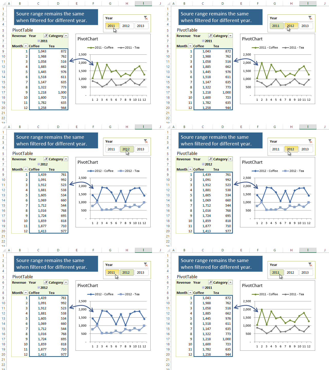
Even though the source range of the PivotChart remains the same, the formatting of the chart changes. This is an odd behavior until you understand that the formatting properties are saved and remembered by Excel.
Excel actually stores this data in a cache with all the other chart properties. This means that it remembers the exact formatting I applied for the Year 2011 only, and that is why the colors and formatting change back to my customization when the PivotTable is filtered for 2011.
To see this you have to dive under the hood of the Excel file. I included the XML code for the PivotChart in the sample file (download below). If you search through the code you can see a reference to “2011 – Coffee” and “2011 – Tea”. Below each of those lines are rows of code that contain the custom formatting settings I applied.

Since there is no reference to 2012 or 2013 in the chart’s cache, the default formatting for the chart is applied. I think it’s cool to be able to see the inner workings of the file and try to understand what is happening with the application. You can see the components that make up any Excel 2007+ file by changing the file extension to “.zip”, then opening the folder.
Why does this matter?
This behavior is annoying for the most part. If you click on a slicer or filter, you usually want to see the same custom formatting you applied for the other slices.
But understanding the behavior allows you to either use it to your advantage, or avoid it at design time. I will explain a solution below that allows you to avoid the behavior, but still use the PivotTable filtering and slicers.
It should also be noted that this behavior does not always happen. It depends on the setup of the PivotTable and the order of the row and column fields. If you have a very simple pivot table that only has one field in the column area and one field in the row area, then you might not experience this change in formatting at all. I am still trying to determine the exact parameters of the PivotTable that cause this to happen. Please let us know if you have any insights on this.
Pros and Cons
The advantage of this unique formatting behavior is that it allows you to apply customized formatting for each slice of your data. This could be useful if you want a series to stand out from the rest when the user is clicking through the slices. You could use it as an attention grabber to highlight some important trends.
The disadvantage is that a lot of the time you want all slices to display the same custom formatting. If you have a lot of slices then it becomes very tedious work to go through each slice and reapply the customized formatting. And it will also require maintenance in future periods. For example, when I get next year’s data for 2014 I will have to create custom formatting for that slice of the data.
Simple Workarounds
One way to prevent the formatting from changing is to create a regular chart that references the PivotTable data. With either of the following solutions we want to avoid the PivotChart all together, and instead create a regular chart. Again, the regular charts do NOT suffer from the formatting issues when filters are applied.
Solution #1
This can be accomplished by applying the technique in Jon’s article Making Regular Charts from PivotTables. With that technique you basically create a regular chart and then carefully add the data series to the chart by referencing areas within the PivotTable. You just have to be careful with the areas you select or reference because Excel has a tendency to want to convert the regular chart to a PivotChart.
Solution #2
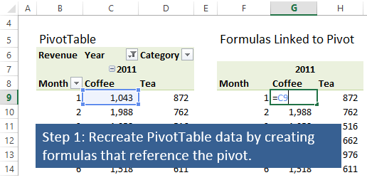
The other option is to create a new area on the worksheet that contains a replica of the PivotTable. This area just contains formulas that reference the PivotTable. You can either use the direct cell references like (=C9) or the GETPIVOTDATA() function to point to the PivotTable. You might want to use the GETPIVOTDATA function if you only want to display a subset of your PivotTable data in the chart.
The advantage of this technique is that once you have the formula based PivotTable setup, you can reference the entire area of the source data range to quickly create a chart that includes all your series. It might save you time over having to add the series individually as you do in solution #1.
The sample file (download below) contains an example of the technique that I will explain here.
The first step is to recreate the PivotTable data by creating formulas that reference the pivot. This can be done in cell adjacent to your PivotTable or on a separate worksheet. Just remember to leave enough blank rows/columns between your PivotTable and formula based table in case your PivotTable expands when filters are applied/removed.
Step two is to create a regular chart using the new formula driven table as the source of the chart. When the PivotTable is filtered or sliced, the formulas will automatically be updated and display the new numbers from the PivotTable. The chart will also be updated and display the new data.
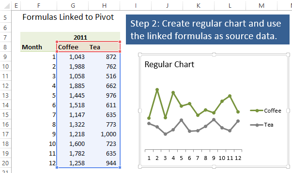
That’s it! You should now have a chart that retains it’s formatting when a slicer or filter is applied to a PivotTable. An example of this behavior can be seen in the screencast below.
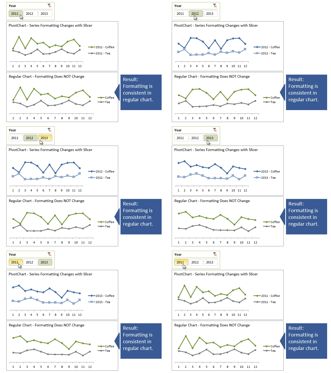
This solution works well for simple cases where the size of the data area stays the same every time the chart is updated. If the number of rows/columns in your PivotTable is increasing/decreasing every time you update the data, then this solution might take more maintenance or tweaking to work for you. But the general principle will help get you started and thinking about more advanced solutions if needed.
Jon has a great article on using VBA to create dynamic charts that explains a more advance approach to this issue.
Conclusion
Adding slicers to your PivotCharts and PivotTables is a great way to make your presentation interactive. PivotCharts allow you to link your chart to a data source so they can be refreshed dynamically with little maintenance. However, PivotCharts display some odd behavior when filtering charts with custom formatting. Understanding this behavior and planning for it at design time will save you time and frustration.
The example file can be downloaded below. Please leave a comment with any questions or suggestions. Thanks!
Download
 PivotChart Formatting Changes On Filter Slicer.xlsx (34.7 KiB)
About the Author
 Jon Acampora writes the blog at ExcelCampus.com where he is focused on helping users improve their Excel and VBA skills. His contributions include in-depth articles, video tutorials, and free add-ins to help save time and improve productivity. Jon is a newly-minted Microsoft Excel Most Valuable Professional (MVP).


