There is quite a discussion ongoing in Business intelligence vs. infotainment on Nathan Yau’s Flowing Data blog. It all started with a marketing guy from Teradata praising the innovation of the data visualization of David McCandless, designer of The Visual Miscellaneum. Stephen Few responded to Teradata’s praise of McCandless’ work in Teradata, David McCandless, and yet another detour for analytics, in which Few called McCandless to task (again) for passing off ineffective data art as cutting-edge information visualization. Nathan called attention to Stephen’s “rant”, and we were off to the races.
I will let the dozens of comments under Nathan’s post speak to the debate about McCandless’ efforts, which I find eye-catching but generally not effective at sharing actual information. However, I did want to share my thoughts on why so many of us continue to use ineffective visualization techniques.
“People like ineffective graphics”
A number of commenters stated that that people like attractive, sexy-looking presentations and fluffy pictures, regardless of their shortcomings. Andrew Vande Moere of Infosthetics suggests that we try to “learn why people actually prefer the less ‘effective’ infographic” (and he specifically mentioned “circular graphs”), so that we can improve the general state of data presentation.
Few replied, “I’m not aware of any research offhand that specifically attempts to explain why some people (certainly not all) prefer forms of display that don’t effectively provide what they need from the information.”
I have a hypothesis about this, pure speculation really, but others may add to it, or at least be amused.
Why do we love pie charts?
We don’t like ineffective graphics, we like familiar graphics.
We learn pie charts from Miss Jones in second grade. Miss Jones teaches many subjects and has to keep a classroom orderly and well-mannered, so she is by no means an expert in data visualization techniques. However, she is a person of authority and we naturally follow her example.
Over the years, we see many pie charts, taught to every second grader by all the well-meaning Miss Joneses out there. The pies are ubiquitous, so we become familiar with them, and we never realize their limitations.
Since all of out software packages, particularly the expensive shiny ones, offer pie charts prominently, we assume they are among the best charting options.
When we see an icon for a 3D pie chart, we click on it, because after all, it’s one whole D better than 2D.
Pies have been ingrained in our consciousness for so long, they become one of the first things we reach for.
Proof That Circular Graphics Are Not Intuitive
Maybe “proof” is too strong a word, but what follows is certainly a telling demonstration.
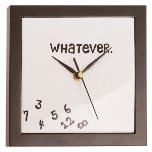
To anyone who doubts how unintuitive circular charts (pies etc.) truly are, I have a simple question: Have you ever taught a young child to read an analog clock?
If children know their numerals, they can read “8:47” on a digital clock, and at least know it’s between 8 and 9 o’clock. In time they even learn that :47 means closer to 9:00 than to 8:00. On an analog clock, 8:47 is obviously closer to the following hour, but knowing the hour isn’t easy. You either have to estimate the angle of the hour hand, or you have to count and interpolate between ticks or read the numerals. Clocks with a square face have lost some of the supposed effectiveness of circular symmetry. And don’t forget the additional difficulty provided by hours expressed in Roman numerals.
Disclosure: The clock images above are affiliate links to product pages on Amazon, where you can purchase such clocks, and earn me a teeny commission. There is a round Whatever clock hanging in the hall outside my office.
A Defense of Pie Charts
I have read Robert Kosara’s recent In Defense of Pie Charts in his Eager Eyes blog. He points out (as Stephen Few did way back in Save the Pies for Dessert (pdf)) that pies have one advantage over other types of graphs: you can readily compare combinations of adjacent wedges. In a pie with four wedges, for example, you can compare A+B to C+D. You can also compare A+D to B+C. However, unless this is planned it is simply the result of an accidental arrangement of the data, since you may in fact be more interested in comparing A+C to B+D.
I’ve always felt that this argument is an afterthought, a rationalization for having used that pie in the first place. If you knew a priori that the comparison of added data points was important, you could easily enough have prepared a stacked bar chart with A+C vs. B+D, or even with all pairs. This would of course be preceded by a bar chart comparing all of the individual points.

