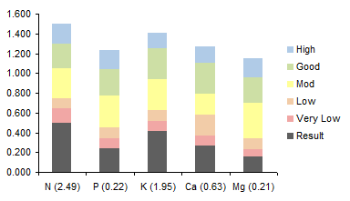
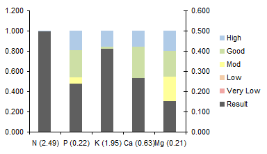
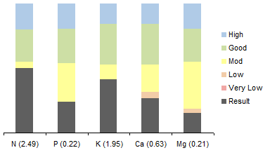
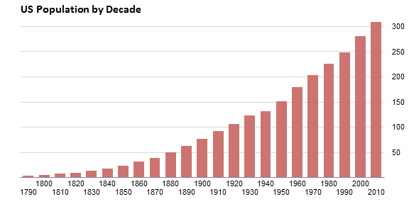
An astute reader asked how to achieve the gridline effect in the following chart. The gridlines are not gray lines running across the whole chart, behind the bars. Instead, the bars themselves appear to be cut into sections where the gridlines would have gone. There are in fact gridlines in the chart, with a line color to match the background, in front of the bars.

Gridlines
The thing is, gridlines are always in back of the bars, as shown in this chart. I’ve lightened the bars, and darkened and widened the gridlines, to show their normal relative positions. Don’t let me EVER catch you making gridlines like this.
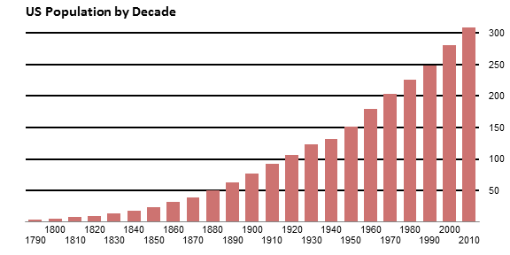
If gridlines are used at all, they should be thin light gray lines, as unobtrusive as possible.
But I digress.
The Data and Chart
Here is the population data for this exercise. Column B has numerical years. Column A has formulas as follows. The even decades (1800, 1820, etc.) simply link to the year; A3 has the formula =B3. The odd decades (1790, 1810, etc.) insert a line feed before the year; A2 has the formula =CHAR(10)&B2. The reason for this will become apparent when we get to it.

Here is the default chart created from the data in columns B and C.
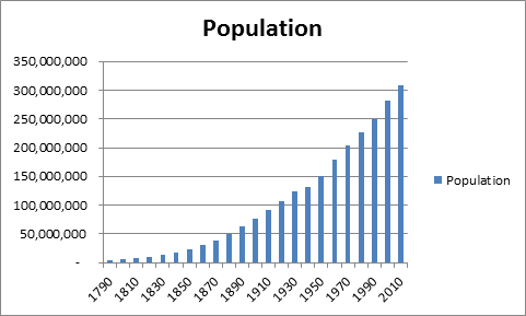
Let’s apply some formatting. That default title is way too large, perhaps the only concession to my over-50 eyes in all of the Office suite. The gap width is set to 50% so the bars are more prominent. And I’ve changed the source data for the chart to column A. The line feed in alternating cells staggers the X axis labels so the years are easier to read. The vertical axis is removed, because we’ll add our own later.

Adding Custom Gridlines
And now to add the gridlines. And how do we get gridlines in front of the data? Well, there are several ways to make horizontal lines in Excel charts. The crudest is simply to draw lines from the Shapes command on the Insert tab, but they’re hard to line up, and they don’t stay where you put them. What’s the trick?
Error bars. Error bars are positioned in front of bars in a chart. We’ll apply error bars, and color them white, so they appear to cut through the bars.
We’ll add a series of points along the right vertical edge of the chart, draw error bars to the left of these points, and add data labels to the right. Here is the data.

To get the millions to show without all of those extra zeros, apply a number format of “0,,” (without the quotes, duh). The zero by itself means use the number format with no decimal digits, and each comma after the zero means slice off one group of three zeros, one for thousands, another for millions.
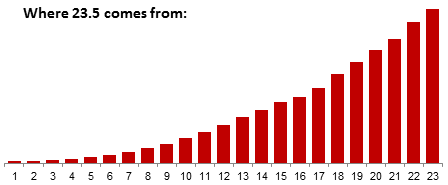
But that 23.5? People always ask me where that came from. The answer is easy once you know it. Let’s look at the chart without the year labels, and just count the bars. They are numbered 1 to 23 from left to right. The tickmarks on the axis between the bars are at the halves: the chart starts at 0.5, the next tickmark is at 1.5, all the way up to the tick at 23.5 at the right edge of the chart. We’ll add an XY series with the points directly above this tickmark, at X=23.5.
Copy the gridline data (two columns and all rows including the “million” label). Select the chart and use Paste Special to add the data to the chart. Make sure the Paste Special dialog has these options selected: New Series, Values in Columns, Series Names in First Row, Categories (X Labels) in First Column, and DON’T Replace Existing Categories.

And here is the chart with the added data. It’s in column chart form, but we’ll fix that.
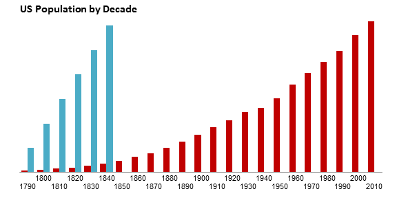
Right click on the added bars, choose Change Series Chart Type from the pop-up menu, and choose the XY Scatter type with markers only.

Excel moved the series to the Secondary axis, and dumped an extra set of axes into the chart. No problem, Format the XY series, and on the first tab of the Format Series dialog, choose Primary Axis.
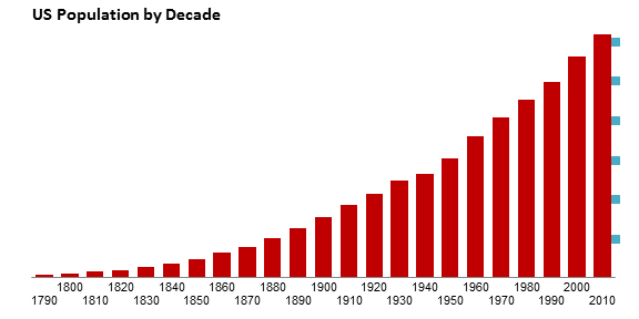
Now it’s time to add the error bars. Select the XY Series, and on the Chart Tools > Layout tab, click on Error Bars, More Error Bar Options.
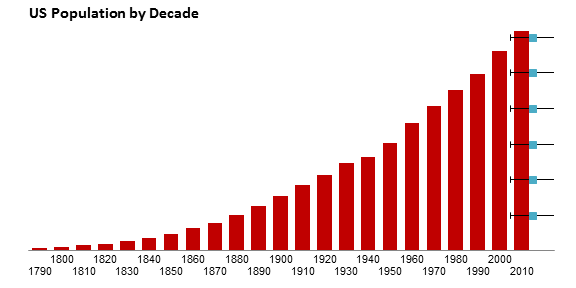
The horizontal error bars are easily visible: note how they lie in front of the bars. You can’t see the vertical error bars, because they are only one unit (one person) tall, but they are selected when you add the error bars. Close the Format Error Bars dialog and press delete to remove the vertical error bars.

Format the horizontal error bars. Choose the Minus direction, No Cap as the End Style, and a Fixed Value of 23 (see the explanatory chart above: the error bars reach from X=23.5 to X=0.5, so they are 23 long). Here’s how the Format Error Bars dialog should look:

And here’s the chart with the appropriately sized error bars.
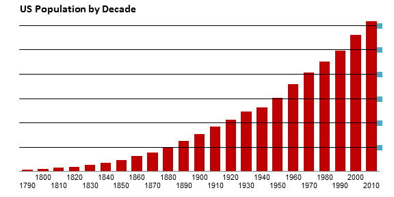
Select the XY series, and on the Chart Tools > Layout tab, choose Data Labels > Right. This adds the default data labels, which show the value. The data labels have the same number format as the cells containing the values. You’ll probably have to select the plot area and drag the right edge inward to make room for the labels.

Format the XY series, and choose None for the Marker Option.
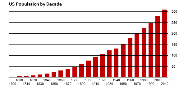
Finally, format the error bars, so the line color matches the chart background, in this case, white.

Lessons Learned
In this tutorial I’ve shown how to use gridlines that seem to cut the bars in a bar or column chart. Among the tricks I’ve used are:
- Line feeds in the category axis labels to stagger labels and prevent overlap,
- Using error bars to draw horizontal lines in a chart (error bars are great for vertical lines, too),
- Using data labels for custom axis labels.
You can accomplish many things with these tricks in your charting arsenal.
For an Excel workbook that contains this step-by-step tutorial, click on this link: Gridlines_Splitting_Bar_Chart.xlsx


