Excel 2010 Chart Type Dialog
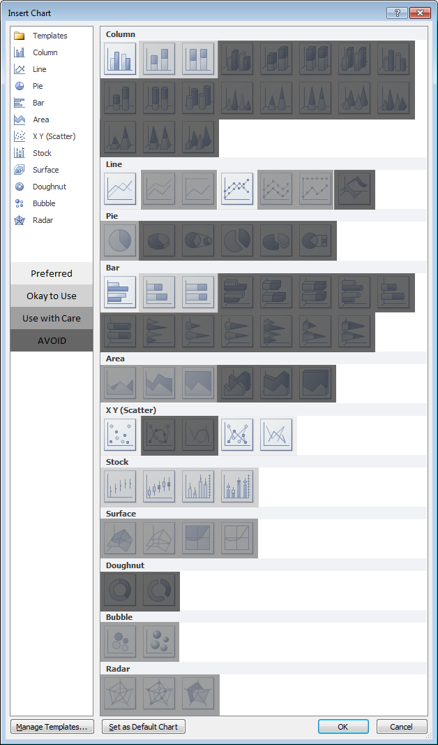
Excel offers a wide range of standard chart types. Below is the Chart Type dialog from Excel 2010, but all of these standard chart types have been available since Excel 97, and most of them since before that.
What makes my dialog different is that it has been annotated to show which chart types you may use freely, which types you may use with caution, and which types you should avoid. If you’ve been reading this blog for a while, and paying attention, you will probably not be surprised by most of the ratings.
Explanations for the ratings
Preferred
This group comprises the commonest and most easily understood charts you can make. Line charts and XY (Scatter Charts), with and without markers and lines. Simple clustered bar and column charts.
Acceptable
These charts are also readily understood, but might not be the first choice for most data sets. They should be used with “a little” caution.
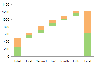
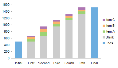
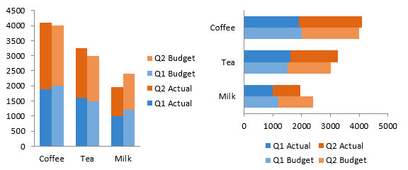
Stacked charts are tougher to decode. Because the bars do not share a common baseline, their lengths are harder to compare.
Stock charts are tough for non-finance people to get, because they convey a lot of information in a specialized way. However, for people familiar with them, stock charts are very useful.
Use With Caution
This set of charts can be useful, if you understand their limitations and drawbacks, and if the audience is skilled in their interpretation.
Stacked line charts can be confusing if the audience does not understand that each line represents a cumulative total of that line’s data plus all previous lines’ data.
Ordinary 2D pie charts can be useful if the number of data points is small and you only use one at a time. Bar charts generally do a better job.
Area charts are problematic for several reasons. Unstacked charts risk areas in back being obscured by those in front, while stacked ones may have an issue if the audience doesn’t realize they represent cumulative data. Line charts are often a better option.
Bubble charts cause problems with interpretation of bubble sizes. Is the area or the diameter proportional to the data being represented? Also, the resolution isn’t too good. It’s often best to use bubble size to indicate discrete factors.
Radar or spider charts seem like they’d be good at displaying cyclic data, but the spoke length is often confounded by the areas within the lines, and it’s impossible to compare values which are not on the same spoke. Line charts are usually a better choice.
Surface and contour charts are the only 3D charts not rated “AVOID”. They can be useful for showing some data. The X and Y values are not treated as numeric variables, but as categories (though you can still use them for numerical values if the points are equally spaced along the axes). Some orientations may lead to features in front obscuring features in back. The wireframe versions have too many line segments, the filled ones may rely too much on color, and starting in 2007, the filled ones have a weird shading applied which often makes the chart less clear. However, when used with care, these can be useful tools.
AVOID
These charts should be avoided because they are difficult to interpret, and some of them have features which may actually distort data.
Most 3D charts are particularly troublesome. The audience has trouble lining up the data elements with offset axes, some elements hide other elements, and the perspective may stretch some elements and shrink others. In many cases the third dimension is a false dimension, created not with data but with lots of extra non-data ink.
All but the simplest 2D pie charts are problematic: donut charts, pie-of-pie and bar-of-pie charts, exploded pie charts. These all have features that make them even less comprehensible than regular 2D pie charts.
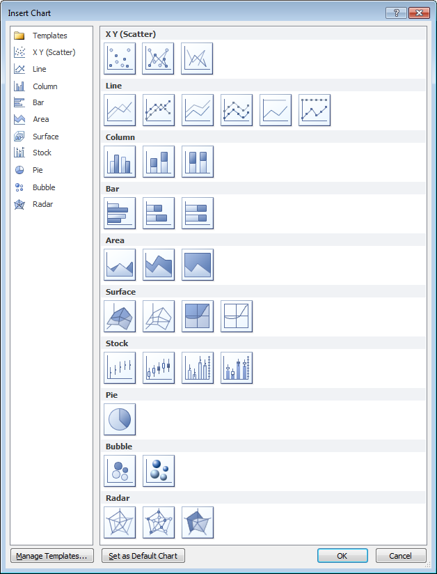
New Dialog
What if we just remove the charts rated “AVOID” from the dialog and do a little rearranging? This isn’t bad:
“Missing” Chart Types
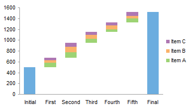
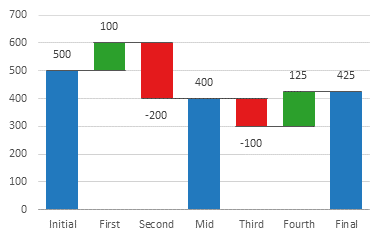
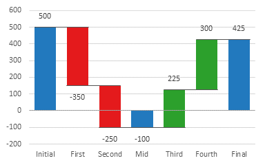
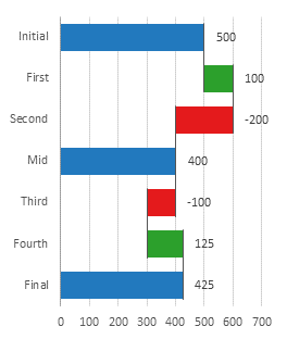
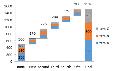
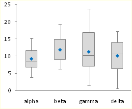
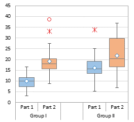
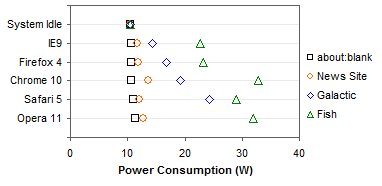
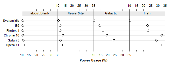
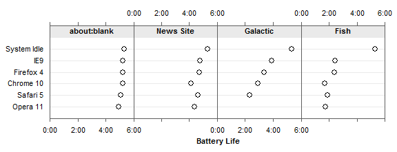
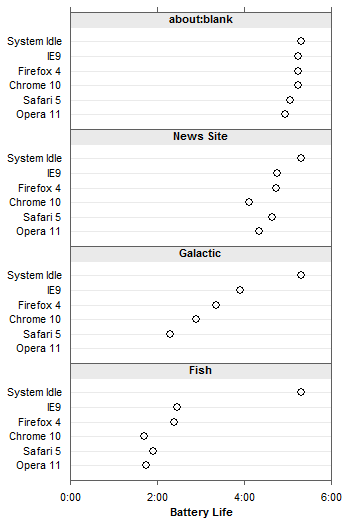
There are various other chart types that aren’t in the Excel dialog, but which you can still make in Excel. You need the savvy to figure out how to arrange the data and how to mix various chart types, and you need the patience to repeat these tasks as necessary. There’s no decent Histogram (despite what the Analysis Toolpak claims), though you can make a column chart and fix it up. Similarly you can make your own Pareto Chart by adding a line series to a column chart. You can make Tornado Charts or simple Gantt Charts by pimping a bar chart. I’ve written some tutorials that show how to make tricky chart types and utilities that will do the work at the click of a button: Waterfall Charts (Bridge Charts), Box and Whisker Charts, Clustered and Stacked Column and Bar Charts, Marimekko Charts, Dot Plots, and Panel Charts.


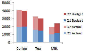








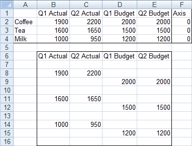
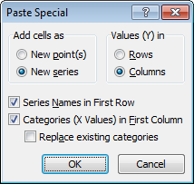


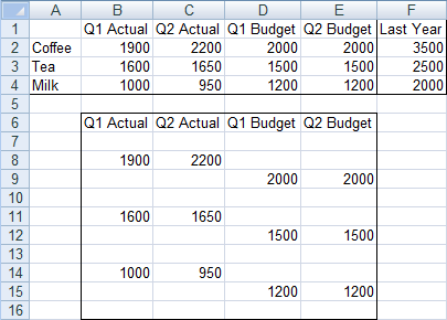
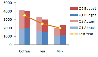

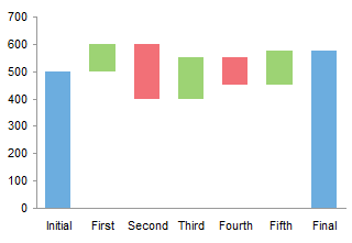

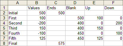
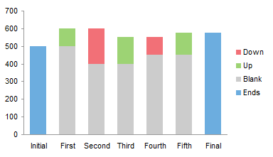
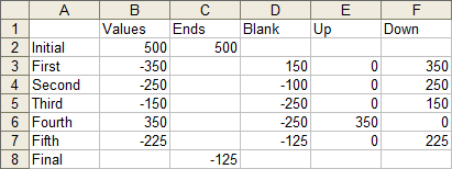
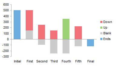
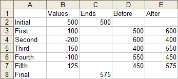
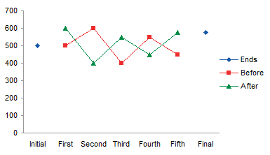
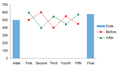
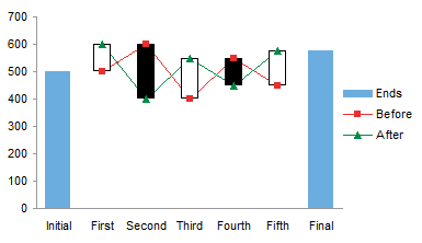
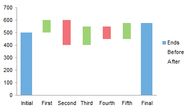
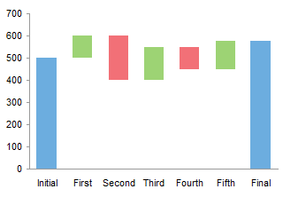

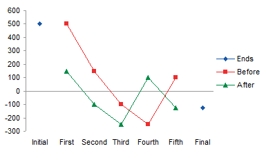
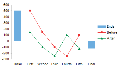
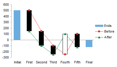
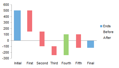
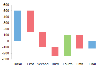
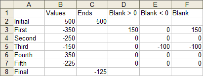

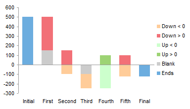
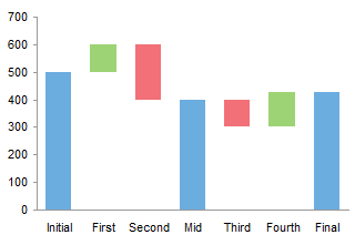
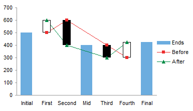
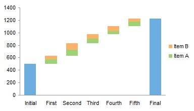
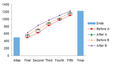
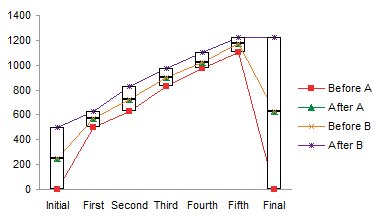
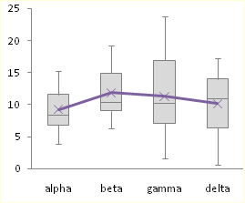
 The result is almost identical to the up-down bar version, except here the horizontal axis is not hidden by the bars that cross the axis.