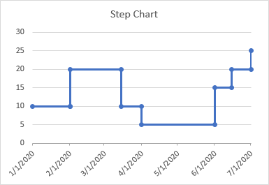
Step Charts are useful for showing values that don’t change steadily from one point to the next, but that instead are constant for a period of time, then jump to the next level, and are constant for another period of time. For example, step charts are good for showing how things like postal rates or interest rates change over time.
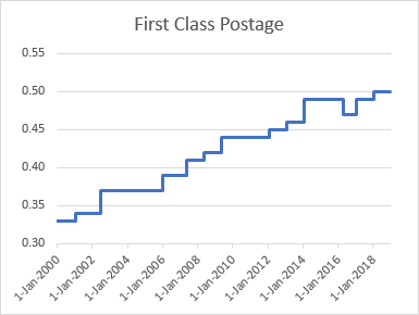
Step charts are not native to Excel, but it’s not hard to build a step chart, with a bit of data tweaking and some smoke-and-mirrors formatting. There are two ways to build step charts, one geared towards timelines (line charts with X-axis dates) which uses duplicate points, and the other towards XY Scatter charts which uses horizontal and vertical error bars.
If it seems like too much work to build your own step charts, I recently included this chart type in Peltier Tech Charts for Excel, my commercial Excel charting add-in.
Step Charts in Excel Line Charts
In an Excel line chart, points are usually connected by straight lines (and I can tell you why you shouldn’t use smoothed lines). But the tendency between points is to visually interpolate the values, while in some cases the data is constant from one point to the next, where it jumps to a new value.
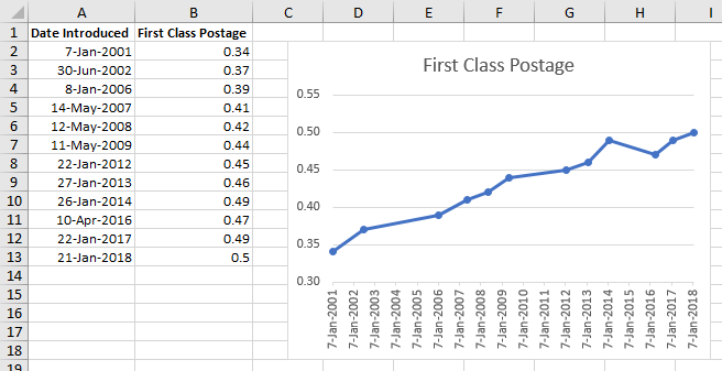
Here is our postal rate data and a line chart showing the rates over time. We know from the table that in 2004 the postal rate was 37¢, even though the line in the chart passes 38¢ sometime during the year.
We need to construct our chart using horizontal and vertical lines. Line charts only allow vertical error bars, not horizontal ones, so that approach is not available. But all we need are extra points to help define the horizontal then vertical line segments connecting adjacent points. This approach, and the similar approach involving Names which is covered later, is based on a discussion many years ago with Michel Gerday of Belgium.
Let’s start with our original data, in the blue shaded range below left. In fact, I’ve added a point for 1-Jan-2000 and another for 31-Dec-2018, so we have horizontal lines extending beyond the data to the edges of our chart.
I have duplicated this data as the yellow shaded range, below right.
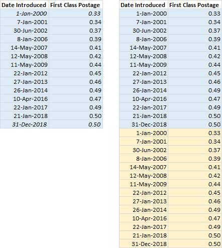
In order to get our extra points, we need intermediate points with the old rate and the new date, to make the treads and risers of our steps. The easiest way to do that is to delete the first date (X value) and last rate (Y value) in the top half of our data, the red shaded cells below left. To delete one cell, right click on it, select Delete…, then select the Shift Cells Up option, and press Enter. The result is shown below right.
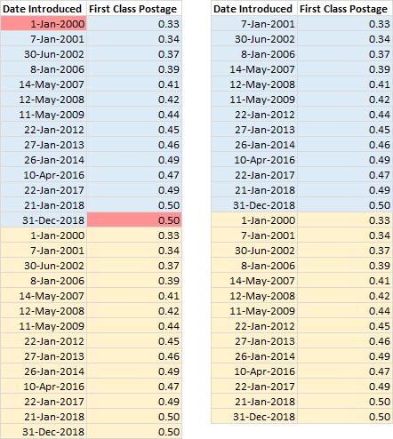
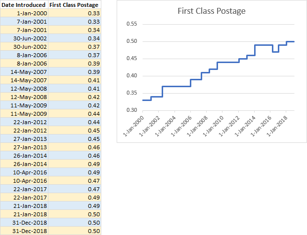
Strictly speaking we don’t need to do the next step, because Excel line charts sort the data by date when it is plotted. But I have sorted the data by date, below left, because this makes it easier to understand what the transformed data looks like. Note that sorting has shuffled the data into alternating yellow and blue shaded rows.
The resulting chart is a plain line chart, below right.
Between 1-Jan-2000 and 7-Jan-2001, the postage is constant at 33¢, forming a horizontal line. Then on 7-Jan-2001, the postage jumps from 33¢ to 34¢, resulting in a vertical line. And we see alternating horizontal and vertical segments in the table and in the resulting chart.
The data wasn’t too hard to transform, once you figure out how, and once you make the chart, you’re done.
Step Charts in Excel Scatter Charts
You could make step charts from scatter charts by manipulating the data as we did for the line chart above. However, it’s not neccessary to change the starting data to make step charts from scatter charts, but you need to add some data.
Here is some simple data, the US marginal tax rate Y vs. income X, for a single filer in 2018. It starts at 10% for zero income (after subtracting the standard or Schedule A deduction), and rises to 37% for an income exceeding $500,000. But the simple XY chart with straight lines between points does not show the stepwise manner of the increase.
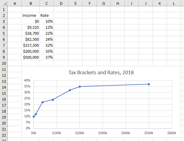
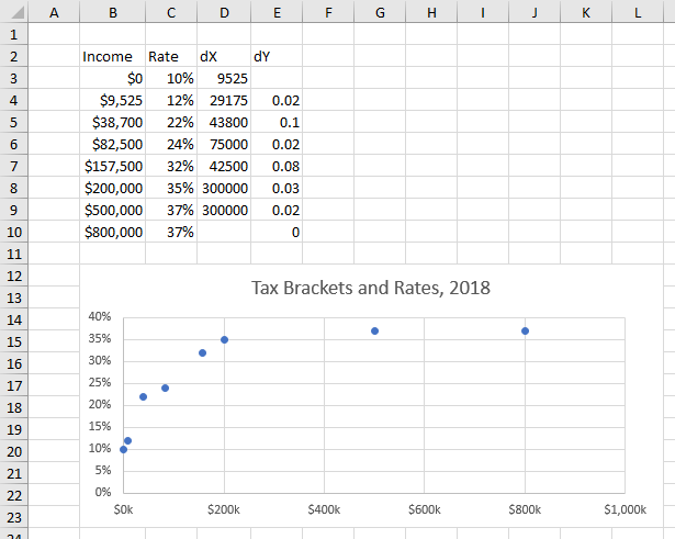
Let’s start by adding one point to the Income-Rate data, 37% at $800,000 in row 10, so the chart ends with a horizontal segment like the postal rate chart above. We don’t need to add a point at the beginning because it starts at an income of zero.
We’ll also add two columns. dX is the difference between the next income value and the current one (cell D3 has the formula =B4-B3). dY has the difference between the current rate and the previous one (cell E4 has the formula =C4-C3).
Start with an XY Scatter chart with no lines.
Select the chart, click the plus icon (“skittle”) next to the chart, and check the Error Bars box. This adds horizontal and vertical error bars using the calculated “Standard Error”. I’m never sure how Excel calculates these things, so I almost always use custom error bar values that I’ve defined with worksheet formulas.
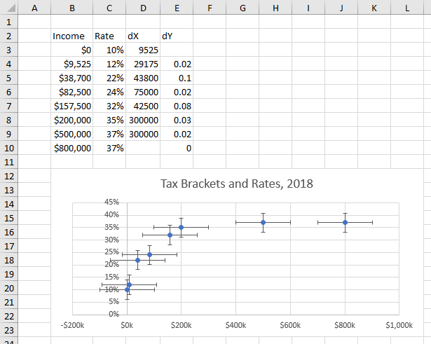
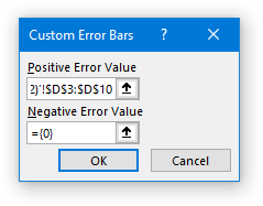
So now we will apply custom error bar values, as I have described in Custom Error Bars in Excel Charts. Select the horizontal (X) error bars and press Ctrl+1 to format them. Under End Style, choose No Cap, and under Error Amount, choose Custom, and click the Specify Value button. Clear the Positive Error Value box and select the dX values, D3:D10. In late versions of Excel you can simply clear the Negative Error Value box, but in 2007 through early versions of 2016 you have to put ={0}, zero in curly braces.
Our horizontal error bars now reach from each point to the income value of the next.
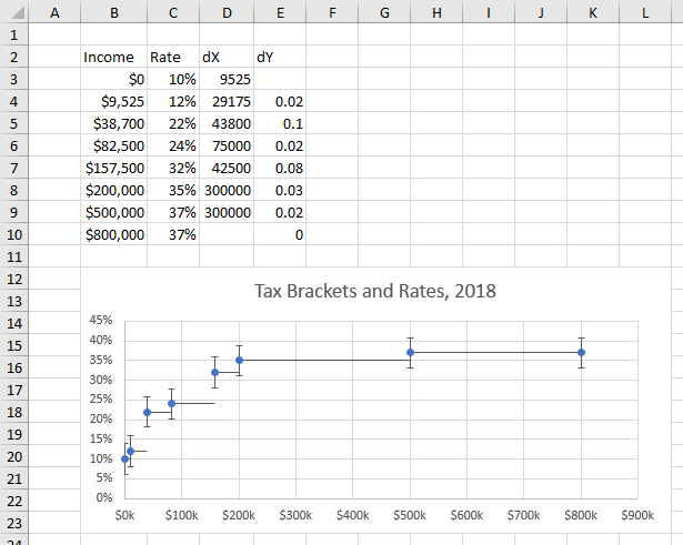
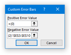
Select the vertical (Y) error bars and press Ctrl+1 to format them. Under End Style, choose No Cap, and under Error Amount, choose Custom, and click the Specify Value button. Clear the Negative Error Value box and select the dY values, E3:E10. In late versions of Excel you can simply clear the Negative Error Value box, but in 2007 through early versions of 2016 you have to put ={0}, zero in curly braces.
Now the vertical error bars reach from each point down to the end of the previous point’s horizontal error bar.
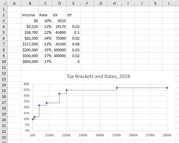
All you need to do is format the seroes to use no markers, then format the lines of the horizontal and vertical error bars.
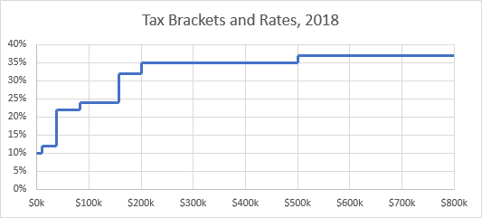
Not too complicated once you are familiar with custom error bars.
Advanced Step Charts in Excel Line Charts
In a couple comments when this post was first published, Lori reminded me that there are ways to make line chart step charts which do not require changing the existing data or creating new dedicated data ranges. These require a working knowledge of how line charts deal with X axis dates, i.e., that the data are sorted by date before being plotted. You can refer back to the color-coded illustrations of the data in the first section above.
SERIES Formula Adjustment
The first approach is just a tweak to the series formula in the step chart. Let’s start with the following data and chart.
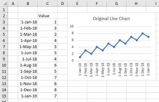
The series formula in the chart is:
=SERIES('Step Chart'!$C$2,'Step Chart'!$B$3:$B$15,'Step Chart'!$C$3:$C$15,1)The X values (purple text) consist of the column of dates in B3:B15, and the Y values (blue text) are the values in C3:C15 next to the dates.
In our first approach above, we used the dates twice, except for the first date, and we used the Y values twice, except for the last Y value. We can select multiple ranges for X and Y values in a series formula, if we separate them by commas and enclose them in parentheses. The modified series formula is:
=SERIES('Step Chart'!$C$2,('Step Chart'!$B$4:$B$15,'Step Chart'!$B$3:$B$15),
  ('Step Chart'!$C$3:$C$14,'Step Chart'!$C$3:$C$15),1)
The dates and values are not in order, but Excel line charts sort them by date, so our chart with the new series formula shows the nice steps:
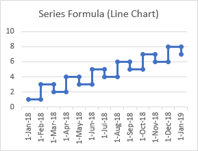
I’ve written a tutorial that shows how you can Convert a Line Chart to a Step Chart with VBA. Essentially it hacks into the SERIES formula, converting the line chart formula to the step chart formula.
This simple change to the series formula works great for lines charts because of the sorting, but not for XY Scatter charts, which do not sort the data. Here is a scatter chart with the same series formula as the line chart above:
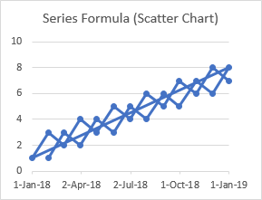
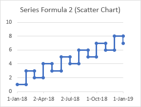
You can use a modified series formula for a scatter chart, but the modification needs to reorder the data:
=SERIES('Step Chart'!$C$2,('Step Chart'!$B$3:$B$4,'Step Chart'!$B$4:$B$5,'Step Chart'!$B$5:$B$6,
  'Step Chart'!$B$6:$B$7,'Step Chart'!$B$7:$B$8,'Step Chart'!$B$8:$B$9,'Step Chart'!$B$9:$B$10,
  'Step Chart'!$B$10:$B$11,'Step Chart'!$B$11:$B$12,'Step Chart'!$B$12:$B$13,'Step Chart'!$B$13:$B$14,
  'Step Chart'!$B$14:$B$15,'Step Chart'!$B$15)
  ('Step Chart'!$C$3,'Step Chart'!$C$3:$C$4,'Step Chart'!$C$4:$C$5,'Step Chart'!$C$5:$C$6,
  'Step Chart'!$C$6:$C$7,'Step Chart'!$C$7:$C$8,'Step Chart'!$C$8:$C$9,'Step Chart'!$C$9:$C$10,
  'Step Chart'!$C$10:$C$11,'Step Chart'!$C$11:$C$12,'Step Chart'!$C$12:$C$13,'Step Chart'!$C$13:$C$14,
  'Step Chart'!$C$14:$C$15),1)
When the data is ordered properly, the scatter chart shows the right stepping pattern:
Using Names
If you’re familiar with Names, you can define Names for the X and Y values of the chart:
Name: LineX
Refers To:=('Step Chart'!$B$4:$B$15,'Step Chart'!$B$3:$B$15)
Name: LineY
Refers To:=('Step Chart'!$C$3:$C$14,'Step Chart'!$C$3:$C$15)
These ‘Refers To’ formulas are the same as the individual X and Y value parts of the line chart Series Formula above. (Note: you would need more complicated Names if you’re using scatter charts.)
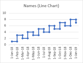
You can insert the Names into the SERIES formula:
=SERIES('Step Chart'!$C$2,'Step Chart'!LineX,'Step Chart'!LineY,1)And the step chart works as above.
Using Tables
Excel’s powerful Tables let you build dynamic formulas and charts, because any formulas that reference all rows or columns of a table will update to keep including all rows or columns if rows or columns are inserted or deleted. For example, I can select the data range and press Ctrl+T to convert the range into a Table. The Table has special formatting, but also special sorting and filtering capabilities, and there are special ways to reference cells and ranges within the Table. I won’t go into them here in detail, but you could read Structured Referencing to Identify Parts of Excel Tables for some examples.
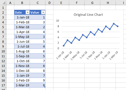
Here is a table with a chart of dates and values from the table:
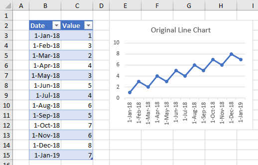
If I extend the table by two rows, so the last point changes from 1-January to 1-March, the chart updates without my having to adjust the series formula or make any other changes:
This works when all rows of a table are involved in the formula. However, the series formula we generated for our step chart uses all rows plus all rows except one:
=SERIES('Step Chart'!$C$2,('Step Chart'!$B$4:$B$15,'Step Chart'!$B$3:$B$15),
  ('Step Chart'!$C$3:$C$14,'Step Chart'!$C$3:$C$15),1)
Therefore the formula only partially updates (in bold):
=SERIES('Step Chart'!$C$2,('Step Chart'!$B$4:$B$15,'Step Chart'!$B$3:$B$17),
  ('Step Chart'!$C$3:$C$14,'Step Chart'!$C$3:$C$17),1)
The original chart…

… doesn’t update properly when the table is extended:
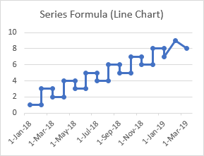
In fact, you can’t use a simple series formula adjustment with a Table and expect the step chart to work out. The Names used above also will not work, but you can use a definition that makes use of the Table’s Structured Referencing and offset functions:
Name: LineX
Refers To:=(OFFSET(Table1[Date],1,0,ROWS(Table1[Date])-1,1),Table1[Date])
Name: LineY
Refers To:=(OFFSET(Table1[Value],0,0,ROWS(Table1[Value])-1,1),Table1[Value])
In Structured Referencing, Table1 is the name of the Table, while [Date] and [Value] refer to the whole columns of dates and values, not including the header row.
As before, insert the Names into the SERIES formula:
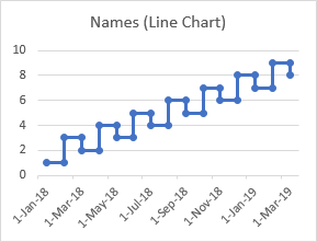
=SERIES('Step Chart'!$C$2,'Step Chart'!LineX,'Step Chart'!LineY,1)The original step chart with dates up to 1 January 2019 using these Names…

… updates properly when the table is extended to March 1 2019:
The Software Solution
Excel is flexible enough to make step charts (and many other non-native chart types), but all the data arranging and chart formatting can become tedious.
I’ve recently added step charts to Peltier Tech Charts for Excel, my commercial Excel charting add-in.
It’s easy: select the data, click the button, choose your options in the dialog…
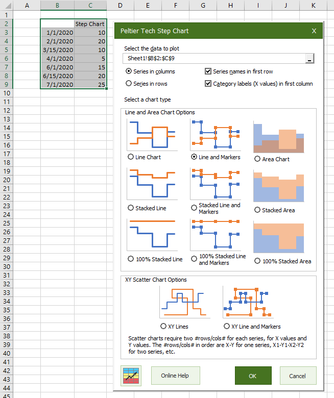
… and out pops a nice step chart.
