We’ve been dissing pie charts and donut charts quite a bit. So why then would we want a donut-pie combination chart? In Jorge Camoes’ How to create better pie charts, he showed a chart like this one. It’s not so much a pie chart as it is a donut chart with about 40 series, the inner 30 sharing the same data, so they seem to make a single wedge. Here’s Jorge’s chart:

Jorge shows personal expenditure portions in the pie part of the chart. The band of light and dark gray shows a breakdown of the wedges within. The arcs lying around the periphery of the chart show how the values change for larger families. It’s complicated and takes a few minutes to really decode, but it puts a lot of data in one place. Some people will scream at this type of chart, and I may have tried for a non-pie configuration myself. But it’s not horrible, like some discussed in my recent post Leave the Donuts for the Cops, and Stick with the Bar.
There was some discussion in the comments of my post regarding the construction of Jorge’s chart. Here is a protocol to create a simplified version of Jorge’s chart, as a donut chart with many rings. It uses this data:
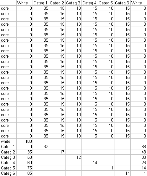
Why are there so many series named “core” with the identical data? That’s how we get a very thick donut-like wedge. The data row labeled “white” will produce a blank ring between the large internal wedges and the outer arc segments. The last six rows have data for one point only, and the columns labeled “white” provide space to position the arcs around the larger wedges.
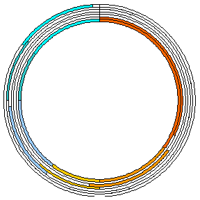
Below left is a donut chart created with this data. I’ve left the borders on the donut arcs to help show the construction of the chart. The central hole is 10% of the total diameter. The “white” categories have been filled with white. When the borders are removed (below right), this chart resembles Jorge’s at the top of the page.
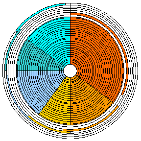

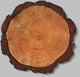
That left hand image looks like a dendrochronograph.

Here’s how to make a similar chart with donut and pie series in the same chart. This uses less data and removes the central hole. Make a donut chart first with all of the data (three series in this case). Right click one series (the innermost in this case), choose Chart Type from the pop-up menu, and change it to a pie series. The two remaining donut series are hidden behind the pie.
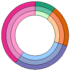

At first glance we seem to be stuck, but never fear, the chart doctor is here (the “voodoo” doctor, that is).
Explode the pie. Select the pie series, then in one motion, click and drag one wedge outward. Outlines of all of the series’ wedges will move outward, even to the point of disappearing beyond the chart border. When you release the wedges will have shrunk, and they will be touching the outside of the donut series. The amount the wedges shrink depends on how far outward you drag them before releasing them. If you have not selected an individual point (wedge), all wedges will move outwards by the same amount. The wedges in the chart below left have not shrunk too much, so repeat this drag to move them further, as in the chart below right.
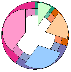

Now one-by-one move the wedges of the pie inwards (if you move the entire pie series en masse, the pie segments will remain stuck to the outer edge of the donuts). You need to click to select the series, then again to select a single wedge. The result is a pie chart that is smaller in diameter than the donut chart diameter. You may have to fine tune the dragging above and adjust the size of the central hole of the donut if you need it to fit more exactly.
Using the pie-donut combo procedure described above, we can get by with a lot less data:

We only need one “core” row, because the core of the chart is a single pie series rather than a 25 tree-ring circus. We also don’t need the “white” series. Instead we get a blank ring between the outer circumference of the pie and the innermost donut ring.
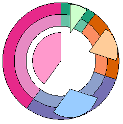
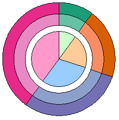
Below left is a donut chart with this data, with a central hole of 85% of the total diameter. Below right the first segment has been converted to a pie series; to save a step, the series was changed directly to the exploded pie type.

Below left, the pie segments have been moved to the center one wedge at a time. Below right, without borders this chart again resembles Jorge’s, except it has no bite taken from the point of each slice of pie.


This is a fancy looking chart, which has the potential to convey a lot of information. As you see, it’s not quite as difficult to build as it might have seemed at first. As with all fancy chart types, this can be used for good or for evil.
Here’s a practical application for this kind of combination chart. I used 23 donut series, one pie series, and a small red circle. The scoring numbers around the rim are data labels on about the fourth ring from the OD. Make sure you hang it so the center of the bulls-eye is 1.74 m (5′ 8″) from the floor.

Please note that these charts are designed and constructed by trained professionals. Do not try this at home.


