My friend Debra Dalgleish notified me the other day that it was National Pie Day.

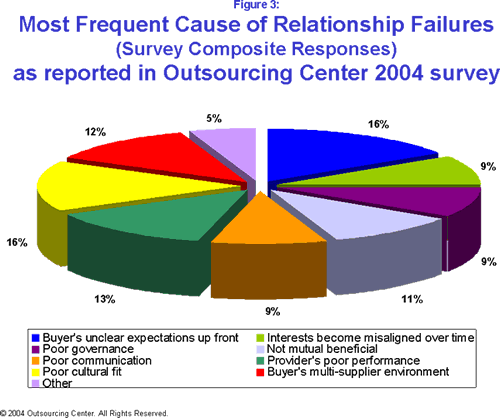
I missed National Pie Day, but while reading The Real Reason Outsourcing Continues To Fail, I encountered a pie chart that gave me indigestion. It purports to show problems with inter-cultural relationships that lead to outsourcing failures.
What’s wrong with the chart?
What’s wrong with this pretty chart, you may ask (or you may already have a good idea). Where to begin…
It’s a 3D pie chart, and we’re looking at it almost end on, so the sizes and angles are all distorted. The values are unsorted, so position around the pie doesn’t help determine relative percentages. The legend is ordered by row instead of by column, so you have to go back and forth between the pie and the legend, then back and forth between the two columns of legend entries, then if you remember, back to the pie.
When I visited the original report that contained this chart, What Causes Outsourcing Failures?, the reason for the unsorted values became clear. Figure 1, earlier in the report, showed its slices sorted by value. Because of the severe angle you can only tell the chart is sorted because the data labels are in numerical order.
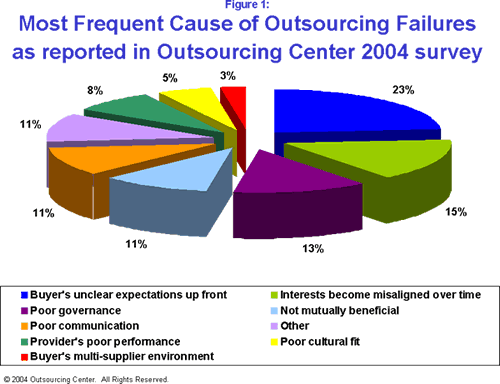
Placing “Other” in the middle of the data is unorthodox. Generally “Other” is placed at the end, because typically it’s comprised of several very small values.
Figure 3 used the same order as Figure 1, except that “Other” was placed at the end where it belongs. This consistency is not a bad thing, but it’s dwarfed by the other problems with the charts. There is another pie chart, Figure 2, which shows Least Frequent Causes of Outsourcing Failure. I’ll spare a kitten and not repost it here.
How can we make these charts better?
Let’s dispense with the 3D distortion. The circular arrangement also does not aid in understanding, especially in the unsorted Figure 3. Let’s remove the legend and put the labels right next to the points. This way, we can reduce the number of colors (which I haven’t mentioned, since it often boils down to a matter of taste).
Well, that sounds to me like a bar chart, so here are bar charts of the two pies above, Figure 1 above and Figure 3 below.


Easy to read, easy to correlate label with data point, easy to see a strong variation in Figure 1 but not in Figure 3. But they take up a bit of room, don’t they? Let’s see how they look in a panel chart.
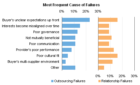
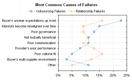
That’s good to compare the general shapes of the trends. If we’re concerned with the specific values of each category, we can even plot the data in the same space with a dot plot.
