According to Do You Know What Planned Parenthood Actually Does?, “the Susan G. Komen Foundation has announced they will stop funding Planned Parenthood for breast cancer exams and other breast-health services.” MoveOn.Org attributes this action on pressure from the Republican Party, because of their stance on abortion and on the abortion practices of Planned Parenthood.
Planned Parenthood gives us this breakdown of services provided by their affiliated health care centers (download pdf):
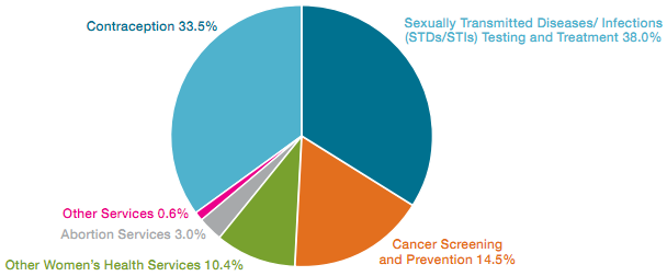
As pie charts go, it’s not terrible. It demonstrates MoveOn’s point, that abortion accounts for only 3% of Planned Parenthood’s treatments. The remainder goes for contraception and health services, mostly for poor women.
The data is also well-presented using a bar chart. This chart uses larger type and yet requires less space than the pie. The data is sorted in an easier-to-read layout, and it’s easier to highlight one value (abortion) using a darker color, because the chart uses shades of only one color.
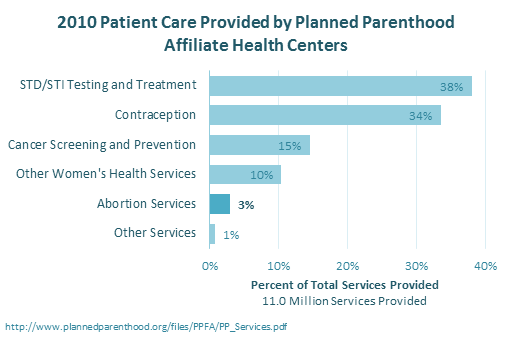
The bars show all of the components of the whole block of services provided, as indicated by the horizontal axis label. To show that the bars add to 100%, another data series can be added and connected with a line, to make a Pareto chart. The top four items, all unrelated to abortion, account for 96% of Planned Parenthood services.


