I haven’t posted in quite a while. I have a few long tutorials that I’m working on, but there hasn’t been enough uninterrupted time to get them done.
I’ve also been working on a new edition of my Chart Utility which will run in PowerPoint. This will allow those users who spend most of their time in PowerPoint to run the utility from there, switching to Excel for long enough to select their data, then build their chart as a native PowerPoint chart. I mean, it’s still really an Excel chart, but it will behave as if it were created in PowerPoint (which it was), and the data will sit in its data sheet in PowerPoint. Tentative plans call for the new utility to be released a month and a half ago. I’ll probably release it in stages, starting in a couple weeks.
In the meantime, a customer asked me to help with a certain topic, and I thought it made a great tutorial, so here it is.
Secondary Axis as Percentage of Target
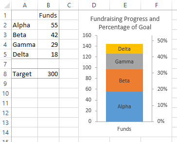
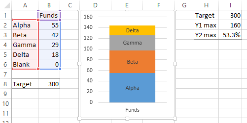
A customer had a stacked chart showing contributions to a fundraising effort by source (below) and wanted to show percentage toward the target. He had sketched something with labels and tickmarks and arrows everywhere, but I thought that was a bit too intrusive and cluttered. Instead I decided to use a secondary axis scale showing the percentage.

I’ve written before about how Secondary Axes in Charts can be more confusing than enlightening, adding to the cognitive load required to understand a chart. But I’ve also written about Secondary Axes that Work – Proportional Scales, and I’ve showed how to Add Percentages on the Secondary Axis. This is really another illustration of that last tutorial.
The only way to get a secondary axis is to have a series that is plotted on the secondary axis. I modified his data range by adding a series named “Blank” with a value of zero. The chart below is selected, and you can see from the highlighted ranges in the worksheet that it includes all series including the new Blank one. To the right I’ve done some calculations that we’ll be using momentarily. Essentially, given a target of 300 and a primary Y axis maximum of 160, I know that the corresponding secondary Y axis maximum should be 53.333%.
The charts below show the steps in constructing the improved chart. Left, I moved the Blank series to the secondary axis. Excel added a secondary vertical axis with a scale ranging from zero to one. Center, I deleted the gridlines, and made all three visible axis lines the same medium-light gray color, and gave the vertical axes major tick marks outside of the axis. Right, I rescaled the axes. I hard-coded the min and max of the primary axis to 0 and 160, just so they didn’t change without me knowing it. I set the min and max of the secondary axis to 0 and 53.333%, and changed the number format to Percentage with No Digits.

Finally I made the chart a little bit taller to allow for a descriptive title. Probably some indication of currency in the primary axis tick labels would also be useful. I also hid the row with the blank data and the columns with my secondary axis calculations, in case the entire sheet would be made public.
