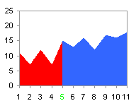
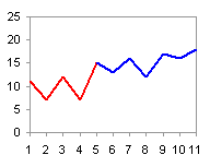
In Category Axis Tricks for Line and Area Charts – 1, we saw how to use two line series to create a two-toned line chart. This is useful if we want to differentiate between actual values up to a certain date and predicted values thereafter, or if we want to distinguish values from different periods of time. This is relatively easy to do for a line chart by distributing the data into two columns, where both series have the same number of category values, and the Y values for each series are lined up with the corresponding category values.
|
|
The line chart works fine, one series starting where the other leaves off. Area charts, on the other hand, don’t work as well. Looking at the two series individually, we see that both have colored regions between categories 4 and 6.


In the stacked version of the chart, the colored areas stack one atop the other, so that the total extends above the top of the chart. In the unstacked version, one area is drawn in front of the other.


In Line Chart vs. Step Chart, we saw that two points with the same category value are plotted on the same vertical line if the line chart uses a date-scale axis. We need to duplicate the point where the two series meet, denoted by the two rows in the table below with green text.
| Red | Blue | |
| 1 | 11 | 0 |
| 2 | 7 | 0 |
| 3 | 12 | 0 |
| 4 | 7 | 0 |
| 5 | 15 | 0 |
| 5 | 0 | 15 |
| 6 | 0 | 13 |
| 7 | 0 | 16 |
| 8 | 0 | 12 |
| 9 | 0 | 17 |
| 10 | 0 | 16 |
| 11 | 0 | 18 |
For illustration purposes I have not yet converted the category axis from category to date-scale; note the dual “5” axis tick labels, colored green. Plotted separately, notice that both area series have a colored region between the two “5” category labels, one sloping down to zero, the other sloping up from zero.


The stacked area chart ends up with a constant sum between the two “5” labels, while hte unstacked again shows one area drawn in front of the other.


When the category axis is converted to a time-scale axis, the dual “5” categories are brought into coincidence, and the sloping lines become vertical. The area series are drawn separately so the vertical border are clearly shown.


When the two area chart series are plotted in the same chart, they now meet at a vertical boundary. This behavior can be used to generate custom background shading effects.


Leave a Reply