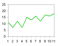
Let’s look at the behavior of line charts and the category axis. Here is some simple data I made up just for this exercise, and a typical line chart plotting the data.
|
|
|
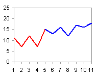
Okay, not too boring. Let’s see what happens if we split the data into two series, red and blue. The red series will include points 1 to 5, and the blue will include points 5 to 11. This is how we might plot actual and predicted data on the same chart, or perhaps data by quarter or year in separate series.
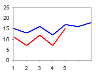
That didn’t do what we wanted or expected. In a chart type that relies on a category-type axis (line, area, column charts), all series use the same category data as the first series; in an XY chart, each series can have independent X values, and the X axis is a value-type axis. The first series has five data points (five category values, 1 to 5), while the second series has seven data points (5 to 11). The chart then has seven category values across the X axis, but only the first five (defined by the first series) have labels to display. The second series starts at the first category, like the first series, even though we would expect them to line up according to category values; an XY chart lines up in the way we would expect. We could just use an XY chart for this, but there are times when a line chart is preferred.
To align the two line series appropriately, we need the same number of category values, and we need to make sure the Y values are lined up with the corresponding category value. We accomplish this by splitting the values into two columns, red and blue; the red range has values in the top part and blanks below, while the blue range has blanks at the top and values below.
Table Arrangement for Two-Toned Line Chart, with Chart
|
|
|
The line chart works fine, one series starting where the other leaves off. By default, no points are plotted where there are blanks in the table. If you are using formulas to generate this data, you need to adjust the formula to use NA(), which is not plotted in a line or XY chart, and not “”, which is plotted as a zero value.
In fact, this is the basis for conditional charts, charts which display different formatting based on certain conditions being met. There is no conditional formatting built into Excel charts, but it can be simulated using multiple series and formulas or named ranges.
To get our two-color chart, we can design a table as follows. The original data is in columns A and B. Columns C and D will have formulas to define the chart series data. Cell E2 contains a cut-off value, below which we want to see the red series, above which the blue. The formulas in cells C2 and D2 are:
=IF(A2<=$E$2,B2,NA())
and
=IF(A2>=$E$2,B2,NA())
These formulas are filled down through row 12. Both <= and >= are used in the formulas, because we want both series to plot the shared point; if we used <= and =, we would have a gap after the cut-off point; if we used = and >=, the gap would occur before the cut-off. If we create the chart with the data in columns A, C, and D, we will get a chart just like the one plotting the previous data arrangement. However, if we change the value in cell E2, the point that divides red from blue will move left or right.
Table for Conditional/Dynamic Chart
| A | B | C | D | E | |
| 1 | Value | Red | Blue | Cut-Off | |
| 2 | 1 | 11 | 11 | #N/A | 5 |
| 3 | 2 | 7 | 7 | #N/A | |
| 4 | 3 | 12 | 12 | #N/A | |
| 5 | 4 | 7 | 7 | #N/A | |
| 6 | 5 | 15 | 15 | 15 | |
| 7 | 6 | 13 | #N/A | 13 | |
| 8 | 7 | 16 | #N/A | 16 | |
| 9 | 8 | 12 | #N/A | 12 | |
| 10 | 9 | 17 | #N/A | 17 | |
| 11 | 10 | 16 | #N/A | 16 | |
| 12 | 11 | 18 | #N/A | 18 |
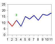
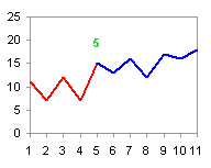
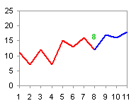
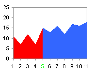
Conditional/Dynamic Chart for Cut-Off Values of 3, 5, and 8.
This technique is extended to area charts in Category Axis Tricks for Line and Area Charts – 2


Alvaro Ledesma says
Jon, there is a small error in your description of what are you doing:
“Let’s see what happens if we split the data into two series, red for the first five rows, and blue for the remainder of the data.”
“The first series has five data points (five category values), while the second series has seven data points.”
You only have 11 data point in your example. Doing what you say in paragraph 1 does not gives you 12 data ponts unless you indicate that you are using data point 5 in both series (which is what happens when you split data points in two columns).
Just a very picky remark, I guess!
I really enjoy reading your feed.
Regards,
Alvaro
Jon Peltier says
Alvaro – The fifth point is used by both series. This can be seen in the data and in the chart. But you’re right, I will clarify the explanation.
Russ Urquhart says
Hi Jon,
You posted the following (http://www.pcreview.co.uk/forums/setting-x-axis-crosses-vba-t3695246.html) about setting the x-axis wrt the y-axis. Is there a special trick to doing this when the y-axis is a log scale? I tried the negative number trick and got no effect!
Thanks,
Russ
Jon Peltier says
Russ –
A very negative number on a regular scale relates to a very small number on a log scale. Something like 1E-300.
Russ Urquhart says
Thanks Jon,
That works to put the x-axis crossing at the lowest point of the y-axis.
Before i had heard from you, i was trying the following: (I am trying to adjust the plot area height, by having vb change the ActiveChart.Axes(xlValue).CrossesAt value until it reaches a desired value as needed by our graphics dept.)
try_again:
plotarea_desired = 10.5 + Application.InchesToPoints(1.75)
ActiveChart.Axes(xlValue).CrossesAt = MinVal
actual_plotarea = ActiveChart.PlotArea.Height
if (actual_plotarea > plotarea_desired) then
MinVal = MinVal + 1
goto try_again
endif
Else ‘ desired plotarea acheived.
I was thinking something like this would enable being able to fine tune the plotarea size. (Especially for log scales.)
Is there a formula/ratio of plot area to chart area?
thanks for all your help!
Russ
Prateek kothari says
Hi jon,
Actually i am facing some problem in automating the axis . For example i am drawing a scatter/bubble chart where i need to adjust the axis manually since my data lies in a very close range. So can u suggest me something which can auomate this using any technique be it in excel, powerpoint or vba as all other codes which are used over here does work for excel charts but not for powerpoint charts.
Waiting for ur reply ASAP
Thanks
Prateek kothari
Jon Peltier says
Prateek –
Read my (ancient) tutorial, https://peltiertech.com/link-excel-chart-axis-scale-to-values-in-cells/.