Sometimes you have data that’s been analyzed in a pivot table, and you want to graph it, but a pivot chart doesn’t do what you want. In Regular Charts from Pivot Tables I showed how to create a regular chart from a pivot table. I described a manual process, which works fine, but becomes tedious.
In a recent project I had to make a number of regular charts from pivot tables, and I finally got tired of the long, slow, tedious manual process. I put together some VBA code and built myself an add-in so I would always have this functionality on hand. The add-in is also handy as a Chart Wizard replacement for Excel 2007, which lost the Wizard in the User Interface Wars.
I thought it would be nice to post this add-in on my blog, for all of you faithful readers. I frequently share such routines, and judging from comments and emails, they are pretty popular. Then I remembered that whole teach-a-man-to-fish thing, and decided it would be a great series of posts if I described the whole process of developing an Excel add-in.
Here is the table of contents for this series.
- Build an Excel Add-In 1 – Basic Routine
- Build an Excel Add-In 2 – Enhanced Functionality
- Build an Excel Add-In 3 – Auxiliary Modular Functions
- Build an Excel Add-In 4 – Create the Dialog
- Build an Excel Add-In 5 – Tie the Code Together
- Build an Excel Add-In 6 – Interface for 2003
- Build an Excel Add-In 7 – Interface for 2007
- Build an Excel Add-In 8 – Last Steps
- Build an Excel Add-In 9 – Deployment
And now, on to the first topic of the series:
Build an Excel Add-In 1 – Basic Routine
The steps in the manual procedure involve selecting a cell which is blank and not part of the pivot table, inserting a blank chart, and adding one series per column (or row) of the pivot table, using the first column as categories and the first row as series names.
The VBA procedure will use the selected range as the chart data source. It will assume that the series are in columns, that categories are in the first column, and that series names are in the first row. It will create the default chart type (clustered column if you’ve never reassigned your default), positioned according to the defaults in “Classic” Excel, that is, Excel 2003 and earlier. This default positioning creates a chart roughly half the size dimensions of the active window, roughly centered in the visible region of the active window.
Here is the whole VBA routine:
Sub PT_Plot()

  ' CREATE AND POPULATE A CHART
  ' ' Start with selected data range
  ' ' Add chart object
  ' ' Use default chart type
  ' ' Plot by column
  ' ' First column for category values
  ' ' First row for series names

  Dim ChtOb As ChartObject
  Dim cht As Chart
  Dim dLeft As Double, dTop As Double, dWidth As Double, dHeight As Double
  Dim rScroll As Range
  Dim rData As Range
  Dim rCats As Range
  Dim rNames As Range
  Dim rValues As Range
  Dim iSrs As Long, nSrs As Long
  Dim Srs As Series
  Dim shp As Shape

  Application.ScreenUpdating = False

  If TypeName(Selection) <> "Range" Then
    MsgBox "Select a range and try again.", vbOKOnly, "No Range Selected"
    GoTo ExitProcedure
  End If

  Set rData = Selection

  ' determine chart object size:
  ' ' half of window height and width, centered in window
  Set rScroll = ActiveSheet.Cells _
      (ActiveWindow.ScrollRow, ActiveWindow.ScrollColumn)
  With ActiveWindow
    dWidth = .UsableWidth / 2
    dHeight = .UsableHeight / 2
    dLeft = rScroll.Left + dWidth / 2
    dTop = rScroll.Top + dHeight / 2
  End With

  With rData
    Set rValues = .Offset(1, 1).Resize(.Rows.Count - 1, .Columns.Count - 1)
    nSrs = .Columns.Count - 1
    Set rNames = .Offset(, 1).Resize(1, nSrs)
    Set rCats = .Offset(1).Resize(.Rows.Count - 1, 1)
  End With

  ' NEED ACTIVE CELL NOT IN PIVOT TABLE WHEN CREATING CHART
  ActiveSheet.Columns(1).Cells(ActiveSheet.Rows.Count).Select

  Set cht = ActiveSheet.ChartObjects.Add(dLeft, dTop, dWidth, dHeight).Chart
  ' probably blank, but remove all series just in case
  For iSrs = cht.SeriesCollection.Count To 1 Step -1
    cht.SeriesCollection.Count(iSrs).Delete
  Next

  ' add series from data range
  For iSrs = 1 To nSrs
    Set Srs = cht.SeriesCollection.NewSeries
    With Srs
      .Values = rValues.Columns(iSrs)
      .XValues = rCats
      .Name = "=" & rNames.Columns(iSrs).Address(ReferenceStyle:=xlR1C1, External:=True)
    End With
  Next

  ' restore original window configuration
  ActiveWindow.ScrollRow = rScroll.Row
  ActiveWindow.ScrollColumn = rScroll.Column
  rData.Select

ExitProcedure:

  Application.ScreenUpdating = True

End Sub
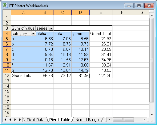
The way to use this program is to select your data, including a header row and header column, and run the procedure. The data below comes from a very simple pivot table.

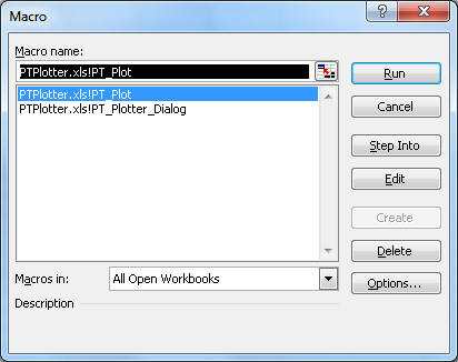
The easiest way to run the program is to press Alt-F8, select the PT_Plot macro from the list of available macros, and press Enter.

You can also see PT_Plotter_Dialog in the list. This is the routine which will eventually be called from the menu or ribbon in the add-in. You’ll have to be patient as it will be refined over the next few installments.
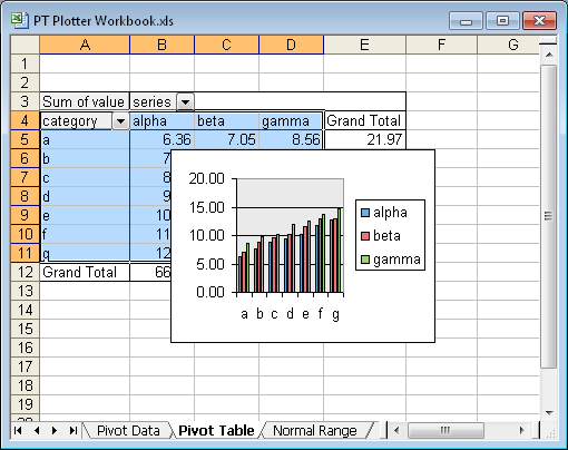
The output of the program is a chart object half the size of the active window, centered in the window. It is the default clustered column type, with default formatting.

Coming Attractions
In Build an Excel Add-In 2 – Enhanced Functionality, this sub will be converted to a function. Various arguments, such as chart source data range, data series orientation, number of header row(s) and column(s), chart type, and optionally the position of chart, will be passed into the function. The function will return an object representing the chart it has constructed.
Build an Excel Add-In 3 – Auxiliary Modular Functions will demonstrate how to incorporate additional functionality in the form of additional functions, which can be shared among any of your procedures. The particular function will be a routine that takes the chart as an argument, applies some “nice” formatting, and returns the cleaned up chart.
We will add a user interface in Build an Excel Add-In 4 – Create the Dialog that will allow the user to easily select the arguments that are passed into the function we developed in installment 2. The PT_Plotter_Dialog will incorporate the use of this dialog, then call the function to create the chart. At this point, the features of the add-in are complete.
Build an Excel Add-In 5 – Tie the Code Together will merge the function that creates the chart, the auxiliary function that formats the chart, and the dialog and the code that interacts with the dialog.
The add-in still needs to make itself visible in the Excel application. This will be done using a custom menu and button in Build an Excel Add-In 6 – Interface for 2003 and using a custom ribbon tab and button in Build an Excel Add-In 7 – Interface for 2007.
Build an Excel Add-In 8 – Last Steps describes some final tasks to ensure your add-in will work properly on a wide range of version combinations of Windows and Excel. Build an Excel Add-In 9 – Deployment will talk about issues you may encounter while deploying your add-in to other users.


Rhys Kidd says
“This default positioning creates a chart roughly half the size of the active window, roughly centered in the visible region…”
“The output of the program is a chart object half the size of the active window, centered in the window…”
A small correction Jon; by default Excel creates a chart roughly *one quarter* the size of the active window, not half the size of the active window, as the chart is half the height and half the width.
Jon Peltier says
Rhys –
That’s what I was thinking, half the width and half the height. I’ve changed the wording to “half the dimensions of the active window”, which is really what I meant.
Jan Karel Pieterse says
For anyone interested, I also have a general series of articles “ready to go”.
On creating add-ins:
http://www.jkp-ads.com/Articles/DistributeMacro00.asp
On deploying an addin:
http://www.jkp-ads.com/Articles/AddinsAndSetupFactory.asp
On updating through internet:
http://www.jkp-ads.com/Articles/UpdateAnAddin.asp
On updating references to UDf’s in Addins:
http://www.jkp-ads.com/Articles/FixLinks2UDF.asp
Jon Peltier says
Thanks, Jan Karel, for your links. Be sure to speak up if anything here needs fixing.
eijaz sheikh says
Hi Jon,
can u provide the remaining final chapters (6,7,8,9) for this tutorial?
Also do you have any code example for adjusting datapoints text labels in a chart showing too many datapoints, so that they donot overlap each other and also adjust the label font effectively so that the labels donot spread outside the chart boundary and also show how to add line connectors from datapoints to their corresponding label.
Best regards.
Jon Peltier says
Eijaz –
I will return to writing very soon. That’s the easiest of the items you mention.
Preventing overlap of labels is very difficult. A number of years ago Andy Pope (http://andypope.info) wrote a routine that would readjust label positions, and it worked okay, but I don’t know if it’s still available.
Connecting labels to datapoints can be done following the (tedious) protocol in Callout Labels with XY Line Segments.
eijaz says
hi Jon,
Is it possible for you to provide atleast the VBA source code or the complete addin example as a download in the meantime? i need to see the final result and maybe implement some of its functionality to what i have in mind…
Regards.
Jon Peltier says
Eijaz – As soon as it is ready, it will be published.