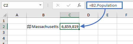
The Misleading Chart
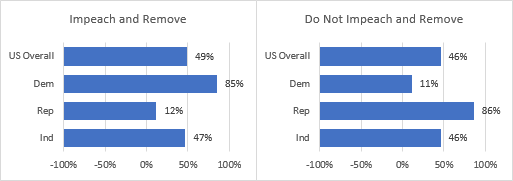
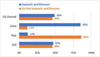
My friend and colleague Patrick Matthews, a former Excel MVP, posted a screenshot of an unusual bar chart on his Facebook page. The chart was taken from What does the public say about impeaching Trump?, the last section of a Washington Post article titled What happens next in the impeachment of President Trump? Patrick’s comment says it all: “Bar lengths on a chart, what do they even mean?”
At the risk of opening a torrent of political comments, I’ve reproduced the chart here.

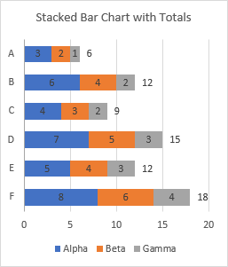
Take a close look at the bar lengths in the first chart. The 12% bar is over half as long as the 85% bar, where in a bar chart with proportional bars, the 12% bar should be about 1/7 as long. But at least the 49% bar is slightly longer than the 47% bar, and they are in between the 12% and 85% bars. The same holds true of the bar lengths in the second chart.
Someone responded to Patrick’s post, wondering how they came up with those bar lengths. After the analysis in the previous paragraph, I replotted the data, set the axis scales to -100% to +100%, and set the vertical axis to cross at -100% on the horizontal axis. Nailed it!
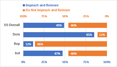
Well, not exactly. As I sometimes do, I overanalyzed the charts. I’ve stripped most of the text from the WaPo graphic, replaced the outlines of my charts with red lines, and stretched my charts so they overlaid the WaPo plot.
It turns out that the axis minimum was really -92%, so my wild guess of -100% was pretty good. I’ve set the gridline spacing so that 0% and +92% are shown on the chart, and the far right edge of the plot area is at +100%.
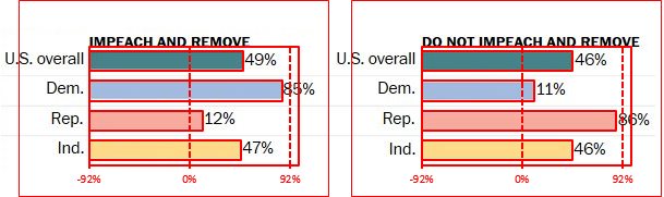
I don’t think the graphic artist really used an axis minimum of -92%. I’m sure they started with 0%, then decided to fill in some white space by dragging the left edges of each bar while keeping the right edge in place. They filled in the space, all right. But by doing so, they obscured the differences between the values.
It’s the same issue that occurs when people start their axis at a value greater than zero, so the differences between values are accentuated. But now the axis and the bars start well below zero, and the differences are minimized.
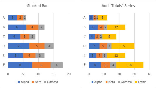
Fixing the Chart
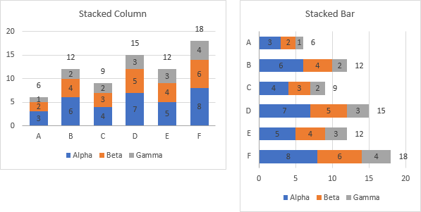
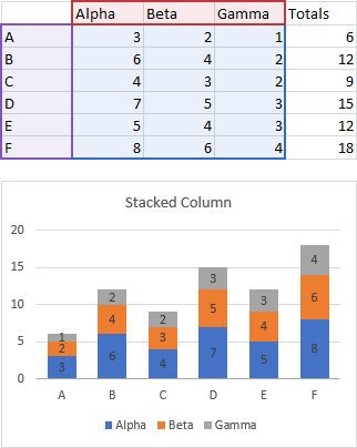
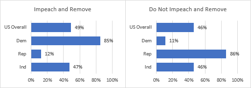
My next step was to take my two charts, and set their axis minimum to 0%. These two charts now accurately show the relative percentages.
Improving the Chart
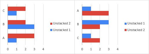
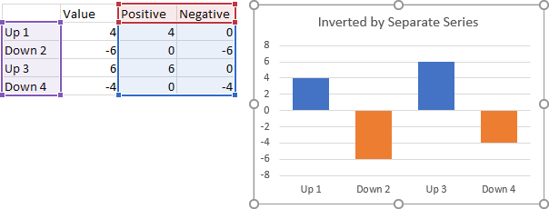
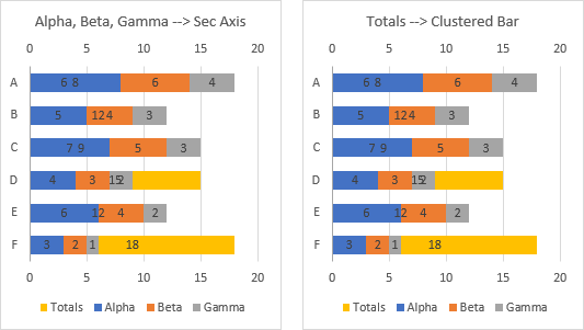
Those last two charts were a big improvement. But if we’re expected to compare the values, shouldn’t the bars all be in a single chart? Below I plotted the negative of one set of data, so the bars stretch in opposite directions, the way they do in population pyramids. Let’s call this a diverging bar chart.
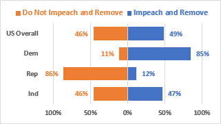
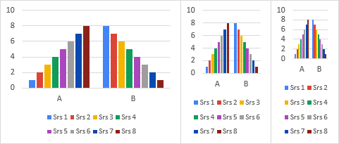
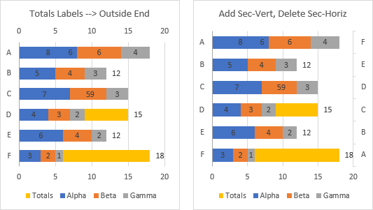
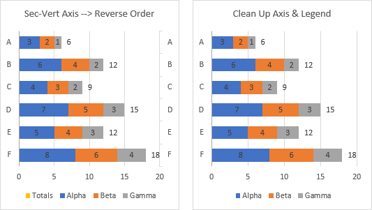
Then I remembered why I dislike population pyramids, as I discussed ages ago in Tornado Charts and Dot Plots. It’s hard to compare bars that reach away from each other. It would be easier to compare the values of any two bars if they start at one horizontal position (the vertical axis) and stretch in the same direction (to the right). So I created this clustered bar chart:
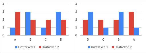
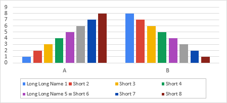
An alternative is to plot one set of bars from left to right, and the other from right to left. It’s a converging rather than a diverging bar chart. This makes individual bars more difficult to compare, as in the population pyramid lookalike above. But the white spaces clustered between the colored bars represent the percentages of each category who have no opinion.
What do you think? Not about the topic of the chart, but about the construction of the chart. Do you prefer the diverging bar chart, the clustered bar chart, the converging (stacked) bar chart, or something else entirely?