Office 365 keeps bringing us new stuff
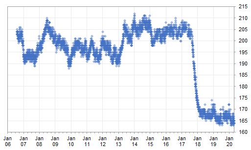
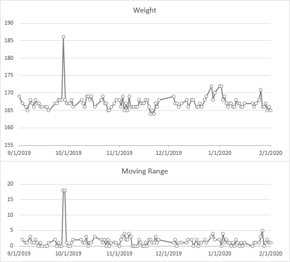
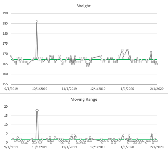
Last week, I wrote my first blog post in a few months. I wrote about Watching my Weight with SPC (Statistical Process Control).
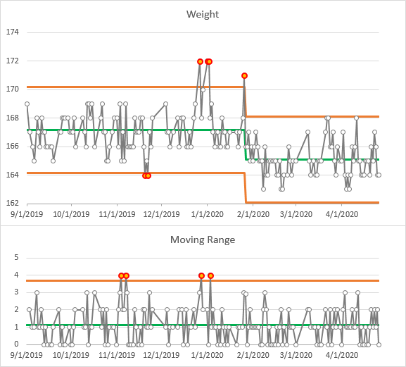
In the first comment, Derek asked for a box plot, so I quickly recompiled my data and built one.
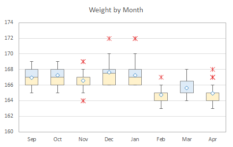
Several new features of Office 365 made it very easy to mush my data around, and I realized that this is a good example to show them in action. I used Dynamic Arrays, the XLOOKUP function, and the new LET function.
Dynamic Arrays
Joe McDaid of Microsoft’s Excel team wrote about Dynamic Arrays in Dynamic Arrays and New Functions in Excel! These formulas break the old paradigm of one formula per cell. In classic Excel, you needed a formula for every value you calculated. Sure, we had array formulas, but you had to include all output cells together and enter an array formula in all of the cells at once. If you didn’t use the right number of formulas, or if your model expanded, you had to rebuild the formula. Ugh! Plus array formulas, amirite?
The new Dynamic Arrays allow you to enter a formula into one cell. Excel figures out how many cells you need, and “spills” the formula into the required range of cells. One formula, multiple cells. And with a retooling of Excel’s underlying grid, any formula can become a Dynamic Array.
In Preview of Dynamic Arrays in Excel, Joe tells us that Dynamic Arrays have rolled out to Office 365 subscribers, with users in the Semi-Annual (Targeted) channel getting them starting last month. I presume that users in the Semi-Annual channel getting them soon as well.
I used a few Dynamic Array Formulas in my example.
XLOOKUP
For years there has been a debate about which is better, VLOOKUP or INDEX/MATCH. I don’t know why there was a debate, because INDEX/MATCH is clearly the superior choice. Like Zoolander, VLOOKUP can’t turn left, and there were many things that could go wrong with your lookups. INDEX/MATCH has its own problems as well, mostly because of the default Match_Type setting which could lead to bad results.
In Announcing XLOOKUP, again by Joe McDaid, we learned of this new lookup function that eliminates the perils and shortcomings of VLOOKUP. It’s simpler to use and more flexible, and best of all, it begins with XL. You can read documentation in XLOOKUP Function. XLOOKUP is on about the same release schedule as Dynamic Arrays.
LET
According to Announcing LET, the new function allows you to assign a name to a value or intermediate calculation at the beginning of the formula, then use this named argument in the main calculation. The LET function improves performance by computing an intermediate calculation just once and allowing reuse of the computed value, and it helps readability of your formulas by allowing you to use descriptive labels for these intermediate calculations.
LET is only available to Office Insiders at this writing, so you’ll have to be patient.
Recompiling the Weight Data
The Data
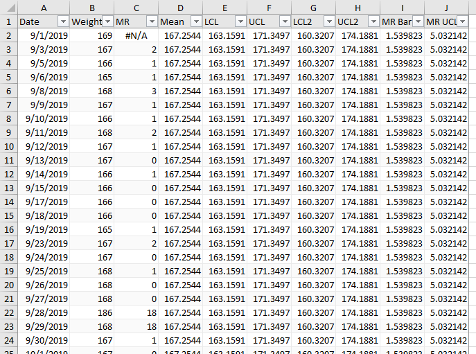
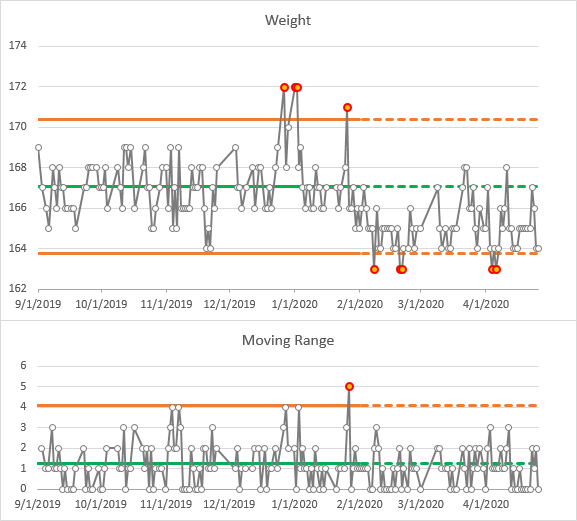
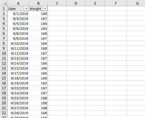
In my previous post, I examined fluctuations in my body weight between last September and this April. The data is in a two-column Table. I will construct a table in the worksheet, starting in cell D2, which has month and year as column headers and day numbers in the first column of each row. This will produce a grid of mostly weights with some missing values, and it feeds directly into Peltier Tech Charts for Excel, the VBA add-in I use to make box plots.
Set up the Grid Headers with Dynamic Arrays
I need to show the months from September through April across the top. I will use the new SEQUENCE function to make a list. In cell E2, I enter the formula
=SEQUENCE(1,8,9,1)
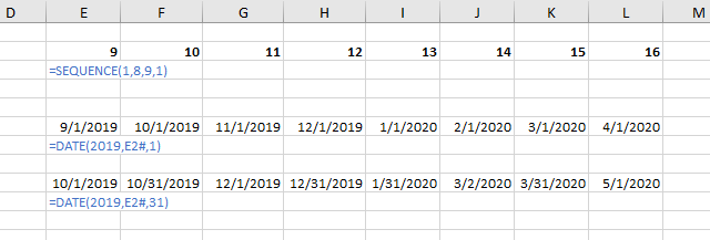
Which tells Excel to make a sequence with 1 row, 8 columns, start the sequence at 9, and increment by 1. And you see the Dynamic Array in E2:L2 filled with this sequence. If the active cell is within this range, the entire Dynamic Array range is highlighted as shown.

But Jon, you may say, you need the months to go up to 12, then start again at 1. And the answer is, no I don’t. A few rows below the first Dynamic Array, I have written a temporary formula to check the dates:
=DATE(2019,E2#,1)
Which tells Excel to give me a date using 2019 as the year, E2# as the month, and 1 as the day. The hash or pound sign appended to E2# tells Excel to use the Entire Dynamic Array that is anchored in cell E2. So I’ve entered this formula in cell E6 only, but it spills into the range E6:L6 to accommodate E2#.
And we see that if I define a date using the year 2019 and the month 13, it uses 12 months to increment the year to 2020, and uses the leftover month, so I get January 2020. Well, you probably new that, but it’s a nice little trick.
In row 9 I repeat the previous formula, but with 31 days. Excel does the same thing with excess days, and converts September 31 to October 1, etc.
So Dynamic Arrays, pretty cool, right?
Now to get the dates I want, I’ll wrapt SEQUENCE in the DATE function:
=DATE(2019,SEQUENCE(1,8,9,1),1)
and Excel gives me the first of each month in the study.

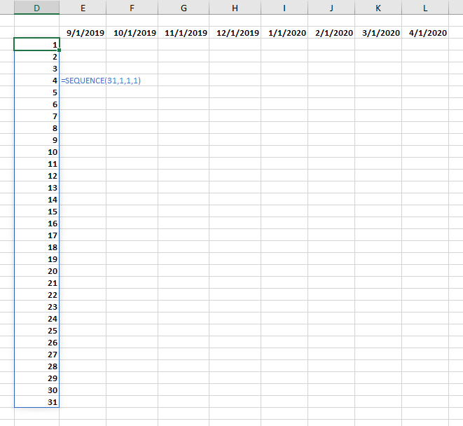
Now let’s fill in the column of days. I’ll use another SEQUENCE function in cell D3, an easier one this time:
=SEQUENCE(31,1,1,1)
Which is a sequence of 31 rows and 1 column, starting with 1 and incrementing by 1.
Populate the Grid with Dynamic Array Dates
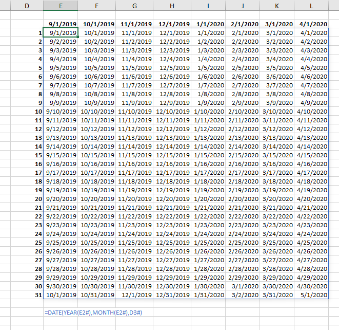
In cell E3, I entered a formula to calculate the dates for my lookups.
=DATE(YEAR(E2#),MONTH(E2#),D3#)
Meaning, give me the data using the year and month from the date E2# and the day from D3#. This new Dynamic Array fills up the whole rectangular range defined by the two Dynamic Arrays it references. Note the extra dates in the September, November, February, and April columns.
Make Dynamic Arrays Perform the XLOOKUP
The dates are fine (except for those extras, which we’ll take care of soon). So let’s wrap the date in XLOOKUP.
=XLOOKUP(DATE(YEAR(E2#),MONTH(E2#),D3#),
Table6[Date],
Table6[Weight],
"")
I’ve put each argument onto its own line for clarity. Basically, I’m telling Excel to look for the date we’ve calculated, look in the Date column of Table 6, and if you find it, return the value from the Weight column of Table 6. And if you don’t find it, give me a cell that looks blank with “”.
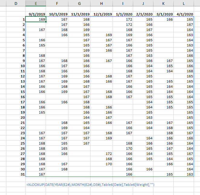
And here are the weights, including some duplications: note that the 10/1/2019 weight of 167 appears at the top of the October column but also at the bottom of the September column.
Remove Duplicate Weights
So how do I eliminate those duplicates? Even though Excel computes DATE(2019,9,31) using month 9, the result is month 10. So I’ll enter a formula that checks whether the month calculated in the lookup cell matches the month in the header cell: if so, perform the XLOOKUP, but if not, return “”.
=IF(MONTH(DATE(YEAR(E2#),MONTH(E2#),D3#))=MONTH(E2#),
XLOOKUP(DATE(YEAR(E2#),MONTH(E2#),D3#),
Table7[Date],Table7[Weight],""),"")
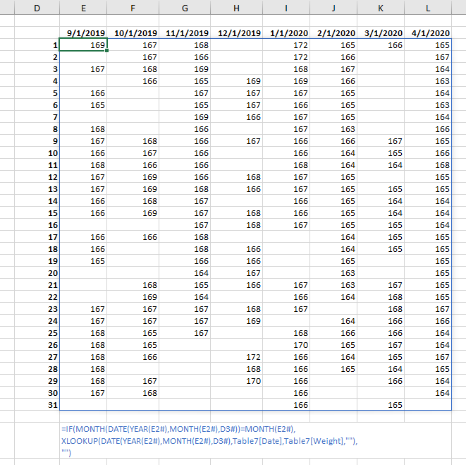
Clever trick to skip those duplicates, Jon, but that’s an unwieldy formula. That big chunk MONTH(DATE(YEAR(E2#),MONTH(E2#),D3#) appears twice, and we’ve all written monstrosities which has more than one chunk like this repeated more than twice.
LET’s Try Out LET
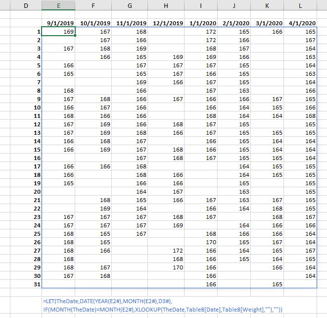
So I’m going to take the new function LET out for a spin. I’ll create an argument called TheDate, and it will stand for MONTH(DATE(YEAR(E2#),MONTH(E2#),D3#). Then in the calculation, I’ll use TheDate where the big chunk was before.
=LET(TheDate,DATE(YEAR(E2#),MONTH(E2#),D3#),
IF(MONTH(TheDate)=MONTH(E2#),
XLOOKUP(TheDate,Table8[Date],Table8[Weight],""),""))
This formula is only a few characters shorter than the original, but it’s certainly a lot easier to read. And if I had to change something in the definition of TheDate, I would only have to change it in one place, and not worry that I forgot to change it somewhere else.
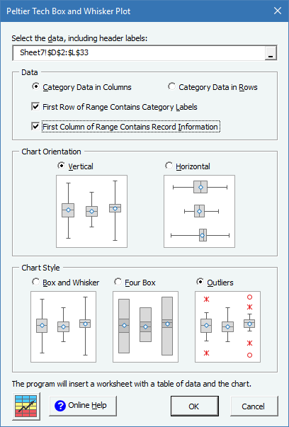
Now all I have to do is select the data and insert my box plot.
More About Dynamic Arrays, LET, and LAMBDA
- ISPRIME Lambda Function
- Lambda Moving Average Formulas
- Improved Excel Lambda Moving Average
- Excel Lambda Moving Average
- LAMBDA Function to Build Three-Tier Year-Quarter-Month Category Axis Labels
- Dynamic Array Histogram
- Calculate Nice Axis Scales with LET and LAMBDA
- VBA Test for New Excel Functions
- Dynamic Arrays, XLOOKUP, LET – New Excel Features
Power Query
Of course, Excel often gives you many ways to accomplish the same objective. You can use Power Query to manipulate this data in the same way, as I show in a follow-up article, Use Power Query to Manipulate Your Data.


