I came across a blog post called Is it just me? (software defaults), which asks the age-old question, Why Are My Excel Bar Chart Categories Backwards? The post was in a new blog by Alex Kerin of Data Driven Consulting. Alex works on projects in analytics and dashboarding.
I have been asked this question a number of times, and being a founding member of Chart Busters, of course I know the answer. I’ve answered the question a number of times, but if I answer it here, it will become available for the ages.
I describe the problem and how to correct it. If you are really interested, I finish with an explanation of why this happens.
The Problem
Let’s use some very simple data to illustrate the problem.

Let’s make a simple bar chart.
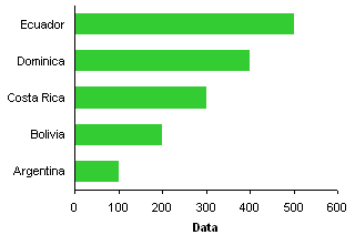
The labels were sorted from top down in the worksheet, but they appear from bottom up along the chart axis.
The Fix
It’s easy, if tedious, to correct the order of category axis labels. Select the axis, press Ctrl+1 (numeral one), the universal shortcut in Excel for Format This Object, and in Excel 2003 the following dialog appears.
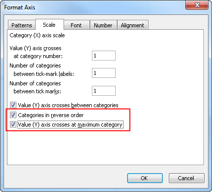
The fix is simple: check the two boxes for Categories in reverse order and Value (Y) axis crosses at maximum category.
The protocol in Excel 2007 is the same, except the dialog looks a little different. You select the same options, but they are located far apart on the dialog.
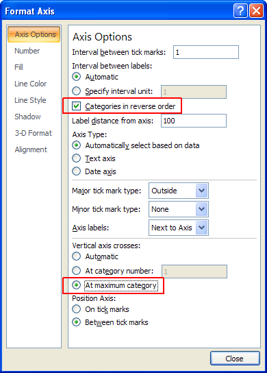
This changes the order of axis labels in our bar chart.

If you forget to make the value axis cross at the maximum category, the axis will now appear at the top of the chart. After reversing the order of the categories, the maximum category is at the bottom of the axis.

Why Does Excel Do That, Anyway?
If we use the same data to make a column chart (line and area chart, too), the labels go from left to right, as expected.
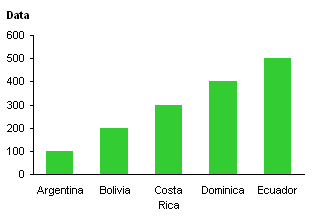
Take another look at the column chart, and note where the origin of the axis system is located. I’ve indicated the origin with a red circle.
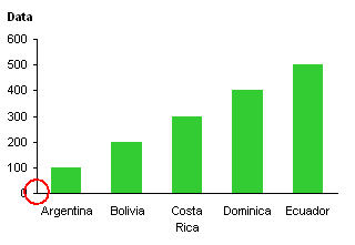
The values start low (at zero in this case) at the origin and increase in value as they move away from the origin. The category labels start with the first one next to the origin and later labels in the list extend further from the origin.
Now look at the bar chart and consider the origin of its axis system.
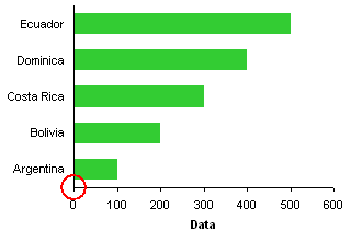
The values start low (zero) at the origin and increase in value as they move away from the origin. The category labels start with the first one next to the origin and later labels in the list extend further from the origin. Just like in the column chart.
Perhaps this is better illustrated if we remove the category data from the bar chart. In this case, Excel uses the counting numbers 1, 2, 3, etc. in place of the empty categories.

Both axes have low numbers next to the origin and higher numbers further away.
The whole problem arises because Excel follows the same axis ordering scheme for bar chart category axes as for any other axis in any other chart.
This describes the mechanics of axis label ordering. But, 99% of the time, a user expects the axis labels to go in the same order top to bottom as in the data source. Why Are My Excel Bar Chart Categories Backwards? is still a valid question: Why can’t bar chart categories automatically be reversed? Alternatively, why can’t the options for a bar chart’s category axis default to:

Works for me.


Adam says
Thank you! I have always known about the “Categories in reverse order” but the other tick option is great!
Now that saves me having to manually sort the categories…small things! :)
derek says
Really, why can’t the “column” and “bar” chart types be abolished altogether, in favour of a “rotate by 90°” option available for all chart types? The axis would still have to be moved to the bottom for those who like it at the bottom, but at least the logic will make sense to users. (a “transpose axes” option will avoid the axis having to be moved, but leave you with the “backwards categories” headscratcher, although I’ve never had a conceptual problem with it)
Also, dot plots would now be a natural Excel chart type, instead of something that has to be kludged using a scatter plot.
chrisham says
At first I thougt of just skimming through! But thankfully I did not, the tick mark at the maximum value was something I did not understand. But this tutorial was just what the (Chart) Doctor Ordered.
Mike Alexander says
Jon: Thank you for finally explaining why this happens. I’ve worked around this problem for so long, I gave up wondering why it happens a long time ago.
Tony says
Jon – great explanation as to why this happens. Also, I often prefer the x-axis labels to be positioned at the top of the chart versus the bottom. I guess we scan from top to bottom and it’s easier to understand the scale first before looking at where the data falls.
Jon Peltier says
I think many of us have been using charts with axes along the bottom and left edges of a chart since we took pre-algebra in middle school. Often it makes more sense to put the vertical axis to the right, since that’s often where you find the latest and most important data. But we stick to our conventions because they look right or feel right.
Alex Kerin says
Jon, thank you for the post. I suppose there’s an element of consolation that at least there’s a reason why they are not in the order we would expect them.
Tony brings up a good point as well – having the axis at the top is good, especially if it’s a chart that the user is not accustomed to.
Grant says
This is exactly what I was looking for. Stupid Excel for putting my months bottom up! Or stupid me for expecting it that way? Smart u for knowing what I want to do.
Thanks a million!
-g
Mark says
I really like the blog! Keep going!
My issue is with the added data table. I have the axis at the top (which I like) and I reversed my order for the left access (Jan through Oct with Jan at the top), but when I added the data table at the bottom, the months are backward. Oct is on the left and Jan is on the right. How can I switch the months on the data table?
Jon Peltier says
Mark –
I never use those data tables, I really hate them, so I can’t help.
Myles says
Posted in 2009, still helpful today. Many thanks for the info!
Wu says
Nice advice. Thank you so much, Jon!
By the way, could you help me with how put to put the data label with the percentage(each category accounts for the whole) instead of the levels?
Thanks again!
Jon Peltier says
Wu –
If you need custom labels, first calculate them in the worksheet, then use Rob Bovey’s Chart Labeler (free from http://appspro.com) to apply these calculated labels to the data points.
Robert says
But if you have a data table ‘on’ for a chart it reverses the order of categories in it too (which will now make it the reverse of the order of the data – basically wrong). Anyway to fix this?! The data table formating doesn’t seem to have the same options.
Jon Peltier says
Robert –
Yes, well, formatting of those built in data tables leaves much to be desired.
Carl Gentry says
If you have two series and have one use the secondary axis the reverse order does not have an effect. That means one series is top to bottom and the other is bottom to top!!
Is there any to check box to fix this “Feature”? I will have to sort the data for the chart.
Jon Peltier says
Perhaps you need to reverse the plot order along the secondary axis as well?
Joe says
This is such a helpful, user-friendly explanation. Thanks!
Johnny says
“Jon Peltier says:
Thursday, November 15, 2012 at 5:23 pm
Perhaps you need to reverse the plot order along the secondary axis as well?”
This is exactly the problem I am having. How can I change the secondary axis in Excel 2010? I tried messing with the series order first but did not get anywhere. It seems I can only change the format in the primary axis…
Jon Peltier says
You can format any element in a chart that exists. Note that you can’t change the plot direction of an axis which isn’t present. In the ribbon, find the Axes dropdown, and add the axis that you are lacking.
José Luis says
I agree with Johnny…
I have 3 series on a table ordered z->a on the column 3:
2 series on the primary axis (showing the total number of pieces and the number of faulty pieces)
and 1 series (with the % of those faulty pieces among the total) on the secondary axis
and I can not see a way to order the last one along with the other two and the table.
Jon Peltier says
José Luis –
Could you clarify the data layout and how you’d like it to appear in the chart?
José Luis says
Hi, Jon,
I will try to make myself clearer,
I have a pivot table showing 4 columns:
1. Company name, 2. Number of units they make, 3. Number of those units with defects, 4. %s (column3/column2)
The table is ordered form max to min on column 4 (that is, highest % on the top).
I have a pivot graph related to the table:
On the Y axis we see the company names (column 1 in table)
On the main X axis (down) we see the number of products (columns 2 and 3 in table)
On the secondary X axis (up) we see %s (column 4 in table)
I would like to see the 3 kind of horizontal bars on the graph be displayed ordered the same way that on the table…
How can I do that?!
José Luis says
I was able to do it at last!
I can not believe it!
I had to select de % series and not their X axis (up) to make the changes…
Thank you for your time and advise.
José Luis says
Forget my final conclusion… I was doing things wrong, that is all.
Maria says
Thanks so much!!! I was getting very annoyed with my Excel before I found your post. Very helpful
Paul McKay says
John,
Thank you for all of your amazing Excel tutorials. I need some help.
I have a pivot chart which graphs in a 100% stacked bar. I am creating Stacking Plans (to show building vacancy visually).
for my data, i have 4 Axis Fields (City, Province, Unit, Floor), and it all looks how i want it, except the AXIS LABELS. i just want to show the Floor # in the axis. it looks mostly fine, except the bottom where it shows the entire string City-Province-Unit-Floor. When I hover over all of the floors, it shows the same (entire) string. I think what I need to do is segregate the multi-categories, and format them differently, but I can not find the relative object.
I hope this is clear enough, and I sure hope your expertise knows what to do!
Thanks,
Paul
Sharon says
Seven years after you wrote it, and your post still solved my problem. Thank you for the solution, and the explanation.
I found the “Categories in reverse order” option in Office 2016 by selecting the vertical access labels, right-clicking, and choosing “Format Axis”. Then selecting the option under “Axis Options” > “Axis position”.
There are many, many options for formatting various parts of a chart these days, and I just couldn’t figure out the right piece to select. Thanks again!
Sharon
Jon Peltier says
Sharon –
Glad to help. This still plagues people, and I still give the same answer. I even wrote another tutorial, Excel Plotted My Bar Chart Upside-Down, because I forgot I’d already answered in in my blog.
Jane Doe says
Looking for this same solution but within PowerPoint. When selecting the chart in PowerPoint, clicking Edit Data, selecting the data and pressing CTRL+1, it brings up a Format Cells instead of Format Axis.
Jon Peltier says
Jane –
You don’t select the data. Right click on the axis, choose Format from the bottom of the list, and change the axis settings as described.
Adam says
Really helpful, thank you!!
David Walter says
I am missing something from your write-up about reversing plotted data. I create a line chart, columnar data, stock price data is printed left to right as most recent to oldest, am use to other way, oldest to the left. Had a second column of calculated values derived from the prices. When I inserted onto the chart as series2, also plotted left to right, most recent to the left. ‘net search showed could change the format axis and on clicking a dialog box, click box for “categories in reverse order” thought ‘great’ done! but clicking that box only reverses data series1, data series2 is unchanged. What have I missed to reverse both data series?
Thanks for your time and help in advance
David / fairweather
Jon Peltier says
David –
If satires 2 is plotted on secondary axis, it will not be reversed. You need to add a secondary X axis, and reverse it. I’ve sent it to Microsoft as a bug…
David Walter says
Thanks for taking time from I’m sure a very busy schedule. Hope adding a second X axis won’t be a big hassle, but also pretty sure easier that creating a helper column and transposing the data to reverse column data order and then plotting. Will contact the Excel Forum where I had earlier posed the problem to let them know you have identified this as a bug and contacted Microsoft as such..
David
Jon Peltier says
David –
Don’t hold your breath on that bug. I reported it many months ago.
David Walter says
Thank you Jon, (hope I spelled that right), but I followed your directions to add a second X axis, some trepidation, but did anyhow and VIOLA a second AND reversed data series (series2), Would attach chart, but I think you have too many other things to be doing plus haven’t seen a way to offer an attachment in your blog.
But posted to EXCEL forum under the Chart forum as fairweather. Hope your comments can help others. But now that removes an issue I think I have been hanging onto and now I have to quit dallying and dig into the ideas I have to see if the indicators I think are there are there, really are there.
Am more than impressed, very appreciative of your taking time excepting, now I have to quit dragging my feet and get on with analysis
David / fairweather.
Miriam says
Great tip! I have shared it with my team. Thank you!
Paul Gobée says
Thanks! Saves me a lot of tedious inverting.
It seems tech has got priority to user common sense here
MCA says
The question is still why Microsoft does this.
If I organise my categories alphabetically, the resultant bar chart is in reverse alphabetical order.
The alphabetical organisation has nothing to do with the actual data. If I’m organising my data alphabetically, then it should be pretty clear that I want the data displayed alphabetically.
Otherwise, what’s the point of Excel Charts? They just confuse the data.
I googled “why” Microsoft does this, and all I got was ways to fix the problem.
Jon Peltier says
As I pointed out in the explanation, the categories are still in alphabetical order, starting at the origin of the chart. The same way that the horizontal axis numerical labels are in numerical order starting at the origin of the chart. The “fix” shows how to change where the origin of the chart is located, top left instead of bottom left: a simple protocol requiring two clicks. It would be nice if Excel guessed that this was what users wanted, but a little understanding makes thiseasy to deal with.