Stacked Bar Chart with Labeled Totals
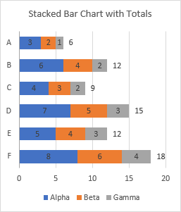
How do you add totals to a stacked horizontal bar chart? Especially if you’ve already used the existing labels for the individual bars?
There are never enough features built into an Excel chart, I know. But with a little magic, that is, smoke and mirrors, you can make an Excel chart do anything you want. That’s the premise of this entire blog, after all.
So how do you add stacked bar totals? It’s pretty easy for stacked columns, but stacked bars are pretty pretty complicated. But a student in a class last week showed me a less complicated way, and I’ll present it here.
Here’s the setup with the data and the initial stacked column and stacked bar charts.
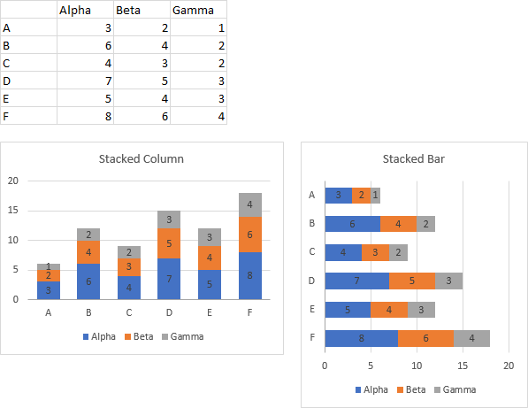
In Label Totals on Stacked Column Charts I showed how to add data labels with totals to a stacked vertical column chart. That technique was pretty easy, but using a horizontal bar chart makes it a bit more complicated.
In Add Totals to Stacked Column Chart I discussed the problem further, and provided an Excel add-in that will apply totals labels to stacked column, bar, or area charts. Below are the stacked column and stacked bar charts with the labels produced by the add-in.
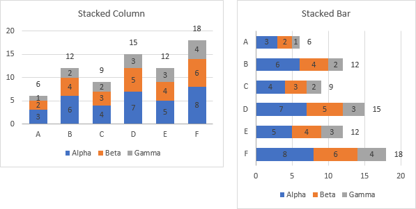
Using the add-in is great; I mean, it’s free and it works. But the labels are not dynamic: they compute a static total, and if any values are updated, the totals are incorrect. If anything changes, you need to rerun the add-in.
Stacked Column Chart with Labeled Totals
First, a quick review of the applicable procedure for a stacked column chart. Here is the data for the chart, and the initial appearance of the chart. The data in the chart is highlighted in the range, and you’ll notice the column of Totals, computed from the charted data range.
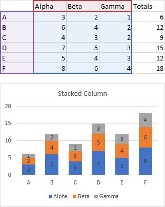
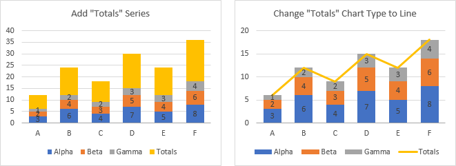
Adding Totals to this chart is pretty easy. First you expand the data range to include the Totals column (below left). The easiest way is to select the chart and drag the corners of the highlighted region to include the Totals.
Then convert the added series to a line chart series type (below right). Right click on the series (or on any series) and select Change Series Data Type, then find the series and in the chart type dropdown select the type you need. I used a line without markers.
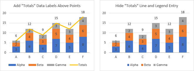
Next, add data labels to the line chart series, above the points (below left). The default labels are Y values, so you don’t need to change anything.
Finally, a little clean up. Hide the Totals line (format it to use ‘No Line’) and remove the Totals legend entry (click once on the legend, then a second time to select the legend entry, and click Delete).
Stacked Bar Chart with XY Series Data Labels (The Hard Way)
I showed the above technique in my Advanced Excel Charting Master Class last week. One student asked how I would do that in a horizontal stacked bar chart. So I said, it’s complicated, but you can use an XY series instead of the Line chart series in the vertical column chart.
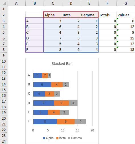
Here is the data setup and the initial horizontal stacked bar chart. The plotted data is highlighted, while the computed sums are in column F, and the necessary Y values for the added XY series are in column G. The formula in cell G3 is:
=(ROW()-ROW(G$3)+0.5)/ROWS($G$3:$G$8)and this formula is filled down the column as far as necessary. This produces a set of values which are distributed along an axis that is scaled from zero to one.
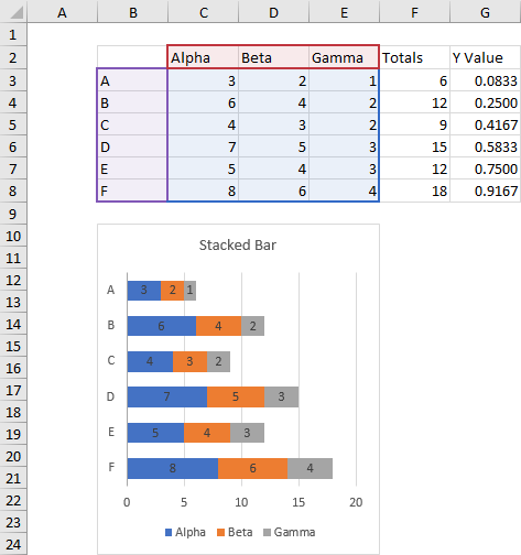
Copy F2:G8, select the chart, and use Paste Special from the Paste dropdown on the Home tab of the ribbon, and add the data as a new series, by column, with series name in the first row and category labels in the first column (don’t replace existing categories). This gives you the small yellow bars added to the end of the stacks (below left).
Convert the added series to an XY chart type. Right click on the added series (or any series) and choose Change Series Chart Type, find the series, and choose an XY Scatter type; I used XY Scatter, with markers but no lines (below right).
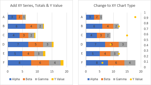
So the markers are there, but not in the right place. To fix this, format the right hand vertical axis, and check the box for Values in Opposite Order (below left).
Add data labels to the XY series (below right).
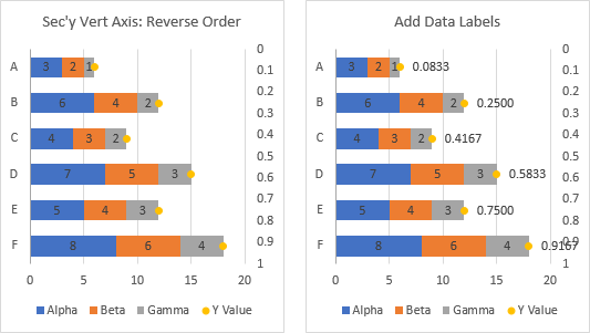
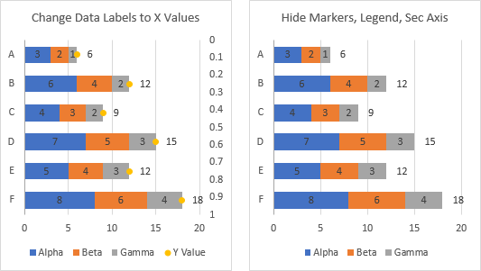
Format the data labels to show X values, not the default Y values (below left).
Finally, hide the stuff you don’t need. Format the XY series to have no markers. Hide the secondary (right-hand)vertical axis by formatting the label position to ‘No Labels’ and formatting the line to have ‘No Line’. Hide the unwanted legend entry by clicking once to select the legend, clicking again to select the unwanted legend entry, and clicking Delete.
The finished chart is shown below right.
Stacked Bar Chart with Bar Series Data Labels (The Easy Way)
I showed the previous technique in the Master Class, and one of the other students told me she had figured out a better way. “And it doesn’t use so much MATH!” she added. My wife is an eighth grade math teacher, but I won’t take the comment personally.
Show me, I said. And she did. Here’s the setup, with the data and the original chart. The Totals data is exactly just a column of zeros, with the calculated totals in the Values column.
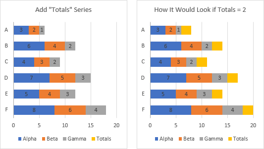
The first step is to expand the chart data range to include the column of zeros (below left). Zero-value bars don’t show up, so the chart below right shows how it would look if the values were a column of 2s.
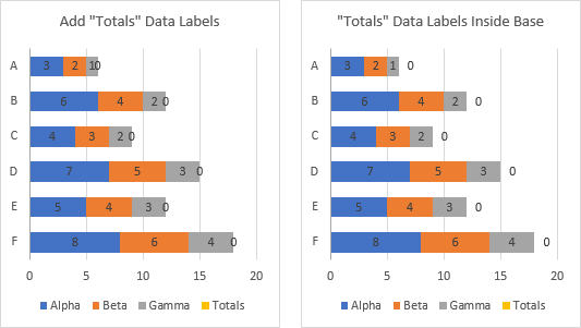
Next, add data labels to the added series (below left) they are all zero, and they are centered on the bars, which means centered on the ends of the previous stack.
Format the labels to use the Inside Base position, which moves them a bit to the right (below right).
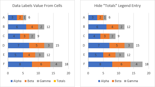
Format the data labels to use the Value From Cells option, and select the column of calculated sums (column G) for the labels (below left).
Finally, hide the unwanted legend entry (below right). Click once to select the whole legend, then again to select the unwanted entry, then press Delete.
Any time I learn something from the students in my class, it’s a successful class. I’m always happy to admit I don’t know everything, and I’m equally happy to share what I’ve learned.
Stacked Bar Chart with Clustered Bar Series (Also Easy)
A smart reader named Sandeep pointed out another variation that does not require too much math. His approach uses a clustered bar series for the labels, because clustered bars have an option to place the labels outside the ends of the bars. Since clustered and stacked bars can’t be on the same axis, we need to move some series to the secondary axis. I will move the stacked bar series to the secondary axis, so the clustered bars will remain hidden behind the stacks of bars.
The approach varies a bit if you show the vertical axis categories in reverse order, which I discuss in Why Are My Excel Bar Chart Categories Backwards? and Excel Plotted My Bar Chart Upside-Down.
Thanks, Sandeep, for sharing your suggestion.
Vertical Categories NOT in Reverse Order (default)
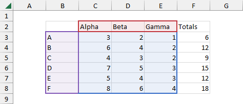
The data looks the same as above, with only a single added column calculating the totals.
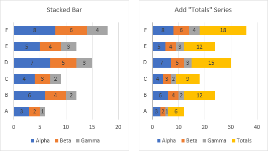
Start with the stacked bar chart (below left), with categories not in reverse order (that is, upside-down), and add the Totals series (below right).
Right click on any of the series of bars and choose Change Series Chart Type from the pop-up menu. In the list of series below the chart preview, check Secondary Axis for all but the Total series.
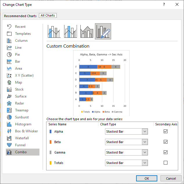
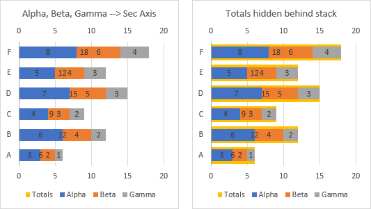
The chart is shown below left. The Totals series is still present, but it is hiding behind the stacked bars. If I make the Total bars wider by decreasing the gap width, you can see the edges of the Totals bars peeking around the stacked bars.
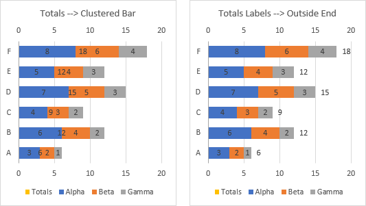
But leave the gap width alone, so the Totals remain hidden. In the same dialog as above, change the chart type of the Totals series from stacked bar to clustered bar. The appearance is still the same (below left). Format the data labels of the Totals series so their position is Outside End (below right).
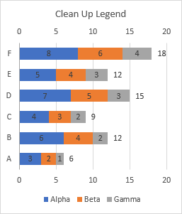
Finally clean up the legend by removing the unneeded legend entry: select the legend, then select the Totals legend entry, and press Delete.
Vertical Categories in Reverse Order
Start with the stacked bar chart (below left), with categories in reverse order, and add the Totals series (below right).
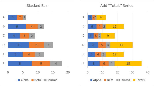
As above, right click on any of the bars, choose Change Series Chart Type from the pop-up menu, and check Secondary Axis for all but the Total series. Some of the longer Totals bars extend beyond the shorter stacks (bottom left). Change the Totals chart type to clustered bar (below right).
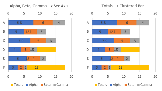
Format the Totals data label position to outside end (below left).
The Totals bars are plotted in reverse order (the longest bar is at the bottom as in our starting chart) but the stacks are not (the longest stack is at the top). Add the secondary vertical axis and delete the secondary horizontal axis (below right).
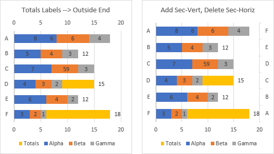
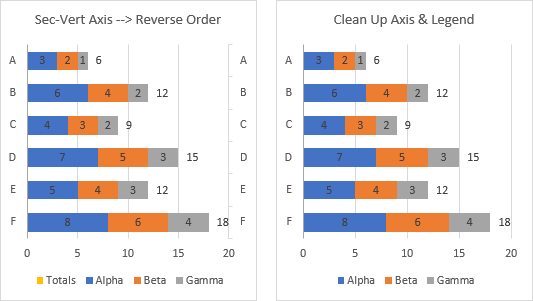
Format the secondary vertical axis so that its categories are in reverse order; the Totals are now completely hidden by the stacked bars (below left).
Now we just need to clean up the chart. You can delete the secondary vertical axis, or you can keep it in the chart but hide it by formatting the tick label position to no labels and the line format to no line. Also, remove Totals from the legend: click on the legend, then click on the legend entry, and press Delete.
Coming to you today from…
Rather than sitting in a hipster coffee shop while I wrote this article, I went across town to the Greater Good Imperial Brewing Company. While writing, I had a flight (well, two flights) and some hot pretzels with mustard. I was not the only patron there working on my laptop.


David N says
Looks like the Inside Base option with an all zero helper series works for stacked columns as well, avoiding the need for any math to calculate a line.
Andy Pope says
Hi Jon,
Another alternative on stacked bar chart is to use a cluster bar on secondary axis.
The new total series bar can have data labels displayed outside end.
You do have to make sure the secondary vertical axis is formatted similar to primary and remove fill from the new total series.
Jon Peltier says
David –
Inside Base works fine for positioning labels in a stacked column chart. However, you still need to do the math to calculate the sume, for the labels. And you need to use the “Values from Cells” option for the data labels, which is not as reliable as the Y Values option.
Jon Peltier says
Andy –
That works as well, with a couple caveats. Keeping the axes aligned can be a nuisance. Also, with the invisible bar on the secondary axis, it blocks attempts to click on one of the primary stacked bars. This is easily handled by putting the total bar on the primary axis and the stacked bars on the secondary.
David N says
Jon, you’re correct. I should have stipulated that I was referring to the more generic case of positioning a label that could then contain any text, be it the total that would still require math, or some other tidbit of information that could be totally unrelated to the Y value.
I’ve personally found that the Values from Cells option is most reliable when “everything” abot the chart is sourced from columns wihtin a structured Table. Then each new data point not only appears automatically in the plotted series, but its custom label is automatically applied as well. (As opposed to other/older methods of applying cutom labels which require that something be done or redone each time a new data point is added to the series.)
Jon Peltier says
David –
For the general case of data label positioning, yes, the zero-value column/bar is a nice thing to have in our toolkit. If the label shows the totals, then the line chart approach is better for a stacked column.
In the ideal world, all chart data is neatly arranged in orderly Tables, and most everything is pretty reliable. In actuality, data comes in many forms, and sometimes it takes a lot of effort to get it into a Table.
Robert Lalonde says
Hi Jon,
Cool technique. I think with your experience with presenting data, you would have sorted the beer samples from light to dark. :)
Cheers.
Bob
Jon Peltier says
Bob –
I’d like to say they were ordered by ABV or IBU, but really, they’re in the order I picked them off the menu.
John Wright says
IBU – so I’ve learned two things from this post!
Rich Williams says
Thanks Jon! I can be dense when it comes to following instructions, but it was a clear post.
Nicola Kastner says
I thought I was missing something simple. Apparently not but this worked. Thanks for sharing
Sandeep Lele says
I found another way.
No need to have the ‘zero’ value column in the table. Just need the data columns and the ‘totals’ column.
Create the chart as a combo chart. Series gap 100%.
Make the data bars as ‘stacked’ bars with data labels in the ‘center’.
Make the totals bar as ‘line’ chart. The line will show wrt X axis. don’s worry. Simply add data labels to ‘right’.
now convert this series to ‘clustered’ bar. It will hide behind the stacked bars. and the totals will automatically show outside the respective bars.
Jon Peltier says
What zero value column? Didn’t you just describe the actual technique I’ve used?
Sandeep Lele says
I had looked only at your solutions for stacked bar chart, not the stacked column. And also at your statement in the original post viz. “… One student asked how I would do that in a horizontal stacked bar chart. So I said, it’s complicated … ”
Now I see that the solution I gave is similar to the one you showed for stacked column.
I wonder why did you not use the same method for stacked bar chart and rather said ‘ it is complicated ‘.
Jon Peltier says
It’s complicated since you cannot use a line chart series to add labels for a horizontal bar chart: they will never line up. So it is necessary to use an XY Scatter series with extra data to align the markers with the bars, or one of the other tricks with more bars.
Sandeep Lele says
Not really.
If you follow the steps I mentioned, the horizontal bar chart also shows totals. Without any additional columns or XY scatter in the data table.
I wrote it only after I could do that myself in a chart.
Jon Peltier says
I must apologize. Your approach works fine. I was reading on a train to the airport, so I must have been distracted, and I missed your last step. Now that I’m back in my office, I tried your protocol step-by-step and got the desired result. It can be more complicated than your approach shows for various reasons, such as when the categories are plotted in reverse order, but it can still be used effectively.
Sandeep Lele says
No worries. In fact, it’s good that we have an agreement !