Usually in order to characterize plotted data more completely, it helps to add a target line to your chart. There are a number of ways to do this in an Excel chart. If your chart is a column chart, you can add another column series, you can add a line series that spans the middle of the first column to the middle of the last, you can add an XY series that spans the entire chart, or you can add an XY point with an error bar that spans the chart.
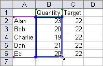
We are plotting how five employees of our widget factory perform against their target of 22 widgets. Here is the data; ignore the extra data beyond column C for now.

A plain chart of the employees’ performance is shown here. This column chart was created using the data in A1:B6.

To add a column series or a line series, the first step is to expand the data to include A1:C6. That is as simple as selecting the chart’s plot area or chart area, then dragging on the corner of the highlighted source data range until it includes the entire range needed. You could also copy the data and paste it into the chart, drag the data onto the chart (if you’re not using Excel 2007), or use the Source Data dialog to add a series with the appropriate data.
 – – –
– – – 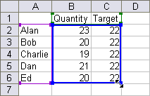
The result is a clustered column chart with two series.
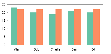
Putting the target right next to the values makes the chart a bit counterintuitive for the reader, so we’ll take a different tack. Format the target series so it is plotted on the secondary axis.
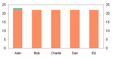
Now format it to have a border and no fill (usually I format column series to have a fill but no border). Then you can adjust the gap width if you like. I usually use a gap width of 100 (the default is 150), which means the gap between clusters is equal to 100% of the width of a single column. Below, I’ve made the gap width of the secondary series about 50.
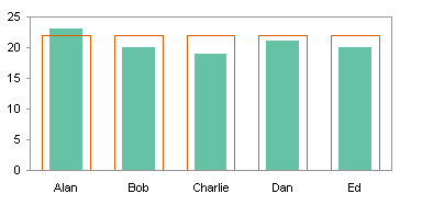
You could also use the same gap width for both, so it looks like the values are filling up the targets. I’ve used formatting that has a bit better contrast.
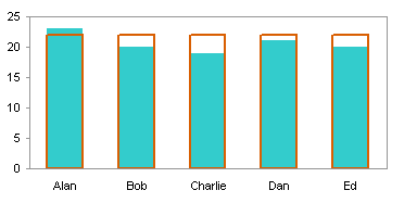
While the dual-column approach works well enough, it’s usually not as nice as the other techniques. To use a line series, start with the clustered column chart from above.

Right click on the target series, choose the Chart Type command, and choose a line type. You should choose a type here with no markers, but I’ve left the markers for illustration purposes.
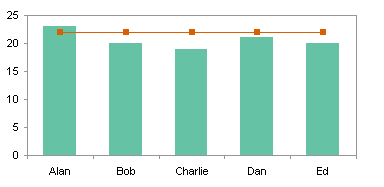
The markers are gone, and I’ve added a data label to the last point showing the target value.
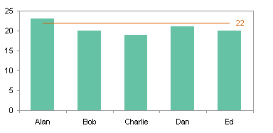
The line and column combination chart is not bad, but the line doesn’t extend to the edges of the chart. The solution, described on my web site but also demonstrated here, is to add an XY series to produce the line. Using what we learned in Integer Values on Line Chart Category Axis, we know that the starting and ending X values for the XY series are 0.5 and 5.5, since the categories have effective X values of 1 through 5.
Start with the column chart with a single series, the values. Copy the data in E1:F3, select the chart, and use Paste Special to add the data to the chart as a new series, with series data in columns, series names in the first row, and categories in the first column.

Right click on the target series, choose the Chart Type command, and choose an XY type. You should choose a type here with no markers, but I’ve left the markers for illustration purposes. Excel moves an XY series to the secondary axis when it is added to a column or line chart, so this chart has primary and secondary axes.
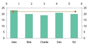
Format the target series so it is plotted on the primary axis. Now the target line spans the entire chart.
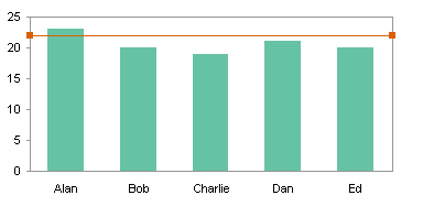
Remove the markers. In the chart below I’ve added a data label to the second point, to show the target value. You could add this or another label to either or both points.
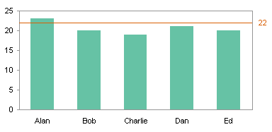
An alternative to a two-point XY chart for a target line is a one-point line with an error bar, as described on my web site. Start with the initial column chart with just the values. Copy the data in H1:I2, select the chart, and use Paste Special to add the data to the chart as a new series, with series data in columns, series names in the first row, and categories in the first column. (H2 contains the X value 5.5, so the point lies along the right edge of the chart; use 0.5 to position the point on the left edge of the chart.)
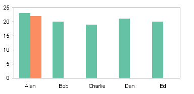
Right click on the target series, choose the Chart Type command, and choose an XY type. You should choose a type here with no markers, but I’ve left the markers for illustration purposes. Excel moves an XY series to the secondary axis when it is added to a column or line chart, so this chart has primary and secondary axes.
While formatting, add a negative horizontal error bar, with a length of 5, to the XY data point.
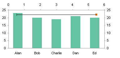
Format the color of the error bar to match the desired target line color, and choose the error bar style without end caps.
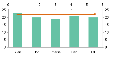
Format the target series so it is plotted on the primary axis. Now the target line (error bar) spans the entire chart.

Remove the data point marker, and if desired add a label.

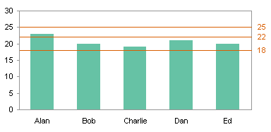
The error bar approach is convenient if you want a series of lines across the chart. The data for the target series would have multiple rows like this:

This data produces three points along the right edge of the chart, each with an error bar and data label.


Chris says
Thanks Jon! This looks very helpful, and I’ll try to get it to work in practice when I get the chance.
Jon Peltier says
Tony – If all the scales are the same, isn’t a single chart better than a set of bullet charts?
Tony says
Target lines are a very good idea. If you aren’t using bullet charts, then this is the next best way to visualize targets.
paresh says
great graphical analysyis, thanks for sharing.
Kevin says
Jon,
Thanks for this. Is there any way to use a similar procedure to add a target (vertical) line to a stacked bar (horizontal) chart created in Powerpoint 2003? It doesn’t have the same functionality as Excel, so I’m wondering if your procedure can be translated somehow to work in a Powerpoint chart?
Been trying to make this work for three days. Would really appreciate your help.
Thanks a lot,
Kevin
Jon Peltier says
Kevin –
The charting app that’s built into PowerPoint and Word (MS Graph) does not have nearly the same flexibility as Excel’s charts. All the data has to be in the same block of data in that data table, so you can’t add series using arbitrary data. That means a great many of my tricks just aren’t going to work in MS Graph.
Kevin says
That’s what I was beginning to suspect.
Thanks, Jon.
Frank says
Can you create a goal/target line, using a pivot table chart?
Jon Peltier says
Frank –
A pivot chart cannot use data that is outside the pivot table, so using this approach to indicate a goal in a pivot chart is next to impossible.
I just revised my post “Making Regular Charts from Pivot Tables” (https://peltiertech.com/regular-charts-from-pivot-tables/) which shows how to plot pivot data without the constraints of a pivot chart. Go there, make a regular chart, then come back here, and annotate it.
Brandon says
Thank you very much for your help!!!! I have learned several new techniques which I have employed in practice.
Madhan says
Hi,
Am trying to set a target line in a line chart…but am not success in it..where as i did success in coloum chart as you described. Can you guide me to make a target line in Line chart?
Madhan says
and am trying to create a Pareto chart analysis and don’t know how to draw a chart with excel 2007, as i don’t find any two line axis like excel 2003…can you guide me how to form a 2 axis line?
Jon Peltier says
Madhan – See Pareto Charts.
Jordan says
How do you do this if you only have one colunm?
Jon Peltier says
Jordan –
If you only have one column, you can use a one-point XY series with an X value of 1.5, and a minus horizontal error bar of length 1.
Andrew Nute says
It’s astounding that we have to fool excel into what is actually a very simple request to put a line at a certain point in the graph.
Jon Peltier says
Hey, all of these workarounds keep me in business.
I think if you are patient, you may see these features begin to appear in Excel by the next major version. A lot of people have requested them, and the engineers at Microsoft are working on requests like these.
Heather says
Thank you this was extremely helpful I just have one question to expand on this. I have built a beautiful stacked clustered column pivot chart with individual targets for each column within the cluster. I used the staggered data chart to pull the information to create the chart. I would like to create a slicer for the chart but cannot find out how. Excel doesn’t allow me to turn my table into a pivot table to create a slicer that way. The horizontal axis is a series of 12 months, each has a cluster of 5 bars. I would like to be able to use the slicer to look at one bar from all 12 months, is this possible?