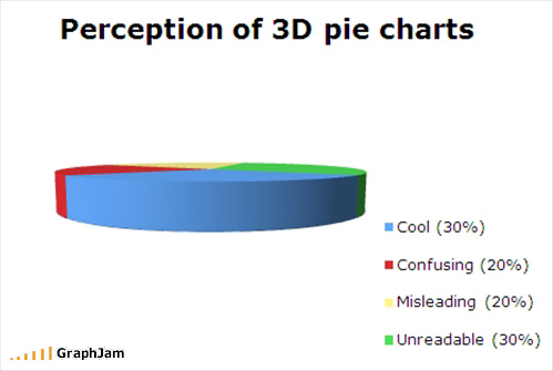
Federico gives us this excellent example of a 3D pie chart, thanks to GraphJam.

The only way I can think of to improve this chart is to explode the segments.

Oh yeah, and animate it. I’ve done just that in this zipped workbook.
GraphJam ought to be banned. After I came across the pie chart at the top of the page (I forget where I first saw it, but thanks somebody!), my daughter and I wasted spent an hour laughing at other graphs.
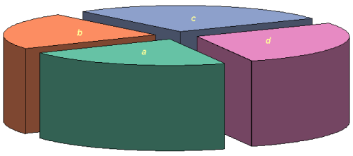
Before you think I’m completely against pie charts altogether, let me say that there are some pie charts, even in 3D and exploded varieties, which are acceptable and even welcome. This one came to me thanks to Nathan of Flowing Data. It is actually a commercial product by Mary and Matt.

I feel a Homer moment coming on.


Bob Gannon says
A different perspective can be an improvement. If you added an adjacent panel with a nice spider chart of the same data everything would be crystal clear.
Jon Peltier says
Bob –
How would that help? Excel doesn’t even have a 3D Radar Chart Type!
Bob Gannon says
Just being sarcastic. I think the only thing worse than pie charts are spider charts.
Jon Peltier says
Bob –
So was I. I’m not a big fan of either type, though I guess each has a place. At a wobbly table next to the kitchen.
Sandi Mays says
I am not a pie charts fan. Which is kind of surprising, because I really do love pie. Why waste my time and a sheet of paper with that? Showing the data in table would be a better bet.
I once had someone ask me to teach them to animate a pie chart. I refused on principal :)
Jon Peltier says
Chandoo –
Your post, which referenced this one, inspired me in a way you couldn’t have expected.
Sandi –
You didn’t like my animation?
I love pie. Even my friend Dick has stated that Peltier Loves Pie. But not pie charts.
Angie says
Hi Jon,
This chocolate pie enticed me to your site! Don’t know if you can help. I write a weight loss blog and am after an application that will let me create a pie chart (yes, I know you hate them, I read the posts) that looks like a pie, pizza, chocolate cake, black forest gateau, anything like that, showing how much weight I’ve lost and how much I have to go, obviously as a % of the total I want to lose. Any suggestions?
Thanks,
Angie
Jon Peltier says
Angie –
See Pizza Pie.
Saul Solis says
Hello, i have a problem while using 3d pies, if some of the fields, or some value from the data becomes 0, then the chart has an issue, it displays a HUGE or a single color on it. Is there anything that I can do to fix this?
Thx
Jon Peltier says
Um, Saul? The lesson is not to use pie charts, especially not 3D pie charts. Make a nice 2D bar chart.