This blog has been silent for three weeks, due to a number of other activities. To re-energize the blog, we turn to Chart Busters to clean up some unattractive and hard-to-read charts.
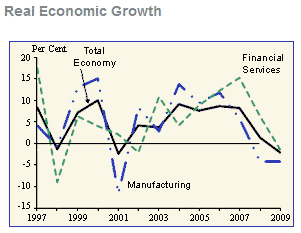
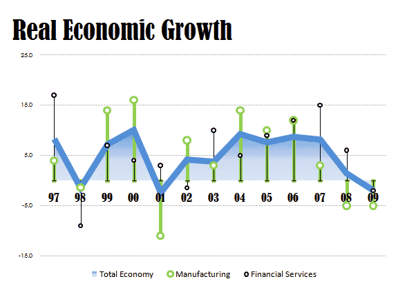
In Ugly Real Economic Growth Chart from Singapore Statistics, an Excel training service shows an ugly chart, then proposes another equally ugly chart as an alternative. Chart Busters will describe these charts, and propose better alternatives.
Ugly Original Chart

The original chart is not too attractive, though it’s not terrible. It’s a line chart, which makes sense for time series data like this. The main problem with it is the use of several line styles to distinguish the different series. The dashed line for Financial Services isn’t too bad, but the dash-dot-dot pattern for Manufacturing is more distracting than clarifying. The effect of the patterned lines is to make the cluttered data look even more cluttered.
Ugly Alternative Chart

The alternative chart suggested in the article cited above is about twice as wide and twice as tall as the original, so data per pixel is reduced by a factor of four. This would be okay if the chart were four times as easy to read, but it isn’t: many of the chart elements are just several pixels wider than in the original. The chart has somewhat brighter colors than the original, but it’s no easier to read. It has inconsistent text: the title is huge, the Y axis labels are teeny, and at least two different font faces are mixed up within the chart (not counting the title, where a different font may be a good effect).
The data is not presented well in this alternative chart. There is still a line chart for the Total series; filling under this line doesn’t help clarify this curve as much as the author states. The Manufacturing and Financial data has changed from lines to circles with drop lines. Losing the connecting lines removes the clues that help your eyes follow each series and see the trends. The drop lines make the data points look like one-legged stick figures without any arms (actually, they are reminiscent of the denizens of Tralfamadore). The overuse of gratuitous formatting detracts from the presentation of the data.
One minor problem is removal of data labels to a legend separated from the data. Another is the Y axis lacking a marker at 0%.
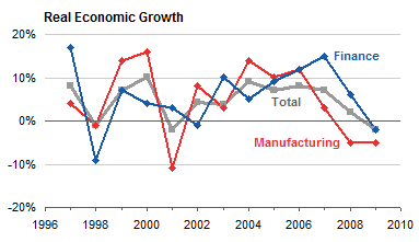
Chart Busters Line Chart

The initial Chart Busters proposal is a line chart like the original, with solid lines for all data series. The chart is a little larger than the original to spread out the points, but much smaller than the alternative above. The data labels have been restored, color coded to match the associated series. The chart is still cluttered, because the data series are intertwined.
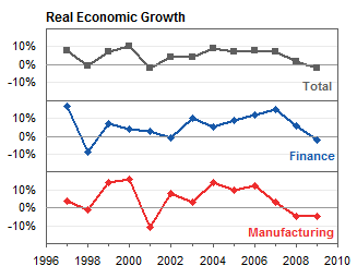
Chart Busters Panel Chart

Chart Busters decided to remove clutter in the line chart by converting it to a panel chart. The redrawn chart is taller and narrower than the first Chart Busters chart, with about the same overall area. The series do not obscure each other, yet the shared time axis allows the reader to see where the series move together and where they move separately. The darker gridline at 0% in each panel lets the reader compare positive and negative changes between the series, while the light gridlines and consistent Y axis scales help to compare the relative values of each series.


Calvin Graham says
The ‘cleaned’ one looks like the same sort of ‘beautiful’ design that thinks it’s a good idea to fill a website with animated GIFs, midi sounds and scrolling marquees :-)
The Panels are a good improvement. I’d maybe keep it as three charts but make the lines thicker and then add the other two as thinner, lighter and markerless lines so you can still make a comparrison for each. As a dynamic chart though you could switch it back to one chart and have a drop-down menu so you could change which line was thicker and highlighted (the focus).
Jon Peltier says
Calvin –
I thought of adding all series to each panel, but thought it was more cluttered than helpful:
Matt Fletcher says
I agree that the panels are much better than either of the two previous versions. But have you swapped the “finance” and “manufacturing” lines?
Jon Peltier says
Matt –
I messed up some of the data in the two series when I was manually digitizing it. I think I’ve fixed it.
Jeff Weir says
Definitely an improvement. I’d be inclined to:
1. have all the markers the same shape (looks like your Total markers are square, with the other markers diamonds)
2. have all series the same color (I find the red series vies for my attention far more than the more muted colors…not to mention too many bad connotations with Red these days)
3. remove the border from the plot area.
Might also be helpful to have a second panel series alongside showing deviation from Total for the other two series.
Jon Peltier says
Jeff –
1. Since Total is presumably more important than any of the constituents, I used a square (and a thicker line), which is a bit larger than the diamonds.
2. In the panel chart, the series can be the same color. In the enhanced panel chart from my recent comment, with all series in each panel but only one highlighted, the colors have to be distinct. Of course, the choice of colors is flexible. I stared with red and green lines until I remembered that red-green is the most common type of colorblindness.
3. How does it work without the border? it’s not so much a plot area border as a set of panel borders. Here it is without borders:
Jeff Weir says
I think that’s better, although I miss some hint of color now. Could be remedied by making all three series a nice shade of something…
Sal Paradise says
I think that each chart should have two components:
1) The monthly change
2) The overall trend
In other words, using the start month as a 0, does each month go up or down from that (as a bar chart?), and what does the cumulative chart look like? Or is that the cumulative chart?
Jon Peltier says
Sal –
I assume that’s the year-over-year change, since the caption has “Growth” in it.
Sal Paradise says
I think using lines at all is a bad choice here. The growth rate is not some sort of constantly shifting thing. It is measured at specific intervals and applies to the entire interval. You can do it every quarter, every year, every week, every day, but it doesn’t smoothly shift up/down like the line graph implies it does.
I think the growth rate should be a bar graph.
What could be a line graph is the GDP of the US. That would help show the relationship between a drop in growth rate and the actual impact on the whole of the economy. By looking at the graph as it is, we can’t tell how much (how many %) the GDP increased from 1997 to 2009, only the change in growth rates. Is that really helpful to us?
Basically, if we look at the economy as a baseline 100 in 1997, the GDP in 2009 with that growth rate would be 200 or so. Has the GDP of the US really doubled since 1997? And if it did, how much of an impact did manufacturing (100 -> 183) financial (100 -> 210) have on it. With the information provided, we just don’t know. In 1997-1998, it seems that manufacturing controls the trend. But in 1999, it changes to financial being the more weighted.
Since that wouldn’t make much sense, chances are that there are many other factors/industries that are having a more pronounced effect on the GDP growth rate, and it may be more effective to show those series (or at least exclude the ones listed if they are meaningless) to get some point across.
I would recommend three graphs in parallel:
1) A line chart showing the actual yearly GDP in the US from 1997 to present
2) A bar chart on the same scale showing manufacturing as a % of GDP
3) A bar chart on the same scale showing financial as a % of GDP
That way you can see if Manufacturing is growing or shrinking as a part of GDP, and whether Financial is growing or shrinking. You can also see how the economy as a whole fared, and compare booms and busts to the percentages of financial vs. manufacturing.
Your graph looks a lot cleaner than the originals, no doubt. I just think we should be asking a little more deeply what we’re trying to say.
(for anyone who wants to play, here is the data set I eyeballed):
,Total,Man.,Fin.
1997,9.5,4,17.5
1998,-1.5,-1.5,-9
1999,9,14.5,6
2000,11,16,4
2001,-2,-11,3
2002,4.5,9,-1
2003,4,4,10.5
2004,10.5,14.5,5
2005,9,11,10.5
2006,9.5,13,13
2007,9.2,3,15
2008,1,-5,6
2009,-1,-5,-1
Jon Peltier says
Sal –
It is not easy to make sense of the up and down of year over year percentage changes. It’s impossible to visually integrate all the changes to get the original curve. I’m not sure a bar chart is any easier to read:
As you point out, it’s easier to see what’s really happening if you look at the actual numbers, not the percentage change. Here is GDP, plus manufacturing and two measures of finance, one including finance and insurance, the other including real estate as well.
This simple chart answers your question, whether the economy is driven by finance or by manufacturing. The answer is that none of these individual components are a large fraction of GDP. Manufacturing ranges from 16% to 12% of GDP, finance itself is 6% to 8% of GDP, and finance including real estate is 18% to 21%. The rest of the economy is around two thirds of GDP.
The large dip in manufacturing may account for a slight slowing of GDP from 2001 to 2004. The dip in GDP in 2009 is reflected in all three components.
AusSteelMan says
I think that the aeternus reponse lacked some integrity since it commented on the (oblivious) stepping stone, not the final alternative (the panel chart).
This is regardless of whether the panel chart is better or not. I do like it somewhat by the way.
Additionally, I think I like the comparison to GDP % too.
I commented as such on their blog and at Excel Tips Monster’s blog.
mumsy says
can u help me with this ,graph they say plot data all four branches on suitable graph 2003 branch A is 6,0 2004 8,0 2005 9,5 2006 10,5 branch b 2003 7,0 2004 6,5 2005 6,0 2006 5,5 branch C 2003 3,0 2004 4,5 2005 6,0 2006 8,5 branchD 2003 5,0 2004 7,0 2005 7,5 2006 8,0 what about 2007 where can i go to do this give me the steps to follow