A common problem people have is adding an extra series to a stock chart. It would be very helpful to add a market index, for example, or another moving value to a stock chart to see how the stock price moves with respect to another factor. This can be done, but you need to follow a few extra steps.
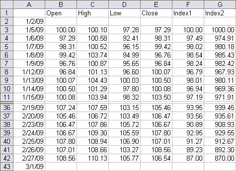
The data I used is shown below. A stock chart needs a column of dates plus four columns of price data. The price data has to begin with Open and end with Close. High and Low can be in any order in between, but conventionally High is listed first. I have included two index columns, one within the same range as the stock prices, one in a much higher range.
I have an extra row above and below the data. I prefer to have my vertical axis cross on a date, not between dates. This is fine, but the first and last candlestick in the chart are truncated (even if there are more dates on either side) unless you explicitly include an extra date before and after the data. Also, I’ve hidden rows 12 through 35 so the data doesn’t take make you scroll down two screens.
Excel 2003 Stock Charts
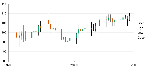
Select the first five columns and create a stock chart. I’ve applied fill colors to and removed the borders from the up-down bars (I always forget whether the white and black bars mean up and down, or vice versa).
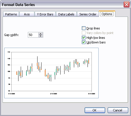
If you want you can change the width of the up-down bars. Format any of the four series: on the Options tab of the Format Series dialog, you can change the Gap Width. Note also that you can add or remove the high-low lines and up-down bars.
Add the index data to the chart. The easiest way is to select the chart area or plot area of the chart, find the colored highlights indicating the chart’s source data range (see below), and resizing these ranges with the mouse. You could also copy the added data and paste in into the chart (I prefer paste special), or use the Source Data dialog to define a new series.
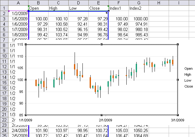
When you widen the blue outline to the right, the green outline also widens to the right. I stretched it by one column, which added the Index1 data to the chart. We can’t see the series itself, but we do see a profound distortion of the up-down bars.
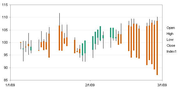
Below I have selected the Index1 series and changed its chart type to Line. As you will recall from reading Stock Charts and Other Line Chart Tricks, a candlestick chart is just a dressed up line chart, with the series lines hidden, and high-low lines and up-down bars added to the chart. The Format Series dialog above is a reminder of this fact.
The up-down bars are messed up because the Index1 series is just another line series in the chart. Since it’s the last one in the plot order, it becomes the close end of the up-down bars.

Fix the Up-Down Bars Using the Secondary Axis
There are two ways to fix this mess. The first way is to exile the Index1 line series to the secondary axis.

If we were plotting Index2, with its values so much greater than those of the stock prices, we would fine tune the secondary axis scale and call it a day.
However, Index1 falls within the same range as the stock prices, and it would be best to use the same axis scale. You can laboriously format the two axes to align their scales, then whenever the data changed, laboriously reformat the scales.
Or you can remove the secondary axis altogether, which forces the secondary axis series to use the primary axis. Remove the axis by selecting and deleting it, or by going to the Chart menu > Chart Options > Axes tab, and unchecking it.
The up-down bars and high-low lines apply to all series within a chart group. A chart group is the group of all series of the same type (i.e., line) and on the same axis (primary). Since the Index1 series in in the secondary chart group, it no longer affects the primary chart group’s features.

This technique is pretty clean, except it ties up the secondary axis, preventing its use for plotting of other data (e.g., Volume) with different value ranges.
Fix the Up-Down Bars Using an XY Type Series
The second way to fix the messy up-down bars created by adding the Index1 series is to select the series and change its chart type to XY. Excel automatically assigns the XY series to the secondary axis, and we are given two misaligned axes.
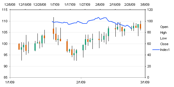
If you reassign the XY series to the primary axis, it uses the existing axes, even though the axes were defined by the stock chart (line chart) series.
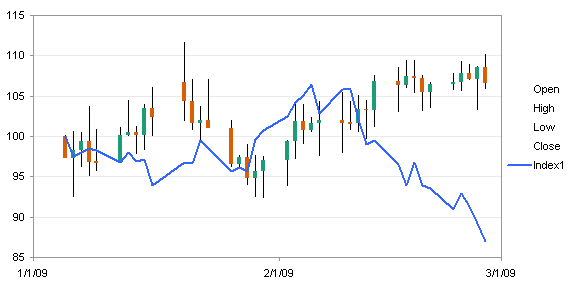
Using an XY chart has the benefit of putting all of this data onto the primary axis. This is useful if there is more data, such as Volume, that you would want to plot on the secondary axis.
Another benefit to using an XY series is that you can plot data with different dates than used by the stock (line chart) data. All line type series in the chart group have to use the same X values.
Excel 2007 Stock Charts
The Excel 2007 stock chart is constructed much like the Excel 2003 version.
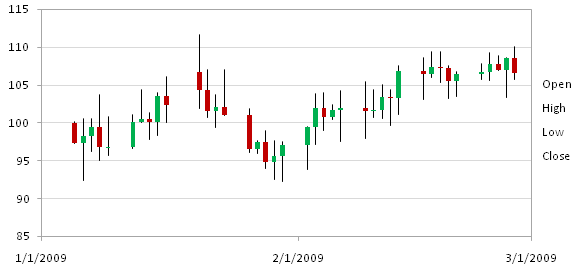
Adding the Index1 series is accomplished the same way, by stretching the highlighting around the chart’s source data range. You can also copy and paste the data, or use the Select Data dialog, but I find this dialog much more confusing than the Excel 2003 version. However, the result shows the same distorted up-down bars as we saw in 2003.
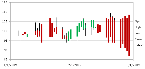
The Index1 series can be changed to a line chart type series just like in 2003.
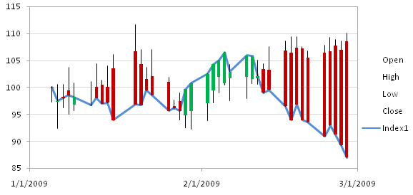
Fix the Up-Down Bars Using the Secondary Axis
Index1 can be assigned to the secondary axis, just like in 2003.
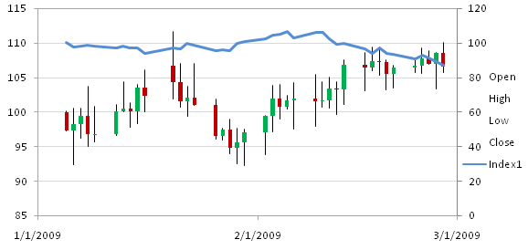
The secondary axis can be removed, just like in 2003.
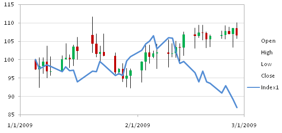
As before, the first technique is good if you don’t need to use the secondary axis for anything else.
Fix the Up-Down Bars Using an XY Type Series
When we try the second technique, changing the type of the Index1 series to XY, we have a rude surprise. Apparently stock charts in Excel 2007 don’t realize they are just gussied up line charts. Whereas we could combine XY and Stock types in a single chart in Excel 2003, Excel 2007 disallows this combination.
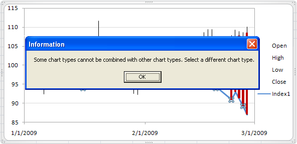
Once you get over your initial shock, remember that a line chart can be dressed up with up-down bars and high-low lines to become a stock chart, much like Cinderella can be dressed up to become a princess.
Convert the chart from stock chart to line chart.
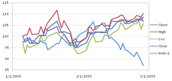
The steps to add up-down bars and high-low lines have been changed drastically in Excel 2007. These features are no longer conveniently formatted in the Format Series dialog. Instead you need to navigate through the contextual Chart Tools tabs of the ribbon. You can find the controls off to the right end of the Layout tab.
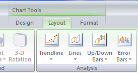
The gap width control for the up-down bars has been moved as well. In fact, as far as I can tell it has been completely removed from the user interface. But in a moment I’ll show you how to change this with a little bit of VBA.
Here’s our line chart with the stock chart features:
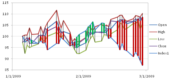
Hide the series lines on all but the Index1 series, and it looks familiar.

Change the chart type of Index1 to XY.
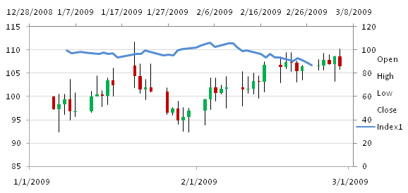
Reassign Index1 to the primary axis.
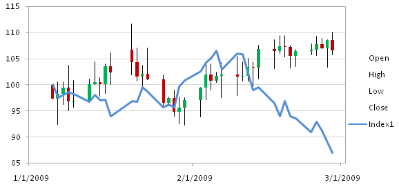
There is our combination XY-Stock chart. Using the XY series allows plotting of data with different dates than the stock prices, and leaves free the secondary axis for other data.
Changing the Gap Width of Up-Down Bars in Excel 2007
To change the gap width of the up-down bars, you need to apply a little VBA. But I’m going to try to make it less scary. First, select the up or down bars, then click on the Chart Tools > Layout or Format tab, and look at the Current Selection box in the top left of the ribbon.

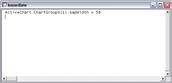
It says Up-Bars 1, and the 1 refers to Chart Group 1. Open the Visual Basic Editor (VBE) by pressing Alt+F11, open the Immediate Window by pressing Ctrl+G, type the following line, and press Enter. Note that ChartGroups(1) refers to the chart group index we found above. Experiment with the gap width value until the bars look good. For this particular chart I didn’t have to change the gap width, but I’ve had others which required it.


Joe Miller says
Thank you very very much for this article. It allowed me to be able to create a bar chart which I was previously unable to do.
However I still have the following problem:
When I successfully create a secondary axis [because I want to overlay a moving average on the bars] and save the workbook the chart is unrecoverable when I try to reload the workbook later. I get a message saying “Excel found unreadable content in ‘stock.chart.object.xlsm’. Do you want to recover the contents of this workbook?” When I reply ‘yes’ the spreadsheet is displayed without the chart. A ‘no’ reply loses the entire workbook. I have tested it enough in various ways to feel confident that it is probably the secondary axis addition that is the problem.
Any suggestions will be much appreciated. Someone suggested a ‘service pack update’ might help – whatever that is? I have Excel 2007.
Jon Peltier says
Joe –
I have gotten that error a few times, for no reason I could detect. When I recovered the contents of the workbook, I didn’t notice any problem. Maybe in your situation the chart was outside of Excel 2007’s comfort zone. If you haven’t applied any service pack, I would suggest installing SP1. I haven’t installed SP2 yet, because there have been a lot of complaints related to it. Perhaps hold off on that one to see if the complaints subside.
Steve Theobald says
Great articles. I already have a one second data connection.
1. How can I keep an updated line chart with just the latest stock price? (most important)
2. How can I store the historical data and then look at it on a 5 min then 15 min then 1 hour chart?
Thanks.
Jon Peltier says
Steve –
Your questions are well beyond the scope of this article. If time allows I may discuss this topic at a future time.
Matthew says
Hi Jon
Thanks for the information. Can you tell me how to get rid of the weekends (blank data) from the candlestick chart? I saw your post for Excel 1997, but I can’t work out how to do it in Excel 2007. Thanks in advance.
Matt
Matthew says
Hello again – I worked it out – change format to text, not dates. Thanks.
Frederick says
Please Jon can you be a little more specific between the intial steps after we’ve gotten the “Convert the chart from stock chart to line chart.”
You say add high low lines and up down bars correct?
but which series should we attempt that?
When I try to apply them I see a huge black rectangle take up the chart, or in other attempts I get small rectangles.
Am I doing something wrong or is this data simply not suitable for this technique? Thanks
Fred
Jon Peltier says
Select the entire chart and change the chart type to Line. Better yet, start the whole exercise with a Line chart.
You can select any of the line chart series to add high-low lines and up-down bars, since these features are associated with all of the line series.
harp says
Is it possible to get VHLC with Williams%R technical indicator- all in one chart? I have trying to do what you have described above but not able to reach at the correct representation of the data. V should be in vertical bars, HLC as candlestick and %R in the same chart in the -y axis?
Jon Peltier says
Add the %R as an XY chart series.
Nadeem says
I would like to make high low and close chart with two different trends. I have two different types of data but in high low and close values. when I add new trend in the existing made first, the high low lines extended due to new values. I want to show the high low lines separately of both the trends. I need your help. Thanks
Jon Peltier says
Nadeem –
You could create the chart with High-Low-Close for the first set of data, then add High-Low-Close for the second set of data, and move the series for the second set to the secondary axis. The high-low-close formatting for series on each axis will be independent.
peter says
Im trying to find a program to add Point and Figure charts to excel 2003 or buy a program for Excel . Im new to Excel, have only used my version a few times but have created charts in other programs like Claris Works I know I know long time ago. I cant find anything online, versions I have found are no longer supported or live sites so any help would be appreciated. Thanks, Pete
Jon Peltier says
Peter – I’ve never done point and figure charts.
Chris says
Hey Jon,
I think I followed your directions correctly but when I attempt to change the chart type, I get following error. “some chart types cannot be combined with other chart types” Any help with this would be greatly appreciated.
Jon Peltier says
Chris –
2007 is picky. You can’t change a series in a stock chart to an XY type, so you have to start with a line chart, add the XY data and change it to an XY series, then add the candlestick features (high-low lines and up-down bars).
Eric says
Jon,
This page has served me exquisitely in Excel 2003 and 2007. However, I now have Excel 2010. I start with an OHLC chart OK, and then add the 5th series, but when I select it and try to change it to a line chart type, it gives me the “some cannot be combined with others” error.
Have you seen this with Excel 2010? Am I missing something?
Many thanks!
Eric says
Wait a sec – I’m making progress. The fifth series is on the chart, but invisible. I tried just selecting the 5th series and while I was in the format dialog box I changed “line type” to “solid” and it appeared!
I was going to say you don’t have to publish my comment, but … I see you did already.
SJ. says
Hi Jon,
Thank you so much for your article. It took me a few days trying so hard to fix this problem unsuccessfully. Seems excel 2007 doesn’t allow extra series to Stock chart.
I use excel 2010, trying to plot VOHLC stock chart with extra series which I can do successfully in 2003. I use macro VB code to put extra series to the stock chart and even be able to set the chart type to xy chart. But the problem is when i try to assign this new series to the secondary axis. I got
“Method ‘AxisGroup’ of object ‘Series’ failed.”
Just want to share and ask your confirmation that this is still be the limitation of 2010, as in 2007. Then I give up, and revert back to 2003.
Thank you so much again for your help.
SJ.
Ben says
I’d been trying to create a OPEN HIGH LOW CLOSE chart for an hour, and was constantly getting the error: “To create this stock chart, arrange the data on your sheet in this order: high price, low price, closing price. Use dates or stock names as labels”.
Then I discovered that this chart only works for >= 4 stocks. If you have less than 4 stocks to graph you get that totally unhelpful message.
I was trying to plot 3 stocks and it didn’t work.
Jon Peltier says
Ben –
HLC and OHLC data require three or four values for each stock.
If you are plotting one stock, the category axis usually shows some time period. If you are plotting multiple stocks, the horizontal axis shows the stock names. You would arrange the data like this:
The problem is that Excel 2003 was smart, and could realize the data was in columns, but Excel 2010 doesn’t get this. So you have to create a line chart with the data, which by default is plotted by rows (because there are more columns and fewer rows).
Then switch rows and columns in the data source.
Finally, change the chart type to OHLC.
David E. says
Hi Jon,
First, let me say you have the best site for Excel and VBA out there – it’s been indispensable.
I used your tutorials to create a very elaborate stock analysis spreadsheet for my own use. I originally wrote it in Excel 2003. The spreadsheet make extensive use of charting via VBA, calculating and plotting indicators, etc, etc. It’s almost a standalone technical analysis application.
Well, now I’ve opted to upgrade Excel and tried moving the spreadsheet to 2007. Ouch. Very painful – not sure it’s worth the major changes that are going to have to occur.
My question is how stock charting as in this article changes in Office 2010. I basically need to choose whether or not to buy a 2010 license and port everything there or use 2003. If I opt to port, will the changes moving to 2007 easily move to 2010, or is 2007 a “special case” for manipulating stock chart data – converting candlesticks to XY scatters, plotting multiple indicators on the primary axis, and other advanced charting issues? I just need some rationale for deciding how to manage these charting problems in the short and intermediate term.
Thanks!
David
Jon Peltier says
Hi David –
What I said about stock charts in Excel 2007 applies for Excel 2010. There is one exception: while Excel 2007 has no means in the Excel interface to adjust up-down bar gap width, requiring the use of VBA, Excel 2010 includes a way to do this. I don’t do it much, so I usually have to hunt for a couple minutes.
Alex Brazlin says
Solid article! I wanted to also post a site I made where you can download bulk historical quotes and quantitative stock data. You’ll need that kind of thing if you plan to do charts.
It’s at and it should be all you need. I originally wrote it for an artificial intelligence project I did in school but it didn’t really work out.
Enjoy!
Reiner says
Hi Jon,
Thanks for the tutorial it saved me hours of trial and error. However even after lots of tries and many errors I could not figure out how to remove the weekend gaps in Excel2010. (I read the comment with the format text. Which resulted in moving all data to the very left of the graph and leaving all else blank.)
Could you please clarify how to remove the gaps?
Thanks in advance!
Paolo says
Hi Jon,
Thanks for providing such a great website. I have a quesion… Curently my bars in the stock chart are displayed adjacent to each other. Is there a way to add some space between each bar?
Thanks, Paolo
Jon Peltier says
You need to increase the gap width for the bars.
It’s easy in 2007. Select one of the OHLC series in the chart. They’re invisible because they have no markers and no lines, so if you can’t select one by clicking on the endpoints of an up-down bar or high-low line, select any chart element and keep slicking the up bar until you’ve cycled the selection to one of the series. Format this series, and increase the gap width.
In 2007, you need to write some VBA code. Select the chart. Click Alt+F11 to open the VB Editor, and click Ctrl-G to open the Immediate Window. Type this into the Immediate Window, and press Enter:
ActiveChart.ChartGroups(1).GapWidth = 100You may have to adjust the “100” to get something that looks good. It can range from 0 to 500, and 100 means the gap is as wide as the bars.
Glen says
I don’t think the main strategy will work in 2010 John. It doesn’t seem to permit changing of the extra series to “line” type (no, not XY; just line). In fact, it doesn’t appear to accept any change of type on a “stock chart”.
The second method can’t work either, because 2010 doesn’t do XY overlays on line/bar chart date axes correctly, ever. You can easily get as far as making a multi-line chart look like a stock chart, but there’s no way to add a line overlay that I can see.
Glen says
Well blow me down, I actually now have it working, via the second method…
Ivana says
Jon, help! I have a stock chart in Excel 2010. I have all necessary data so I managed to do a stock chart. However, this chart is supposed to expanded when new data arrives.
My data source is an OLAP Pivot table and I used cube formulas to have a non-pivot table (because I can’t create a stock chart with data from a Pivot table). I expanded all columns (currently the empty cells are #N/A, but will be filled when new data arrives) and expect new data when the pivot table is refreshed. And now my stock chart is huge, but has data just on one half of the chart. because of my empty cells, half of the chart is empty. Is there any way not to display cells when they are empty?
If needed, I can send you example data of what I am doing.
stock charts says
Thanks to the blogger for share it. I have a stock chart in Excel 2010. I have all necessary data so I managed to do a stock chart. However, this chart is supposed to expanded when new data arrives.
Jon Peltier says
There was no question in your comment, but I guess you’re asking how to make the chart dynamic. See Easy Dynamic Charts Using Lists or Tables for an easy way to keep a chart up-to-date.
David S says
Hello, I’m trying to add a line to an existing stock chart and found your article, which I’d like to ask you about. I can’t find a way to change the new series to a line type without affecting the stock chart. Your article says “Below I have selected the Index1 series and changed its chart type to Line”. How did you do this? I’m using Excel 2010. Thanks
Jon Peltier says
David –
I have not revisited this in a long time. It seems that what I claimed I could do in Excel 2007 doesn’t work anymore. I doubt they changed anything, I suspect I didn’t follow the protocol very closely.
Here is what I discovered. You can start with the OHLC stock chart, then extend the data range to include an extra column. Select this added series in the chart, format it so it is on the secondary axis, then format it again and put it back on the primary axis. It’s not really a line chart series, according to what the UI says, but it is not longer associated with the stock chart series you started with.
Richard says
I have been using MarketXLS, it produces great charts without this much effort.