Slope Graphs
Edward Tufte introduced Slope Graphs in The Visual Display of Quantitative Information (p. 158):

Slopegraphs compare changes over time for a list of nouns located on an ordinal or interval scale. The table-graphic above organizes data for viewing in several directions. When read vertically, the chart ranks 15 countries by government tax collections in 1970 and again in 1979, with the names spaced in proportion to the percentages. Across the columns, the paired comparisons show how the numbers changed between 1970 and 1979. The slopes are also compared by reading down the collection of lines, and lines of unusual slope stand out from the overall upward pattern. The information shown is both integrated and separated: integrated through its connected content, separated in that the eye follows several different and uncluttered paths in looking over the data.
This tutorial will show how to make a slope graph in Excel.
When to Use Slope Graphs
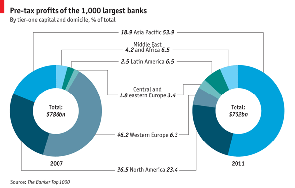
The Economist used a pair of donut charts to show changing pre-tax profits among banks from 2007 to 2011 in Bank Profits Head East. This is not a very effective approach.
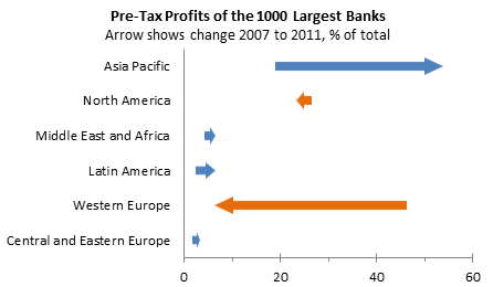
In Arrow Charts and Other Alternatives to Multiple Pie Charts on the Forbes magazine web site, Naomi Robbins introduced Arrow Charts as a replacement for double pie charts (and double donuts are at least as bad). I wrote a tutorial on my blog that showed How to Make Arrow Charts in Excel. The technique results in a much more effective chart:
Naomi showed a slope graph in her Forbes blog post. You can read more about slope graphs in Slopegraphs for comparing gradients: Slopegraph theory and practice on the bulletin board on Edward Tufte’s web site, and in Edward Tufte’s “Slopegraphs” on Charlie Park’s blog.
Making a Slope Graph
Here is the data for our slope graph. Unlike the arrow chart, we do not need to make any adjustments to the data prior to building the chart.

Select the data range (A4:C10) and insert a line chart without markers.

Excel assumes the series are in columns because there are many more rows of data. On the Chart Tools > Design tab, click on Switch Row/Column.

Hide the vertical axis by setting Major and Minor Tick Marks and Tick Labels to None, and select No Line for line color.

Format the horizontal axis, and change the Position Axis setting to On Tick marks. You might also want to use a lighter gray than the default for the axis line.
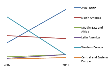
Delete the legend, make the chart taller, and format the series lines so they are thinner (1.5 pt wide rather than the default 2.25 pt). There is still plenty of white space to the left of the chart where the legend had been.
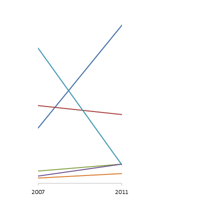
Select a series, and add data labels. here I used the default label (which is the value) in the Right position.
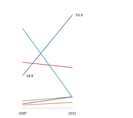
Select the first label (single click to select all the labels, then single click again to select the one label), and format it so it is in the Left position. Also color the label font to match the line color. For text I like to use one tile darker in the Excel color palette.
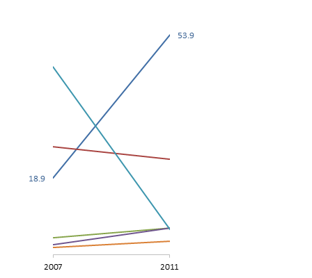
Add and format labels as above for the rest of the series.
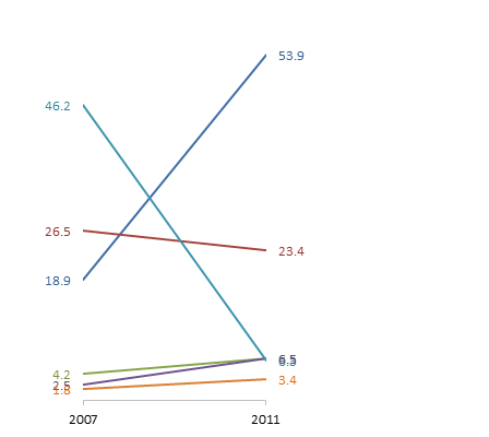
Reposition any overlapping labels. Single click twice on a label, then you can drag it into position. The chart is wider because I stretched it to the left to fill the too-wide margin I began with.
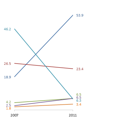
Insert text boxes from the Chart Tools > Layout tab. Type the names of the regions, color the text to match the data labels, and position the text boxes next to the labels.

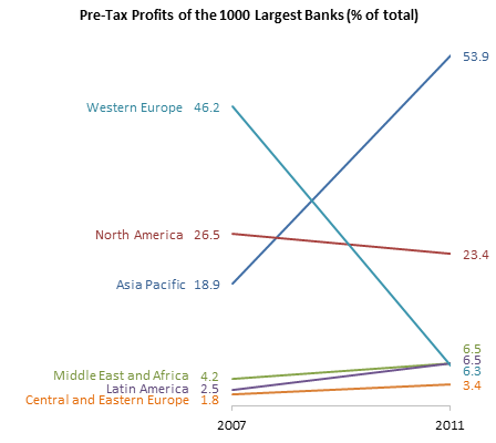
Finally, add a chart title, and the slope graph is finished.

I generally prefer my labels to the right of the chart, but a lot of these labels are clustered at the bottom of the 2011 data. It might be better to position the region labels to the left of the chart.

The slope graph shows that while most regions saw little change, Asia Pacific had a large increase and Western Europe had a similarly large decrease. The arrow chart also showed this, but it was not easy to see in the original double donut.
Related Posts
Slope Charts in Peltier Tech Charts for Excel
This tutorial shows how to create Slope Charts, including the data layout needed, and the detailed combination of chart series, chart types, and formatting required. This manual process takes time, is prone to error, and becomes tedious.
I have created Peltier Tech Charts for Excel to create Slope Charts (and many other custom charts) automatically from raw data. This utility, a standard Excel add-in, lays out data in the required layout, then constructs a chart with the right combination of chart type and format. This is a commercial product, tested on thousands of machines in a wide variety of configurations, Windows and Mac, which saves time and aggravation.

Please visit the Peltier Tech Charts for Excel page for more information.


Egor says
Regarding left or right labeling: sometimes it’s better to label only the maximum of two digits (or minimum – depends on what is meaningful). If the line is almost horizontal – there is no need for the viewer to compare the digits. You know, that the maximum (or minimum) is one with the label.
Adam says
Would it be easier to make a dummy series (as an XY chart type) and Chart Labeler to add the labels instead of individually adding text boxes? The drawback would be needing additional rows of data, but it might make updating the chart easier.
Kai Lubbe says
How about sorting from greatest positive change to greatest negative change. To my mind that seems an easier read than the crossed lines resulting from sorting by greatest net change.
Jon Peltier says
Adam –
This would be my favored approach. The problem is that Excel wraps data labels (as well as chart and axis titles and axis tick labels) wherever it wants, but usually in much shorter segments than anyone would want. If the labels are short enough, you can use data labels instead of text boxes. Or you could make the chart excessively wide, with lots of blank space on either side: Excel allows wider labels in wider charts. If you have to fit the chart into a smaller space, though, this isn’t practical.
XLCalibre says
The text wrapping on labels is pretty frustrating. I have an example of the solution you’re talking about.
In one of my recent posts I used an additional graph with no fill in any part of it apart from the labels, and expanded the chart excessively wide like you say. The field names were then concatenated with the values to create the label text, and the labels moved to the inside base so that they appeared left aligned.
Here it is: http://xlcalibre.com/hr-dashboard-organisation-heirarchy-pyramid-chart
It’s a bit fiddly, but if you’re going to use the chart more than once, it’s less fiddly in the long run than text boxes that you’ll have to manually move.
Jim says
I think it would be cool if you could start a data line midway.
For example, let’s say there were no banks in Latin America until 2008 so I only want that line to begin at 2008 opposed to 2007. And also if America closed all their banks in 2010, I would want that line to end there.
Any suggestions on how to accomplish that?
Jon Peltier says
Jim –
It’s just a line chart, so you could have points in between the endpoints. To be honest with your data, if you insert an intermediate point for one series, you should add corresponding points for all series.
roberto mensa says
the lines are not arrows, so the chart can be read from right to left and vice versa … for this the labels are on both sides.
there is a difference … in your chart, the result of sum percentages is 100% … this information is lost. In the original graph there is no such, the percentages are compared
However, this graph is better than the previous one with arrows …
Reed Handlery says
Thank you for this informative post, it was very helpful to me as I created a figure for a manuscript.