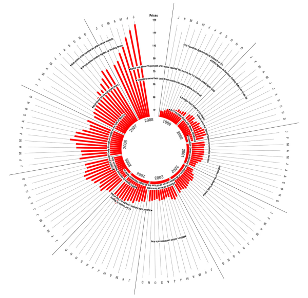
A few months ago, Pedro Monteiro of the What Type blog asked What type of events affects oil prices? To illustrate the changing price of oil over the past decade, Pedro built the following bicycle-spoke-like chart:

click to view original chart at full size
At first glance, the chart catches your eye.This chart was picked up by a number of blogs and other sites which thought this was a great work of visuaization: Flikr, Simple Complexity, and Occasional Roborant, to name but a few.
Upon closer inspection, it is obviously not very effective at displaying its information. There is no basis for the circular alignment, because it does not represent any kind of cycle, annual or otherwise. The resolution is limited to the radius of the chart, or half its height, whereas a simple bar chart would have the entire height of the chart, and thus twice the resolution. The original chart is much larger than this, more than twice as large, so shrinking it has made the labels illegible. It’s hard to tell which dates the labels reference, because some of the wrap far enough to span up to two years. Because of the angular rotation, it is not easy to compare bars that are more than a couple months apart.
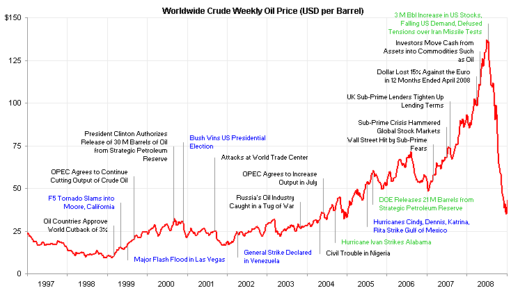
I looked up some petroleum price data and a few events, and built a line chart. My data is weekly, not monthly, so the line chart has finer resolution on the time scale. I also have the benefit of several more months of data, covering the precipitous price drop during the last half of 2008. In my chart, the black labels correspond to labels in the rotary chart. The blue labels also relate to labels in the radial chart, which I repositioned to more accurately indicate their occurrence. The green labels refer to other events I looked up to add a few more relevant details.

click to view chart at full size
I shrunk the chart slightly to fit the margins, but you can see much more detail. For reference, the shrunken versions of the radial chart and the line chart cover about the same area.
I’m no economist, so I’m not going to try to analyze which events affected oil prices in what way. But I will point out that a simple line chart is easier to interpret, and it leaves more room for clear labeling. If you’d like more information and an informed analysis, you can visit Annual Oil Market Chronology and Current Monthly Energy Chronology at the Energy information Administration of the Department of Energy, or Oil price chronology, a more detailed timeline at Wikipedia.
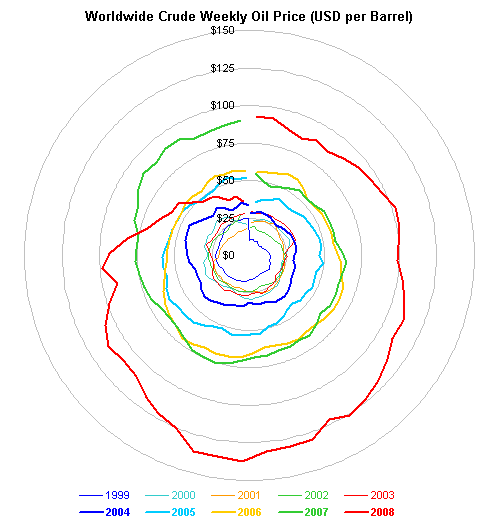
If you want to examine the data for any periodicity, you could plot it on a radar chart, which is difficult to read. I didn’t even try to apply labels, and I’m sure the peak in July 2008 is hidden by the spiral shape and the position of the peak near the bottom of the chart.

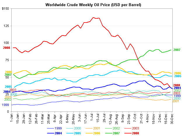
Alternatively you could draw a line chart with a category axis that spans a year. This is much easier to read. The lower prices of the early 2000s are not crunched into the center of the chart like a tangle of yarn. The rise in price which started in 2007 and accelerated in the first half of 2008, and the subsequent drop to 2004 levels, are clearly visible.

I guess the moral of this story is that simple chart designs are best. Plain, garden-variety line charts are much more effective than the radially oriented bar chart and the radar chart at showing the details of oil prices over the past decade.


Liu 's chart blog says
yes ,I can not agree with you any more . a simple line chart is effective enough ,that chart is just chunk .
Tim Wilson says
Well done, Jon! “…the moral of this story is that simple chart designs are best.” That’s certainly where we should start: am I presenting data that can be effectively represented using a common design? If so, then that’s the way to go — although there is still plenty of opportunity to butcher a simple line chart (missing labels, fonts too small, overly heavy gridlines, etc.). If not, then it’s critical to think about what information needs to be conveyed and how to represent it. You nailed it with your observations of the chart that inspired this post — there’s clearly confusion between “what looks cool at first blush” with “what communicates the information most effectively.”
Matt Healy says
I strongly agree that a line chart is best for something like this. Over long periods of time I would prefer using the price of oil divided by an inflation index (consumer price index, or producer price index, or GDP deflator) as opposed to the nominal price. Also it might be good to shade periods on the chart corresponding to recessions in the US.
Yet another variation would be to plot several basic commodity prices over the same time period — if I had more time I might concoct an interactive spreadsheet that lets the user pick the time period, pick nominal versus inflation-adjusted prices, and pick which commodities to plot…
Jon Peltier says
Matt –
When you start with an appropriate chart type, the rest of the features you mention can be added with a few dropdowns or checkboxes, with a few worksheet formulas.
Pedro Monteiro says
Dear Jon,
Sorry for my late reply. There are a couple of things that I wanted to correct from your post. For example when you say that ‘it’s hard to tell which dates the labels reference’ I would advise you to look closer because there’s a bullet in the beginning of each one. As for the ‘some of the wrap far enough to span up to two years’ your go as far as span for 4 years.
On the other hand, when you placed some text in blue ‘which I repositioned to more accurately indicate their occurrence’ you’ve really made things a lot harder. You might not understand it; but each of the years on my chart have the first letter of the month on the bars. For example, in 1999 the ‘major flash flood in Vegas’ event happened when on your chart? Somewhere in the middle of the year, as in my chart you can see that, not only it happened in July, but also at the beginning of the month (therefor it’s probable that this event influenced prices on the same month, as opposed to events at the end of a month that would only influence the coming month).
And, as much of the discussions that I’ve read between ‘excel’ charts and some trials from visual designers, there is really one point that is always overlooked. And this shouldn’t be like that. In my professional experience (I work on a newsmagazine) your chart would be impossible to publish. It might work wonders on a powerpoint presentation for a corporation (much better then mine I give you that) but it wouldn’t work for a printed media. Let’s assume that you would use CMYK colors, you would still have your strokes to much alike, to much text justified to the right. You have a lot of labels that are ‘glued’ together, no clear indication of when the events of the labels took place (you might try adding the actual day and month in braces after the label) and still have a very large graph (even if it is smaller in height then mine) with the problem that, since the strokes are to thin you would loose some information if you had to print the chart on a spread page to actually be able to read something.
My conclusion? Besides the obvious point that I don’t agree with most of what you posted, it would really help this kind of discussions if we made clear from the start what the graphs that we make will be used for.
My best
Jon Peltier says
Pedro – Thanks for your response. I have a few clarifications of my own.
In fact I did notice the bullet points on your labels, but it was not clear (assumed maybe) that the bullets marked the time of the event, or they may have just been bullets. The span of the labels doesn’t matter much (one of yours reached across nearly five years) as long as the time it references is clear. Perhaps the vertical lines on my chart are a bit more precise than bullet points, especially since they used the actual dates of the events to position the lines. In any case, if my labels require appended dates to clarify when they occurred, then so do yours. (I think neither requires this, as long as the bullets can be relied upon to pinpoint the dates.)
The initials of each month were plainly obvious on your chart. That’s not a cause for confusion. Making the spokes proportional in length to the number of days in each month was an interesting feature, but it was merely decoration. The data I show has greater resolution than your monthly bars, so it stands to reason that the position of the label callouts has this same fine resolution. Even if a viewer didn’t know the data was weekly, s/he would see that it was more granular than monthly. The Vegas flood occurred at the beginning of July, and given the resolution of my chart’s plotted data, you can judge that the line occurs somewhere at the end of June or beginning of July. More important is pointing to the precise point on the line chart, to see whether there may be an effect. In fact, I thought it was a strange event to plot: a priori I could not imagine why a flood in Vegas would have the slightest effect on fuel prices, and I don’t think the data shows any effect.
You failed to address the largest flaw in your chart, the angular misorientation of the bars in your chart which makes comparison of different months inaccurate if they are separated by more than a few intervening months. The second largest problem is the rotational symmetry which falsely implies a cyclical nature to the information it tries to convey.
I don’t understand the problem with publishing my chart, unless it’s just not stylish enough. I did state the purpose of my chart, though, which was to make a chart which is easier to interpret and more clearly labeled.
Karen says
Jon, I’ve been trying to figure out how to plot a circumplex or radex solution using Excel. Most of the time, the solution has 3 or 4 concentric circles centered on a two-axis intersection. I’ve been able to use the scatterplot function to plot each of the rings individually and show the plots side-by-side, but the graphic is much more effective showing all three concentric circles on the same plot, each in a different color.
Google searches yield the typical solution for side-stepping this plotting issue — three different sized circles are layered on top of one another in powerpoint with the broad bands named, but the placement of the individual questions that form the foundation for each of the bands is hidden. Here is the only example I’ve found with the actual points plotted, albeit for a single ring: http://www.psy.gla.ac.uk/~frank/Talk_folder/Y2K_Talk_folder/sld019.htm
Your radar chart of oil prices reminded me of this graphical struggle I’ve been in. I am reaching out to see if you had dealt with the circumplex before.
Jon Peltier says
The chart you referenced only showed points in a two axis space. I’m not sure how your bands will look. Are they concentric rings, or might they be offset or distorted? Must they be filled? If filled, do they need transparency?