This isn’t really about my first Excel 2013 chart. I’ve already made hundreds of charts in Excel 2013 over the past couple years, and I’ve found a lot of nice enhancements over the last two versions. You could modify and format Excel 2003 charts much more efficiently, but with much less effort the charts in 2013 look nicer significantly nicer than those in 2007, and extremely nicer than typical Excel 2003 charts.
Let’s take a short stroll through Charting in Excel 2013.
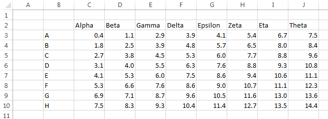
These examples will use the following data. 8 rows and 8 columns of numerical values, plus a row of Greek letter names above and a column of Latin letters to the left of this grid.
Plus that all-holy blank cell in the top left, which will help any version of Excel parse the data into values, category labels, and series names.
Select one cell or the whole data range, and click on the Insert tab. Here it’s been shrunk to fit, but click on it and you’ll see it full size in a new browser tab.
Let’s focus on the Charts group within the Insert tab.

Looks pretty much the same as ever, except for the addition of “Recommended Charts”. What’s that look like?

This takes a peek at your data and proposes some chart types that might suit the data. Our data has text labels above and to the left of the data, so we get several variations of stacked and unstacked bar and column charts, with thumbnails of each.
We can click on the All Charts tab to select from the entire Excel chart cuisine.
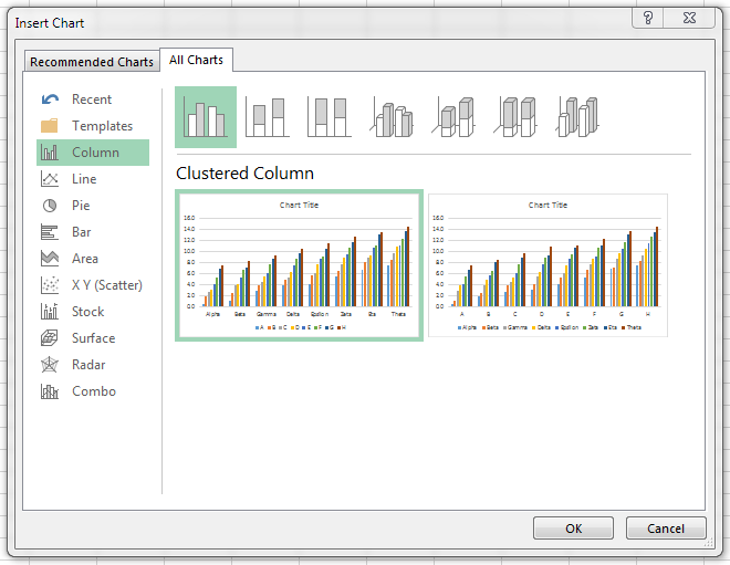
The default as always is the clustered column chart. We have two choices, plot by rows and plot by columns.
Let’s look at the Line Charts options.
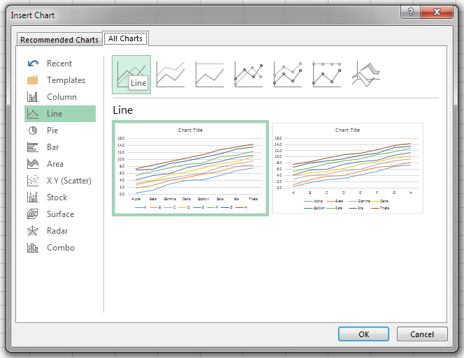
Again, two choices: data in rows and data in columns.
When I saw this dialog for the first time, I happened to move my mouse over one of the thumbnails, and I got a larger preview. Nice touch.
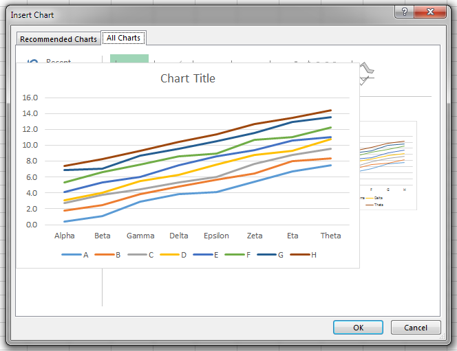
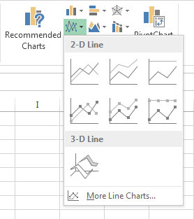
You can also get to the Line Charts dialog from the bottom of the line chart dropdown on the Insert tab of the ribbon.
And here’s my first line chart. The defaults are pretty nice. The gridlines are lighter (they were black in all previous versions of Excel), and the other lines and text are slightly muted. The default colors have changed from Excel 2007 and 2010: they seem a bit richer. I want to look at this chart. The series lines aren’t as thick as Excel 2007 and 2010, so the chart looks less like your first grader drew it with crayons.
The worksheet ranges used in the chart are highlighted, as in previous versions of Excel. But in previous versions the highlights were thin borders around the ranges, and to tell you the truth, I’d been using Excel 97 for several months before I noticed the outlines and realized what they were for. Here the lines are a bit wider, and the ranges themselves are filled with a faint tint of the outline color. The category labels are purple and the values are blue, like in previous Excel versions, but the series names have changed from green to red (though 8% of Excel users may never notice this change).
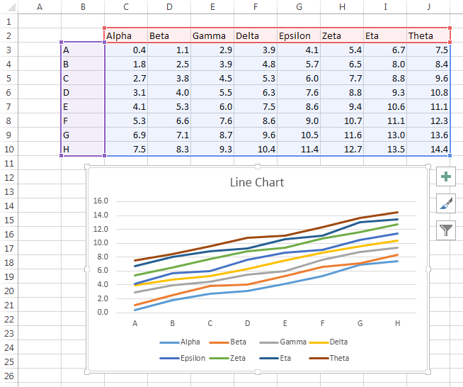
When the chart is selected, three icons appear to the right of the chart. These are new user interface elements that let you adding and removing chart elements (the plus sign), apply color schemes and gaudy visual effects (the paintbrush), and filter of the chart’s data on the fly (the funnel). The first icon is a nice addition, putting chart element controls right next to the chart instead hiding them on a ribbon tab that’s usually not even visible. The middle icon is an attractive nuisance, too tempting to people who like to sex up their charts. The third icon is way cool, because it lets you show and hide entire series, or data points for given categories, just by clicking on checkboxes.
I’ll tell you all about these icons in an upcoming post.


Jan Karel Pieterse says
Hi Jon,
Pretty impressive: “I’ve already made hundreds of charts in Excel 2013 over the past couple years”
Given the first day we got to play with 2013, which is about one year ago… :-)
Jon Peltier says
JKP –
It seems like a lot, but I always make a bunch of charts before I decide which views make the most sense for a particular set of data and set of questions about the data. And even if I have a set of charts I use for my usual analysis, I may decide to knock off a few quickies to look at something in detail.
When I write a blog post, I usually make about five charts for each one that makes it onto the page. Sometimes the data I started with isn’t the best to show a technique, or sometimes I need to modify the chart types. I even have to throw a bunch away and start over.
In a typical week, I probably churn out several dozen charts. Easily a hundred a month.
Suzanne says
My very first day with Excel 2013, and I’m lovin it! I love how all ribbon borders, etc are softer, making my data really stand out. Very Tufte esque.
Jon Peltier says
I have more articles about 2013 coming out. I find the new interface a bit too white. It hurt to use 2007, but 2010 was nicer, easy on the eyes but with sufficient affordances. Problems with 2013:
– It’s too light, and too many lines have been removed.
– It has lost the gray regions that helped set off different parts of the interface, like the grid from the row and column headers, and the formula bar from those.
– The sheet tabs are shaped like cells.
– All caps in the ribbon tab labels? Haven’t we learned anything?
– It’s hard to distinguish the very dark green of the active tab from the very dark gray of the other tabs. What’s wrong with bold? And I know the emphasis was on white white white, but a shaded tab background would have been very helpful.
– 2010 finally got the MRU documents and folders right, and 2013 split them onto different screens, and you have to scroll to get to the browse for save as. Extra clicks suck, which Microsoft should have learned from scathing feedback on Excel 2007.
Hmm, looks like I’ve outlined a new post…
DaleW says
Jon,
Great to hear that Excel finally is moving towards better charts for decision support and STEM uses. I look forward to reading more about Excel 2013 here.
Microsoft seems to be betting its future on Windows 8 and the Office 2013/365 subscription pricing model. Like some big companies, the main reason I see to upgrade past the familiar and productive interfaces of Windows 7 and classic Office 2003 over the next several years would be for what the new Excel might offer. Google Docs can already offer a majority of companies better value in an office suite — except for the spreadsheet. If Google Docs adds Dynamic Named Ranges that can be used to keep charts live (especially if they make DNRs by whatever name they use easy to create), that would be a sign to me that Google is serious about competing with Microsoft in spreadsheets.
Software empires rise and fall. A couple of decades ago, we used an IBM PC running Lotus 123 and Wordperfect, and IBM assured us that OS/2 was the future. A few years ahead, many of us just might be using a Chromebook running Google Docs — or some other successor. Nimble innovators that add value win.
Suzanne says
Yes, maybe too Tufte, too white, I thought so too, then found that you can “personalize Office” in the options tab to at least make the background less white. Grid lines still quite faint, thought…. especially for older eyes….
update says
Most of those complaints you had about 2013 I also share, but at least you can work around somewhat. Not sure why they were chosen as defaults with this in mind. Microsoft is just going to do what they want, like with Windows 8. Although, when the sales and consumer viewpoints don’t come in as planned, they might finally change their plan.
Jeff Weir says
Bloody hell..having to do all that scrolling in the right hand chart formatting pane is a formatting pain.
Rick says
Hi Jon,
1. I have added a textbox to the top of my pivot chart in excel 2013 for the chart title and it is linked to a cell. I tried to group the textbox with the chart so that they will move as one item however it does not seem to work.
2. I have to do charts and tables in both French and English. How could I add a dropdown box to a chart and/or table to select the language and show the appropriate labels and formatting without having to duplicate every chart and table twice? Is there any other way to deal with multiple languages?
3. I cannot figure out how to create a custom format that will change the numbers to a French format. For example in English $2,456,789.21 in French would be 2 456 789,21 $ Therefore to change a comma to a space and a period to a comma and put the dollar sign at the end with a space before it. Some combinations seem to work with some numbers but not all depending on the size of the number.
Jon Peltier says
Rick –
1A. To add a textbox to a chart, select the chart, then go to the ribbon and insert the textbox. If the chart is selected, the inserted object becomes part of the chart. Or you can copy the textbox (not just the text but the shape), select the chart, and paste.
1B. You can also link the chart title to a cell, omitting the textbox middleman.
2. Add a Forms Menu listbox, populated with “English” and “French”. The linked cell will display 1 or 2. For a given label in cell A1 (for example), put the English version in A2 and the French in A3. If the linked cell is B1, in A1 use the formula =INDEX(A2:A3,B1).
3. The above formula only transfers values, not formats. To use your formats, put the value into cell A4, then in A2 put
=TEXT(B6,”$#,##0.00″)
and in A3 put
=SUBSTITUTE(SUBSTITUTE(TEXT(B6,”#,##0.00″),”,”,” “),”.”,”,”)&” $”
I tried a couple number formats directly with no joy.
The formula in A1 is fine. I hope you’re using these for display only and not for calculations. If you have to do calculations on this value, use A4 for the calculation.
Rick says
Hi Jon,
I am trying to figure out a way to have the number format of data labels in an Excel 2013 chart appear the same as in the source data and change accordingly when the format in the table changes. However, there does not appear to be any link between the number format in the table and the number format of data labels in the chart. Changes to the data values in the source table are reflected in the chart but not the format. Even when the link to data box is checked it makes no difference. The same is the case for the number format in the axis. Is there any way to have the number format of data labels in the chart match the number format in the source table?
Thanks
derek says
Hi Jon,
I have found that Excel 2010 struggles when I try to use a custom fraction format (for example, ???/???) in chart axes, and completely crashes when I try to combine that with an exponential scale (I was trying to have the scale read 1/2,1/4,1/8, etc.). I have found this behaviour reproducible in multiple machines using Windows 7, even in the tiniest of worksheets (one data point!)
Does this work okay in Excel 2013?
Jon Peltier says
Derek –
I just tried this in 2010 and 2013 (both 64-bit). I had no problems.
Does it help if you format the worksheet range using ???/??? before making the chart? The axis labels pick up the format of the data range. I’ve had to use this approach because in an Excel 2013 chart, you can no longer insert a line feed into a number format by pressing Ctrl+j, though this undocumented formatting trick works in the worksheet.
derek says
Jon,
Yes, that works, thanks a millon; these machines are only 32-bit, I don’t know if that makes the difference. I too am annoyed by the loss of the ability to insert a line feed into the number format in chart axes.
Karin Landsberg says
Hi,
I just got upgraded from 2007 to 2013. I like some of the changes to the default charts, but not all. I’d like to create my own default format. I’ve found instructions on how to do that in older versions, but not for 2013. I’m sure it’s possible, but how?
Thanks much,
Karin
Jon Peltier says
Karin –
If you’ve found how to do this in 2007 or 2010, use that approach in 2013.
This is way different than in 2003 and earlier, though.
I’m planning a tutorial at some indeterminate future time…
Daniel Smith says
Hi, does excel 2013 also suffer from the same charting bug as excel 2010 (not fixed in service pack 2) Which can be duplicated as below:
Create a new workbook
add in column a, some x values, e.g. 1,2,3,4,5,6,7,8,9
add in column b a formula, e.g. type in B1 : “=A1^2” and drag down, this is the y values
highlight the x and y values and insert a scatter chart showing them
rightclick on the chart and move it to a new sheet of its own
On the layout tab for the chart, select “Chart Title”
Type “frad” (don’t press return)
press the left arrow key (as if you wanted to change “frad” to “fred”)
excel crashes completely, and all work in all open workbooks is lost, unless you saved it.
The important part here is pressing backspace when editing a newly inserted title in a chart, it can be a chart title or an axis title and is easy to do by accident when typing even if you know of the bug and are trying to avoid triggering it.
Jon Peltier says
Daniel –
I can’t repro your problem in Excel 2013 or in 2010 SP2.
Anane E says
Hi Jon,
(Unfortunately my comment is not about the above post, it’s about multiple axes in excel)
I understand adding multiple axes to a chart makes it clumsy, but there are times when this is very necessary. For instance in Science (Engineering) applications we may be interested in points of intersection of lines, areas enclosed by intersecting lines (which I need to determine now) and other comparative plots that can only be obtained by overlapping different charts on the same plot (that is, using multiple Y-axes on the same X-axes). Panel Charts may work well in business analyses, but in my case they are not working. Please can you re-post your tutorial on how to add tertiary and quatenary axes to a chart? Thanks in advance.
Daniel Smith says
Hmm, tha tis strange!
I have now replicated it in excel 2010 (three different pcs), excel 2010 + sp2 (one pc) and excel 2013 (a differnet pc – I finally found a laptop at work with excek 2013 installed). My colleagues at work also get it.
It is important that the chart is on its own sheet, and after selecting “chart title”, “primary x axis title” or whatever the user does nothing else other than typing and pressing the left arrow key.
I am so bad at typing that my fingers have learned to type the left arrow automatically, and even whilst trying to avoid it I get a crash because of this bug about once a week.
Jon Peltier says
I missed the “on its own sheet” part. When I did it this way, I crashed Excel.
I’ll report it to my contacts at Microsoft.
Jon Peltier says
The crash happens for chart title, axis titles, and data labels, in Excel 2010 and 2013. Any arrow key leads to the crash, not just the left arrow.
When there are interface elements that can be used to select ranges, using the F2 function key toggles between cell selection mode and typing mode. If you click the F2 key before clicking the arrow, the mode toggles to the typing mode, and the cursor moves as expected, with no crash. Click F2 again, and the mode toggles back to cell selection mode, and clicking an arrow key will again cause a crash.
Jon Peltier says
Anane –
Are you talking about intersections of and areas between curves on different axes? Depending on the relative values of their scales, the intersections and areas are not assured of being invariant.
Could you normalize to scales of zero to one?
Daniel Smith says
When I need more than two Y axes I use the two built in Y axes but scale some of the Y values in some of the series so that they can share the same axis. For instance if 1 Y is distance that ranges from 0 to 70000 metres and the other Y is profit ranging from 0 to 10^6 dollars I can plot them both on a Y scale ranging from 0 to 100 and note that this is “profit in millions OR distance in km ” on the title for that axis. I then just need to divide all the “profit” values by 1 million and divide all the distance values by 1000 before I plot them and I am there.
If you choose your first and second axis carefully you can give them the same number of major (and minor if necessary) divisions, so that one set of gridlines works for both axes.
Anonymous says
i want it to show a single line of x versus y variable… :/ but i am getting two separate lines instead… :/ i want to plot voltage versus current graph for a diode…
Matt Elman says
How can I adjust the chart size when it is in it’s own tab?
The Format/Size tab appears to be deactivated when viewing charts in their own tab.
I don’t want the chart to print at full page size. In Excel 2007 you could adjust the chart area by sliding its’ borders. Now the borders appear to be fixed.
Any thoughts?
Jon Peltier says
Anonymous –
Put X values in a column, put Y values in the next column. Put a label above the column of Y values, DO NOT put a label above the column of X values: leave this cell blank. Now select the data and insert an XY Scatter Chart.
Jon Peltier says
Matt –
Looks like you can’t. But Charts on their own sheet aren’s so useful anymore, since we can’t resize the chart to fit the window height and width.
What you can do is make a blank chart (make a simple chart, then delete all of its series). Move this blank chart to its own sheet. Then move your real chart to be an object on this chart sheet. Yeah, that’s allowed. Your chart floats on the chart sheet, and you can move and size it at will.
Matt Elman says
Thanks John–
I thought of that but havn’t tried it yet.
The chart gets placed in a word file, and was sized to fit in the available space on the page. With the new version’s output coming in at full page size, adjacent text and graphics in the Word file get displaced. One option I found is to create a new page size for the excel chart, but this needs to be loaded into the printer settings for any machine that will be creating the charts–not real workable with the variety of chart formats we are using.
Jon Peltier says
Matt –
Any reason not to keep those charts in a worksheet? Save a step or two. And it’s easier to adjust the size of the chart.
DW says
Big posting gap, I know, but I have pretty much given up on Excel 2013 charting and gone to WPS Kingsoft for familiarity and ease of use. It’s been a year since I replaced laptops and went from XP/Office 2000 to W8/Excel 2013 and it still drives me nuts. I make more progress in WPS charting than I have ever done with this Excel mess. IMHO Microsoft has jumped the shark with day-to-day users and gone with navel-gazing tech complexity.
Jon Peltier says
Okay, I was intrigued for a brief moment, so I downloaded and installed WPS Office. Atr first glance it looked like a cheap knock-off of Microsoft Office. It has a ribbon-like interface like MS Office 2007+, but the charting dialogs are either clones of the old dialogs from Excel 2003 and earlier, or they are toy-like imitations.
The charts are not really very nice, since they’re based on the same old 56-color palette as in old MS Office, the old gray ugly default chart styles are there (though less ugly options are also available), and some chart elements didn’t even line up quite right, off by a pixel here and there.
Formatting a chart in WPS Office is way more tedious than in any version of MS Office. First, Ctrl+1 does not work to open the formatting dialog like it has in Excel for as long as I can recall. Second, you cannot use the arrow keys to cycle among the elements of an active chart. If I wanted the Excel 2003 experience, I could fire up an old Windows XP laptop and use Excel 2003, and enjoy it more than WPS Office.
Thanks for the diversion, but I don’t know what you are complaining about. WPS Office is inferior (you get what you pay for), and I’ve uninstalled it.