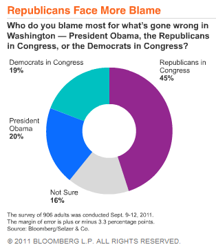
In Republicans Blamed Most for Ineffective Government in U.S. Poll, Bloomberg show results of a poll that asked who was to blame for ineffective national government in Washington. Their results were shown in this donut chart:

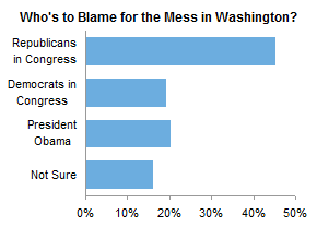
I was pointed to the Bloomberg article by Kevin Drum of Mother Jones, who wondered in Everybody Hates Everybody Else why Bloomberg used a donut chart to plot the data, though he did not elaborate. We’ve been trained to cringe at pie and donut charts, and replace them with bar charts:

Ah, we can breathe freely again. And we can see that people blame Obama slightly more than Congressional Democrats. This 1 percentage point difference was not apparent in the donut chart, and really it may be meaningless given the poll’s 3.3 percentage point margin of error. Of course, the Republicans have collected by far more blame than any other category. This is clear in both charts.
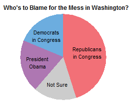
There is one reason to use a pie for this kind of data, though. Stephen Few himself described The Secret Strength of Pies in Save the Pies for Dessert. Pie charts have an advantage over simple bar charts when you want to compare not single values, but subtotals. What the donut chart above shows is that the total blame assigned to Democrats, the sum of Congressional Democrats and President Obama, is less than the blame assigned to Congressional Republicans.
The pie chart below shows this difference even more clearly: we have not cut out the central region of the pie, which has central angles as well as the areas of the points to help us decode the chart’s values.

Sometimes this strength of pies is not realized, because data sorted differently may not have related slices in adjacent positions. However, if you know some categories are related (the two Democrat categories here), you can sort the data to make use of this feature of pie charts.
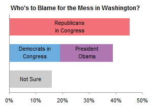
Then again, if you know some categories are related, you can convert the simple bar chart into a stacked bar chart, which sums related quantities linearly instead of circumferentially. This easier comparison allows us to see that Republican blame exceeds Democrat blame by almost twice the margin of error.

Bloomberg’s choice of chart type may not have been as bad as our initial reaction indicates, assuming the data was purposely sorted the way it was. Our stacked bar chart is an even better choice.


Alex Kerin says
I was just preparing my comment on how the two democrat options should be stacked… Must read ahead.
Fiona says
Hmm…I disagree with your last sentence. The stacked bar chart format requires an implicit assumption that the Democrat Congress blame and the Obama blame are two flavours of the same thing. The original donut chart does not put forward that assumption, while leaving it open to readers to interpret the data that way if they wish.
The donut chart also allows readers to easily observe that Republican blame is slightly less than half of all responses.
Jon Peltier says
Fiona –
You’re right, I did lump together Obama and the Dems in Congress. The pie does make it easier to view them as either separate or combined.
The stacked chart also shows Republicans just below 50% of the total, judging from the axis scale across the bottom.
The part of this post I didn’t like from the beginning, is that it assumes the blame is either-or. My own opinion is that all three of the parties mentioned here deserve some of the blame. I’m sure many people agree. In this case, a pie is not valid, because there are more “votes” than people voting. For example, maybe the “true” values are Republican 75%, Democrat 74%, President 72%. A pie chart for these numbers would recreate the Great Fox News Pie Chart Fiasco of 2009.
Sebastien Labonne says
The Pie/donut also allows to lump together congress as a whole.