In Yikes! Another Pie Horror Show, I was showing problems with yet another pie chart. I know the criticism of pie charts getting tiresome, but I wanted to respond to a comment by Jeff Weir:
Q: What’s worse than comparing categories within a pie chart?
A: Comparing categories between 2 pie charts.
I will use an article Jeff cited to show a better way to make comparisons.
The Analysis
Jeff pointed to Why are men more affected by labour market downturns?, a study by the NZ Department of Labour. The article stated that of the 34,000 jobs lost by the NZ economy in the eight quarters ending September 2009, 80% were lost by men.
This disparity in job losses can be seen through an analysis of the jobs held by men and women. Many more men hold jobs in manufacturing and construction, sectors which are hard hit during recessions. Women on the other hand are more likely to be employed in fields such as education and health, which are largely government funded and tend to be less sensitive to economic conditions.
The Visualization
This is a well thought out analysis, but as Jeff pointed out, comparing wedge sizes in two different pie charts is not an effective way to support the argument. Their two original pie charts were huge, and not even posted on the same page, though they did show barely legible thumbnails adjacent to the text of the article. The following two charts show the breakdown of jobs by men and by women. I’ve enlarged the pit thumbnails somewhat, to improve legibility and to compare with an alternate display I’ve created below using Dot Plots.
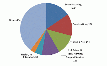
Seasonally adjusted male employment by industry September 2009 quarter
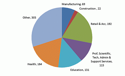
Seasonally adjusted female employment by industry September 2009 quarter
The Alternative Visualization
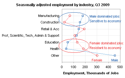
I’ve made two dot plots to show the same data. Within a couple pixels, the Dot Plots (including title) are the same size as these pie charts (without title), but each Dot Plot shows twice as much information, the Dot Plots have much more legible text, and the comparisons are much easier to make within a Dot Plot than between multiple pie charts.
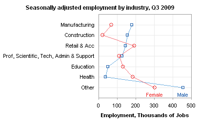
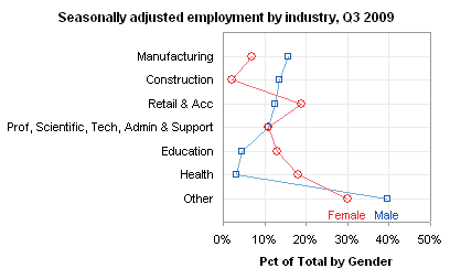
It would be so easy to make a few simple annotations on one of these dot plots to drive home the point of the analysis.
Dot Plots
Dot Plots have been developed as a more effective tool for categorical comparisons than bar charts, pie charts, or (gasp!) donut charts. You can read about them in several places:
- Good Graphs for Better Business by William S. Cleveland and N.I. Fisher
- Dot Plots: A Useful Alternative to Bar Charts by Naomi Robbins
- Some Comments on Dot Plots by Naomi Robbins (a guest post on this blog)
- Compare Metrics by Category Using Excel Dot Plot Charts by Charley Kyd
- Excel Dot Plots by Kelly O’Day
- Dot Plots on this web site
The last three links show various techniques for creating Dot Plots in Excel. Excel doesn’t make it easy to create Dot Plots: you need to use one helper series technique or another to generate the text labels along the vertical axis. The easiest approach is probably to use a horizontal bar chart with hidden bars to supply the labels, and an XY chart to supply the data points.
Dot Plots in Peltier Tech Charts for Excel
This tutorial shows how to create Dot plots, including the specialized data layout needed, and the detailed combination of chart series and chart types required. This manual process takes time, is prone to error, and becomes tedious.
I have created Peltier Tech Charts for Excel to create Dot Plots (and many other custom charts) automatically from raw data. This utility, a standard Excel add-in, lays out data in the required layout, then constructs a chart with the right combination of chart types. This is a commercial product, tested on thousands of machines in a wide variety of configurations, Windows and Mac, which saves time and aggravation.
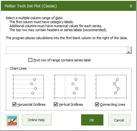
A simple dialog presents you with a few options for your chart.
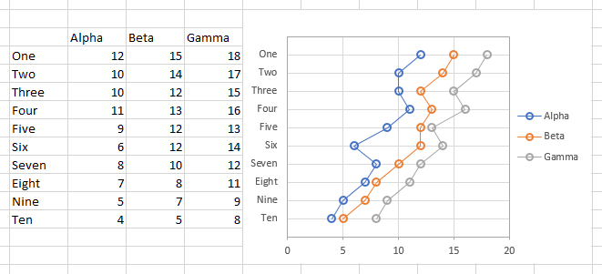
The output appears in an instant. The necessary calculations are hidden behind the chart, which is scaled and sized so the chart axis categories line up with the rows of the table.
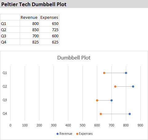
I’ve also added some additional types of dot plots, including lollipop charts and dumbbell plots. The dialog is simple to use:
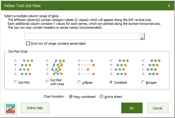
The output of this dialog is produced on an inserted worksheet:
Please visit the Peltier Tech Charts for Excel page for more information.


Ed Ferrero says
Hi Jon,
Much as I like your Dot Plot utility, I think that in this case the data lends itself to a simple bar chart.
It is easy to make the female numbers negative and draw a bar chart that looks like a tornado chart.
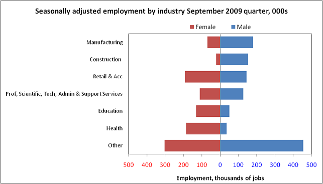
Note that I have used a custom format on the x-axis to remove the minus from negative numbers.
And adding dummy series on the secondary axis (and a little formatting) will highlight the relevant details nicely.
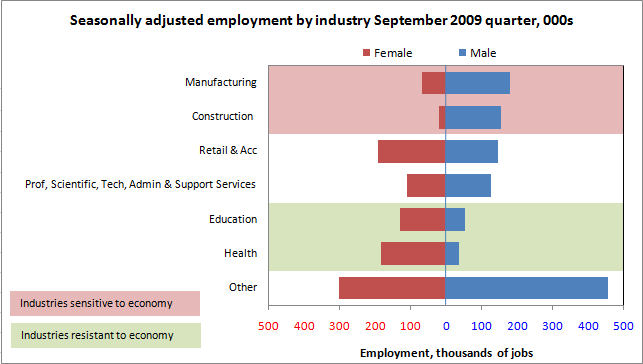
To my mind, Dot Plots are better at showing detailed values, but tend to look more cluttered than bar charts. In this case we don’t really care if the male participation rate in Construction is 13.5% or 14%, we just want to see that its much bigger than the female rate. So a bar chart should suffice.
Jeff Weir says
Funnily enough, after being one of those New Zealand males affected adversely by the recession (albeit just for a short period) , I just landed a job as a senior analyst at none other than the New Zealand Labour Department. I love irony.
Here’s a screenshot of how the same data works in a bar chart
While the dot plot and bar chart are definitely an improvement, the problem remains that we are looking at a static photo of a particular year, when we could be looking at how things have changed over a year. So I whipped up a graph in Excel then tweaked in Word that shows the absolute changes by sector and gender over a year, and gives the net change at the top.
This shows that female jobs in manufacturing actually fell more than male jobs: -15,000 female (-17%) as opposed to -13,000 male (-7%). So men actually sufferred less overall than women here. In fact, the biggest fall for male employment over the last year was in retailing and accommodation – 14,000 jobs; while female employment grew here by 2000 jobs (1%). I wonder what is going on here?
derek says
The dot plot could use some Bertin-style reordering, from Men Most Affected to Women Most Affected, say.
Chris says
Jon,
is your DotPlot Utility capable of handling PivotTable as ChartSource or do you know any workaround for PivotData?
Thy
Naomi B. Robbins says
Ed,
In general bar charts get more cluttered than dot plots. It’s the lines connecting the points that clutter these dot plots. We should be comparing men to women in the same
industry rather than men to men in different industries. The lines move our eyes from men in manufacturing to men in construction rather than to women in manufacturing.
Jon Peltier says
Ed –
The problem with bar charts is when you have more than about two series, they become too cluttered to interpret.
The problem I have with left-right tornado charts is that the comparison between the left bars and right bars is made difficult by not aligning them next to each other. I wrote about this in Tornado Charts and Dot Plots and I offered a bunch of alternatives (including Dot Plots). But some readers stepped up to defend the left-right charts, saying “everyone [in this field] uses these ‘population pyramids’, so it’s okay”. Fine, but I still don’t care for this approach. Anyway, for this reason, I prefer Jeff’s bar chart.
Some people say Thou Shalt Not Use Line Charts Along A Categorical Axis. Thus, a Dot Plot with connecting lines is unacceptable. I understand Naomi’s point that the lines add clutter, and perhaps she’s right. However, I use the line as a way to connect points in a series. I tried using lines which were lighter than the markers, in an attempt to de-emphasize any implied trend from point to point and reduce the clutter.
Jon Peltier says
Derek –
The data is already in Men Most Affected ordering. Do you mean we need two charts, or am I missing something?
Jon Peltier says
Chris –
The Dot Plot utility can handle pivot tables as the data source range. It will not automatically update when the pivot table is refreshed. If the cells in the charts data range change, so does the chart, but if the pitov table changes its shape, the chart does not reflect this change. The utility is not smart enough to deal with discontiguous ranges… maybe some day when I have time to program enhancements.
Naomi B. Robbins says
I don’t say never use line charts along a categorical axis because I have seen some cases where they are very useful. Here’s an example: patients are screened for a condition by being given five tests. Perhaps patients with high scores on test 1, 3 and 5 and low scores on test 2 and 4 need further testing. Plotting the results and connecting the points lets the researchers look for patients with a W pattern. Connecting the points makes looking for patterns easier. But in general I don’t like connecting points when it doesn’t make sense to interpolate between them and when you’d see a completely different pattern if you ordered differently.
derek says
Sorry, I meant instead of ordering from industries men are more likely to be in to industries men are less likely to be in, I’d order from industries men are more likely to be in compared to women to industries men are less likely to be in compared to women (as determined by subtracting the two percentages).
In practice, I see this actually only means switching Professional and Retail in this case. I was also a bit confused by the “Other” category, which I didn’t find useful since it’s just the bin that makes the whole thing up to 100% for each sex. I’d drop that category and just present the sequence C, M, P, R, E, H.
Jon Peltier says
Naomi –
I was not thinking of you when I cited the No Lines commandment: your approach has always seems to be utilitarian, not totalitarian. Your guidelines for when to use lines are helpful.
One of the most useful cases of lines in a categorical chart is in a parallel coordinates plot. Without the lines, the chart would be useless, yet I’ve had the discussion that I shouldn’t use lines.
Here are my dot plots, stripped of their lines. Does anyone have a comment?
chip says
Interesting discussion in the comments. Naomi made the comment that I came here to make: that the lines are connecting unrelated data and lead the eye to follow a pattern that’s not really there. I think your revised charts work perfectly well. I like them better than Jeff’s bar charts, because I think the bars make me more likely to look at the patterns of the blue bars in relation to each other rather than in relation to the red bar next to them. With the dot-plot I can also quickly discern how many categories have men “leading” vs. women, while the bars seem to make my brain work harder at getting to that.
Chris P says
I am with Naomi on not serially connecting items that are randomly ordered. yes, it is nice to see the two series, but the angles created by the lines between categories are NOT data–in fact they are artifacts. The segmentation of male/female and by category provide dimensions that you feel are important to understand, but the within gender or between gender hypothesis could drive two different sets of plots. Your last dot plot introduces exogenous data (the change over time) to the graph–but we do not see this dynamic in the graph. A table sorted by the % of men in the industry then showing the change in unemployment over the period would help establish the claim better than the current dot plot.
Jeff Weir says
I think Chip’s right that the bars tend to work for blue-on-blue comparisons at the expense of blue-on-red, and that it’s harder to see at a glance who is leading who across all categories.
So technically I think dot plots are a better medium for people that understand charts well. But are they the best medium for the majority of people more familiar with bar charts? So something we should factor in is the ‘reading age’ of the publication. This source material is public interest, not an article in a scientific periodical. So perhaps we need to err on the side of ‘understanding of the masses’.
While the lines on bar charts add ‘clutter’, I think that the upside is that this clutter helps draw the eye back to an axis. Whereas with the dot plots, you look at the dots and then have to decide ‘what do I have to connect these things to?’ or ‘where should I look next?’
Bar charts may be for sissies, but if that’s what most of our readers are, then perhaps bar charts it is, then.
Regardless, even more important than chart style is chart content. If this publication is about the effect of the recession across sexes and sectors, then plotting how things have changed over a year is a better choice than plotting how things look right now… as I’ve done in my 2nd bar chart above.
Content is still king. Or to paraphrase Tufte, is this the best data we can present to illustrate this story?
derek says
Here is what I had in mind. I thought of another advantage of ordering by increasing difference between two series: the two series are by definition guaranteed to have at most one crossing point, minimizing confusing clutter.
I’m a convert to the value of lines between the points in nominal category series, thanks to the work of Alfred Inselberg.
BTW, this is my lazy dot plot method– I just make an Excel line chart and rotate it 90 degrees when its time to save the image using my favorite photo app.
Jeff Weir says
Yikes…labor pies everywhere. http://www.bls.gov/opub/ted/
DaleW says
I agree with Ed Ferarro and especially Jeff Weir here. While either a dot plot or a bar chart is a clear improvement over the original pie chart, none of them convey the full story in this data.
The oft-discussed loss of jobs in male-dominated manufacturing actually seems to be hurting women more than men in this NZ data, as Jeff pointed out by his supplemental chart of jobs lost/gained by sector and gender. It is only the big gain of jobs by women (but not men!) in the Health field that allows the recession overall to impact the employment of women less than men in NZ. A bar/tornado chart is a very effective way to convey such nuances.
When zero matters, and there are only a few (1-3?) series per cluster, a bar chart seems easier to grasp than a dot plot — even for those familiar with dot plots.
Jeff Weir says
Just found another blog that covers some of this ground: Eagereyes. Check out
http://eagereyes.org/criticism/cost-of-a-sick-chart