In the Microsoft Charting newsgroup, a reader wanted to show separate lines on a line chart to compare the severity of the medical conditions of different patients after one to five visits. The question was whether it would be possible to resolve the individual patients.
A parallel coordinates chart can show an individual’s condition in front of a background of the entire population.

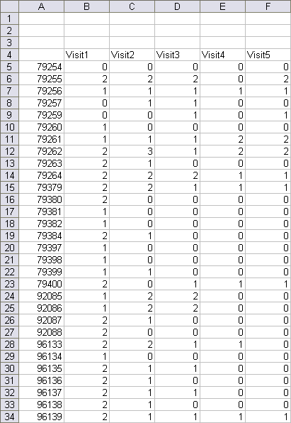
Here is a small sample of the data. The first column represents the patient identification number, and the other columns show the patients’ conditions on each visit, on a scale of 0 to 4. I’ve left a few blank rows at the top for extra chart data.

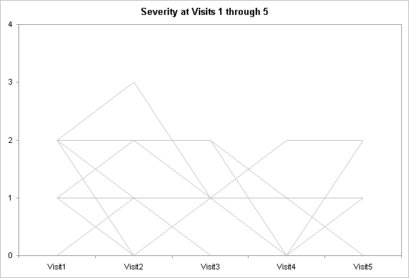
The first step is to chart all the data, by row, and format the lines in the same muted gray.

From the ActiveX Control Toolbox (below), select the List Box button, and draw a listbox. I drew mine next to the chart, the same height as the chart. In Excel 2003, I usually right click on another toolbar and choose Control Toolbox from the pop up menu, although there is also a button on the Visual Basic toolbar that toggles the visibility of the Control Toolbox. In Excel 2007 click on the Developer ribbon tab, choose Insert from the Controls group, and select the List Box from the list of ActiveX Controls.

Right click on the listbox and choose Properties.Select a cell for the LinkedCell property (I used A2) and a range of cells (A5:A35) for the ListFillRange property. You can also set other properties, including appearance, from the Properties window.

The list fill range is the list of patient IDs from column A, plus a blank cell at the bottom, because sometimes the listbox truncates the last item in the list. The linked cell is A2, which contains the selected patient ID. (A Forms toolbar listbox returns the index of the selected item, not the item itself).
Cell A3 has a formula to determine the index of the selected patiend number:
=MATCH(A2,A5:A34,0)
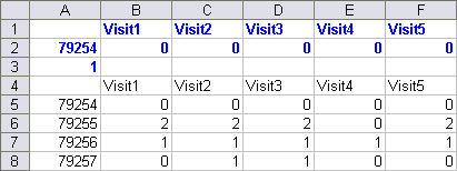
Cells B2 through F2 have simple index formulas to return the condition for the selected patient from that column. Select B2:F2, enter the following formula, and hold CTRL while pressing Enter, to enter the formula in all selected cells.
=INDEX(B$5:B$34,$A$3)
The top of the table, highlighted in blue, shows the data for the selected patient.

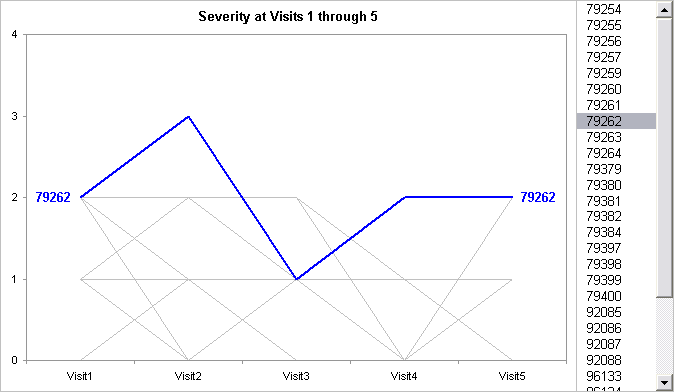
This data in A1:F2 is added to the chart, and given a distinct color. I added data labels to the first and last point, showing the patient number.

It’s very easy for the reader to select any patient and view the corresponding severity scores. I used a Controls Toolbox listbox instead of a Forms toolbar one, because after selecting one item, you can easily scroll through the rest using the arrow keys.
I have posted my sample Parallel Coordinates Workbook.


derek says
It might be worth jittering the data a bit to avoid the lines all falling on top of one another:
=B5+0.1*NORMSINV(RAND())Jon Peltier says
Derek –
That helps to show the amount of data for each line:
KDS says
Hi Jon,
Thank you for all the excellent tutorials. I am working on a Parallel Coordinate graph for which the raw data has values between -1 and 24000 and am looking for an appropriate way to scale since I want to distinguish between 1 and 0, so far I’ve found
Bagwell, C Bruce. 2005. “Hyperlog-a flexible log-like transform for negative, zero, and positive valued data.” Cytometry. Part A : the journal of the International Society for Analytical Cytology 64:34-42. http://www.ncbi.nlm.nih.gov/pubmed/15700280.
but…am not sure how to implement it. Any ideas?
This is for my thesis and others have not been able to help so thank you very much!
Jon Peltier says
KDS –
You need to define your parameters a, b, and c. Put them into a range of cells, and name the cells param_a, param_b, param_c. Then put the y values into a column, say, A2:A100. In B2 enter this formula:
=if(A2>=0,param_c^(param_a*A2)+param_b*A2-1,-param_c^(param_a*A2)+param_b*A2+1)
and fill down column B.
Christy says
I am wondering how to make such a parallel coordinates figure where the scale of severity, in this case, is different for each visit. For example, on visit 1 and 2 the scores range from 0-4, but on visit 3 a different type of score is taken that ranges from 120-200. So, dual y-axes?
thanks
Jon Peltier says
Hi Christy –
Using different scores can be problematic. It is important to ensure that those reading the chart are aware of the different scales.
In order for the different measures to fill the whole Y axis range, you could normalize the scores for each category, where the plotted score
Z = (Y – Ymin)/(Ymax-Ymin)
ranges from 0 to 1.
Jim Janas says
Sample Parallel Coordinate Chart – Question
I am trying to do something similar to your sample. However, what I receive in the linked cell(a2) is an index number. The match statement in a3 then fails unable to find a match. Is there a property that needs to be turned on for the list box to return a value instead of an index number?
Thanks
jim
Jon Peltier says
Jim –
In this example I used a listbox from the Controls Toolbox. This places the selected list item in the linked cell. You need to use a MATCH function to get the index.
A listbox from the Forms Toolbar will place the index of the selected item in the linked cell. Use the control’s linked cell directly in the INDEX function, rather than the cell with the MATCH function.
Jim Janas says
Jon:
Sample Parallel Coordinate Chart – Question(s)
Unfortunately, I know enough to be dangerous. I have around 70 items in the table. The data values varies quite a bit and I have to use a log scale for the axis. I modified a macro to change all the line colors to a muted color. Actually, the macro was written by you for another purpose.
Sub FormatLinez() < — my change
Dim srs As Series
For Each srs In ActiveChart.SeriesCollection
srs.Border.Weight = xlThin
srs.Border.Color = RGB(236, 236, 236) < — my change
Next
End Sub
The ActiveX listbox works great. One of my earlier problems was I failed to turnoff Design Mode after building the table. My match and Index statements work correctly. My problem is NO chart line for the selected item. Hopefully, you can point me in the right direction.
One more thing, where do you set the data labels for the line?
Thanks again
Jim Janas
Jim Janas says
I managed to get my chart working. I did not know you could paste a series into a chart. That worked great. Data labels are working as well. Your tutorial’s are great.
Thanks again.